CSS is full of nuances that can be pretty confusing for beginners. Over the last 20 years, developers have had to come up with many methods for building out layouts, and as the language evolves we have better and better solutions.
I recently made a tweet that mashed together several of these solutions into one single unusable broken class, so now in a more helpful manner I'm going to explain the real patterns to use
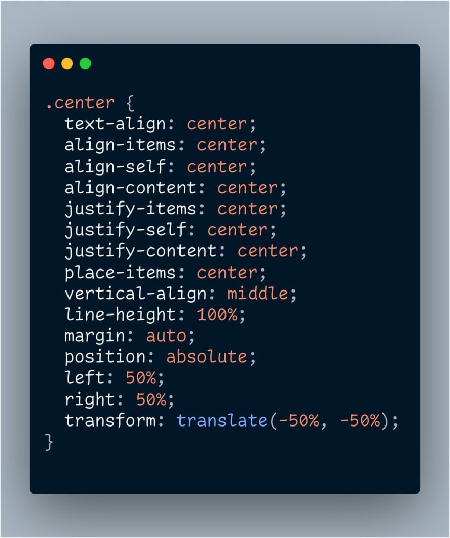 hey everyone I finally solved centering things in CSS03:36 AM - 01 Apr 2020


The Text Align Method
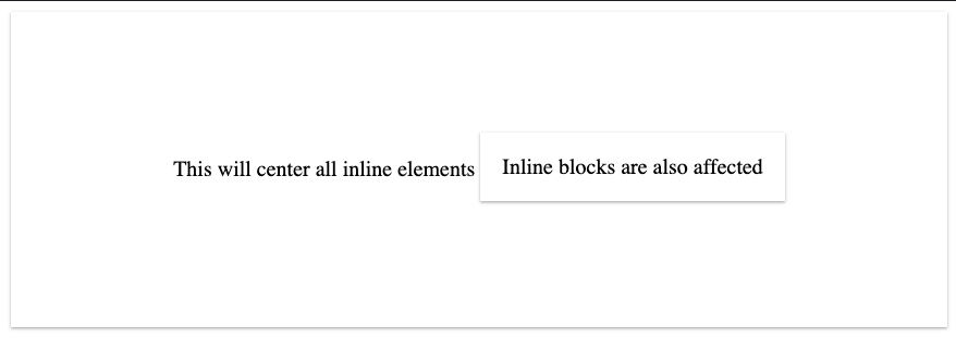
To center all the text within a container, you can use the css rule text-align: center;
This will apply to all inline elements — that is, anything that flows like text
<div style="text-align: center">
  This will center all inline elements

  <br />

  <span>
    Spans are inline elements by default
  </span>

  <br />

  <div style="display: inline-block;">
    Inline blocks are also affected
  </div>
</div>

Example here: https://codepen.io/jacobparis/pen/BaNEbVQ
The Line Height Method
To center text vertically, you can use the vertical-align: middle; rule. It's important to note that this only aligns characters within their line height. For example, you can use this rule to set text to superscript or subscript positioning, but it still flows the same.
If you want to center text vertically within its container this way, you'll need to make sure the line-height property has the same height as the container.
<div style="height: 200px; text-align: center;">
  <span style="vertical-align: middle; line-height: 200px;">
    This will center all inline elements
  </span>

  <div style="display: inline-block;">
    Inline blocks are also affected
  </div>
</div>
Example here: https://codepen.io/jacobparis/pen/RwPOdza
The Background Position Method
This only works for images (and SVG!) that you want to set as backgrounds to other elements. For <img /> tags, you can use any of the methods that work on divs.
The rule here is background-position: center;
<div style="
  height: 300px;
  background-image: url('http://placekitten.com/200/200');
  background-repeat: no-repeat;
  background-position: center;
"/>

Example here: https://codepen.io/jacobparis/pen/rNVbgBO
The Margin Auto Method
Block elements are max width by default, so horizontally centering doesn't mean anything until you set its width explicitly.
An artificially narrow div defaults to the left, (or right in RTL scenarios), but you can force it center with margin-left: auto; margin-right: auto;
A common shorthand for the same margin is margin: 0 auto; and since we don't care about vertical margin here nothing stops us from doing margin: auto; either
<div>
  <div style="max-width: 300px; margin: 0 auto;">
    This is a centered div
  </div>
</div>

Example here: https://codepen.io/jacobparis/pen/RwPOOwR
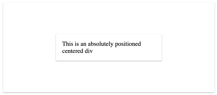
The Position Absolute Method
Of all the methods, this is the most extreme. Instead of letting the browser calculate where the element should be at all, we're setting it explicitly.
Important here is that if you want to center something within a container, the container must have position: relative;. That's what tells the absolute position what to base its coordinates off of.
position: absolute;
left: 0;
right: 0;
top: 0;
bottom: 0;
Essentially, you're anchoring the edges of your element to the edges of its container, which makes it exactly the same size. If you then set the width or height explicitly AND use the Margin Auto Method, it ends up suspended between the edges
If you only want horizontal or vertical centering, you can leave out the other axis
<div style="height: 500px; position: relative;">
  <div style="
      position: absolute;
      left: 0;
      right: 0;
      bottom: 0;
      top: 0;
      width: 100px;
      height: 200px;
      margin: auto;">
    This is an absolutely positioned centered div
  </div>
</div>

Example here: https://codepen.io/jacobparis/pen/RwPOOwR
The Absolute Offset Method
The trouble with the previous method is you need to set the width and height explicitly. But what if your content changes dynamically? We have another solution!
Instead of setting all four corners, only set left: 50%; and top: 50%;. That will position the top left corner of your element in the center of its container.
Then you can use CSS Translate to shift the child by half of its own width and height up and to the left, landing in perfectly in the center
<div style="height: 200px; position: relative;">
  <div style="
      position: absolute;
      left: 50%;
      top: 50%;
      transform: translate(-50%, -50%);">
    This is an absolutely positioned centered div with dynamic position
  </div>
</div>
Example here: https://codepen.io/jacobparis/pen/bGdJJJm
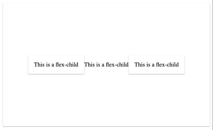
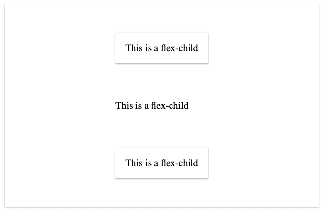
The Flexbox Method
Flexbox is the biggest game-changer to ever hit CSS, and it makes centering a snap.
The key to flex is to understand that parent elements are responsible for laying out their children. If you try to make every element position itself, you're gonna have a bad time.
Since a flex parent is responsible for its children's position, it doesn't matter whether they're inline or block elements. That makes no difference anymore. Instead of inline and block, think in terms of flex-parents and flex-children
The element with display: flex; is the flex-parent, and it only controls direct children, not further descendants.
<div style="
  height: 300px;
  display: flex;
  justify-content: center;
  align-items: center;
">
  <div>
    This is a flex-child
  </div>
  <span>
    This is a flex-child
  </span>
  <div>
    This is a flex-child
  </div>
</div>
Example here: https://codepen.io/jacobparis/pen/poJBBpq
The Grid Method
CSS Grid is extremely powerful but more advanced than I'd like to get into today. If you just want to center items, the pattern is pretty close to flexbox — just change it to display: grid;
If there were one single element here, it'd be perfectly centered (and that goes for flexbox too)
<div style="
  height: 300px;
  display: grid;
  justify-content: center;
  align-items: center;
">
  <div>
    This is a flex-child
  </div>
  <span>
    This is a flex-child
  </span>
  <div>
    This is a flex-child
  </div>
</div>
Example here: https://codepen.io/jacobparis/pen/poJBBpq
Grid (Place Items)
One other thing I'd like to note is the place-items: center; property, which works on CSS Grid like a combination of justify-content, align-items, and text-align all at once
display: grid;
place-items: center;

Latest comments (0)