
Prerequisite
Basic understanding of HTML and CSS.
A text editor to write your code, such as Sublime Text, Atom, or Visual Studio Code.
A web browser to test your email, such as Google Chrome, Mozilla Firefox, or Safari.
Introduction
Emails are powerful for reaching your audience and promoting your products or services. In today’s world, there are numerous devices and screen sizes available, so ensuring your emails look good on all types of devices is essential.
Creating a responsive custom email using HTML and CSS is not as challenging as some may think with the right tools and knowledge. In this guide, I’ll take you through the step-by-step process of building a responsive custom email using HTML and CSS and testing it on various devices.
What is a Responsive Custom Email?
A custom email is an email designed with a specific brand or message in mind and may include custom graphics, fonts, and formatting.
A responsive custom email is such that its design and layout are modified to fit the device’s screen size and orientation on which it is viewed. This ensures that the email is legible and visually appealing, regardless of the device or screen size.
Responsive designs are achieved through HTML and CSS code that adjusts the email’s layout and formatting based on the device’s screen size. This may include adjusting font sizes, images, and other design elements to fit the available space.
Planning for your Custom Email
Before you start coding your email, planning and defining its purpose is essential. Here are some steps to adopt when planning your email:
- The first step is clearly defining the email’s primary goal. This could be to promote a product or service, inform the audience about an event or update, request a meeting or feedback, or to simply say thank you. The purpose of the email will determine the tone, language, and structure of the message.
For instance: the purpose of the email we will build in this tutorial is to introduce myself to the new subscribers of my newsletter.
- Secondly, you should be clear on who the target audience for the email is. This includes understanding the target audiences’ interests, preferences, and behaviors. For example, if the email aims to promote a product, the target audience may be existing customers or those interested in similar products. If the email is about an event, the target audience may be people who have previously attended similar events or have shown an interest in the topic.
For this tutorial, the target audience for this email is the new subscribers to my newsletter who have read some of my articles and have shown interest in getting notified whenever I publish a new article. They will likely be tech newbies and professionals interested in the latest trends in AI, blockchain, and software development.
- The third step is to outline the structure of the email. This includes deciding on the sections of the email, such as the header, body, and footer. It may also include images, links, or other multimedia elements. The structure of the email should be easy to read and follow, with clear calls to action and relevant information for the target audience.
For this tutorial, the structure of the email will be as follows:
Header: The header will include my name and a catchy subject line that grabs the recipient’s attention.
Body: The body will include an introduction of myself. It will also include images and a call-to-action button that directs the recipient to my blog page or website for more information.
Footer: The footer will include my contact information, social media links, and an unsubscribe option.
The purpose, target audience, and structure of the email are all important factors to consider when creating effective email communications. By understanding these elements and tailoring the message accordingly, you can improve the chances of your email being read, understood, and acted upon by the recipient.
Creating the HTML Structure of your Email
The HTML structure is the foundation of your email. It’s important to code it correctly to ensure it’s optimized for all devices. Here are the steps to follow when coding the HTML structure of your email:
- Use a basic HTML structure: Your Email should use a basic HTML structure that includes the head and body tags. The head section should consist of the title, meta tags, and any style sheets you’ll be using.
     <!DOCTYPE html>
     <html lang="en">
     <head>
         <meta charset="utf-8">
         <meta name="viewport" content="width=device-width">
         <meta http-equiv="X-UA-Compatible" content="IE=edge">
         <meta name="x-apple-disable-message-reformatting">
         <link rel="preconnect" href="https://fonts.googleapis.com">
         <link rel="preconnect" href="https://fonts.gstatic.com" crossorigin>
         <link href="https://fonts.googleapis.com/css2?family=Roboto:wght@700&display=swap" rel="stylesheet">
         <title>Custom Email Tutorial</title>
     </head>

         <style></style>

         <body></body>
     </html>
- Code the email header: The header of your email should include your logo, navigation links, and any other information you want to include.
     <!--This goes inside the body tag-->
         <center>
         <div class="email-container">
                   <table role="presentation">
                       <tr>
                           <td class="logo" style="text-align: center;">
                             <h1><a href="https://jamesajayi.hashnode.dev">Blog Introduction</a></h1>
                           </td>
                       </tr>
                   </table>
         </div>
         </center>
- Code the email body: The body of the email should include the primary information you intend to pass on to the reader.
     <!--This goes inside the body tag just after the email header above-->
     <table role="presentation">
                     <tr>
                         <td>
                             <div class="text">
                                 <h2>Thank you so much for subscribing to my newsletter!</h2>
                             </div>
                         </td>
                     </tr>
                     <tr>
                         <td>
                               <div class="text-author">
                                   <img src="https://cdn.hashnode.com/res/hashnode/image/upload/v1682512999217/80KL_VPxD.jpg?w=500&h=500&fit=crop&crop=faces&auto=compress,format&format=webp" alt="picture">
                                   <h3 class="name"></h3>
                                   <span class="position">Technical Writer, James Ajayi's Blog</span>
                                    <p><a href="https://https://twitter.com/ajayijames_" class="btn btn-primary">Introduce yourself too</a></p>
                                    <p><a href="https://https://twitter.com/ajayijames_" class="btn-custom">Skip introduction</a></p>
                                </div>
                           </td>
                         </tr>
                 </table>
- Code the email footer: The footer of your email should include your contact information, social media links, and any other important information you want to include.
     <!--This goes inside the body tag just after the email body above-->
     <table role="presentation">
               <tr>
               <td class="bg_light footer email-section">
                 <table>
                     <tr>
                     <td>
                       <table role="presentation">
                         <tr>
                           <td>
                               <h3 class="heading">About</h3>
                               <p>I enjoy writing technical content to ease user experience.</p>
                           </td>
                         </tr>
                       </table>
                     </td>
                     <td>
                       <table role="presentation">
                         <tr>
                           <td>
                               <h3 class="heading">Contact Info</h3>
                               <ul>
                                         <li><span class="text">Remote</span></li>
                                         <li><span class="text">+123-4567-890</span></li>
                                       </ul>
                           </td>
                         </tr>
                       </table>
                     </td>
                     <td >
                       <table role="presentation">
                         <tr>
                           <td>
                               <h3 class="heading">Visit my Blog</h3>
                               <ul>
                                         <li><a href="https://jamesajayi.hashnode.dev">Home</a></li>
                                         <li><a href="https://jamesajayi.hashnode.dev">About</a></li>
                                         <li><a href="https://jamesajayi.hashnode.dev">Services</a></li>
                                         <li><a href="https://jamesajayi.hashnode.dev">Blog</a></li>
                                       </ul>
                           </td>
                         </tr>
                       </table>
                     </td>
                   </tr>
                 </table>
               </td>
             </tr>
             <tr>
               <td class="bg_light">
                   <p>Do you want to stop recieving my mail? <a href="https://linkedin.com/in/jamesajayi-">Unsubscribe here</a></p>
               </td>
             </tr>
           </table>
Styling your Email with CSS
Once you’ve coded the HTML structure of your email, it’s time to style it with CSS. Here are the steps to follow when styling the Email with CSS:
- Use inline CSS: Inline CSS is the most effective way to style your email. It ensures that your styles are applied consistently across all devices.
     <style>

      html,body {
         margin: 0 auto;
         padding: 0;
         height: 100%;
         width: 100%;
         background: #f1f1f1;
     }

     /*BUTTON*/
     .btn{
         padding: 10px 15px;
         display: inline-block;
     }
     .btn.btn-primary{
         border-radius: 5px;
         background: #ff0000;
         color: #ffffff;
     }
     .btn.btn-white{
         border-radius: 5px;
         background: #ffffff;
         color: #000000;
     }
     .btn.btn-white-outline{
         border-radius: 5px;
         background: transparent;
         border: 1px solid #fff;
         color: #fff;
     }
     .btn.btn-black-outline{
         border-radius: 0px;
         background: transparent;
         border: 2px solid #000;
         color: #000;
         font-weight: 700;
     }
     .btn-custom{
         color: rgba(0,0,0,.3);
         text-decoration: underline;
     }

     h1,h2,h3,h4,h5,h6{
         font-family: 'Roboto', sans-serif;
         color: #095034;
         margin-top: 0;
         font-weight: 400;
     }

     body{
         font-family: 'Roboto', sans-serif;
         font-weight: 400;
         font-size: 15px;
         line-height: 1.8;
         color: rgba(16, 76, 40, 0.918);
     }

     a{
         color: #ff4507;
     }

     /*LOGO*/

     .logo h1{
         margin: 0;
     }
     .logo h1 a{
         color: #095034;
         font-size: 24px;
         font-weight: 700;
         font-family: 'Roboto', sans-serif;
     }

     /*HERO*/
     .hero{
         position: relative;
         z-index: 0;
     }

     .hero .text{
         color: rgba(0,0,0,.3);
     }
     .hero .text h2{
         color: #000;
         font-size: 34px;
         margin-bottom: 0;
         font-weight: 200;
         line-height: 1.4;
     }
     .hero .text h3{
         font-size: 24px;
         font-weight: 300;
     }
     .hero .text h2 span{
         font-weight: 600;
         color: #000;
     }

     .text-author{
         bordeR: 1px solid rgba(0,0,0,.05);
         max-width: 50%;
         margin: 0 auto;
         padding: 2em;
     }
     .text-author img{
         border-radius: 50%;
         padding-bottom: 20px;
     }
     .text-author h3{
         margin-bottom: 0;
     }
     ul.social{
         padding: 0;
     }
     ul.social li{
         display: inline-block;
         margin-right: 10px;
     }

     /*FOOTER*/

     .footer{
         border-top: 1px solid rgba(0,0,0,.05);
         color: rgba(0,0,0,.5);
     }
     .footer .heading{
         color: #000;
         font-size: 15px;
     }
     .footer ul{
         margin: 0;
         padding: 0;
     }
     .footer ul li{
         list-style: none;
         margin-bottom: 10px;
     }
     .footer ul li a{
         color: rgb(132, 132, 132);
     }
     /* What it does: Stops email clients resizing small text. */
     * {
         -ms-text-size-adjust: 100%;
         -webkit-text-size-adjust: 100%;
     }

     /* What it does: Centers email on Android 4.4 */
     div[style*="margin: 16px 0"] {
         margin: 0;
     }

     /* What it does: Fixes webkit padding issue. */
     table {
         border-spacing: 0;
         border-collapse: collapse;
         table-layout: fixed;
         margin: 0 auto;
     }

     img {
         -ms-interpolation-mode:bicubic;
     }

     a {
         text-decoration: none;
     }

     *[x-apple-data-detectors],  /* iOS */
     .unstyle-auto-detected-links *,
     .aBn {
         border-bottom: 0;
         cursor: default;
         color: inherit;
         text-decoration: none;
         font-size: inherit;
         font-family: inherit;
         font-weight: inherit;
         line-height: inherit;
     }

     .a6S {
         display: none;
         opacity: 0.01;
     }

     .im {
         color: inherit;
     }

     img.g-img + div {
         display: none;
     }

     .email-section{
         padding:2.5em;
     }
     </style>
- Use media queries: Media queries help to create different styles for different screen sizes. This ensures that your email is optimized for all devices.
     /* This adjusts the email design on iPhone 4, 4S, 5, 5S, 5C, and 5SE */
     @media only screen and (min-device-width: 320px) and (max-device-width: 374px) {
         u ~ div .email-container {
             min-width: 320px;
         }
     }

     /* This adjusts the email design on iPhone 6, 6S, 7, 8, and X */
     @media only screen and (min-device-width: 375px) and (max-device-width: 413px) {
         u ~ div .email-container {
             min-width: 375px;
         }
     }

     /* This adjusts the email design on iPhone 6+, 7+, and 8+ */
     @media only screen and (min-device-width: 414px) {
         u ~ div .email-container {
             min-width: 414px;
         }
     }
- Keep it simple: Keep your styles simple and consistent. Use a limited colour palette and avoid the usage of too many fonts or font sizes.
     .primary{
         background: #062917;
     }
     .bg_white{
         background: #ffffff;
     }
     .bg_light{
         background: #f7fafa;
     }
     .bg_black{
         background: #000000;
     }
     .bg_dark{
         background: rgba(0,0,0,.8);
     }
Below is the end result of the HTML and CSS code above

Testing your Custom Email
Once you’ve coded your email and styled it with CSS, testing it on various devices is vital to ensure it looks great. Here are some ways to test your email:
Use testing tools: Many testing tools, such as Litmus and Email on Acid, allow you to test your email on various devices and email clients. These tools will also show you how your email will look on different screen sizes and resolutions.
Test on multiple devices: It’s important to test your email on multiple devices, including smartphones, tablets, and desktops. This ensures that your email is optimized for all devices.
Test on multiple email clients: Email clients render emails differently, so it’s important to test them on multiple email clients, such as Gmail, Outlook, and Apple Mail. This ensures that your email looks great regardless of the email client your audience is using.
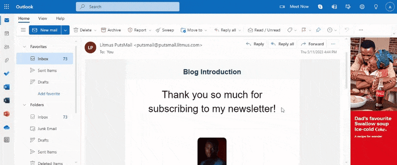
For this tutorial, I used Litmus to test how the custom email looks on Outlook and Gmail.
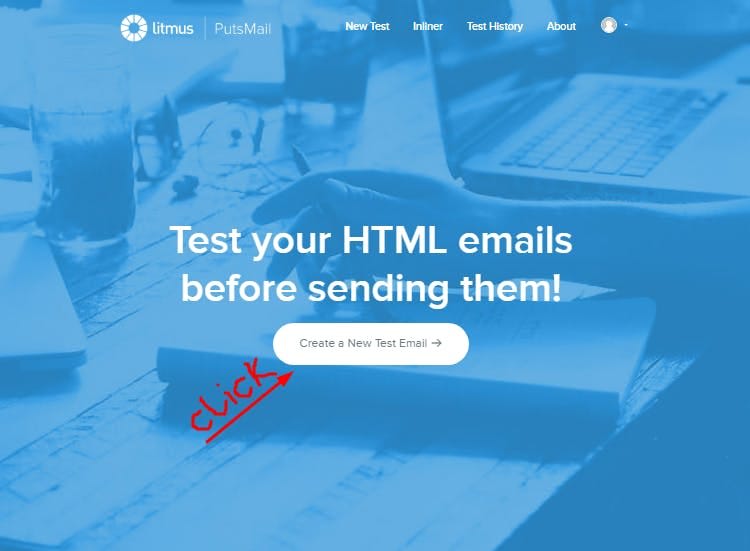
To use Litmus, you’ll have to create an account, after which you’ll sign in and then click on ‘Create a New Test Email’. You’ll be taken to a page where you’ll have to fill in the email addresses you want to use to test your email, the subject of the email, your HTML code, and the inline CSS code. You’ll then click on ‘Send email. The email will be sent directly to the email addresses you filled in for you to see what it looks like. There are other nice features on the paid version of Litmus that you can explore to get the results you want.

Below is what I got in my Email from Litmus
Conclusion
In this guide, you’ve gone through the steps to create a responsive custom email, from planning and building your email to testing it on various devices.
By following these steps, you’ll be able to create a custom email that looks great on any device and email client. Remember to keep your email simple and consistent. With these tips, you can create effective and engaging emails that your audience will love.
You can access the sample code used for this tutorial here.
For more tutorials on building responsive designs with HTML and CSS, check freeCodeCamp.
See you in the next article!

Top comments (0)