Picking up from part one, we left off with two planets with orbits.

Saturn and beyond
Preparing to add another planet in (actually two), my next move is to double our grid size again.
grid-template-columns: repeat(8, 1fr);
grid-template-rows: repeat(8, 1fr);
And using our grid numbers supplied in this case by Mozilla’s inspector, I can adjust the row and column assignments for Neptune and Uranus before adding the next two planets.
.neptune {
   grid-row: 1/2;
   grid-column: 1/9;
}
.neptune-orbit {
   grid-row: 1/9;
   grid-column: 1/9;
}
.uranus {
   grid-row: 2/3;
   grid-column: 1/9;
}
.uranus-orbit {
   grid-row: 2/8;
   grid-column: 2/8;
}
And that brings us back to basically the same design as before. But, now I can add two more planets and their respective orbits. Continuing to use the line numbers provided in the inspector, I can place the next two planets right away.
<div class="saturn-orbit orbit"></div>
<div class="saturn planet"></div>
<div class="jupiter-orbit orbit"></div>
<div class="jupiter planet"></div>
.saturn {
   grid-row: 3/4;
   grid-column: 1/9;
}
.saturn-orbit {
   grid-row: 3/7;
   grid-column: 3/7;
}
.jupiter {
   grid-row: 4/5;
   grid-column: 1/9;
}
.jupiter-orbit {
   grid-row: 4/6;
   grid-column: 4/6;
}
Double it
Now we have a system developing here ( pun intended ), though it’s a bid tedious we can simply double our grid again, then adjust all the previous row and column assignments to account for the change.
Just to update, this is what our code looks like at this point
<main>
       <div class="neptune-orbit orbit"></div>
       <div class="neptune planet"></div>
       <div class="uranus-orbit orbit"></div>
       <div class="uranus planet"></div>
       <div class="saturn-orbit orbit"></div>
       <div class="saturn planet"></div>
       <div class="jupiter-orbit orbit"></div>
       <div class="jupiter planet"></div>
       <div class="mars-orbit orbit"></div>
       <div class="mars planet"></div>
       <div class="earth-orbit orbit"></div>
       <div class="earth planet"></div>
       <div class="venus-orbit orbit"></div>
       <div class="venus planet"></div>
       <div class="mercury-orbit orbit"></div>
       <div class="mercury planet"></div>
   </main>
body {
   padding: 0;
   margin: 0;
   box-sizing: border-box;
   display: grid;
   place-items: center;
   height: 100vh;
}
main {
   width: 90vw;
   height: 90vw;
   margin: 5vh 5vw;
   border: 1px solid #cccccc;
   display: grid;
   grid-template-columns: repeat(16, 1fr);
   grid-template-rows: repeat(16, 1fr);
}
.planet {
   height: 5vmin;
   width: 5vmin;
   border-radius: 50%;
   border: 2px solid #000000;
   background: #ffffff;
   justify-self: center;
   margin-top: -2.5vmin;
}
.orbit {
   border-radius: 50%;
   border: 2px solid #000000;
}
.neptune {
   grid-row: 1/2;
   grid-column: 1/17;
}
.neptune-orbit {
   grid-row: 1/17;
   grid-column: 1/17;
}
.uranus {
   grid-row: 2/3;
   grid-column: 1/17;
}
.uranus-orbit {
   grid-row: 2/16;
   grid-column: 2/16;
}
.saturn {
   grid-row: 3/4;
   grid-column: 1/17;
}
.saturn-orbit {
   grid-row: 3/15;
   grid-column: 3/15;
}
.jupiter {
   grid-row: 4/5;
   grid-column: 1/17;
}
.jupiter-orbit {
   grid-row: 4/14;
   grid-column: 4/14;
}
.mars {
   grid-row: 5/6;
   grid-column: 1/17;
}
.mars-orbit {
   grid-row: 5/13;
   grid-column: 5/13;
}
.earth {
   grid-row: 6/7;
   grid-column: 1/17;
}
.earth-orbit {
   grid-row: 6/12;
   grid-column: 6/12;
}
.venus {
   grid-row: 7/8;
   grid-column: 1/17;
}
.venus-orbit {
   grid-row: 7/11;
   grid-column: 7/11;
}
.mercury {
   grid-row: 8/9;
   grid-column: 1/17;
}
.mercury-orbit {
   grid-row: 8/10;
   grid-column: 8/10;
}
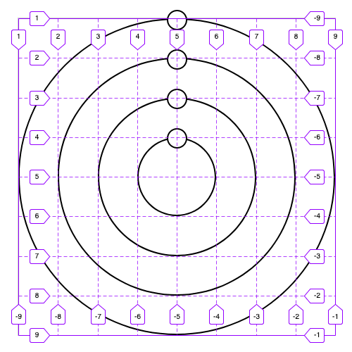
With all of our planets, RIP pluto, here is what our system looks like.

Now, we have a good foundation. We are missing a sun for all these planets to revolve around, unless that’s not your thing, which I don’t even know where to begin. So adding a div for our sun, and the following CSS
.sun {
   grid-row: 8/10;
   grid-column: 8/10;
   height: 5vmin;
   width: 5vmin;
   border-radius: 50%;
   background: #000000;
   justify-self: center;
   align-self: center;
}
We can drop it into the same grid position as mercury, but place it in the middle both vertically and horizontally.
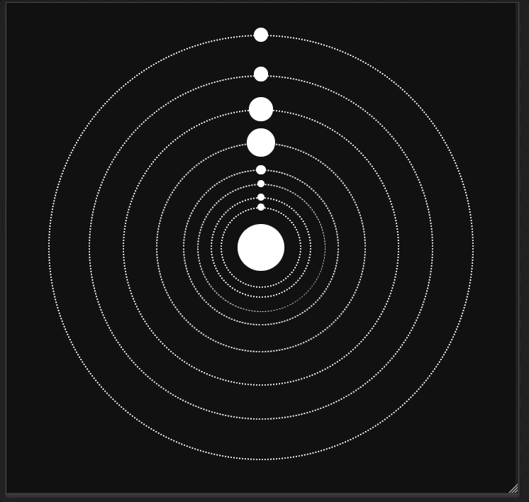
And there it is, a basic responsive solar system with CSS grids. Now, the sizes, spacing, ratios and anything else you can imagine are totally off, but it works!

Finishing touches
Before we continue, I’m going to invert the colors. Anything that was white, I will make #101010 and black will flip to #ffffff. I will also change the orbit border to 2px dotted #ffffff.
Now that everything is aligned correctly, and our grid is worked out, I want to make the size and spacing ratios slightly more true to life.
At this point I spent 15 minutes learning some valuable insights by making some aggressive mistakes
Thinking how the spacing of my grid will change, I notice that the columns and rows must mirror each other, so I know that. Also, the columns and rows will be written out as a palindrome within each property. This means if I use a row spacing of 5px, 8px, and 10px, my next three rows would be 10px, 8px, and 5px. The entire row property would read 5px 8px 10px 10px 8px 5px. Therefore, I have decided to plan out my spacing and simply write out my row property declaration long form.
grid-template-columns: 3fr 2.5fr 2.5fr 2fr 1fr 1fr .75fr 3fr 3fr .75fr 1fr 1fr 2fr 2.5fr 2.5fr 3fr;
   grid-template-rows: 3fr 2.5fr 2.5fr 2fr 1fr 1fr .75fr 3fr 3fr .75fr 1fr 1fr 2fr 2.5fr 2.5fr 3fr;

.planet {
   height: 2vmin;
   width: 2vmin;
   margin-top: -1vmin;
   }
I settled on this spacing. It’s not that pretty written out, but hey. I also cut the default planet size down now that the distance between each planet became a little clogged.
For each planet, I adjust the height, and width to the same number and change the margin-top to subtract half of that number.
With all those changes we have this

So far this is really responsive, but when the screen is over 1000px it starts to look ridiculous. So I am going to cap the main section at 600px by adding
max-width: 600px;
max-height: 600px;
But now my planets continue to expand when the grid doesn’t, so I am going to stop each of them from expanding too. This is a bit more cumbersome, but if open my inspector and adjust my screen to 666px by 666px I can hover over each planet and see a pixel amount to cap them at. Using the min() and max() functions for each planet like so
.neptune {
   grid-row: 1/2;
   grid-column: 1/17;
   height: min(3vmin, 20px);
   width: min(3vmin, 20px);
   margin-top: max(-1.5vmin, -10px);
}
I can ensure they will not expand beyond the cap, and the margin will not push them into outer space even as the grid ceases to expand.
There it is! Hopefully you can learn something about CSS grids, or some other tricks along the way.
If you’re interested to look at the code
https://github.com/JDHofmann/css-grids-solar-system

Top comments (1)
Awesome! Thanks for sharing!