Content:
- Create the shapes
- Create a component
- Create reusable colors
- Choose the base colors
- Choose the main colors
- 60-30-10 rule
Hello! On this day I will continue the series little design system with Figma. Today I will share how to create components and color palette.
1. Create the shapes
Working with UI elements as components gives us many advantages when we have to reuse them in our design.
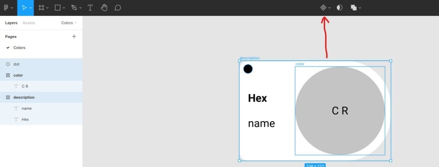
To start we need to create simples shapes.
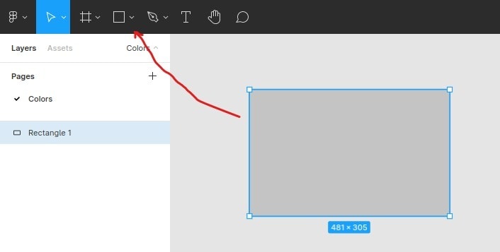
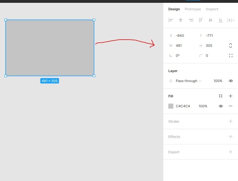
We can edit the shape's properties in the right panel.
In my case, this shapes are color swatches, they include color, contrast ratio, hexadecimal code, name and a dot for distinction.
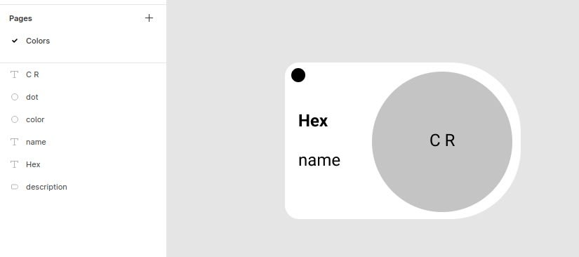
It's a good practice sets auto layout behavior to main parts of our shape.
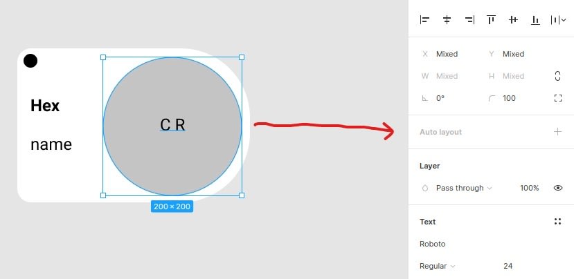
The Auto Layout option allows you to structure components or frames in such a way that they can grow automatically, making a container adapt to the size of its contents, or vice versa.
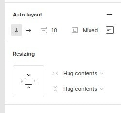
When set it gives us some functionality similar to display:flex in CSS. We can configure direction of the items, space between them, padding and alignment.
2. Create a component
Once we have nested our initial shape, we can create a component.
A component in Figma looks:
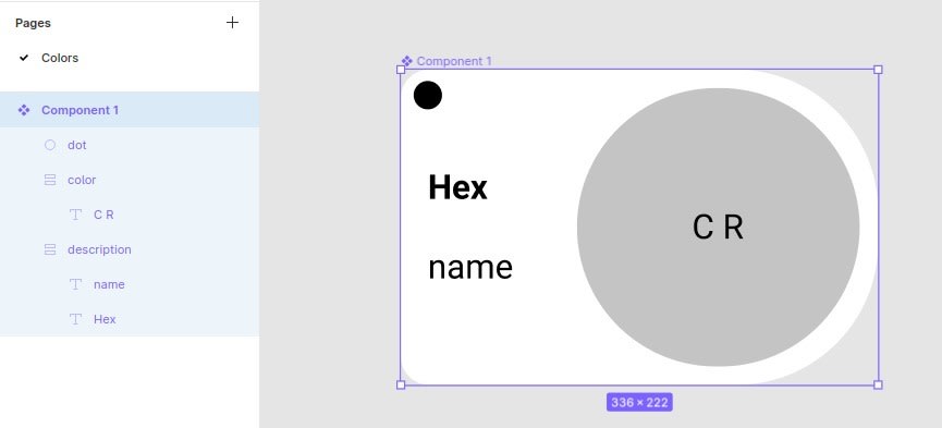
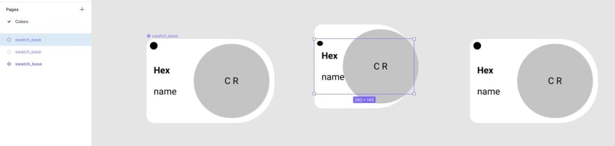
The awesomeness and power of Figma components allow us to create multiple instances of our component and modify them all by modifying the parent they came from (the parent component is marked whit four full-color diamond, while it instance is a only bordered diamond).

Also each instance can be individually modified.
3. Create reusable colors
To reuse colors we need set it as styles in tow steps:
First, we need to select the component part and set it the desired color.
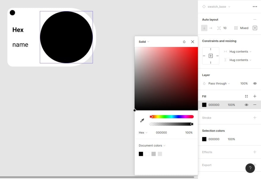
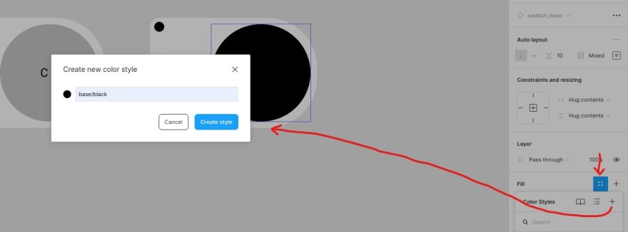
Then, click on four-dots bottom, then on plus symbol and finally set a name to new color style. If you want to have your colors organized, follow the schema group name/item name.
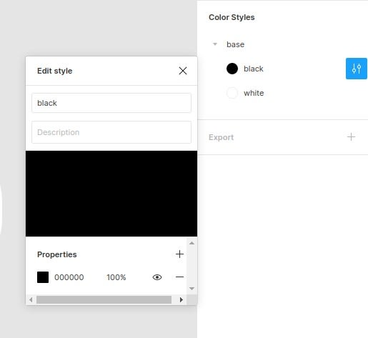
It is possible to edit a color style clicking on the work space to view all styles, then click on the settings icon.
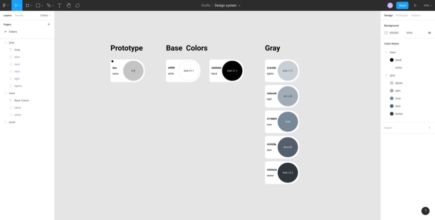
4. Choose the base colors
It's time to customize the instances. As I am making a color palette is a good practice to have into account the contrast ratio for purposes of accessibility and good visualization, I used webaim.org to get it.
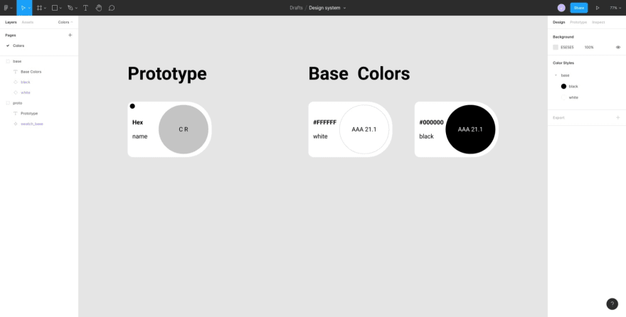
Black and while are base color in my palette.
for the other colors I used maketintsandshades.com, a tint and shape generator. My project is small so I only get five variations: the picked tone, two light and dark levels.

My basic gray scale:
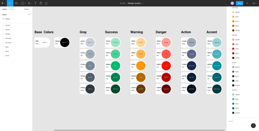
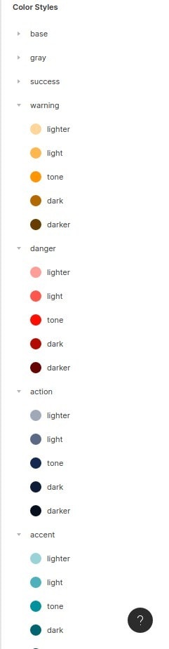
Colors to facilitate interaction between the system and the user:
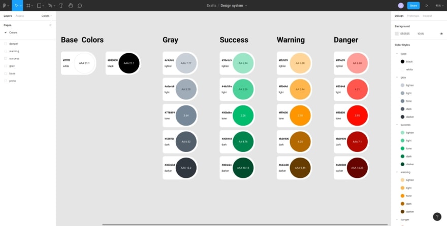
5. Choose the main colors
Searching in colorhunt.com I found these colors that I liked.
These are all the colors for my projects:
6. 60-30-10 rule
This rule is for interior design to calculate the percentage of colors, but it can also be used for user interface design.

In my projects the proportion of colors will be:
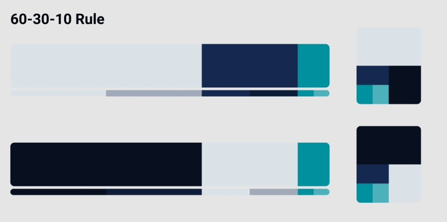
The result of the palette is not important in itself, it's only a visual guide. The most matter is the resulting library of colors.
In future posts I will show how to share and reuse these colors in others Figma projects.
And this way we come to final of this post. The next post will deal with fonts.
Thank you for reading.

Top comments (4)
Yes it is
60:30:10 Rule, I got something to say when I talk with designers. Thank you for sharing the good post!
I'm glad you liked it