Another day, another concept. Today we're flexing on Flexbox.

With Flexbox, "flex containers" and "flex items" are introduced. Think of them like "parent element" and "child element" but they are boxes. The "flex container" the box that is the parent element and its main goal is to organize the boxes that are the "flex items" (child element) and set their position.
Understanding this is key as you will want to ensure that you are adding properties to the elements you want.
So now you have the container and the items and you want to move the items and you will do so mainly with the container. You will want to use the available properties for Flexbox but you should know that a specific property is preset to move in a certain direction, that is the "main axis" and the cross "axis".
Here is a visual that helped me in the beginning and will help in understanding which property to use to move the items in a specific position.

I am organizing the below into properties for the flex container and the flex items. CSS Trick has an excellent breakdown of the value of the different properties.
Flex Container Properties
These only affect the flex items boxes and not the content inside them.
1- Horizontal Alignment
justify-content is used to position the flex items horizontally along the main axis. There are multiple values such as center, flex-start, flex-end, space-around and space-between.
The default value for this property is flex-start.
2- Vertical Alignment
align-items is used to position the flex items vertically along the cross axis. The values are similar to justify-content.
They are: center, flex-start, flex-end, stretch and baseline.
The default value for this property is stretch.
3- Flex-Wrap
Imagine that you have a container that has a set width of 600px. The flex items are set to a width of 200px and there are 5 flex items. What will happen is that the flex items will line up horizontally and thus creating a horizontal scroll bar. Of course, we don't want that and that's where flex-wrap:wrap comes in. It defines what happens to the flex items that are outside the container.
4- Flex-Direction
This defines whether the flex items will be displayed horizontally or vertically. The main two values are flex-direction: row; and flex-direction: column.
The default direction is flex-direction: row;.
Note
When the flex-direction; is row, the main axis is horizontal and the cross axis is vertical.
When the flex-direction; is column, the main axis is vertical and the cross axis horizontal.
Another cool thing you can do with flex-direction; are with the values row-reverse and column-reverse. This is really cool way to change the order of the flex items.
Flex Items Properties
Flex Container only affect the direct child, the flex items, and they don't affect the content the the direct flex items. These properties can be used to manipulate the content inside the flex items.
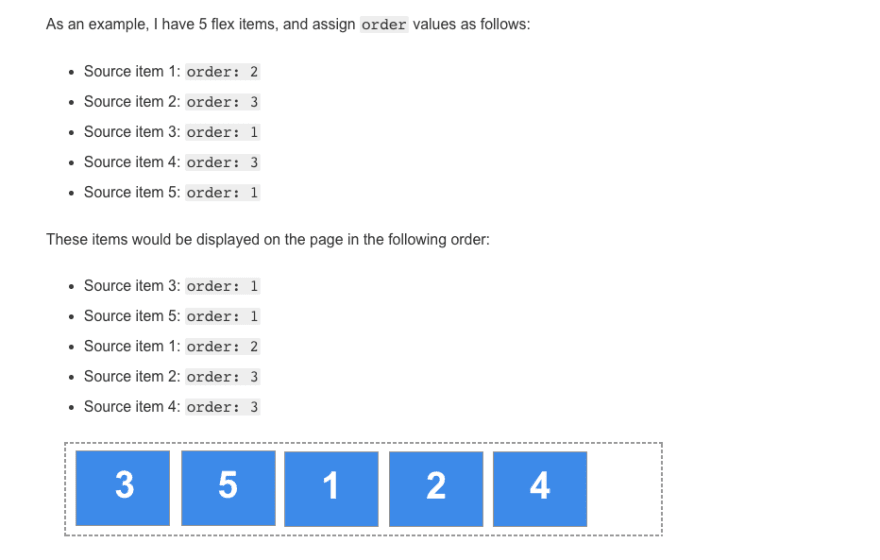
1- Order
The purpose of the order property is to create lay the items out in ordinal groups. They are assigned a number and the items are then laid out in order starting with the ones with the lowest value. If two items have the same order value, they will be place according to the HTML placement.
MDN explained this very well.
Let's look at this example from MDN.
Now, you wouldn't see the above often. The order property could be given to only two flex items.
Let's take the example above and keep the order property to source item 3 and 5 and the rest will be empty. What would happen?
Source item 3 and 5 will be moved to the end of the row. Remember how we said that the ordinal group always starts from the lowest. Well, each flex item has a default value of 0. Therefore, when we added the order: 1; to source item 3 and 5, we gave them a higher value than 0 and they are pushed to the back.
Another value I've seen is the negative value which will put the item to the from of the other items since the value is lower than 0.
2- Align-Self
align-self is used to position the content within the flex items vertically along the cross axis.
It has the same value as align-items.
3-Flex
The flex CSS property sets how a flex item will grow or shrink to fit the space available in its flex container. It is a shorthand for flex-grow, flex-shrink, and flex-basis. The default property settings is flex: 0 1 auto;.
flex-grow: This specifies how much of the extra available space that a flex item should take. The default is 0, meaning if there is extra space the flex item will not stretch.
flex-shrink: When there is not enough room, this specifies how much space should a flex item give up in proportion to the other flex items. The default is 1 meaning that when there is not enough room, the flex items should be spread evenly.
flex-basis: This specifies the initial size of the flex item before CSS makes adjustments with flex-shrink or flex-grow.
The units used by the fflex-basis property are the same as other size properties (px, em, %, etc.). The value auto sizes items based on the content.
Wow, another one down. It is 2am and I didn't think I would be able to do this today but I pushed through.
The streak continues...

Oldest comments (0)