Our first two posts in our recently published Angular 'How To' series were meant to show you how to create a simple chart and give you examples of different chart types and features, all in Angular.
As the third article in this series, we have created an interactive dashboard and will walk through how we created it. To make this happen, we used ZingChart, ZingGrid and ZingChart's new Angular component.
ZingChart and TypeScript
ZingChart is a JavaScript charting library that has been around for 10+ years and has over 35+ chart types and 25+ charting features. To improve our library, we created a TypeScript definition file - giving you easy access to all typings for ZingChart's extensive JSON configuration.
If you use TypeScript, this will allow you to easily verify your various chart configurations. Using this in conjunction with an IDE that supports type-ahead descriptions, such as VS Code, makes setting up new charts a breeze.
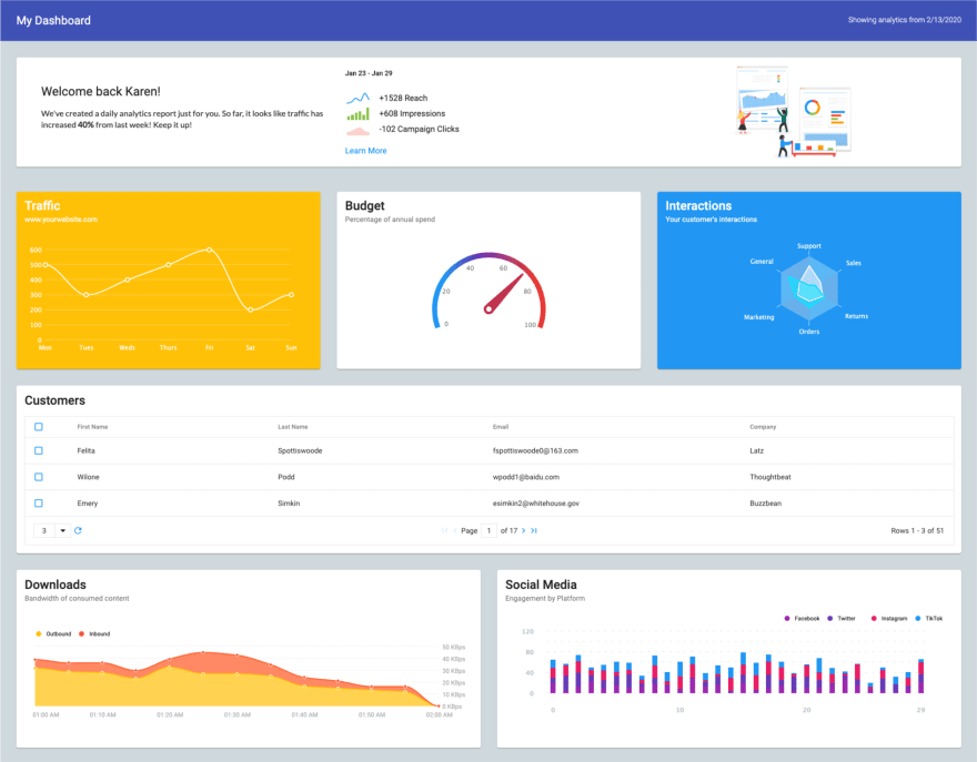
Dashboard originally created by Mike Schultz, Engineer at ZingSoft
Take a minute to check out this dashboard and view the code used to create it.
Overview
This article primarily focuses on how to create the actual charts and grids themselves.
To create this dashboard, we need to look at a few key areas:
- Starting & Creating your Angular Application
- Formatting your JSON config and Styling your Charts
- Creating and Formatting Your Grid
Setting Up Your Angular Application
To start, we will look at how we set up our new Angular application. Much of this is already outlined in our first article, How to Create Charts in Angular.
When setting up a new Angular app, we recommend using the angular-cli.
$ ng new my-app
We have to add ZingChart's library, the ZingChart Angular package as well as the ZingGrid library using NPM.
npm i zingchart-angular zingchart zinggrid
From here, we have to add ZingChart's chart module to our App's module.
import { BrowserModule } from '@angular/platform-browser';
import { NgModule } from '@angular/core';
import { ZingchartAngularModule } from 'zingchart-angular';
import { AppComponent } from './app.component';

@NgModule(
  {
    declarations: [ AppComponent ],
    imports: [ BrowserModule, ZingchartAngularModule, ],
    bootstrap: [AppComponent]
  }
)

export class AppModule { }
Inside of the app.component.ts, we will be defining and customizing our chart. ZingChart's TypeScript definition file will allow us to validate our JSON configuration moving forward. For now, we will setup everything outside of our chart's JSON.
import { Component } from '@angular/core';

@Component(
  {
    selector: 'app-root',
    templateUrl: './app.component.html',
    styleUrls: ['./app.component.css']
  }
)

export class AppComponent {
  name = 'Angular';

  websiteTraffic:zingchart.graphset = {
    //all of our JSON
  };
}
Lastly, we need to add our charts into app.component.html. The example below only shows the div for a single chart. I recommend taking a moment to review the .html and .scss file to see exactly how we setup the HTML of this dashboard using Material design and standard CSS.
<div><zingchart-angular #subscribers [config]="websiteTraffic" [height]="'250px'"></zingchart-angular></div>
Formatting your JSON Config & Styling Your Dashboard
ZingChart renders charts based on data structured as JSON.
Without diving too deep into the capabilities of ZingChart, we will highlight some of ZingChart's basic features and customizations. Pretty quickly, you should see that changing a few properties can drastically change the contents of a chart.
If you take a look at the TypeScript component found here, you will notice we start off by importing our list of customers. This will be used later when we are adding data to our grid component.
import { Component, } from '@angular/core';
import customers from './customers.js';


@Component({
  selector: 'my-app',
  templateUrl: './app.component.html',
  styleUrls: [ './app.component.scss' ],
})
From here, we will be creating our JSON config for each chart. You will see additional code meant to do things like fill in dummy data, grab the current date, etc.
For our first chart, we will define our config as websiteTraffic and call the ZingChart library using zingchart.graphset.
export class AppComponent {
  name = 'Angular';
  today = new Date().toLocaleDateString(); //grabbing the current time
  customers = customerData; //grabbing our customer list for our grid

  websiteTraffic:zingchart.graphset = {
    //all of our JSON
  }
}
The two essential properties required to render a chart are:
-
type- defines what type of chart you are looking to display. -
series- where to format and set data for a chart
Additional important properties include:
-
scaleX- allows for customization of the X-axis. -
scaleY- allows for customization of the Y-axis. -
plot- affects the data on your chart (global change). -
tooltip- allows for customization of the tooltip feature. -
legend- allows for customization of the chart's legend.
Review the full list of ZingChart's JSON config to see what is available to you.
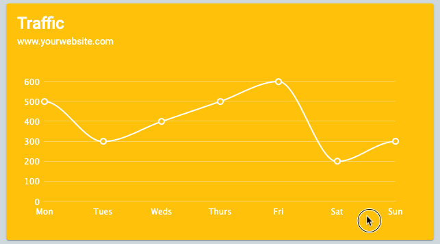
Below is the configuration we created for the initial yellow-background line chart in our demo. Review the comments in the code to see how each property changes the way the chart is displayed.
Notice that you can include most standard CSS classes for any object within a config.
websiteTraffic:zingchart.graphset = {
  type: 'line', //defines what chart type to display
  backgroundColor: "#FFC107", //sets the yellow background color
  tooltip: {
    fontColor: "#333" //sets the font color of the tooltip
  },
  plot: {
    marker: {
      backgroundColor: "#FFC107",
      borderWidth: "2px" //sets the border width for the marker
    },
    aspect: 'spline'
  },
  plotarea: {
    margin: "35 40 40 40", //gives a specific margin to the area of the chart
  },
  scaleX: {
    lineColor: "#ffd363", //changes the color of the X-axis line
    tick: {
      lineColor: "none"
    },
    labels: ['Mon', 'Tues', 'Weds', 'Thurs', 'Fri', 'Sat', 'Sun'], //defines the X-axis labels
    item: {
      fontColor: "white",
      rules: []
    },
    guide: {
      lineColor: "none"
    }
  },
  scaleY: {
    offsetX: -15, //offsets the entire Y-axis to the left
    lineColor: "none", //adds transparency
    tick: {
      lineColor: "none"
    },
    item: {
      fontColor: "white"
    },
    guide: {
      lineColor: "#ffd363"
    }
  },
  series: [{
    values: [500, 300, 400, 500, 600, 200, 300], //defines the values for the chart
    lineColor: "white",
    lineWidth: "2px"
  }]
};
This is the output
When looking at other chart configurations in this demo, you will quickly see that they all follow a similar format with changes to chart type, data, scales and other customizations.
Within this file, lines 66 through 124 create a gauge chart and lines 237 through 298 create a radar chart. The three of these configurations output the three charts shown below.

We won't go over the other charts and how they were created, but if you run into any issues trying to recreate these - visit our JSON config page or reach out to support@zingsoft.com with any questions you may have.
Creating and Formatting Your Grid
You might also notice there is a grid in this dashboard. This is powered by a newer library called ZingGrid.
This free-to-use web-component has made it extremely easy to create data tables and grids.
The entirety of the Grid can be created and displayed by downloading the library (completed earlier) and adding a few lines of HTML to our code. Below shows exactly how we used the ZingGrid component to render a grid to the page.
<zing-grid
  template-start-delimiter="$^"
  template-end-delimiter="^$"
  pager
  page-size="3"
  page-size-options="2,3,6"
  viewport-stop
  [data]='customers'>
  <zg-colgroup>
    <zg-column index="selector" type="selector"></zg-column>
    <zg-column index="first_name" header="First Name" ></zg-column>
    <zg-column index="last_name"></zg-column>
    <zg-column index="email"></zg-column>
    <zg-column index="company"></zg-column>
  </zg-colgroup>
</zing-grid>
By adding various attributes to the <zing-grid> component, we are able to seamlessly add and remove features from our grid.
Each of these attributes are explained below:
-
[data]- important attribute is what tells ZingGrid what to include as data. It can be mannually added or fed from a dataset. -
template-start-delimeter- defines the regex expression for starting data binding. -
template-end-delimeter- defines the regex expression for ending data binding. -
pager- allows for pagination. -
page-size- defines how many entries are shown on a single page. -
page-size-options- defines what options the user has when changing page-size. -
viewport-stop- inclusion of this disables viewport resizing.
Check out ZingGrid's site for a full list of features and attributes.
In this particular case, we defined the customer data in our TypeScript file. By importing the customers.js file into app.component.ts and setting customers = customerData we were able to set [data] = 'customers' in our <zing-grid> component and let ZingGrid do the rest!

Ending Thoughts
ZingChart and ZingGrid have both made it incredibly easy to visualize your data through the use of various charts and grids. I highly recommend downloading the library for free, copying this demo or any of the other 300+ demos these libraries have available.
Good luck!

Top comments (0)