
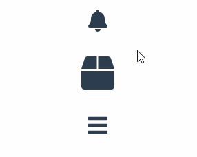
With the library vue-svg-transition you can easily add micro-animations to your vue application.
So how does this library work?
Basically one SVG is scaled down while the other SVG is scaled up simultaneously. Using the right timing this creates a very nice transition between these two.
Installing
npm i vue-svg-transition
import Vue from 'vue';
import SvgTransition from 'vue-svg-transition';

Vue.use(SvgTransition);
Usage
Using vue-svg-loader, we can import SVGs and use them like vue components.
This leads to a very concise syntax.
<template>
    <svg-transition>
        <MyIcon slot="initial" />
        <MyOtherIcon />
    </svg-transition>
</template>

<script>
import MyIcon from "./assets/MyIcon.svg";
import MyOtherIcon from "./assets/MyOtherIcon.svg";

export default {
    components: {
        MyIcon,
        MyOtherIcon
    }
}
</script>
And that's already all the magic. By default the transition triggers on click, but you can also pass hover or none with the trigger prop.
<svg-transition trigger="hover">
<!-- your icons -->
</svg-transition>
You can also trigger the transition programmatically using ref.
<svg-transition ref="transition" trigger="none">
<!-- your icons -->
</svg-transition>

<script>
export default {
    mounted() {
        this.$refs.transition.performTransition();
    }
}
</script>
 kai-oswald
/
vue-svg-transition
kai-oswald
/
vue-svg-transition
Create 2-state, SVG-powered transitions
vue-svg-transition
Create 2-state, SVG-powered animated icons

inspired by Icon Transition Generator

Quick start
npm install --save vue-svg-transition
import Vue from 'vue';
import SvgTransition from 'vue-svg-transition';
Vue.use(SvgTransition);
Template Example
It is recommended to use vue-svg-loader so we can import our SVGs from external files
But it's possible to use inline SVG as well.
<template>
<svg-transition :size="size">
<MyIcon slot="initial" />
<MyOtherIcon />
</svg-transition>
</template>
<script>
import MyIcon from "./assets/MyIcon.svg";
import MyOtherIcon from "./assets/MyOtherIcon.svg";
export default {
components: {
MyIcon,
MyOtherIcon
}
data() {
return {
size: {
width: 48,
height: 48
}
}
}
}
</script>Trigger programmatically via ref
<svg-transition ref="transition"…
Top comments (0)