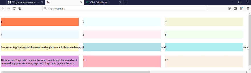
I tried implementing Rich Haines's CSS grid responsive cards to see what it does, since I'm open to ideas for my navbar experiments, but I'm not sure where to go from there.


<html>
<head><title>Test</title></head>
<body>
<div style="margin: 2em auto; display: grid; grid-auto-rows: auto; grid-template-columns: repeat(auto-fill, minmax(auto, 450px)); gap: 1.5em; justifyContent: space-evenly; width: 100%;">
  <div style="background-color: coral;"><p>1</p></div>
  <div style="background-color: azure;"><p>2</p></div>
  <div style="background-color: beige;"><p>3</p></div>
  <div style="background-color: aliceblue;"><p>4</p></div>
  <div style="background-color: lavenderblush;"><p>5</p></div>
  <div style="background-color: honeydew;"><p>6</p></div>
  <div style="background-color: lemonchiffon;"><p>7supercalifragilisticexpialidociouseventhoughthesoundofitissomethingquiteatrocious7supercalifragilisticexpialidociouseventhoughthesoundofitissomethingquiteatrocious7supercalifragilisticexpialidociouseventhoughthesoundofitissomethingquiteatrocious7supercalifragilisticexpialidociouseventhoughthesoundofitissomethingquiteatrocious</p></div>
  <div style="background-color: powderblue;"><p>8</p></div>
  <div style="background-color: paleturquoise;"><p>9</p></div>
  <div style="background-color: plum;"><p>10 super cali fragi listic expi ali docious, even though the sound of it is something quite atrocious, super cali fragi listic expi ali docious</p></div>
  <div style="background-color: lightpink;"><p>11</p></div>
  <div style="background-color: linen;"><p>12</p></div>
</div>
</body>
</html>
When I comment out item #7 and shrink the screen as much as I can, it won't shrink beyond 450px wide. Not sure I really want that.
Also, not sure I really want to not fill things that only take up a single row to 450px wide when we're in that awkward window width between 451 and wide enough to fit 2 on the screen. Then again, I suppose that's kind of what makes a "card" element a "card"? But arguably it's also the way its border pops out from the background that makes it a "card," even if it does shrink & grow, not just a maximum-width. (Also, centering everything could help a lot w/ caring about the "wasted" whitespace.)
Furthermore, there's a little bit of space to the right of it in #10 that shrinks away to 0 when I go all the way down to my minimum window width (also, it wraps to join is, leaving of as the final word of the first line). Not really understanding yet why.

Finally ... still not wrapping my mind around whether this would actually be at all useful for the way I want things to behave in my navbar. I was hoping I could cheat at grokking what CSS Grid could do for me w/o really studying it by implementing this example, but alas, I don't think it was that easy.


Top comments (0)