Why are fonts so important?
When you visit a new website the first thing you do is read the content before clicking on anything. If the text is hard to read, with complicated font style (handwritten / romantic), not enough space between lines plus the font size is too small, then you don't even bother browsing that site. I mean why would you if you can barely read the content.
First of all, the font style.
Some people recommend using max 2-3 font styles and other recommend up to 4.
When it comes down to it, it all depends on what kind of website you are designing and how large is it.
If it is a very large website you might get away with using 4 font style but if the site is rather small then less is more.
The idea behind using 4 font style is this,
* one for the headline,
* one for the subtitle,
* one for the body
* and at last one for quotes.
Using the same font for the whole website is perfectly fine and often even better. The website will look more professional, trustworthy and consistent.
If there are too many font style used it might end up looking unprofessional, messy and confuse the reader. If you need some ideas on what fonts to pair together this website could be great help.
If you end up choosing one font style, it doesn't mean the website will look flat as some fonts have large font families. If you choose one of the font with large families you have all kinds of font weight in regular, italic, bold etc to choose from.
When designing a large website, it is often recommended using fonts with large font family to be consistent, specially in the long run, here you can see fonts that have large font families (variable fonts).
When choosing the right font style for the website you are designing, keep in mind who the site is for, who are the customers and what is the company‘s brand about.
You might find a cool handwritten font and it could be tempting to use it but be careful. Be sure the font you choose is readable, most people find it hard and even annoying to read text with different kinds of writing style then they are used to and don't bother reading it.
The picture here below shows a good example of what different font style are appropriate for different companies.
Have in mind, what is the purpose of the website, what do you want the customer to feel like when they land on the page?

picture from The Daily Egg
When it comes to the font size
keep in mind there are all kinds of people that visits the website and some of them have bad vision.
It is very important to choose the right font size both for mobile and desktop, here below you can see the recommended font size for h1 and body for different kind of devices.

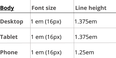
(charts made by me)
As well you need to think about the line height, so the text is not all cramped together. If the line height is right the text is easier to read and it is better skimming it. Many people today don't bother or don't have time to read the text word by word and instead skims quickly through it to find the information they are looking for.

Top comments (0)