
As a web developer, testing your UI on various screen sizes and resolutions is crucial. With Google Chrome Developer Tools, you can easily emulate different devices without owning them physically. In this post, we will list the mandatory screen resolutions required for UI testing using Chrome Developer Tools.
So, buckle up and let's dive in! Here are some of the popular resolutions you should add in your test suite
Desktop Resolutions:
1920x1080 - The classic resolution for most desktops. If your website looks good on this, you're halfway there!
2560x1440 - For those with high-end monitors or who need to see the bigger picture :P
3840x2160 - For the ones who like to see things in 4K, but also need a microscope to read the text. lol.
1280x720 - For the users with potato PCs, because someone's gotta test the low-end, right?
Mobile Resolutions:
1080x2400 - The resolution of the latest Android flagship devices
1080x2340 - The resolution of the budget-friendly Android devices that flood the market.
2556×1179 - Resolution of iPhone 14 daddy, the iPhone 14 Pro
720x1600 - The resolution of low-end Android devices that are mostly used for playing Snake.
Tablet Resolutions:
2048x2732 - The resolution of the iPad Pro, for those who like to carry their desktop on the go.
1280x800 - The resolution of most budget Android tablets that come with the promise of "unbeatable performance".
2224x1668 - The resolution of the iPad Air, for those who need a slightly bigger canvas to work on.
Bonus Resolution:
- 300x600 - For when you want to test your website on a banner ad, because let's face it, we've all been there.
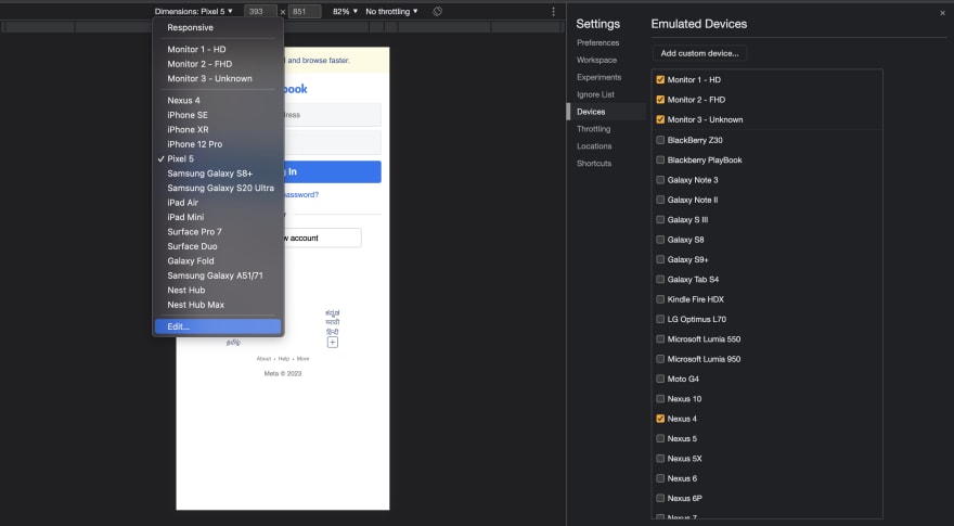
Steps to add these resolutions in the Google Chrome Developer Tools - Emulated Devices
Open Google Chrome and navigate to the website you want to test. (Probably your localhost)
Click on the three dots at the top right corner of the browser to open the menu.
Click on "More Tools" and then "Developer Tools" or use the keyboard shortcut "Ctrl + Shift + I" (Windows) or "Cmd + Option + I" (Mac).
In the Developer Tools window, click on the device icon at the top left corner of the window (it looks like a mobile device and a tablet).
Select the device you want to emulate from the dropdown list or click on "Add Custom Device" if your desired device is not listed.
Enter the mandatory screen resolution in the appropriate fields. Make sure to enter the correct pixel density and aspect ratio values.
Click on "Add" to add the new custom device to the list.
Once the device is added, you can select it from the dropdown list and test your website on the added mandatory resolution.
In conclusion, testing your UI on various screen sizes and resolutions is critical, With these mandatory resolutions, you'll be well-equipped to ensure that your website looks good on any device.

Top comments (0)