Want to stay up-to-date? Check out React Native Now, the bi-weekly React Native newsletter
In late 2017, we began the ambitious task of rewriting one or our mobile apps from the ground up from Ionic 1/AngularJS to React Native. Six weeks later, we shipped it to the app stores. A few months after that, we started that process again and after another busy six weeks, shipped our other app out the door.
Reflecting back over the past year and some, here are some of the main takeaways we've learned:
Plan out your navigation in advance
If your app has fairly straightforward navigation - you may not need to worry about this, but our apps have many flows that allow our customers and providers to self-service through any issues that may arrive, along with plenty of ways to access those flows. This has resulted in a web of nested stacks within nested stacks within our parent tabs that all need to be aware of one another so we can navigate appropriately and ensure we've reset stacks we're exiting. For the most part, we're happy with how these have turned out - but had we given more time in the planning stages to map out our user flows and screens, we certainly could have reduced the number of navigation helpers we had to write.
When we started on our first app, react-navigation was still pre-v1 and the jury was still out on whether it would take the crown as best of breed solution compared to the native offerings. Overall, we've had a positive experience with it - and it has only improved since then.
The community is still young
Prior to our move into React Native, we started creating any new web apps in Vue and have been very happy with the experience thus far. So, when we got stuck during our rewrites, we were fairly familiar with the sense of finding or creating solutions to our own problems - as a Google search on either platform doesn't present the wealth of results as some other technologies may. With that in mind, we've had some fun open sourcing some of the work we've done and will continue to do so.
One of the projects in our backlog is to create our own text input mask - as we haven't had a ton of luck with the current offerings. One suffers from a lack of updates and is often broken by React Native major releases, while the other lacks in our needs for flexibility. We've had good success using Cleave.js on the web, and are planning to model our own library after it as best we can - unless something better comes along before we get to it.
Stay one version behind on upgrades
We typically try to time our upgrades to be on the final minor release of the previous major release (i.e. upgrading to 0.57.8 once 0.58.0 was released). This has allowed us to benefit from a ton of bugfixes and improvements, without being first to the gate in dealing with unexpected breaking changes.
Our typical upgrade workflow has been very successful and it looks like this:
- Ensure our sandbox branch is up-to-date with master
- On sandbox, update React Native, core files, and any related dependencies using a guide to follow along with any changes
- Take this opportunity to update all other dependencies
- Do a quick run through on iOS and Android to see if anything looks wonky (super easy to do thanks to our deployment process via App Center which pushes our builds to BrowserStack)
- Merge sandbox into our master branch and run through our regression checklist
- Once everything checks out, release the upgrade with no other changes to the app stores (100% on Google Play and phased on the App Store)
- Monitor the release with Sentry
Try to use native elements, but don't mandate it
When we first rewrote our apps, we tried to use as many platform-specific native elements as we could. Our opinion was that users were comfortable with their platforms already, so the more native UI components we could present to them - the easier it would be for them to interact with our app. Also, and not to undersell this point, it certainly sped up our development time when we didn't have to think about deviating from that experience.
While we would still agree to those points on some level, we've now learned that there are plenty of valid reasons to deviate from that plan. This is especially true when you can replace native UI components with better ones.
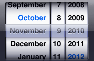
Take iOS's UIDatePicker for instance.
It has been an objectively horrible user experience in iOS for over ten years now, with no sign of changing soon. When we first launched our app, when a user needed to enter a date, we had a modal pop up with DatePickerIOS inside of it. If they scrolled to a date that wasn't permitted, they wouldn't know until the modal closed and they saw a validation message underneath the input. This was a poor experience.
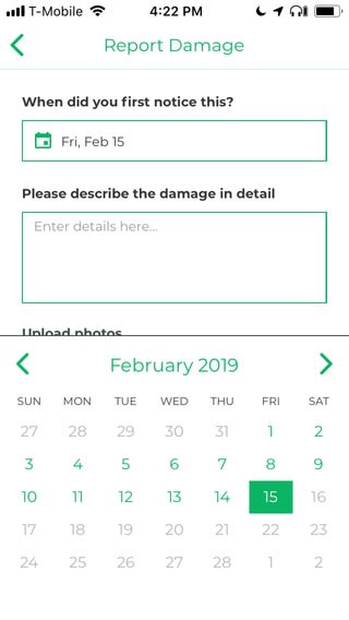
On Android though, the default calendar looks like an actual calendar. We eventually realized that all users should have this experience, so we rolled our own date picker with the help of react-native-calendars and the results have been fantastic.
As a result, we're now much more flexible when designing UI elements as the benefits of designing for better brand consistency and user experience have far outweighed unwritten rules where all iOS apps must all look like iOS apps and vice-versa.
It makes hiring fantastic
We were recently able to double the size of our team with some extremely talented junior engineers thanks in part to our commitment to React Native. While there have been some bumps on the road, we've pushed the platform further than we'd originally expected to when we first rewrote these apps - including the use of animations, hardware sensors, and native modules - and still haven't hit a challenge that couldn't be solved without native mobile developers. This has enabled us to focus our hiring efforts on front end developers who we can ramp up quickly on the quirks between React and its mobile counterpart - but are also able to help us build out our web offerings.
It's been a great ride so far and we're excited to see what 2019 brings for the React Native community!


Top comments (0)