Background
So I have been learning design by action from 5-6 weeks(or weekends) now for my Resume Builder application and I made 3 posts for my journey here. I was finding it really difficult to proceed with the design of that website so I thought of trying something easier. Hence, I designed a simple Chat Application will be good as a starting point as it has less number of screens and interactions as a part of my MVP design.
Welcome Chatrr
Chatrr is the name I thought during the rise of Web 2.0 8-9 years back ( you can guess that just by looking at the name) but at the time, I didn't have time, skills and dedication to get started with it. Welcome 2019, I got into web development after years of making excuses and I was sure that this is one of the open-source product, I need to ship. It works or not is not really my priority as of now.
Motivation
There are 100s of chat applications out there but very less of them are anonymous. I had always loved the feel of Yahoo Rooms that used to exist 10 years back but now there is nothing like that. Moreover, Chat Application will help me develop following skills from scratch :
- Mobile Design Languages
- Design tools such as Figma
- Web Sockets
- React Native/Flutter/Kotlin (Not sure yet)
- GraphQL
First Phase
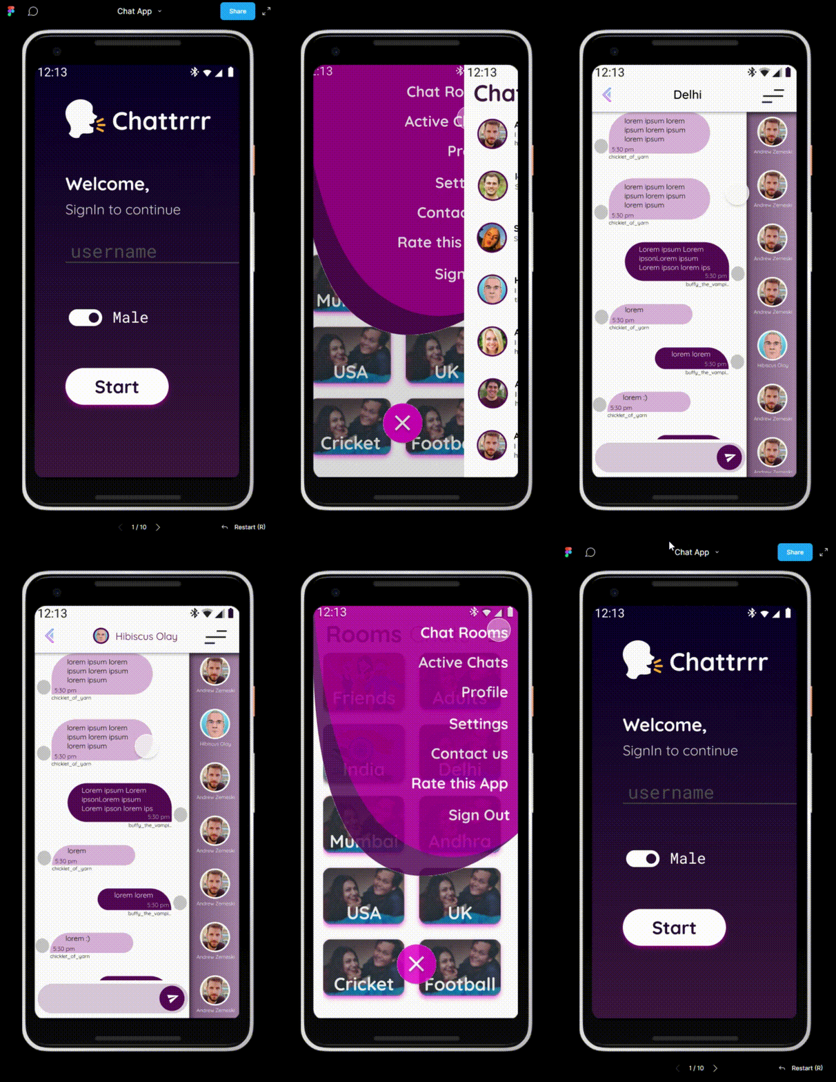
So I plunged into it 3 weeks back and have been spending weekends on doing the prototyping in Figma. I think I am happy with first draft and can start doing the development. UI is not my forte and hence I am feeling a little accomplished because I am liking colors, fonts, choice of buttons and overall look and feel of the app.
But who doesn't love their own solution. Hence, I would appreciate the community's opinion. If you are an expert, please be brutal in judging what looks good, bad and ugly and Why. If you are not, please do not hide your opinion.
With this, I will not take much of your time and state assumptions and functionality of app in few lines before we get to mock-up video so that you have some context.
Functionality
-
So this is an anonymous chat application and hence login screen doesn't have anything apart from :
- username
- gender
- submit button (May be captcha in actual app)
-
Rooms
- Chat-rooms are pre-created and cannot be created by user.
- These are like groups which will have members who have joined that particular chat room.
- People cannot exit all rooms, they can only switch rooms. Hence, if during the login if a person has joined a Room, they will remain joined in the background and User should be able to access the member list from anywhere. User can either switch rooms of Log out.
-
User Profile
- Very minimalist as already stated and you can only modify your gender as a part of MVP.
Settings page is still remaining as I am still thinking about it but it will mostly have notification stuff and gender hiding. Nothing more.
Font is Quicksand in multiple sizes
Logo and Name is temporary and are merely placeholders.
Note : Figma has only screen transition but not component animation and transition so there are elements where current animation is not there or it sucks. For example, The main menu will be an expanding circle like shown below (not mine). but in prototype it just slides or dissolves:

Note : above awesome animation is by Fausto Renier. Do checkout this website's home page. It have really interesting elements.
And here is mine :
You can find all the material on my github Repo here


Top comments (0)