It's a happy day today as I think I have made some good progress in this 3rd weekend of designing as a noob. If you are interested in background, links are given below :
Reflection
As concluded in the part 2, I said I was not very happy with the design but it is OK for now to move forward with. And as I started my work today and looked at it... Yukkk! I couldn't even look at it. I needed to do something about it and guess what, I already had an idea what I am gonna do.
More Inspiration
This past week I was listening to Basics of UI Design for Engineers with Erik Kennedy on Programming Throwdown and it gave me a lot of insight on different design elements and Erik was congnizant of how a non-designer would approach any design. Go give it a listen if you interested to learn design and you will come back enlightened in one way or the other.
One of the things Erik emphasised on was the important of CopyWork and how it can help any newbie in developing gut feeling for the design they work on. "Should I just copy that website?", this thought has already crossed my mind multiple times. So I thought, I should go ahead and try to find a website that may be similar to what I am trying to do and I will first copy that and then customize(ruin) it according to my needs and liking.
So I started browsing land-book & dribbble for more inspiration with below things in my mind. :
It should have some kind of caraousal or photo showcase where I can show-case CV templates. Like did it previous design on the left side, see below for reference
It should have place where I can write captions as you see on the right.
A basic Nav bar.
Essentially, I didn't want elements on the page to change. So after couple of hours of change, I reached what you can see on the left side.
 |
 |
|---|
Learnings & Action
We can see the design I found has very similar layout but was much more professional and better in every way. My initial wish was to have Material theme and Flat icons but this looks really good to eye and I love white and black whitespace which this design has in plenty.
So we start with the result. After much of tinkering, this is what I got.

I didn't copied it exactly but I ripped off main text layout, shadow and color decision where was I struggling a lot and applied it to my elements.
Things I am happy about
Color - White is looking much better than the violet/mauve(I'm not sure) I chose earlier, the gradient didn't seem very smooth.
-
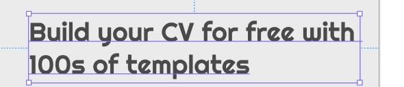
Text Layout - This is my favourite part of the page today. I am loving how it looks and color of button is very bold.
- I added my flavour of pagination as well which was represented by arrows in last design. Not sure if you noticed but this text box will be sliding carousal for 3 difference Call To Actions(CTAs).
- Typography is also something I chose independently with one font remaining as it is in the previous design. Although, I think I can do better. Below are the fonts I'm using :
Buttons - Color of buttons is not much better and I need to solve this mystery of what makes a color better than the other. I am unable to answer why this color is better.
Can anybody please explain What makes #8144E6 better than #AA86E6 which is just few shaded lighter. See example below:

Things that are missing/need improvements.
- Alignments : Alignment is off at many places and I am still figuring out how to correct or control that. See below examples.
Check the alignment on left and right.
Carefully look at the gridlines and alignment above login word is much more than it is below. Not terrible. Not Great. ;).

You see this red line. This is the whitespace, I don't like. I am not sure what to do with it as I don't have any more content. Any suggestions are welcome.
Extra-extra whitespace - See the red block on the bottom, It is empty space and it is too much, I would like to fill it. But I am not sure with what. Suggestions?
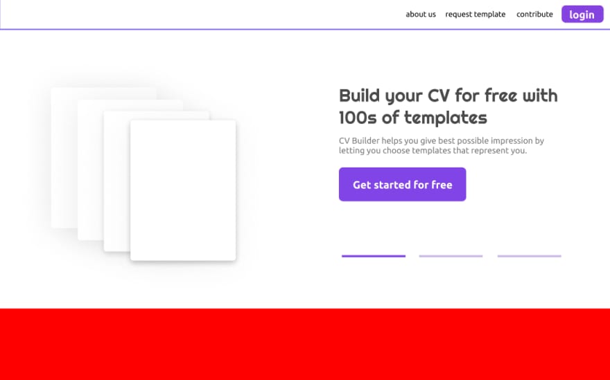
Background - If you look closely, the original design has some kind of white background, it is giving it some texture on the right hand side. I tried some gradient but those were hedious, I will try some more and will report next week.
Ciao.

Top comments (1)
I like how you tackle this.
First of all design is not really that hard. It boils down to learning a couple of principles and then start with copying others people work. Once you have enough experience and references, you can start creating "your own" design, but it's not really your own, you just rehash things you already done so far. In time you will be able to come up with better rehashes.
There's so much material to inspire from, it would be a waste not to borrow things you find cool. You can also change it a bit to make it your own.