
Written by Habdul Hazeez ✏️
This article explains in detail what CSS animation is all about using the CSS clip-path() property. By the end of it, you will have a thorough understanding of CSS animation and how to manipulate any clip-path() code you might come across.
What is CSS animation?
CSS animation allows you to animate the value of CSS properties over a specific period of time using keyframes. Keyframes are among the many building blocks of understanding CSS animations.
Two main building blocks allow CSS animations to take effect. They are:
-
@keyframes -
animationproperties
Using @keyframes in CSS
@keyframes is an at-rule in CSS. It is used to define the stages and styles of the animation. It comprises the name of the animation, the keyframe block, and the stages of the animation.
1. Name of the animation
You specify the name of the animation after @keyframes. It's also called the keyframes name.
Let's create an animation that allows text to pop in called popIn.
@keyframes popIn {}
2. The keyframe block
This encapsulates the entire code of the animation.
@keyframes popIn {
    /* This is the keyframes block */
3. Stages of the animation
The stages of animation — also called the keyframe selector — contain the CSS code that dictates the behavior of the animation. This CSS code is situated in a pair of from or to blocks, comma-separated percentage values, or a combination of both.
@keyframes popIn {
   0% {
       transform: scale(0.1);
       opacity: 0;
  }

   60% {
       transform: scale(1.2);
       opacity: 1;
  }

   100% {
       transform: scale(1);
  }
}
You can also combine the from or to block with the comma-separated percentage values, meaning you can write the previous code block as such:
@keyframes popIn {
   from {
       transform: scale(0.1);
       opacity: 0;
  }

   60% {
       transform: scale(1.2);
       opacity: 1;
  }

   to {
       transform: scale(1);
  }
}<
Why? That is because from is equivalent to 0% and to is equivalent to 100%.
Mind you, if you write 60% in the previous code block as 60, the browser will ignore the animation at that stage, which can lead to hard-to-trace bugs.
Now that you've created the keyframes, you'll use animation properties to add the keyframes to the element(s) you wish to animate.
Animation properties in CSS
These properties assign the @keyframes to the elements you wish to animate, and they also define how the element is animated. They are necessary for the animation to function.
Although there are nine properties, the following two are necessary for the animation to occur:
-
animation-name: this is the animation name defined in the keyframes -
animation-duration: this tells the animation how long it will occur for and is specified in seconds or milliseconds.
At this juncture, you have almost everything you'll need to create an animation. Read on.
Animation example: popIn
Now we have to determine the element to animate, which, of course, is an HTML element. You can grab this HTML element via your suitable selector from CSS, but here I'll use a class selector.
Before proceeding, create the following:
- A project folder
- Boilerplate HTML file
- CSS file
- Link the HTML file with the CSS file
- Copy and paste the
popInanimation to your CSS file
In your HTML file, type the next code block between the opening and closing body tags.
<div>
   <p class="hello-world">Hello World!!!</p>
</div>
In addition to the @keyframes you have in the CSS file, type the following:
.hello-world {
   animation-name: popIn;
   animation-duration: 3s;
}
That's it. Save your files and test them out in your browser. The phrase "Hello world!!!" should pop in.
In addition, you can write the previous code block like this:
.hello-world {
   animation: popIn 3s;
}
This is possible because the animation property is shorthand for all other animation properties listed in the next section (excluding the animation property itself).
Additional CSS animation properties
Listed below are the remaining animation properties.
-
animation -
animation-delay -
animation-direction -
animation-fill-mode -
animation-iteration-count -
animation-play-state -
animation-timing-function
The functions of these properties are explicit from their name, but I think they are best explained when you see them in action. Later, we'll use the clip-path() property to create some cool effects.
Before that, though, you need to know about the clip-path() property.
What is CSS clip-path()?
CSS clip-path() is a property that allows you to create a clipping region from an element. The region within this clipped part is shown, while the rest are hidden.
At first, clip-path() might be daunting to understand, but once you understand the geometry behind it, it becomes easy to use.
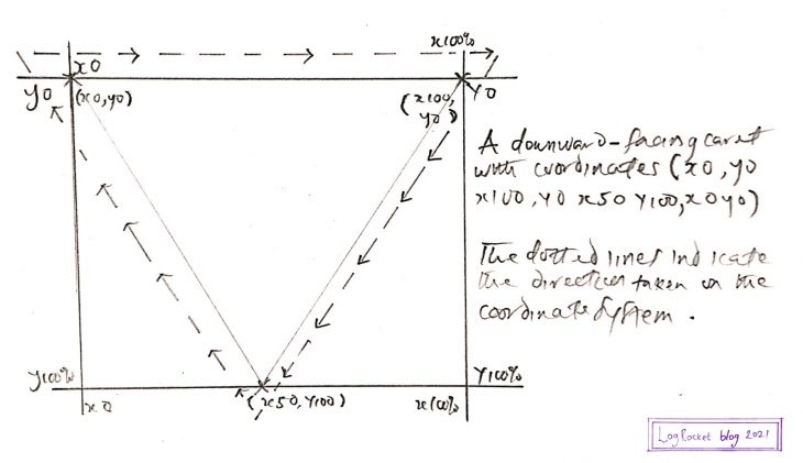
The CSS clip-path() coordinate system
In CSS, clip-path() allows you to create clipping regions of shapes when you specify their shape and position on a coordinate system.
The coordinate system uses coordinates to determine the position of the points in a given space. Here's an example.

From the image above, the starting point of the coordinate is x0, y0. When you move clockwise, the final position would still be x0, y0.
Armed with this knowledge, you can use CSS clip-path() to create and position shapes on this coordinate system. This is possible thanks to its array of accepted values.
CSS clip-path() accepted values
CSS clip-path() accepted values are functions that accept parameters. These parameters dictate the appearance and position of the clipped region.
The functions are listed below:
-
inset() -
circle() -
ellipse() -
path() -
polygon()
inset()
The inset() function allows you to clip an element from all four sides of the coordinate system. The result is a visible rectangle.
The way you assign values to inset() is similar to the way you assign values to the margin or padding property.
This means:
- A single value applies to all four sides
- Two values apply to the top and bottom, right and left
- Three values apply to the top, right and left, bottom (in that order)
- All four values apply to individual sides
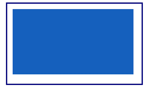
As an example, the image below shows a blue box occupying its entire parent width.

The next code block clips the box from all four sides of its parent.
.selector {
   clip-path: inset(20px 30px 35px 20px);
}
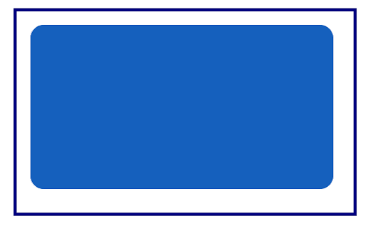
Now, you have this:
Meanwhile, inset() comes with additional powers! You can specify the border-radius as one of its parameters. You'll have to use the round keyword followed by the border-radius value, as depicted in the next code block.
.selector {
   clip-path: inset(20px 30px 35px 20px round 20px);
}
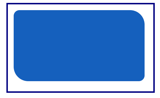
You can also limit the rounded corners to two sides by specifying two values after the round keyword.
When you do this, the first value is assigned to the top left corner and bottom right corner, while the second value is assigned to the top right corner and the bottom left corner.
.selector {
   clip-path: inset(20px 30px 35px 20px round 20px 50px);
}
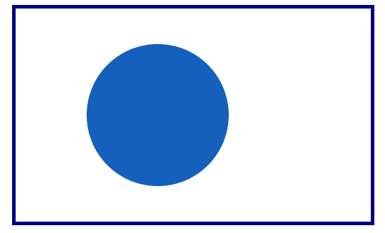
circle()
Its name says it all. It allows you to draw a circle on the coordinate system using the circle radius and its position.
.selector {
   clip-path: circle(100px at 40%)
}
From the previous code block, the circle radius is 100px and its position is 40% on the x- and y-axis.
ellipse()
This allows you to create an oval-shaped clipping. Its parameter is the width, the height (followed by the at keyword), then the clipping position.
The position can be specified by keyword values such as center or percentage. In the next code block, 50% 50% is equivalent to the center keyword.
.selector {
   clip-path: ellipse(80px 60px at 50% 50%);
}
path()
If using Scalable Vector Graphics (SVG) is your thing, you'll need the path() function, which allows you to use an SVG path to create a clipping region.
The browser support is inconsistent, as shown in the Can I use... image below.

To get around this, you can declare an inline SVG in your HTML file. In your CSS, you'll use the url() function as the value of clip-path().
<div class="myClip">
   <svg>
       <clipPath id="clipPath">
           <path d="M10,10 q60,60 100,0 q50,50 50,50 l40,0 l-40,40 l-100,-20"/>
       </clipPath>
   </svg>
</div>
Then, in your CSS:
.myClip {
   background-color: #1560bd;
   clip-path: url("#clipPath");
}
The next image is the result in a modern browser.

polygon()
With the polygon() value, you can create complex shapes. Here is what we'll do: I will walk you through the process of plotting some shapes on the coordinate system. Afterward, you'll pass these coordinates as parameters to the polygon() function in your CSS file.
Here are the shapes we'll cover:
- Parallelogram
- Downward-facing caret
- Pentagon
- Diamond
Parallelogram
If you would like to create a parallelogram, you'll use the following approximate points in a clockwise manner on the coordinate system:
-
x20, y0 -
x80, y0 -
x70, y100 -
x10, y100 -
x20, y0

I drew this to show you how to locate the points on the coordinate system.
You can customize it when you put the coordinates in the polygon() function with one tiny but crucial modification: the percentage sign (%).
.selector {
   background-color: #1560bd;
   clip-path: polygon(20% 0%, 80% 0%, 70% 100%, 10% 100%);
}
Below is the result when viewed in a modern web browser.

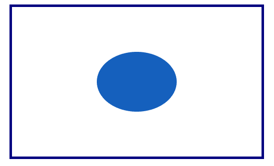
Downward-facing caret
Plotting the downward-facing caret is less complicated than a parallelogram. Here are the coordinates:
-
x0, y0 -
x100, y0 -
x50, y100 -
x0, y0
In CSS:
.selector {
   background-color: #1560bd;
   clip-path: polygon(0% 0%, 100% 0%, 50% 100%);
}
The result in a modern browser is shown below.

Pentagon

This time, I did not include the coordinates. I'll leave that to you 😇, or, you can check the previous image or the next CSS code block.
The CSS:
.selector {
   background-color: #1560bd;
   clip-path: polygon(50% 0%, 100% 45%, 80% 100%, 20% 100%, 0% 45%);
}
In your browser, it should look similar to the image below.

Diamond
Hopefully, this is easy for you to do now. Here's what it looks like.
 And here's the CSS.
.selector {
   background-color: #1560bd;
   clip-path: polygon(50% 0%, 100% 50%, 50% 100%, 0% 50%);
}
As seen in a modern browser:

Now, you might ask yourself: what more can I do?
Well, with the polygon() function, you are only limited by your imagination 😊.
Now, It's time to create some cool effects by combining animations and CSS clip-path().
CSS animations and CSS clip-path()
When you animate an element, you use clip-path() to create a clipping region during the stages of the animation, creating the illusion that the element is indeed changing its shape.
You can clip the element both before and when you animate it.
Let's look at some examples. Throughout this process, you'll write plenty of CSS code, but I'll explain the code for the animation and clip-path() property exclusively. The rest are considered cosmetics.
Listed below are the animations you'll create using clip-path().
- Infinite circles
- Dancing squares
- Flipping shapes
- Multi-shapes image animation
Creating infinite circles in CSS
This infinite circle is achieved by passing different values to circle() at different stages of the animation. When you add it to the element you wish to animate, you ensure the animation is running at all times.
How is that possible? Because you leverage one of the animation properties, namely animation-iteration-count, and specify its value as infinite.
Before that, use the following HTML:
<main>
   <div class="circles"></div>
</main>
The CSS code is listed in the next code block.
main {
display: grid;
place-items: center;
padding: 2em;
}
.circles {
background: #1a1a1a;
clip-path: circle(80px at 50% 50%);
height: 200px;
width: 200px;
border-radius: 50%;
animation-name: infiniteCircle;
animation-duration: 3s;
animation-timing-function: ease-in;
animation-iteration-count: infinite;
}
@keyframes infiniteCircle {
from {
background: #f00;
clip-path: circle(50%);
}
50% {
background: #ffd700;
clip-path: circle(35%);
}
to {
background: #f0f;
clip-path: circle(75%);
}
}
The output in a modern browser is depicted in the GIF below.

Dancing squares
The name once again says it all: squares that literally dance. First, plot the initial square on the coordinate system with polygon(), then plot varieties of shapes closely related to the square at different stages of the animation.
Finally, make the animation run infinitely. For the HTML, you can use the one from the previous section with a slight modification: change the class name of the div inside main to squares.
The CSS code is below:
main {
display: grid;
place-items: center;
padding: 2em;
}
.squares {
width: 250px;
height: 250px;
background-image: linear-gradient(to right, #000000, #e74c3c);
clip-path: polygon(20% 0%, 80% 0%, 100% 100%, 0% 100%);
animation-name: dancingSquares;
animation-duration: 4s;
animation-direction: alternate-reverse;
animation-iteration-count: infinite;
}
@keyframes dancingSquares {
25% {
background-image: linear-gradient(to right, #f0c27b, #4b1248);
clip-path: polygon(20% 0%, 100% 40%, 70% 100%, 10% 100%);
}
50% {
background-image: linear-gradient(to right, #c21500, #ffc500);
clip-path: polygon(0% 45%, 100% 20%, 50% 75%, 0% 100%);
}
75% {
background-image: linear-gradient(to right, #00d2ff, #3a7bd5);
clip-path: polygon(100% 38%, 100% 38%, 66% 100%, 0% 53%);
}
}
Here's the output as a GIF.

Flipping shapes
The idea behind this animation is to create a shape with clip-path() around an element, and afterward, flip it into another shape during the animation stages.
For this example, the element is an image.
Here is the HTML:
<main>
   <img src="path-to-your-image" alt="The image all text" />
</main>
And the CSS:
main {
display: grid;
place-items: center;
padding: 2em;
}
img {
width: 600px;
clip-path: polygon(50% 0%, 100% 38%, 82% 100%, 18% 100%, 0% 38%);
animation-name: flippingShapes;
animation-duration: 3s;
animation-iteration-count: infinite;
}
@keyframes flippingShapes {
from {
clip-path: polygon(50% 0%, 100% 38%, 82% 100%, 18% 100%, 0% 38%);
}
50% {
clip-path: polygon(50% 50%, 90% 88%, 80% 10%, 20% 10%, 8% 90%);
}
to {
clip-path: polygon(50% 0%, 100% 38%, 82% 100%, 18% 100%, 0% 38%);
}
}
The result is shown in the GIF below.

Multi-shape image animation
In this animation, you'll create your desired shape around an element using clip-path(). During the animation stages, you'll create more desired shapes.
Finally, when you attach the animation to the element, you set its animation-iteration-count to infinite.
You'll use the following HTML:
<main>
    <div class="container">
        <img src="multi.jpg" alt="Two brown Tiger cubs">
    </div>
</main>
The CSS is listed in the next code block. Take note that the keywords from and to are mixed with comma-separated percentage values.
main {
display: grid;
place-items: center;
padding: 2em;
}
img {
max-width: 100%;
}
.container {
width: 30em;
clip-path: polygon(20% 0%, 80% 0%, 100% 100%, 0% 100%);
animation-name: changeShapes;
animation-duration: 5s;
animation-iteration-count: infinite;
}
@keyframes changeShapes {
from {
clip-path: polygon(25% 0%, 75% 0%, 100% 50%, 75% 100%, 25% 100%, 0% 50%);
}
50% {
clip-path: polygon(25% 0%, 75% 0%, 100% 50%, 75% 100%, 25% 100%, 0% 50%);
}
75% {
clip-path: polygon(0% 15%, 15% 15%, 15% 0%, 85% 0%, 85% 15%, 100% 15%, 100% 85%, 85% 85%, 85% 100%, 15% 100%, 15% 85%, 0% 85%);
}
to {
clip-path: polygon(25% 0%, 100% 0%, 75% 100%, 0% 100%);
}
}
The result in a modern browser is illustrated in the next GIF.

Important tips to consider when animating in CSS
Browser and CPU speed
You likely have access to a high-end system with fast CPU speed, so you may not notice the memory consumption of your animations. Keep in mind your users might have a system with less CPU speed.
This is illustrated in the next GIF. In the GIF, before the animation starts, the CPU utilization of Firefox was 3.3%, and when the animation runs for 10 seconds, the CPU utilization increases to 24.5%.

Please take note of this and do not let your animations run infinitely unless it's absolutely necessary.
Accessibility
In our examples, we set the animation-iteration-count to infinite, so the animation will run at all times until you close the active browser window.
However, you should provide a mechanism for your users that would allow them to start and stop the animation at will or limit the animation iteration via animation-iteration-count.
Browser support
Not everyone has access to modern browsers. With this in mind, you should use a tool like Can I use to confirm the browser support of a CSS property before using them in your projects.
Is your frontend hogging your users' CPU?
As web frontends get increasingly complex, resource-greedy features demand more and more from the browser. If you’re interested in monitoring and tracking client-side CPU usage, memory usage, and more for all of your users in production, try LogRocket.

LogRocket is like a DVR for web apps, recording everything that happens in your web app or site. Instead of guessing why problems happen, you can aggregate and report on key frontend performance metrics, replay user sessions along with application state, log network requests, and automatically surface all errors.
Modernize how you debug web apps — Start monitoring for free.

Top comments (1)
Excellent read! I learned a lot, thanks so much!