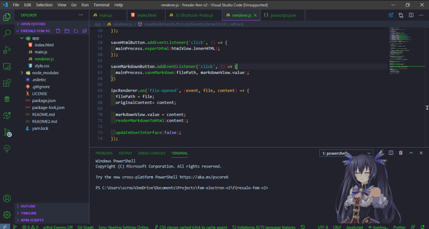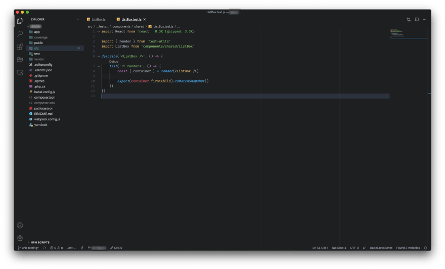
I'm using One Dark Pro theme, VS Code icons, FiraCode font and Git Bash terminal. It's pleasing to an eye and lets me stay productive.
Could you...
For further actions, you may consider blocking this person and/or reporting abuse


Yes, I have my waifu(it is a VS Code extension). It is such a pitty that she only talks Chinese. I am planning to put some Spanish messages in there.

What does your waifu do? Interesting extension!
It follows your mouse with its eyes. When you start VS Code send messages when hover or click over it send messages. it has multiple animations. There are different characters to chose from.
You can give it a try. It's free: marketplace.visualstudio.com/items...
I need to give it a try, I guess 😎
This. I need answers :) .
You can give it a try. It's free: marketplace.visualstudio.com/items...
Here's my current simple setup:
Looks like many of who have already commented prefers darker themes!
Haha I love it, easier for eyes!
I've tried a couple of light themes as well, switched back immediately 😂
In general dark themes give me better contrast and are easier to work with for longer periods of time 😉
Yeah I feel you ! Thankfully we live such time when it's possible to have almost anything with darker theme! 😂
Hi Sanjiv, which extension are you using on your vs code
Hey, I am using just the ones I mentioned above. Nothing else, I promise!
Heh very similar look and feel!
Can you share how you got the purple line the runs from line 6-23? That looks really helpful.
I'm using Bracket Pair Colorizer. They have v2 as well.
See which one do you like best 😉
awesome! will check it out :)
same, i use default Dark+ theme as well with material icon theme. Other extensions are based on language and project.
Just Base2Tone themeset. Currently it's SeaDark.
marketplace.visualstudio.com/items...
That SeaGreen looks nice on #1C252E for sure 🤩
Mood !
Exactly 💯
My current setup:
😍😍😍I love Shades of purple, is my second theme after Night owl.
Yeah it’s beautiful. Night Owl was my main for a long time I decided to try something different.
Material icons look so nice on that setup 🤩
+1 for the 4 spaces indentation
👋Nice setup, here's mine:
Night owl is awesome too 👌👍
I guess I'm still too much of an Atom fan to fade away from One Dark Pro 😂😂
Theme: Ayu Mirage
File Icons: File Icons
Font Family: Fira Code
Plus a little bit of custom CSS to hide the left and bottom toolbars.
Ayu Mirage keeping it basic, strictly avoids of reds 😂
Oranges FTW! 😄
Yup 😄😄 I actually love the simplicity, it's like right in the middle between flashiness that could be hard for the eyes and no highlighting at all that could be bad for readability 😉 Good find! 👍
Dracula Theme
Ubuntu Mono with ligatures
"Panda Syntax" theme
"CaskaydiaCove Nerd Font Mono"
CaskaydiaCove font for the UI
That's a nice font 🤩
Why would anyone choose VS Code (the limited development environment) when you have Visual Studio 2019 (a very powerful development environment)
It is like having the option to choose between basic car with almost no internals vs the latest Mercedes SUV fully loaded, and choose the basic car? I never understood that.
That is not a super fair comparison. VS Code is completely free, no paid version for Professional or Enterprise use.
Its like one is a Toyota, but its free, and the other is a Mercedes but you gotta pay for it, lots of people would opt for the free version that does 80% of the paid.
If it is just the free part then it is ok, but I see it used more by people in large companies because it is “better”, and I see people spend days configuring, reconfiguring, adding extensions, etc, for stuff that is already there in VS 2019
And all that time is paid time, 70$ to 100$ an hour per person (internal cost), put a week for configurations per project, and this is around 20,000$ or more lost for a team of 7 people, 4 of them developers.
Sometimes the full thing cost is cheaper than the salary / time spent
I have a C++/C# programming background I have experience in Visual Studio. In my opinion, Visual Studio is an overkill option for web development, it is unnecessary heavy for download, then you open the program and you start to see a lot of options that in my opinion doesn't make sense like debugging tools, debugging!? what JS or node JS? Which browser ? Which framework?
The difference is that web development is evolving very fast, all years we have new tools and I don't want to depend on Microsoft to integrate these new innovations. I prefer to trust the community that's why web developers tweak our IDEs/Editors. All this for free.
About the waster of time doing configurations. You can save your configuration once and share it among multiple users.
Bloated !== Better
So, installing a small editor VScode, then installing 10 to 50 extensions with thousands of files, then running projects with node_modules with tens of thousands of repeatable files is called “light” and VS 2019 which also have tons of files is called “bloated”? excellent logic!
VS Code starts faster, VS 2019 starts slower that is correct, but bloated? It should apply to both of them :-)
Here is mine setup:
- Tokyo Night Theme
- Operator Mono font
- Custom terminal color scheme
Bright and sharp 🔥🔥
How is it for the eyes for longer periods of coding, tho? 🤔
Precisely because of the bright colors, I use a monochrome theme for the terminal (the font is smaller) so my eyes can rest and there is a color balance. I coding for 9 hours a day. So I can say with confidence that with such a color theme, my eyes do not get tired.
Theme: DA UI from ST3 (author deleted the public repo when he switched over to VS Code, luckily I had it locally on another machine) I kinda ported over to VS Code

Clean 🤩 I like how there is no background transition between folder tree and an actual coding space 👍
I'm using the Powershell ISE Theme with a few custom colors, VS Code Icons, Jetbrains Mono font, and Powershell 7 as my terminal since most of my work is in that language. I've tried black backgrounds but I've found that I like greys more.
Today I launched a free Visual Studio Code theme called GitHub Dark Turbo. It's a fork of the official GitHub Dark theme, with some workbench goodies to help users focus. The sample images show Ruby on Rails source code. Enjoy =)
github.com/dubesoftware/github-dar...
Currently my vs code setup :
My setup is focused on Java/Scala development. I use Material Theme, Hasklig font, Fish Shell with Starship to configure the prompt.
I made my own gray color theme from scratch to avoid headaches I got from traditional dark and light-colored themes. It also has custom icons.
marketplace.visualstudio.com/items...
Thanks I use vim , but I like the scheme.
Theme: Horizon
Font: JetBrains Mono
Extensions: Bracket Pair Colorizer 2, Indent Block Highlighting
+1 for Tokyo Night
My current setup is:
Folder tree on the right? 👀
Interesting take, I guess it all falls down to individual taste anyways 👍
I used to have it on the left for ages then one day I just decided to swap it and never looked back!
I love VSCode for what it is, how it works and that it 100% free
But I am too addicted to JetBrains IDE :(
Materials Icons
Prettier (and a lot of others formaters)
Prettier website
Halcyon Theme
Autorename tag
CDNJS
(and some more.. tell me, if you want I can list them all)
Nice one 😉 Thanks for sharing! 👍
Theme omni
Bracket pair colorizer 2
Material icon theme
Here is my VSCode setup looks like this
The difference is that this is not VSCode
dev-to-uploads.s3.amazonaws.com/i/...
Here is my VSCode setup looks like this
The difference is that this is not VSCode
dev-to-uploads.s3.amazonaws.com/i/...
Sorry I can't supply with screen I just closed my machine but I'm using Eva dark theme, Vs code icons, hack nerd font,zsh terminal on Linux
I'm using Omni theme, ZSH terminal, FiraCode Font, Material-icons.
Material Community Theme (High Contrast), Material Icons and fish terminal (the autocomplete is amazing)
That's really nice. I like that theme