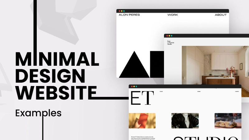
Minimalism has become one of the most popular and influential web design styles in recent years. Also referred to as minimalist design, it is characterised by clean layouts, plenty of white space, simple navigation, and ample breathing room between page elements.
But minimalist web design is not just about aesthetics and visual appeal. Embracing minimalism has many practical benefits for both the site creator and the end user. When properly executed, it can vastly improve user experience while also ensuring easy site maintenance and updates in the future.
In this blog post, we explore some key tips to adopt a minimalist approach for your next Web Design in Melbourne. Keep reading to learn how you can leverage minimalism, even with limited design skills or budget.
Focus on Clarity and Effective Communication
Minimalist web pages prioritise clarity in communication above everything else. There are no flashy animations, cluttered menus or overlapping images to obscure the message. Every design element serves a clear communicative purpose.
That’s why you must start by defining what needs to be conveyed to visitors and plan all design choices accordingly. Determine a hierarchy that highlights the most important page elements. Then, utilise white space, size, layout, contrast and other design tools to articulate this visual hierarchy.
Direct User Attention with Strategic Visual Cues
Once site content and structure is set, direct attention smartly using some graphical elements. For example, an arresting large image, stylish fonts and complimentary accent colours can indicate what users should look at first. Or a minimalist slideshow can showcase featured content pieces.
But be extremely selective about these visual cues. Each decorative element eats up cognitive load and distracts from primary content. Use only as much graphic touches as necessary to catch the eye and then guide users efficiently to what’s important. Don’t over decorate the web design in Melbourne for ornamentation's sake.
Provide Intuitive and Seamless Navigation
Site navigation is another make-or-break area from a usability perspective. With minimal e-commerce stores or blogs, ensure each critical section is reachable within 1-3 clicks. Provide persistent, easy-to-spot main menus using chunky text or symbolic icons.
You can also try progressive disclosure to declutter - only showing secondary menus on hover or click rather than everything upfront. Breadcrumb main menus help users trace their path. Auto-hiding sidebars prevent distraction while enabling access to tools when required.
Embrace Plenty of White Space
Generous white space is easily the defining visual characteristic of minimalist web design in Melbourne. Also referred to as negative space, white space refers to the empty areas between images, blocks of text and various page constituents.
By removing needless page constituents and expanding margins, you instantly curb clutter and improve visual processing ease. Key content stands out better against negative space. There is also more room to highlight and enlarge signature graphic elements like logos.
Ensure Visual Consistency
Consistency in design systems is a prerequisite for minimalism where you only have limited elements to establish site-wide patterns. Make sure fonts, colours, layout grids and interface elements like buttons look and feel cohesive irrespective of which page users land on.
Maintaining such discipline with a style guide is worthwhile to reinforce usability intuitions. For example, if main CTAs are positioned at top right on homepage, preserve that across inner pages too instead of arbitrarily shaking things up. Adhering to an overarching aesthetic brings harmony amidst simplicity.
Choose the Right Colour Palette
Colour selection can have a major impact enhancing minimalist appeal or ruining it with garishness. As mentioned earlier, you want only a handful of colours for accents so individual hues really stand out.
Neutrals like white, black, shades of gray and tan tend to define minimalist base schemes. Then bright pops of accent colours are sprinkled in for focal points. Common accent palette choices include vibrant blues, greens, oranges, reds or pinks.
Whatever colours you ultimately select, exercise prudence. Rely more on muted earth tones over neon shades unless specifically relevant to brand identity. Too many loud colours risk clashing. The accent shades you do use should harmonise well with neutrals preserving a calm feel.
Carefully Break Rules Occasionally
Lastly, the best minimalist designers know when breaking conventions pays off. Once you get adept with the guiding principles, stay open to selectively deviating from them for strategic impact.
For instance, displaying 1 or 2 striking full-width oversized images on selective pages could dramatically underscore a specific brand quality. Or custom illustrations could metaphorically communicate value propositions like trust or innovation better than text alone. Just don’t go overboard with such departures wherever traditionalism serves best.
In Conclusion
Adapting a minimalist website design philosophy is a smart approach for both seasoned and novice designers to craft elegantly functional user experiences. Not only are such sites easier to create with smaller assets making them a cost-effective option for an Affordable Web Design Company in Melbourne, they are also simpler to manage in the long run.
With its stresses on unfussy navigation, purposeful visuals and abundant white space, minimalism ultimately places site visitors front and center letting core content mesmerisingly take spotlight. Hopefully, the tips above have inspired you to try out this contemporary web design style for your next project!

Top comments (0)