For some people, and probably most people, CSS can be a pain. However, CSS does come with a lot of useful utilities to make your life easier as a developer and website designer. So let’s get started and look at 3 of the many features that CSS provides.
1. Flexbox Center Alignment
The first feature deals with laying out your page. Very often, you will find that you have some content that you’d like to center, rather on a page or inside of a parent. For the longest, though, centering both vertically AND horizontally has had a ‘hacky’ approach and could sometimes be unresponsive. Now, with flexbox and the alignment features it provides, we can do this in a very elegant way.
On the parent of the element we want to center, we can apply the following styles
display: flex;

justify-center: center;

align-items: center;
This will allow me to turn this:
Into this:

How does this work?
In flexbox, you have two axes. You have something called the main axis and the cross axis. The main axis is essentially an X-axis, it holds content horizontally. In contrast, the cross axis is like a Y-axis, it will hold content vertically. The justify-center property and the align-items property will allow for you to change how items are aligned, respectively. Justify-center being the main axis modifier and align-items being the cross axis modifier.
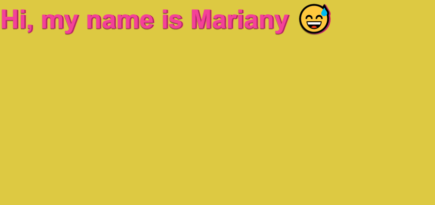
<div class="my-container">
  <div class="text">Hi, my name is Mariany 😅</div>
</div>
So we’re telling the parent element (my-container) to use the flex display. We need to define this in order to be able to use align-items and justify-center. We then add justify-center, which moves the text over to the middle. And then we add align-items, which slides the text down. This will leave our my-container styles looking something like this:
.my-container {

  display: flex;
  align-items: center;
  justify-content: center;


  background: #ddc942;
  width: 100vw;
  height: 100vh;

}
I recommend reading more about flexbox and it’s features at CSS-Tricks Guide to Flexbox
2. Transitions
When animating things like buttons or link hovers, or practically anything for that matter, that is considered simplistic; Using animations and keyframes can be overkill. Thankfully, we have transitions that come in handy. Transitions allow for us to transition our elements when certain properties on them change. Just think! Making a hover animation in just 2 lines of CSS!
We can do this with the transition property. The transition property can take up to 4 values but a minimum of 2. Add the transition to whatever element selector you want to target. For example, if I wanted a transition to the background of an element whenever it gets covered, I could do something like this.
.box {
  width: 300px;
  height: 300px;
  background: red;

  transition: background 1s;
}

.box:hover {
  background: blue;
}
Essentially, we’re telling the box element to animate or transition whenever the background changes, instead of just instantly changing it. We then add a selector for whenever the user hovers the box element, to change to pink.
You can read more on transitions at the MDN Docs.
3. The calc() function
You may be surprised to know that CSS has functions. Well, it does! And they can be quite useful. One of the most useful in my opinion is the calc() function. The calc function allows you to essentially use two different types of units when dealing with sizes. For example, say I want to set a box’s border-radius to 30%, but I want an extra 44px with it? Without this function, it would take a lot of trial and error figuring out what percentage would equal that exact amount. Using the calc() function, I could perform something like this:
.my-box {
  border-radius: calc(30% + 44px);

  width: 400px;
  height: 400px;
  background: orange;
}
The calc function can do addition, subtraction, multiplication, and division. So it gives you a lot of opportunities to make ‘dynamically’ styled content. It especially becomes useful when dealing with 100vh and navigation bars.
If you’d like to learn more about the calc function, read more on the MDN Docs.

Top comments (0)