
The Staggered Layout
Chances are you have seen the pervasive staggered layout (a.k.a., zigzag) at least once. Maybe you even use it on your own site or a site you've built for someone else.
Let's take a 2x2 example—two rows two columns:
- The first row has an image on the left and its text content on the right.
- The second row has text on the left and its image on the right.

Alternating images and text look nice. It breaks up slabs of words. This design makes content more digestible and appealing. Until you view it on a phone.
The Stacking Order Problem for Mobile Displays
Instead of neatly stacking:
- First row image.
- First row text.
- Second row image.
- Second row text.
as one expects, we get this image/text sandwich (anti-pattern) thingie:
- First row image.
- First row text.
- Second row text.
- Second row image.
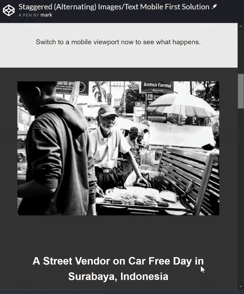
Here's a visual of what I mean. Again, this gif demos what we don't want.
Just to Summarise
The gif shows us what we don't want: image > text > text > image.
What we do want is image > text > image > text.
One Attempt (Duplicating Content)
One way to solve this sandwich problem (in WordPress) is to make a copy of the second (alternating) row. Next, switch the columns in the new copy (image on the left—text on the right like the first row). Then for mobile widths, use WordPress theme visibility settings to:
- Hide the desktop version of the alternating row. This is the staggered version.
- Display the alternating row where we reversed columns. This is the extra stacked copy we created.
This definitely achieves our goal to have image > text > image > text stacking on a mobile.
You probably noticed—it's a bit of a hack. And, it creates confusion and duplicate content which means duplicate work. This is not so much an SEO issue.
The alternative solutions I see out there use CSS grid or flexbox to control display order on mobile devices. Way cool! I think. Why do they fix the mobile display second as an after thought?
A Little Ditty on Mobile First
Ok—hang on. I'd like to do one better. I want to make our solution mobile-first. Meaning, let's order things for the mobile display first, then rearrange things for wider displays. Not the other way around like the other solutions. This is a subtle yet important way of thinking.
Let's go!
The Solution (Vanilla, Gutenberg, Avada, Divi)
Vanilla HTML and CSS [#]
Vanilla HTML and CSS means it's agnostic. I.e., no dependencies on CMSs (CloudCannon, WordPress, Squarespace, Wix) or JavaScript libraries. This particular solution use CSS grid. It's a fully working demo that shows the before/after. Please pay close attention to how I reverse the order in this snippet.
/**
 * Mobile First - The images are placed above the text by
 * default.
 *
 * Only Re-order Columns for Larger Displays
 *
 * These two lines of code is where the rubber meets the road.
 * This only affects the second row where we will put the text
 * on the left and the image on the right.
 */
#section-h.grid div:nth-of-type(1) {
  order: 2; /* This is the image. Make it go to the right. */
}
#section-h.grid div:nth-of-type(2) {
  order: 1; /* This is the text. Make it go to the left. */
}
Here's the CodePen.
Note: Please log in to your CodePen account to view if the pen doesn't show up at first.
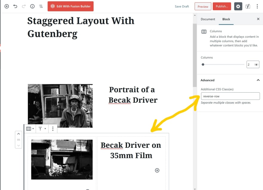
Gutenberg Block Editor [#]
Interjecting commentary: I admit. I was naive to assume Gutenberg had a nice built-in solution. Why doesn't it? It's the "new kid/latecomer" to the block (oops—no pun intended). Gutenberg has the advantage of looking at the weaknesses of all the other page builders. Oh well.
Let's take-on "The 'Berg".
Here's our Staggered Design in Gutenberg on a Large Display

Here's the Before/After on a Mobile
Grab the handle and slide right and left to see the before (sandwich) and after (no sandwich).
Here's the CSS
/**
 * Fix the Staggered Problem for Mobile Stacking Order
 *
 * This is a mobile-first approach.
 */
@media all and (min-width: 767px) {
  .reverse-row {
    display: flex !important;
    flex-flow: wrap;
    flex-direction: row-reverse;
  }
}
Here's Where I Added the CSS

Here's Where to Hook the CSS Into the Alternating Second Row
Avada WordPress Theme [#]
Besides the obvious Fusion Builder classes, the CSS I used for my Avada solution is almost identical to the Gutenberg code. The main difference? I used an ID instead to specifically target the second (alternating) row.
CSS Used for Avada
/**
 * Fix the Staggered Problem for Mobile Stacking Order
 *
 * This is a mobile-first approach.
 */
@media all and (min-width: 767px) {
  #reverse-cols1 .fusion-builder-row.fusion-row {
    display: flex !important;
    flex-flow: wrap;
    flex-direction: row-reverse;
  }
}
Here's the Full Avada Solution on GitHub (with Screen Grabs)
Divi WordPress Theme [#]
Last but not least. Below is an article I used to help me start solving the stacking order problem sans duplicate content. Jason Champagne shows how to solve the stacking sandwich problem both ways—with duplicate blocks and without (pure CSS).
I love this article. It's well worth the read even if you aren't using Divi. Bookmark it!
Leave me a comment if you have any questions.
Share & enjoy!

Top comments (0)