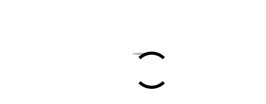
This article introduces a method to create a simple loading animation with PURE CSS, as demonstrated below (powered by codepen.io):
HTML
This implementation needs only one line of HTML code, like what's below:
<div class="loading">Loading</div>
CSS
Then we move on to the major part, the CSS code.
Because we have only one related html element, we use a :before or :after selector to implement the spinning circle. Setting its content, width, height, etc. to let it show up.
.loading, .loading:before {
  position: fixed;
  top: 50%;
  left: 50%;
  width: 16rem;
  height: 16rem;
}
.loading:before {
  content: "";
  border-radius: 50%;
  border: 1rem solid;
  border-color: black transparent;
}
Then we will have two none-spinning quarter-circles, which is due to the border-color: black transparent; setting top/bottom's color to black, and left/right's color to transparent.
Note that position: fixed aligns the top-left corner to the 50%/50% position. so to align the center point to the center view point, we do the following modification to the css
.loading,
.loading:before {
  margin: -5rem;
}

.loading {
  padding: 4.7rem 1rem;
  font-size: 2rem;
  text-align: center;
}

Then we shall define the spinning animation, using CSS @keyframes to implement.
.loading:before {
  animation: loading 1.5s linear infinite;
}

@keyframes loading {
  from {
    transform: rotate(0deg);
  }
  to {
    transform: rotate(360deg);
  }
}
You can also define the animation with keywords like 0% {...} 100% {...}.
Finally, a bit beautifying work and variable-replacement for future modification.

Top comments (0)