CSS Grid Layout is the most powerful layout system available in CSS. It is a 2-dimensional system, that means you can handle both columns and rows, making it easier to design web pages without having to use floats and positioning.
Table Of Contents:
1. display
2. grid-template-columns
3. grid-template-rows and grid-auto-rows
4. grid-gap (Gutters)
5. Nested Grid
6. Grid Lines (columns)
7. Grid Lines (rows)
8. justify-items
9. align-items
10. grid-template-areas
11. Flexbox vs CSS Grid
12. Creating Simple Layout
13. Conclusion
1. display
To make an HTML element behave as a grid container, you have to set the display property with a value of grid to generates a block-level grid or inline-grid to generates an inline-level grid. All direct children of the grid container automatically become grid items.
2. grid-template-columns
The grid-template-columns property defines the number of columns in your grid layout, and it can define the width of each column.
For example: if you want to divide your grid into 3 columns each one of them being 33.3% so, the value will be grid-template-columns: 33.3% 33.3% 33.3%;

But, if you want each columns being with different width you have to set a different value for each one like that: grid-template-columns: 50% 20% auto;

another way to do the same thing is to use repeat function, if you need to divide your grid into two columns each one them their width will set to 300px so you have to set the value of grid-template-columns prop as grid-template-columns: repeat(2, 300px);

you can also divide your grid columns equal to each other using fr unit for example setting the value of grid-template-columns prop as 1fr 1fr 1fr will divide the grid into three columns equal to each other in the width as each separated value act as a column.
If you set the grid-template-columns prop to 2fr 1fr 1fr this will also divide your grid columns equal to each other but the first column will equal to two columns in size(width).

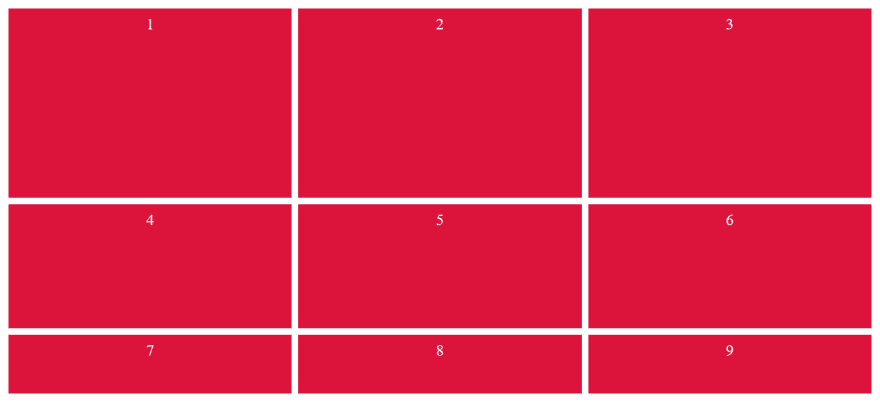
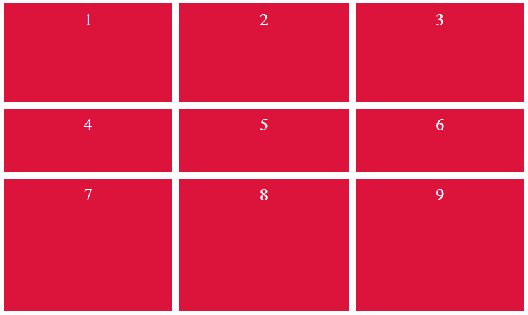
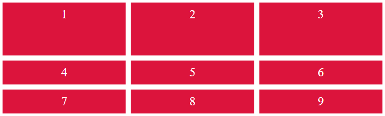
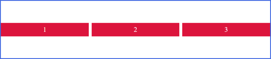
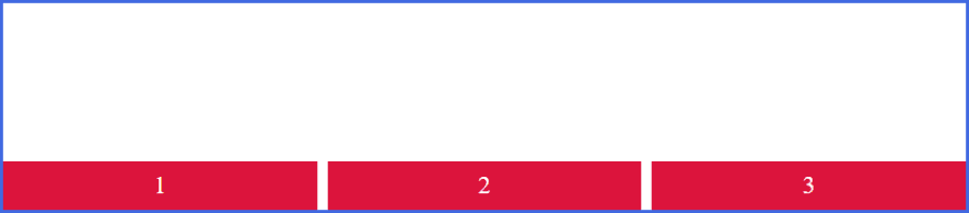
3. grid-template-rows and grid-auto-rows
The grid-template-rows property all its values work as same as the values of gris-template-columns but, it will defines the height of each row.
Examples:
setting the grid-template-row to 300px 200px 100px the result will be like this image
setting grid-template-rows: 150px 100px 200px;
setting grid-template-rows: repeat(2, 300px);

and setting both grid-template-rows: 1fr 1fr 1fr; and grid-template-rows: 2fr 1fr 1fr; will act / behave as same as the grid-template-columns but, grid-template-rows will effect the height not the width.
grid-template-rows: 2fr 1fr 1fr; for example:
Minmax: if you have a content that is bigger or taller than the row size(height), in this case you can use a CSS function called minmax which defines a size range greater than or equal to min and less than or equal to max.
grid-template-rows: minmax(100px, auto);
grid-template-columns: minmax(auto, 50%);
The minmax() function accepts 2 arguments: the first is the minimum size of the track and the second the maximum size. Alongside length values, the values can also be auto, which allows the track to grow/stretch based on the size of the content.
In this example, the first row track is set to have a minimum height of 100px, but its maximum size of auto will allow the row track to grow it the content is taller than 100px.
The first column track has a minimum size of auto, but its maximum size of 50% will prevent it from getting no wider than 50% of the grid container width.
4. grid-gap (Gutters)
The grid-column-gap and grid-row-gap properties create gutters between columns and rows.
Grid gaps are only created in between columns and rows, and not along the edge of the grid container. grid-gap is shorthand for grid-column-gap and grid-row-gap.
If two values are specified, the first represents grid-row-gap and the second grid-column-gap.

💡Note💡: The image above show a gap between rows larger than 20px because I was setting a margin: 5px;
grid-gap: 20px;
One value sets equal row and column gaps.

5. Nested Grid
Do you know that you can create a grid inside another grid? yes, let's see how?
If we need to create a grid for the paragraph elements inside the div with the class of nested-grid in the below image
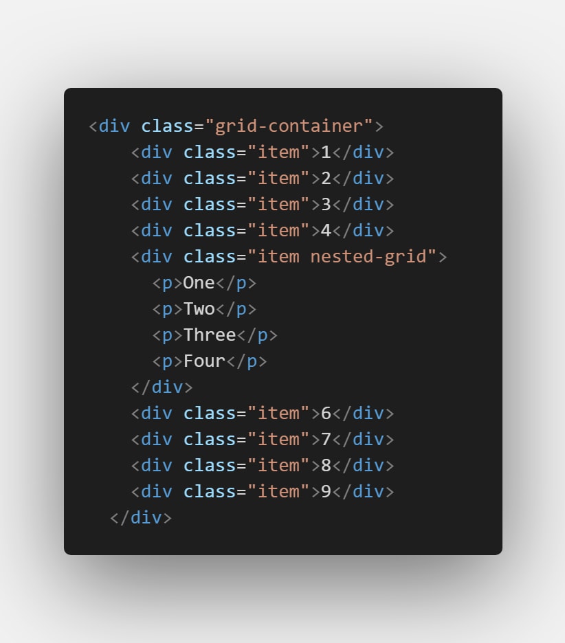
so, we have to give the div with class nested grid a display: grid, because it becomes the parent element for the paragraph elements and you can set the css grid properties we learned above to create the grid like that:

the result:

6. Grid Lines (columns)
Grid lines are essentially lines that represent the start of, the end of, or between column and row tracks.
Each line, starting from the start of the track and in the direction of the grid, is numbered incrementally starting from 1.
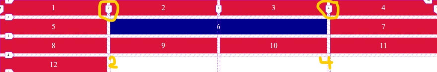
This 4-column by 4-row grid results in 5 column lines and 5 row lines. Item 6 was repositioned by row and column line numbers.

grid-column is shorthand for grid-column-start and grid-column-end.
If one value is provided, it specifies grid-row/column-start, like this: grid-column: 1
If two values are specified, the first value corresponds to grid-column-start and the second grid-column-end, and must be separated by a forward slash / like this: grid-column: 2 / 4
7. Grid Lines (rows)
grid-row also work as grid-column but it will effect the height of the row insted. grid-row is shorthand for grid-row-start and grid-row-end.
If two values are specified, the first value corresponds to grid-row-start and the second grid-row-end, and must be separated by a forward slash /.
Like this: grid-row: 1 / 4

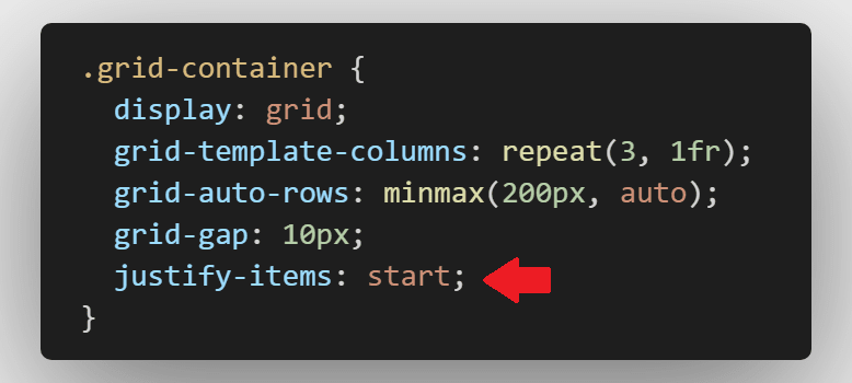
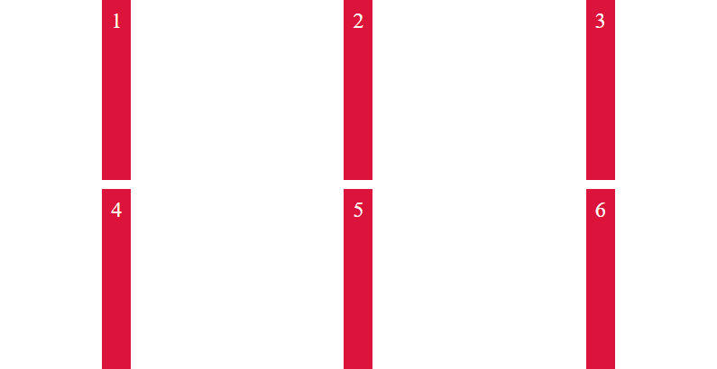
8. Justify Items
Aligns grid items along the inline (row) axis. This value applies to all grid items inside the container. justify-items are applied to the grid container and support the following values:
justify-items: start; Items are positioned at the start of the row axis
result: 
justify-items: end; Items are positioned at the end of the row axis.

justify-items: center; Items are positioned at the end of the row axis.
A simple GIF (44 seconds) as a brief for the three values of justify-items click here
9. Align Items
align-items align items along the column axis.
align-items: start;

align-items: center;
align-items: end;
justify-items and align-items are applied to the grid container and support the following values:
- start
- center
- end
- stretch
- baseline
- auto
- normal
10. grid-template-areas
grid areas can be named with the grid-template-areas property. Names can then be referenced to position grid items.
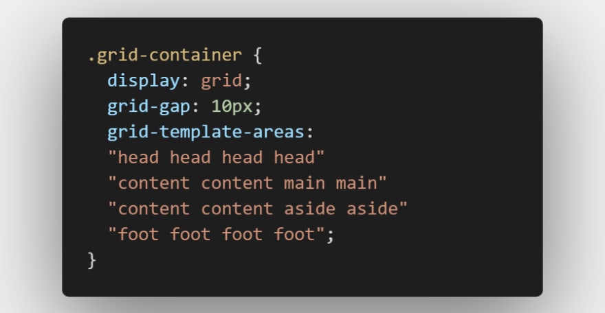
Sets of names should be surrounded in single or double quotes, and each name separated by a whitespace and each set of names defines a row, and each name defines a column.

Leaving a grid cell empty
We have completely filled our grid with areas in that 👆 example, leaving no white space. However you can leave grid cells empty with this method of layout. To leave a cell empty use the full stop / period character, ..
example:

result:

11. Flexbox vs CSS Grid
The basic difference between CSS Grid Layout and CSS Flexbox Layout is that flexbox was designed for layout in one dimension - either a row or a column. Grid was designed for two-dimensional layout - rows, and columns at the same time. The two specifications share some common features, however, and if you have already learned how to use flexbox, the similarities should help you get to grips with Grid.
In addition to the one-dimensional versus two-dimensional distinction, there is another way to decide if you should use flexbox or grid for a layout. Flexbox works from the content out. An ideal use case for flexbox is when you have a set of items and want to space them out evenly in a container. You let the size of the content decide how much individual space each item takes up. If the items wrap onto a new line, they will work out their spacing based on their size and the available space on that line.
Grid works from the layout in. When you use CSS Grid Layout you create a layout and then you place items into it, or you allow the auto-placement rules to place the items into the grid cells according to that strict grid. It is possible to create tracks that respond to the size of the content, however, they will also change the entire track.
A simple question to ask yourself when deciding between grid or flexbox is:
- Do I only need to control the layout by row or column? Use a flexbox.
- Do I need to control the layout by row and column? Use a grid.
| Tables | Flexbox | CSS Grid |
|---|---|---|
| Pros | Flex can be arranged in any direction, flex can have its visual order reversed or rearranged, items can be aligned in your container or between them and support all browsers. | Grid tracks are created within your stylesheet, reduced file sizes, prototyping with CSS Grid is fast and efficient. |
| Cons | Performance issues | Not supported by every browser |
If you need to know more about the difference between Flexbox and CSS Grid, and want to know when to use them? I will leave some sources for you in the conclusion section.
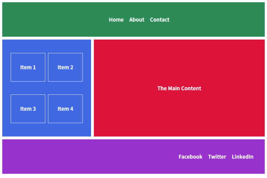
12. Creating Simple Layout
This is a simple layout created using Flexbox and CSS Grid. You will find the source files in Github.com in the Conclusion Section at the end of the post.
13. Conclusion
The source files of this post is here on My Github.com
Resources:
- Learncssgrid.com
- A Complete Guide to Grid in CSS Tricks
- cssgrid.io
- Basic Concepts of grid layout in MDN
Another sources for Flexbox vs CSS Grid
- Quick! What’s the Difference Between Flexbox and Grid?
- Does CSS Grid Replace Flexbox?
- The main differences between Flexbox and CSS Grid
- Flexbox vs. CSS Grid: Which Should You Use and When?

Top comments (2)
Nice Work & Awesome Afford from You.
3aaaaaaaash ya ebn baldy
Thank you 🙏 .. Your comment made my day. 7abeby ❤️