While I was talking with Vitor Amaral, creator of UpStamps, I was inspired by the design he uses for his homepage. It’s a clean homepage with awesome vectors that animate(!). Reading through the copy I noticed some things that could be improved which would increase his conversion. So let’s start!
About
UpStamps is a startup that makes it easy for you to enable and disable features of your website in production. They also offer A/B testing of features based on segmentation.
Copywriting
Copywriting is definitely one of the hardest things to do about building a website. You want your text to be unique and to grab the attention of your visitors. And how else can you do that by displaying the awesome features or your unique idea? This is what I see time and time again on websites and it perfectly makes sense. You think. Unless you have a super idea, it converts worse than when you use a different approach. People want to feel addressed and understood. Especially feeling understood is an important factor when writing copy. But how can you feel someone understood when you are the one talking? You don’t talk about yourself, you talk about your visitor.
To be able to talk about your visitor you need to know them thoroughly. Your visitor has a problem, something he is worried or annoyed about. These problems are so-called pain points. For the concept of UpStamps I can think of 2 major pain points:
- As a developer, he accidentally deployed a feature to production that was not ready yet. Once he saw that the feature was in production he was incredibly stressed.
- As a developer, he develops new features and wants to test them if they work on a production server as well. Last time he released a new feature there were too many support tickets coming of users complaining that something didn’t work. He wants to test the feature among a small group of people.
You need to get in the head of the visitor and answer his questions. Say we validated these questions by asking a couple of dozen developers what their biggest problem is. Now we know they deal with this problem we can change the headline to a more pain point based text:
- Did you ever deploy a feature by mistake?
- Do you ever doubt if your feature will work in production?
- Do you want to test a feature among a small group of people?
In this case, I would go for the headline that focusses on the pain point that has the most emotion. I am a developer myself as well, and if you ever deployed a feature to production which was not finished yet, that is incredibly stressful. You never want that again. And that’s exactly the type of feeling we want to address.
The key point here is that you want to address an emotion before you offer your solution. You don’t want to sound like Jordan Belfort but more like Oprah Winfrey.
Call to action’s

How your mind processes the homepage
When using multiple ‘call to action’ buttons on a page it is better to use primary, secondary and tertiary colours. This will draw the attention of your visitor to 1 place. But since this is the homepage the user is probably not convinced yet to register. We want to take him by the hand and lead him through some paragraphs and pictures that will convince him, that he needs this tool. Therefore it would be better to lower the appearance of the yellow signup button. You can consider not making it a button but a normal menu item or only using a border.
The feature rows further down the page do a better job. I want to know “what’s in it for me?”. The headlines in these sections don’t directly describe a feature but more what can be of value for me. Although the call to action buttons don’t contain any ‘Sign up’ or ‘Create account’ texts, they don’t convince me to do something that’s beneficial to me. Changing texts in a button can really make the difference if people click it or not. Although these are not exactly buttons, I think we can improve them by changing them to ‘Call to Value’ buttons. Here’s what it would look like:
- Create a new feature flag
- Start (features) testing in production
Where ‘features’ would be optional.
Images
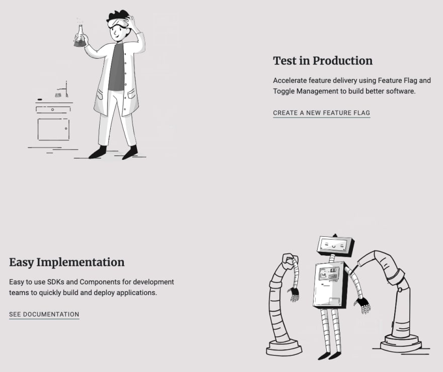
Something I really like about this homepage, are the images and animations. I just love how they make the website more alive. One of the things I couldn’t help noticing is that they all have eyes. And with eyes, you can play. Take this feature row:
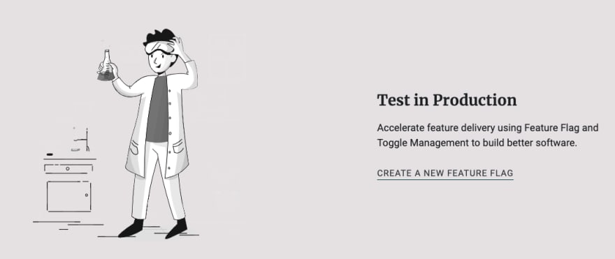
The guy here is looking at his potion and brewing his new formula for his live elixir! But he should not be the centre of attention if this feature row. So how can we still keep the cool animation but also emphasize the attention on the text? Flip the image horizontally and it will look towards the text:
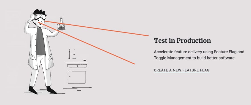
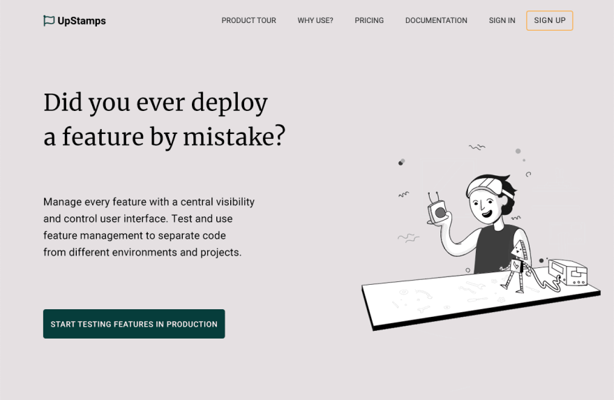
This is a very good practice for pointing someone’s attention to a paragraph or a call to action button. You could even use this approach for the hero image as well:
Every time the little robot walks towards the button your attention will point you towards the call to action. But like I mentioned earlier, the visitor might not be convinced enough yet.
That’s it for this week! I hope you learned something about copywriting and how people unconsciously take a look at a website. If you want to take a look at how my landing page looks, visit https://targetaudience.app!


Top comments (2)
Copy writing is so commonly overlooked. Really cool that you covered it here AND followed up with an awesome breakdown. Appreciate all the examples! Overall great post Sjors 🤗
Some comments may only be visible to logged-in visitors. Sign in to view all comments.