
If there is a component in web development that is too often treated as an option only (if at all), it’s accessibility. Companies want business value out of it but don’t see a benefit; developers have either never heard of accessibility for the web or think that they can’t apply accessibility in their company due to lack of time.
In my experience, accessibility for websites and web applications is 80% writing standard compliant HTML markup with progressive enhancement in mind and 20% content improvements.
The 80% should be doable by every front-end developer with fundamental knowledge in HTML, CSS and JavaScript. This is about semantics, using the right HTML elements, applying correct keyboard focus order and so on. A big part of this work can automatically be tested with tools like aXe (the same engine that powers Google’s Lighthouse accessibility tests).
The last 20% — and that’s why I call it content improvements — is a lot of “accessibility by usability”. It’s less technical and more about how you provide the content of your website so that everyone understands it. This is about providing additional hints for screen readers, subtitles in videos, making content readable in high contrast mode or replacing PDFs with web pages (or replacing them with accessible PDFs).
And, of course, design is also a big part of web accessibility. In this post, I want to show developers five code improvements they can apply today to make their website more accessible.
Disclaimer: I might link to various chapters of the Accessibility Developer Guide in this post. Not because the company I’m working for is contributing to the guide but because it provides a more detailed explanation of the materials in this post that are actually tested, verified and kept up-to-date. They are also much easier to understand compared to the official WCAG specification.
Before we begin: Fundamental mindset about HTML and CSS
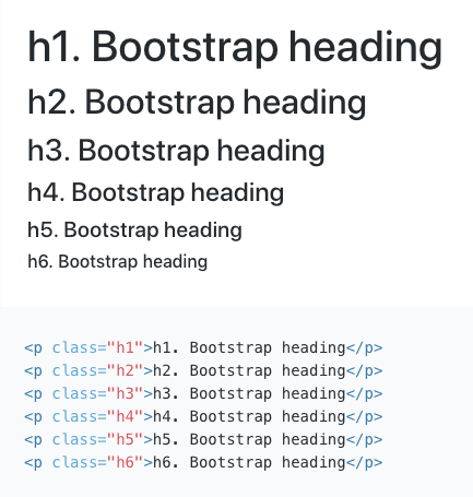
It’s important that you approach HTML and CSS separate. It’s totally fine to use an <a> element in code and then style it like a button. Your HTML markup should make sense on its own, without the styling. That’s why libraries like Twitter’s Bootstrap provide classes for various typographic choices in addition to the default element styling. I recommend using classes as much as possible over type selector styling. Your life will be much easier later on, I promise.
Nr. 1 — Fix general code semantics
Semantics refers to the meaning of a piece of code. MDN — which is my favorite source to look up various features of the web platform — has a very good description of what it means for HTML, CSS and JavaScript to be “semantic” (I recommend to quickly read through the referenced page).
The most frequent case of wrong semantics I’ve come across on websites and applications — especially when frameworks like React, Vue.js or Angular are used — is the misuse of <div> elements for everything.
Here’s a short list of cases to check on your website or application:
-
Titles are wrapped in H1 to H6 tags. That doesn’t mean every title needs to be a heading element. Think of writing a text document e.g. in Microsoft Word. When would you style a line of text as a title? When would you make something bold? Just be aware that people using screen readers love to use the H1 to H6 tags to jump around your content. By contrast, boldness of a text, even when marked with a
<strong>tag, doesn’t have any influence on how the screen reader accesses and reads your content. - Lists , no matter if it’s a list of navigation items or a list like this one here, are defined as unordered lists, ordered lists or description lists. Make sure there is no list with only one element. For example, if your navigation can have only one element in any circumstances, remove the list wrappers. Lists with only one element can be confusing to people using screen readers.
-
Interactive elements are either anchors (
<a>), buttons (<button>) or form elements (e.g.<input>,<select>). If you find things like click handlers on elements like a<div>, that element most likely should be one of the elements above. - Use the HTML5 section elements in combination with ARIA landmarks to mark content. Not all have an effect on screen readers but some have. See the referenced page for a good explanation and how to implement.
That’s for sure not all you can do, but these are the most common cases of wrong semantics I’ve found in accessibility testings. A more detailed explanation with examples can be found in the Accessibility Developer Guide.
Nr. 2 — Fix your title structure
Even if you have all your titles wrapped in correct H1 to H6 elements, that doesn’t automatically mean that they are used correctly.
Check that there are no heading level gaps: e.g. a <h2> has to follow a <h1>, a <h3> has to follow a <h2> and so on. For example, if you find a lonely <h5>, no <h4> but only <h3> elements, something’s wrong. So you would rewrite your <h5> to a <h4>.
There is a bookmarklet that helps you to find these problems.
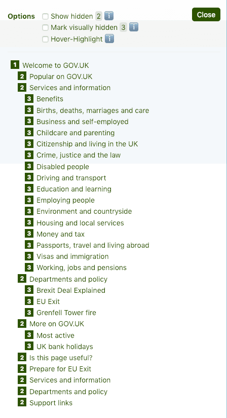
Reminder: The visual representation of an element can be different from its HTML element. You can style a <h5> like a <h4> by adding a CSS class. And that’s what you should do in the case described above.
Nr. 3 — Add hidden titles to the structure to mark site sections for screen readers
This improvement belongs to the 20% mentioned at the beginning of this post: This is not something an automatic testing suite will tell you. These are the additional content improvements you either tackle based on feedback from manual testings or by gut feeling. And with gut feeling I mean:
What’s obvious when the website is visually represented but not so obvious when looking at the HTML markup.
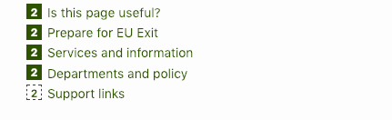
The meaning of hidden titles is titles that are not visible by eye but can be accessed by a screen reader. This means adding titles like “Main site navigation”, “Language switcher” and “Site footer” to your content.
Taking again the example of gov.uk like in Nr. 2, you’ll see for example a hidden title for the links in the footer.

The section about headings in the Accessibility Developer Guide covers this quite well.
Hint: You and I might not agree about using multiple to improve accessibility, as gov.uk proofs that you can mostly follow the HTML specification without any accessibility concerns. I for one use the approach of one and I would recommend this to follow best practice in all projects.
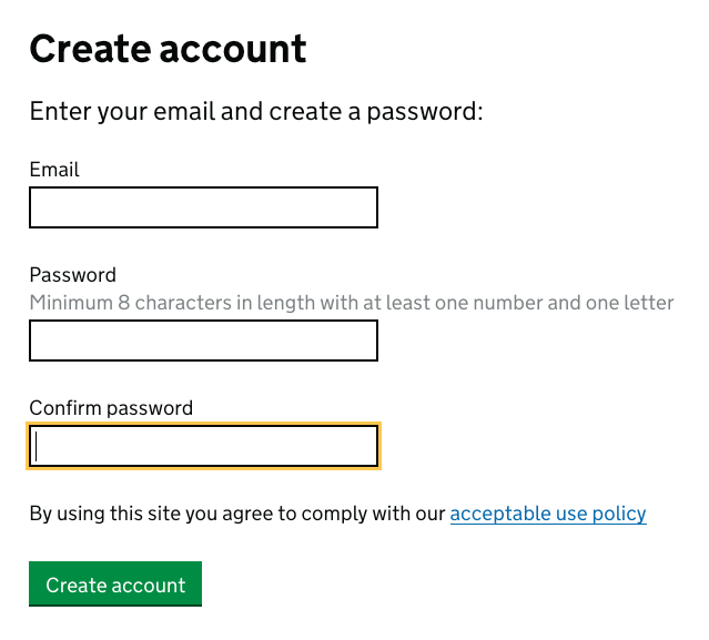
Nr. 4 — Fix your forms
There are more things that can go wrong with forms than I initially thought, before I dove into accessibility. This is not mentioned in Nr. 1 of this post as it’s not only about semantics. There are a few additional things that have to be done to make forms, especially the validations, accessible.
-
Check that every input, select or text area has a label: If it doesn’t have a
<label>, what a form field is about is most likely invisible to screen reader users. You can either wrap the form field into the<label>tag, which is valid, but for more flexibility I recommend using the for attribute to make the connection to a form field via the ID. - Mark required fields with the required attribute : This makes it obvious to screen readers that the field is required.
-
Connect inline validation errors and other hints with aria-describedby : Assuming you show errors just below the form field that contains the mistake, the screen reader doesn’t read the error message when having focus on the field. For this, you need to connect the most likely
<p>tag containing the error message with the form field by adding anaria-describedbyto the form field linking to the ID of the error message. A detailed description can be found in the Accessibility Developer Guide.
There are a lot more improvements to forms you probably want to do, but they can also get more complex.
Nr. 5 — Fix keyboard focus visibility and order
This is easy to test. Open your website or application and navigate through it without using the mouse (Tabulator key, Shift+Tabular and arrows are your friends, but there are more).
Do you always see where you currently are? Can you focus all interactive elements? Does the order make sense to you?
Fixes you can apply:
- Change source order of elements: Default keyboard focus relies on HTML source order. So there can be cases where you want to correct the order in your code and then visually change the order with CSS so it fits in your design. This is totally valid as long as the focus doesn’t make huge jumps from left to right or from top to bottom and back, which can be very confusing.
- Change the default focus style to something more visible: Browsers implement the default focus style very differently. Some browsers show a blue outline when an element is focused. That’s okay on a white background but not on a blue background. Some browsers like Firefox only show a dashed/dotted line around focused elements which is barely visible. Never rely on the default focus style. Create your own. For the latest browsers, there is now even a modifier for keyboard-only focus, so you can make a difference between focusing via mouse click and keyboard.
-
Use native HTML elements over customization: For example, if you want to have custom styles for your radio buttons, use the
<input type=“radio”>element and overwrite the styles e.g. by visually hiding the input and keeping the label in place with a “fake” styling for the input.
Conclusion
Basic accessibility on a website or application isn’t that difficult to achieve. The more modern your UX and design becomes, the more effort is needed to make it accessible, for example when you go with SPA solutions like React, Vue.js or Angular.
These five fixes are only a few of many you can do, but you should be able to apply them in a couple of hours and already make a big difference.
If you’re interested in more in-depth knowledge about how to make your websites and applications accessible, I’ve got some links for you:
- Accessibility Developer Guide A guide mostly for front-end developers on how to build and test websites for accessibility. Includes much practical knowledge from real world testings.
- Inclusive Components A blog about building accessible components.
- WCAG The de facto standard for web accessibility.
- A List Apart, topic accessibility Many useful resources about accessibility.
If you have questions regarding accessibility, feel free to contact me at rey@nothing.ch.

Top comments (1)
Excellent article, thank you!