I've always though that users must be placed right in the center of every feature development. 🧑💻 👨💻 👩💻
While I was building the MVP of stanza.dev in one month, I took the time to add one page that will allow users to give feedbacks and report bugs.
Get feedbacks asap 🙋♂️ 🙋♀️
I'm sure this seems obvious for some people but it was not for me when I launched my firsts projects. 🤷♂️
Protect yourself 🌞
As a developer it's way too easy to build new features that we (sometimes) tend to forget our users. What seems cool for you is not always cool for your users...
After coding an awesome feature for two weeks during the evening after your daily job, you deploy your new feature and no one cares. 🤯
Build features without asking your users what they want is the best way to loose motivation, time, energy and quit.
Engage your users 👷♂️ 👷♀️
Imagine going on a website, ask for changes or for a feature that you wanna see and some weeks later it's online ! Magic right ? 💫
Give this magic to your users, they will tell you what they want, you will work on that and they will give you love in return.
Turn haters into lovers 👹 👺
Ok now imagine that you are on stanza.dev and something bother you so much, you're very angry and you have a way to express yourself.
A few minutes later, you drop a message to Stanza to tell that this website is a piece of shit and you close the tab.
A few days later, Stanza comes back to you with this brand new feature you wanted so much. And the magic comes again 💫
Getting feedbacks 👋
Be everywhere 👀
Your users should be able to give you their feedbacks (or express their hate) from everywhere on your website.
I've chosen to add a button into the navbar and one other in the bottom left of the screen that scrolls with the content.
I even added a button on my /tags page as I thought some users would want to ask for more tags at this exact place.
ps: I've removed these buttons from the mobile view as my feedback page is not very nice on mobile (for now) and most of my users are on computer (for now), but I must allow mobile users to give feedbacks too asap.
To do list ✅
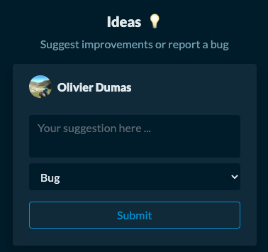
The feedbacks page of stanza.dev looks like a to do list of four columns :
- Ideas 💡 - Users can freely ask for what they want based on four tags (bugs, features, Ux, Ui).
Of course, all users of Stanza can upvote any card if they think the issue is relevant.
They can't do anything on the three following columns (apart from liking cards)
- Todo 👀 - What we will build asap.
- Doing 💪 - What we are currently building.
- Done 🙌 - What we did.
Inform your users 💬
Every time a card goes from one column to another, stanza.dev sends an email to inform the user.
These are very simple emails for the moment, to include the user into the building process.
This is how we are getting users' feedbacks 24/7 while we are building stanza.dev.
I am sure that a lot of things can be improved and will be changed over time but at least it's working 🤹♂️ 🤹♀️


Top comments (0)