Everyone has their own unique set of priorities, goals, and views of the world and themselves. On top of that, you or someone else you know may not be goal-oriented a person in the first place, instead shifting their focus to intuition and practical application to the world around them.
For those of us who are goal-oriented, however, managing those goals at scale (once again refining the audience to those with markedly busy minds) can become cumbersome without help. If it's not forgetting the goals you had in mind during your brainwave in the day before, it's trying to recall the priority structure that you had; furthermore, it becomes useful to have these goals in your life if you can properly understand if you've been reaching your own standards.
Introductions
Given my experience in both setting goals and writing React and Django applications (notably in Stopclutch)...
...I set out to design a front-end and back-end pair called LifeKnifeX.
The name was suggested to me after announcing that I was designing this tool which was "cool enough to slice through the cake of life". The X at the end was more so for domain naming and IP reasons.
The Objective in a Nutshell
LifeKnifeX aims to cover the "slices" of life that pertain to goal-setting, personal performance metrics, continuous improvement of oneself, and discipline in areas one could call "classic offenders", such as diet and habit.
Walk Through
The above screenshot of the home page is where users land, giving them a high-level overview of what possible areas the site provides assistance with in one's life. As of these screenshots, this includes Nutrition and Goals.
The idea between these two modules, designed as equally applicable to the other planned modules on the home page, is about regular check-ins, and being rewarded for consistency of attention paid to these areas. Such reward would take place through the Score function, though Score will not be covered in this post.
Nutrition
The Nutrition card provides both direct access and shortcuts to deeper functions within the module itself. When a user first decides to Visit nutrition, they're likely meet with a notice that they've yet to log something they consumed.
The app is intelligent enough to display a different message if the user hasn't logged any food to begin with. In this situation, the Food Library button disappears, and the message changes to inform them that they must first add a food they wish to log.
Upon navigating to the Food Library itself in this situation, an appropriate and similar message is shown there, too.
The form to add a new food allows a subjective determination of whether it's of good or bad quality along a Likert scale. This food can also have an image assigned to it for quick reference, and to be easy on the eyes.
Once the food is added, a confirmation toast is shown as such:
It will then appear in the Food Library, replacing the previous guidance message.
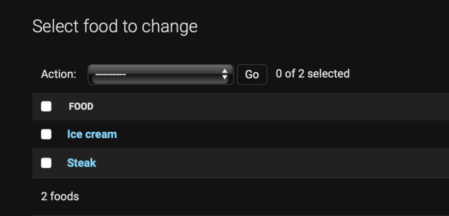
Since Django is used for the back end, it makes for easy management of Food and any other model in the app:
One can then log a nutrition (or consumption) record against that food. In doing so, one can specify the food they ate , when they consumed it (because ice cream sounds good for lunch), and how much they had.
The When field is generalised to hour groups of the current day no later than the current hour. This is to dissuade users from allowing a backlog of consumption records to build up either in their head or on paper; by logging it at the source as soon as possible, the app works to encourage a general philosophy of consistency and discipline.
The intrinsic benefit and purpose of the Quantity field is to have a more complex version of Quantity • Quality to categorically rate a user's health in each consumption, and then generate statistics across days or any arbitrary time period.
Saving a consumption record shows a similar toast to before:
This consumption then appears in the list, once again replacing the previous empty message on the corresponding page:
Similar to before, this can be seen and managed in the admin:
Goals
When visiting the Goals section of the site, one is met with a similar guidance screen to before:
Adding a goal is performed through a similar procedure, clicking on the big pink button to bring up a form:
The Question, Style, and Start Date fields should be familiar and self-explanatory to many, behaving as intuition would have you guess. However, the Test field is slightly nuanced.
The idea, following on from the precedent set by a Goal, is to allocate accountability to users to ensure continued contribution; this then helps the app help them. By choosing one of At least every or No more than every options, the user gets to define both the sentiment, and the priority of the goal in question; this effectively says whether the goal is intrinsically good or bad.
The final Test option, Never provides no penalty or action taken on the user not contributing answers.
Saving a Goal shows a similar toast message, and then redirects to the Goals page to show the newly saved item:
This can then be viewed in the admin:
The admin can also edit a Goal, much like other models:
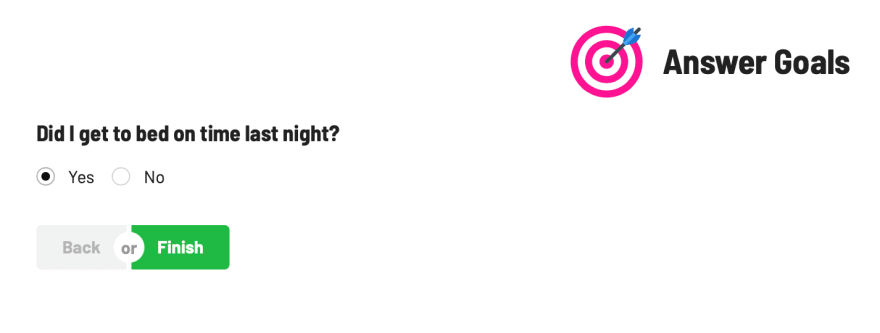
When a goal hasn't been answered on the current day, an exclamation mark will appear in its card. A user can then answer that goal by clicking on the pink Log Answer button, bringing up the answer form:
Considerably simple, this page shows one goal at a time, allowing the user to choose an answer defined by the Style of the goal as seen the previous form.
Once answered, the previous warning message will change to show success against answered goals, depending on the Test:
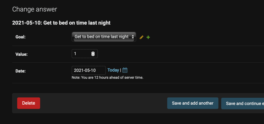
Following the now-classic admin pattern, an administrator can edit any answer:
Project Structure
The application is broken down into a React front-end and a Django back-end. The Django back-end uses the standard PostgreSQL database without any frills, and exercises Django REST framework for communication from the front-end.
Front-end
This was created with (and still technically uses) create-react-app, but the project was initially created some time ago; as a result, it uses the older method of npm install in place of yarn and other similar commands.
It uses Redux Toolkit to make Redux marginally bearable (more on that story later) for state management, and the wonderful and stunning Semantic UI React integration to make things look pretty. Icons are provided via React Icons, which we will see in action shortly.
Back-end
Aside from the aforementioned PostgreSQL and Django REST framework, this Django application doesn't do anything particularly out of the ordinary. Django's incredibly convenient model and migration management (alliteration not intended) make for a humorously fast development experience, especially when there are no views to be configured.
This site could have been made using the standard MERN stack, and while there's nothing wrong with that intrinsically, I was curious (at the time of this application's development) to see what Django was like when communicating with another stack for the front-end.
CI and Deployment
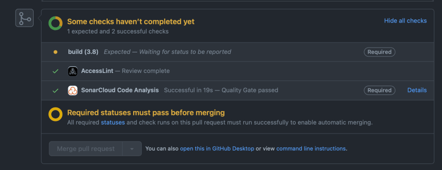
Similar to the previous Stopclutch app, both the front-end and back-end use GitHub Actions for testing and deployment checks:
Once all checks pass on a merged pull request to main, Heroku will detect this and automatically the appropriate app to the staging environment. After manual inspection to ensure staging works as expected, this can be promoted to production.
Criticism and Improvements
Building at Scale
Contrary to what it may seem, this was a big project, especially to take on alone. I have a fair number of such small app concepts that I like to try out, often in new languages; this gives me a good idea of how much time and effort an idea will usually take, and as a result I tend to have a good idea of project feasibility.
Here, however, I discovered so much about the front-end from the back-end, and vice-versa. The work increased dramatically as a result; it was here that I had newfound respect for full-stack developers out there in industry. Ironically I'm one of them in a professional capacity, and yet still this took me by surprise.
The lesson learned here was to start small; it's easy to know when something is too small, but often times your internal alarm as a developer won't go off when your idea isn't quite bite-sized enough.
Stick With What You Know
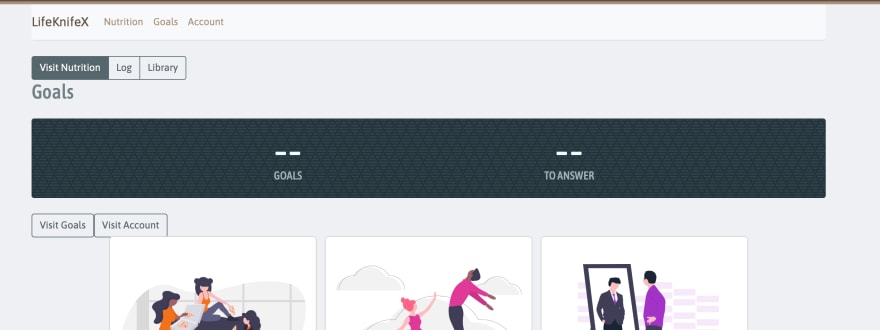
The front-end uses Semantic UI for theming, and more recently I started a branch to see what it would look like if I shifted everything to Bootstrap. The working copy looks like this:
I very quickly realised that the app would have been considerably more valuable had I stuck with contributing to the core internals and mechanics of the app, instead of playing around with theming. Being both the developer and the user of the app, I could quickly imagine myself complaining at the developer (if the poor soul weren't me) about not putting effort where they should.
Don't Trivialise Fast-Paced Stacks
If PHP is a serene lake, JavaScript is white-water rafting. I have many a time assumed that it was safe to ignore the goings-on and just carry about my business. Little did I know that coming back to this app to ensure it was ready for this post, that many depended-upon libraries had since long moved on (yarn in CRA is a good example here).
After this experience, it has made me think twice before starting up a React app as a knee-jerk reaction, and instead viewing slower-moving (or perhaps more mature) stacks with greater respect and temptation.
Conclusion
This has been an incredibly educational experience that has given me newfound respect for both developers and stacks. This isn't a project I feel particularly compelled to continue however, for the main reason that I discovered how it adds more work to my day to contribute such diet and goal logs than it does give back.
This is really something I had to implement to truly understand, and so this has by no means been a waste of time. All in all, thank you for reading through to the end!
Until next time, all the best!







Top comments (0)