
Introduction
Hello, everyone! Welcome to this advanced tutorial on Styling with Prismane. In this tutorial, you will understand how powerful and versatile Prismane’s styling system really is.
Empower your React development with Prismane's comprehensive arsenal of tools: 26+ hooks, 111+ components, and 28+ form validators. Craft seamless forms with Prismane's intuitive form builder. Experience unparalleled performance, as every component is meticulously optimized for speed and efficiency.
All of the code in the example below can be directly accessed through the GitHub Repository.
Styling Components with Prismane
In this section, we will demonstrate how to style components using Prismane. We will cover various styling options, CSS variables, and component-based theming.
Shorthand Props
Prismane's shorthand props make it easy to quickly style components without writing lengthy CSS rules. This can save you time and effort, and make your code more readable and maintainable. Additionally, Prismane's shorthand props have support for pseudo-classes, at rules and much more.
Instead of lengthy CSS rules, use the shorthand props to effortlessly customize components like the Box without the need for additional CSS.
.PrismaneBox-root {
  padding: 16px !important;
  background: red;
  color: white;
}
We can write the following code, which will produce the same output:
<Box p={16} bg="red" cl="white" />
The p prop sets the padding of the button to 16px
The bg prop sets the background of the button to red
The cl prop sets the color property of the button to white
💡 All of Prismane’s components support these shorthand props. To learn more about the full list of shorthand props, you can check out this documentation.
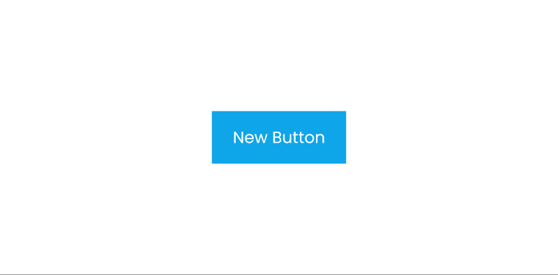
Customizing A Button Component
Using the shorthand props that Prismane exposes, you can craft a new component, tailor the Button component to your preferences, and reuse it by following these steps:
import { Button, ButtonProps } from "@prismane/core";

const NewButton = ({ children, ...props }: ButtonProps) => {
  return (
    <Button px={18} py={12} br={0} {...props}>
      {children}
    </Button>
  );
};

export default NewButton;
The px prop sets the horizontal padding of the button to 18px
The py prop sets the vertical padding of the button to 12px
The br prop sets the border-radius property of the button to 0
💡 We are using the
ButtonPropstype from Prismane’sButtoncomponent. This way we are ensuring that the new component still has TypeScript support.
Following these steps, you have created a fully customized NewButton component that still has all of the functionality of the Button component.
Let’s see the result
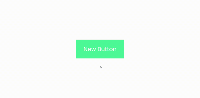
Pseudo Classes
All of Prismane’s shorthand props have support for pseudo-classes. To fully understand all of Prismane’s shorthand props’ features, check out this tutorial.
To add a pseudo-class value, we need to pass an array to the shorthand prop. The first value of the array is the normal value, the second value of the array is an object whose keys are the names of the pseudo-classes, and it’s values are the respected values when the pseudo-class is active.
To easily understand how they work, let’s change the background of our button and change it once again on hover. This can be done as follows:
import { Button, ButtonProps } from "@prismane/core";

const NewButton = ({ children, ...props }: ButtonProps) => {
  return (
    <Button
      px={18}
      py={12}
      br={0}
      bg={["#40e495", { hover: "#2bb673" }]}
      {...props}
    >
      {children}
    </Button>
  );
};

export default NewButton;
This results in:
CSS Global Style Customization
All of Prismane's components have CSS classes for each of their layers, classes that are toggled by props, and classes that represent given prop values. This makes it easy to integrate Prismane components with your existing CSS styles.
Let’s use this App.tsx starter code and work our way through customizing our buttons globally.
import { Center, Button } from "@prismane/core";

function App() {
  return (
    <Center w="100vw" h="100vh" direction="column" gap={8}>
      <Button>Primary Button</Button>
      <Button variant="secondary" color="base">Secondary Button</Button>
    </Center>
  );
}

export default App;
This will render the following:

Now, we are going to use the Button component’s prebuilt classes to style our two buttons. You can find the full list of CSS classes that the Button component has in the Button API page.
💡 You can find the full list of CSS classes of any component by choosing the component from the Overview page.
Let’s make our buttons round by default. To do that, we can use the .PrismaneButton-root class that every Button component has. This class targets the root element of our Button which is the button element.
.PrismaneButton-root {
  border-radius: 9999px !important;
}
Let’s see the result

Great! Now, let’s add a linear-gradient to our primary button only. To do that, we can use the .PrismaneButton-{variant} class that Prismane exposes. Since we want to target only the buttons that have the primary variant, we are going to use this class - .PrismaneButton-primary
.PrismaneButton-primary {
  background: linear-gradient(to right, #11998e, #38ef7d) !important;
}
Let’s see the changes:

CSS Theme Variables
Prismane converts the Theme Object to CSS variables, which enables you to integrate them into your CSS Stylesheet.
CSS Theme Variables:
Primary Colors:
—prismane-colors-primary-50,
—prismane-colors-primary-100,
—prismane-colors-primary-200,
—prismane-colors-primary-300,
—prismane-colors-primary-400,
—prismane-colors-primary-500,
—prismane-colors-primary-600,
—prismane-colors-primary-700,
—prismane-colors-primary-800,
—prismane-colors-primary-900,
Base Colors:
—prismane-colors-base-50,
—prismane-colors-base-100,
—prismane-colors-base-200,
—prismane-colors-base-300,
—prismane-colors-base-400,
—prismane-colors-base-500,
—prismane-colors-base-600,
—prismane-colors-base-700,
—prismane-colors-base-800,
—prismane-colors-base-900,
Border Radius:
—prismane-border-radius-xs,
—prismane-border-radius-sm,
—prismane-border-radius-base,
—prismane-border-radius-md,
—prismane-border-radius-lg,
—prismane-border-radius-xl,
—prismane-border-radius-2xl,
Spacing:
—prismane-spacing,
Now, let’s customize our primary button gradient to use the primary theme colors:
.PrismaneButton-primary {
  background: linear-gradient(
    to right,
    rgb(var(--prismane-colors-primary-700)),
    rgb(var(--prismane-colors-primary-400))
  ) !important;
}
Let’s see the final result:

That is awesome! You are now a pro Prismane developer!
Thank you for reading!
Feel free to connect with us on Twitter, GitHub, Reddit
You can support us through Contributing and OpenCollective.
Check out our website for more in detail information.

Top comments (0)