
When Stripe was founded in 2018, stripe.com featured just one sentence – Payment processing for developers, and a single link. Stripe have grown from this simple page to a valuation of billions and a reputation for cutting edge design – using radically simple design and software to help customers navigate complex payment flows.
The stripe status page is a great example of design in the service of clear communication, which delivers exactly what the reader needs and nothing more. Today we're going to look at the elements they chose to include on their status page, and why it works so well.
The first status page at Stripe
The first stripe status page at status.stripe.com was created in 2012 by Amber Feng, then an engineer in her first few weeks at Stripe – she now heads Financial Infrastructure at the billion dollar company.
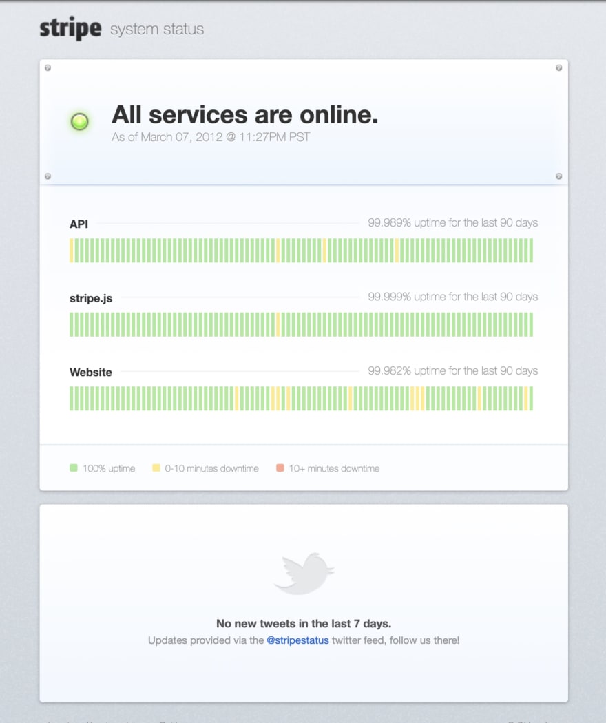
The first page was not responsive (responsive web design not being a mainstream idea at the time), but otherwise was very similar in content and style to the page we see today. It has a global indicator at top, and then a list of services with historical uptime below, and at the bottom a feed from the twitter account which was used to tweet out status updates in the event of an outage. From the post:
"We built color-coded charts that show 90-day availability in Stripe’s three core services: the site, the API, and Stripe.js. We also show the raw uptime figures, calculated over the same three-month period. To calculate the figures, we use Pingdom to monitor each service, effectively performing a complete API request in the case of the API."
The original page:
Pingdom for status checks
This first page was updated via checks from pingdom – an interesting case of avoiding building out a separate checker service when an external one was available which was good enough – this let them build the first status page quickly and see if it was something they wanted to invest more time in later. It was a small company of around 10 people and this was her first task:
"When I first joined Stripe, we were tiny – I interviewed with everyone at the company! Without the lure or credibility of Stripe’s reputation or brand, what really attracted me to the company was the team." – Amber Feng
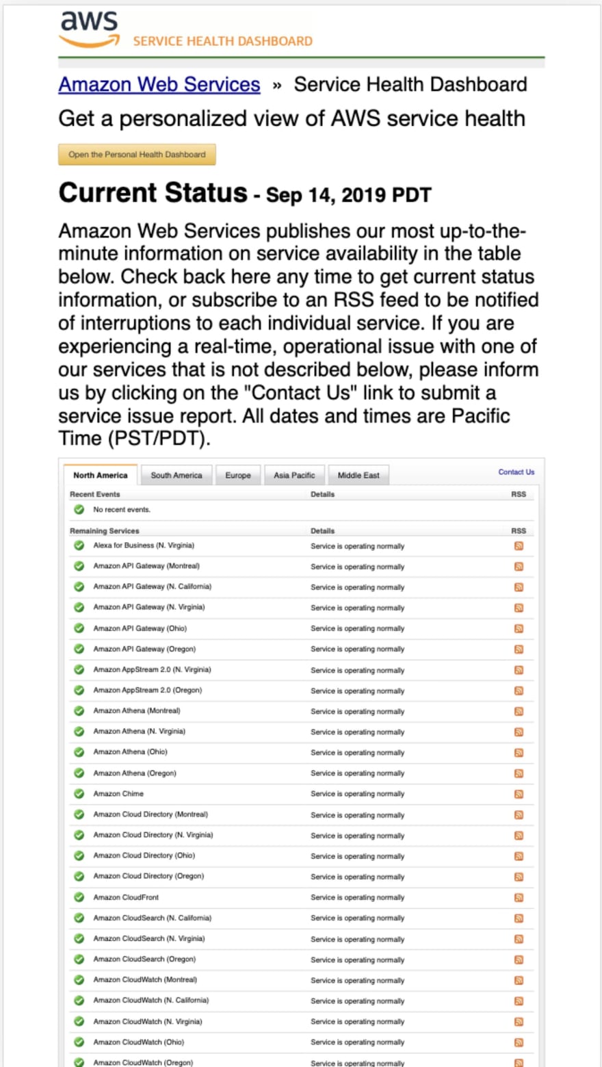
Contrast with AWS
The Amazon AWS status page provides a good counterpoint to the stripe status page. It is manually updated, non-responsive (so hard to read on phones), and hugely complex. There is no overall status and no grouping of services in a logical order, just an interminable list of services and regions. It's so long that I couldn't even take a representative screenshot, and at the top of the page is a wall of text that nobody visiting it wants to read.
The new status page
Stripe started with the smallest thing that could possibly work, and a very simple page, and it has served them well to this day. Their latest status page looks very like the original, what is most remarkable is how little has changed since the original design, which is a testament to its thoughtful simplicity:
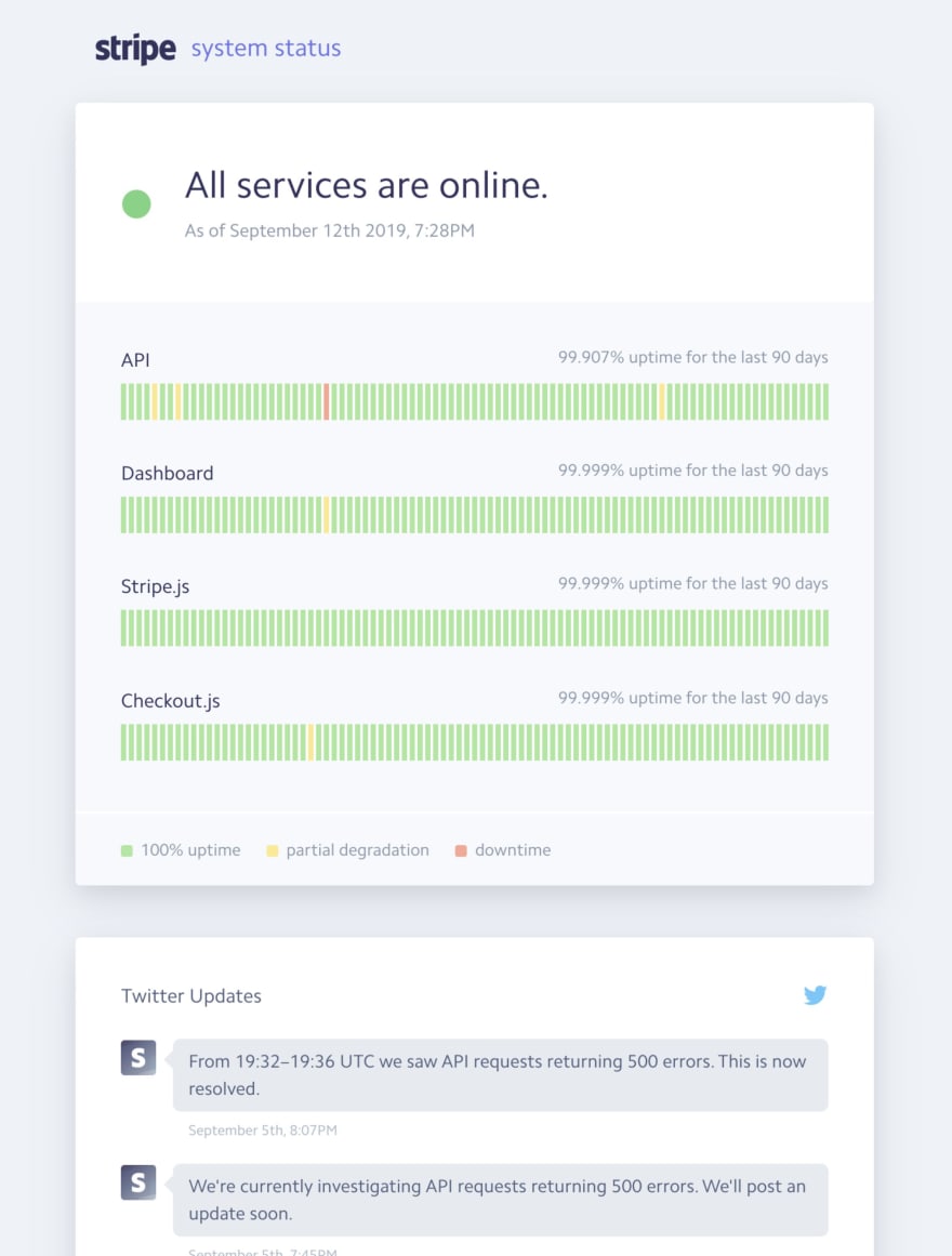
The design is so good that competing services have been heavily inspired by it. Statuspage.io, founded in 2012, offers a very similar view, clearly inspired by the stripe design to break down status by service and show the historical uptime as green or red bars summarising status per day.
You can read a longer article with more detail and images in the full case study over at Project Page, or read more on twitter.

Top comments (0)