
One of the most difficult aspects of programming is predicting how long a particular task will take. Sometimes, something that you think will take weeks takes hours instead:
But sometimes... Oh, sometimes, estimations can take a far, far darker turn. This is that tale of woe.
The Problem
In the process of putting together a particular "secret" project of mine, I found myself creating a CodeMirror theme. For those who don't know, CodeMirror is a Javascript library for creating code inputs on the web. It is incredibly well put-together, and is used by Github, Codepen, Glitch, and many more.
After spending a little too long finding some nice text colors (estimations are hard), I moved on to styling text selection. By default, the text selection styles are... fine. It's very boxy, though, and hardly elegant.
If there's anything I've learned as a developer doing design, it's that adding a little border radius can improve just about any rectangle. So, like the good, detail-oriented designer that I am, I set out to achieve a ludicrously simple goal: Add a small border-radius to the text selection in CodeMirror.
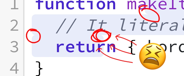
After years of rounding out rectangles, I knew that this was an easy task. 30 seconds. Tops. 1
The Solution
/* This code is infallible. */
.CodeMirror-selected {
  border-radius: 3px;
}
I wrote the code, smashed ctrl-s with a deeply satisfying mechanical click, watched webpack compile (frontend is crazy, eh?), and waited for some hot-reloaded perfection.

Oops. If you don't see it, allow me to make it clear:
Look at it! Oh, horror of horrors! This selection isn't just one rectangle... It's three!
I wasn't about to stand for such an abomination of a radius, so I set out to find a solution.
The Solution
After a few minutes, it became clear that this problem wasn't so hard after all. There are three separate rectangles, so there can be three separate sets of styles.
For the first rectangle, the top corners get a radius but the bottom ones don't:
.CodeMirror-selected:nth-of-type(1) {
  border-top-left-radius: 3px;
  border-top-right-radius: 3px;
}
Then comes the middle rectangle. It turns out that in the markup, the middle one is third, so it will be :nth-of-type(3):
.CodeMirror-selected:nth-of-type(3) {
  border-top-left-radius: 3px;
  border-bottom-right-radius: 3px;
}
And now the bottom rectangle, which should be rounded at the bottom corners:
.CodeMirror-selected:nth-of-type(2) {
  border-bottom-left-radius: 3px;
  border-bottom-right-radius: 3px;
}
And, lo and behold, it's perfect!

... Just kidding.

This one doesn't work if you make a selection of any other shape, and there's no way to detect the shape of the selection, so we're back to square one.
But I wasn't about to give up! I don't (properly) cut corners, after all.
The Solution
The main problem was that my solutions hadn't been very-context aware. I was blindly applying border-radii2, when what I really wanted was an adaptive set of rectangles which could meld into each other in a smooth way.
As a 17 year old acne attack, I've seen enough to have some pretty sage programming wisdom. Here's one piece of bug-fixing advice that has always been obvious in hindsight: Write code that describes the thing you want to do.
It's tempting to write code which is tangential to your goal; code which achieves the purposes as a side-effect of what is written. But clean code is clear and direct.
So what's the direct solution here? Well, rather than setting individual border-radii, it would be best to write some CSS which says directly, "Make the boxes gel to each other."
And you know what's wild? That solution exists.
If we add an SVG filter definition to the page:
<!-- https://css-tricks.com/gooey-effect/ -->
<svg style="display: none;">
  <defs>
    <filter id="selection-goo">
      <feGaussianBlur in="SourceGraphic" stdDeviation="1" result="blur"></feGaussianBlur>
      <feColorMatrix in="blur" mode="matrix" values="1 0 0 0 0  0 1 0 0 0  0 0 1 0 0  0 0 0 19 -9" result="goo"></feColorMatrix>
      <feComposite in="SourceGraphic" in2="goo" operator="atop"></feComposite>
    </filter>
  </defs>
</svg>
We can use it (with filter: url(#selection-goo)) on the parent of the selection divs, and it will cause the three separate boxes to be drawn to each other in just the way we want:

Check it out! Even with multiple selections, it works beautifully. It also does a little inverse border-radius effect for us at the interior corners, which looks pretty neat! (Both nice side effects of writing code that states what we want to achieve -- gooey boxes -- rather than tangential details about how to achieve it.)
The Conclusion
We have a solution. It works. For real. No gotchas. No cut corners (except the ones we want). There's probably a life lesson to be learned, although I'm not sure exactly what it is.
Is this solution a good idea? Absolutely not. It's a startlingly inefficient solution to a problem that didn't need to be solved. Applying the CSS filter takes up a pretty solid chunk of CPU (GPU?) time that could be spent on better things.
Am I going to use it anyway? Of course! I'm a web developer, and it's 2018! 3

Top comments (5)
Well written - and also funny - article. Thank you!
Maybe you can achieve the same effect without SVG filters (check here, for example), but I don't know CodeMirror enough to know if it's really possible, as it requires an extra wrapper.
One hell of a funny article. Thanks for it. :D
Attention to details is a highly valuable skill. But devil is hidden in it.
This was wonderful! 👍
Some comments may only be visible to logged-in visitors. Sign in to view all comments.