
This blog is very long to read, I have summarized every bit made the video of it, and have provided all the code on GitHub, check them out:
GitHub: https://github.com/raman04-byte/appwrite_webpage
Video: https://youtu.be/aW6firJJxSU
In this blog, we are going to make appwrite NavigationBar
In this whole project, I am going to follow MVC architecture
Let's talk about MVC architecture first and get to know what it is:
MVC (Model-View-Controller) is a popular architectural pattern used in software development to separate the concerns of an application into three distinct components: Model, View, and Controller. While Flutter primarily promotes using the "Flutter way" architecture (similar to the MVVM pattern), you can still implement an MVC-like structure if it aligns with your project's requirements and design principles.
Here's a brief explanation of how you can apply the MVC architecture in Flutter:
Model (M):
The Model represents the application's data and business logic. It is responsible for data storage, retrieval, and manipulation.
You can create Dart classes in a Flutter app to define your data models. These classes represent the data you are working with, such as user profiles, items in a shopping cart, or any other application-specific data.
Model classes do not depend on the UI or user interactions. They should be as independent and reusable as possible.
View (V):
The View is responsible for rendering the user interface (UI) and displaying data from the Model to the user. In Flutter, this is typically done using widgets.
Each screen or page in your Flutter app can have its own View component, which includes the UI layout and design.
Widgets like Text, Image, ListView, and custom widgets can be used to visually represent your app's screens.
Controller (C):
The Controller acts as an intermediary between the Model and the View. It handles user input, processes requests, and updates the Model or View accordingly.
In Flutter, you can use state management techniques like StatefulWidget or third-party state management libraries (e.g., Provider, Bloc, Riverpod) to implement the Controller part of MVC.
The Controller can handle user interactions, validate input, make API calls, and update the Model and View as needed.
Let's go to the development state of this navBar application:
First, let's take a look on pubspec.yaml file:
name: appwrite_web
description: A new Flutter project.

publish_to: 'none'

version: 1.0.0+1

environment:
  sdk: '>=3.1.2 <4.0.0'

dependencies:
  flutter:
    sdk: flutter


  cupertino_icons: ^1.0.1
  get: ^4.6.6
  flutter_svg: ^2.0.7
  google_fonts: ^6.1.0
  simple_icons: ^7.10.0
  flutter_switch: ^0.3.2

dev_dependencies:
  flutter_test:
    sdk: flutter

  flutter_lints: ^2.0.0
flutter:

  uses-material-design: true

  assets:
    - assets/
    - assets/images/
  fonts:
    - family: Inter
      fonts:
        - asset: assets/fonts/Inter-Bold.ttf
        - asset: assets/fonts/Inter-Medium.ttf
        - asset: assets/fonts/Inter-Regular.ttf
        - asset: assets/fonts/Inter-SemiBold.ttf

    - family: Poppins
      fonts:
        - asset: assets/fonts/Poppins-Bold.ttf
    - family: SourceCodePro
      fonts:
        - asset: assets/fonts/SourceCodePro-Regular.ttf
Use the latest version of the package.
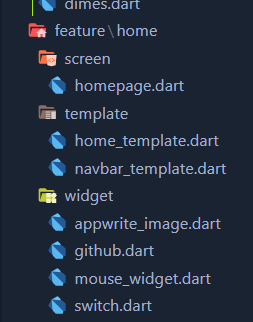
Let's look for the folder structure that we are going to follow during this development of the Appwrite Navigation bar:

Let's dive into our main.dart file:
import 'package:flutter/material.dart';

import 'app.dart';

void main() {
  WidgetsFlutterBinding.ensureInitialized();
  runApp(const App());
}
The code is the entry point for a Flutter application. It initializes Flutter's widget binding, ensuring proper initialization. It then runs the App widget as the root of the app. The App widget is likely defined in the imported app.dart file and serves as the main structure for the Flutter application, incorporating the app's logic and UI components.
Let's dive into app.dart file:
import 'package:appwrite_web/routing/namesroute.dart';
import 'package:appwrite_web/routing/webrounting.dart';
import 'package:flutter/material.dart';
import 'package:get/get.dart';
import 'package:google_fonts/google_fonts.dart';

class App extends StatelessWidget {
  const App({super.key});


  @override
  Widget build(BuildContext context) {
    return GetMaterialApp(
      debugShowCheckedModeBanner: false,
      title: 'Flutter Demo',
      theme: ThemeData(fontFamily: GoogleFonts.poppins().fontFamily),
      getPages: WebRouting().getPages(),
      initialRoute: NamesRoutes.home,
    );
  }
}
The code above defines a Flutter application named "App" using the GetX package for state management and routing. Here's a summary of what's happening in the code:
Import Statements:
The code imports various Flutter and external packages, including appwrite_web, get, and google_fonts.
App Class:
This is a Stateless widget that represents the root widget of the Flutter application.
build Method:
Inside the build method, a GetMaterialApp widget is created. This widget is used for setting up the application's core configuration.
GetMaterialApp Configuration:
debugShowCheckedModeBanner: false: Disables the debug banner in the app.
title: 'Flutter Demo': Sets the title of the app.
theme: ThemeData(fontFamily: GoogleFonts.poppins().fontFamily): Defines the app's theme. It appears to use the Google Fonts package to set the default font family to "Poppins" for the entire app.
getPages: WebRouting().getPages(): Specifies the app's routes and pages. It seems to use a WebRouting class to define the routing configuration.
initialRoute: NamesRoutes.home: Sets the initial route for the app, likely pointing to the "home" route defined in NamesRoutes.
Overall, the code initializes a Flutter app with a specific theme and routing configuration using the GetX package. The routing setup appears to be based on the WebRouting class and the app starts with the "home" route defined in NamesRoutes.
Let's look into the routing of the web application:
Since we have only one screen now our routing code will look like this using the Get package:

namesroute.dart:
class NamesRoutes {
  static const String home = '/homeScreen';
}
webrouting.dart:
import 'package:appwrite_web/feature/home/screen/homepage.dart';
import 'package:appwrite_web/routing/namesroute.dart';
import 'package:get/get.dart';

class WebRouting {
  List<GetPage<dynamic>> getPages() {
    return [
      GetPage(
        name: NamesRoutes.home,
        page: ()=> const HomePage(),
      ),
    ];
  }
}
The code above defines the routing configuration for a Flutter web application using the GetX package. Here's a summary of what's happening in the code:
Import Statements:
The code imports several packages, including appwrite_web, get, and specific Dart files related to routing and screen navigation.
WebRouting Class:
This class is responsible for defining the routing configuration for the application.
getPages Method:
getPages is a method that returns a list of GetPage objects. These objects define the routes and associated screens/pages for the application.
Route Configuration:
Inside the getPages method, a list of GetPage objects are created to specify the available routes in the application.
The provided code includes one route configuration:
GetPage for the "home" route:
name: NamesRoutes.home: Assigns a name to the route, which is likely defined in the NamesRoutes file.
page: () => const HomePage(): Specifies the page/screen associated with the "home" route. In this case, it points to the HomePage widget, which is marked as a constant (const).
Overall, this code defines the routing configuration for the Flutter web application, associating the "home" route with the HomePage widget. Additional routes and pages can be added to the getPages method as needed to navigate between different parts of the application.
Let's dive into how we can make our webpage dynamic in nature by making it responsive:
// ignore_for_file: deprecated_member_use

import 'dart:ui';

import 'package:flutter/material.dart';

class Dimensions {
  static double get screenHeight {
    return WidgetsBinding.instance.window.physicalSize.height /
        window.devicePixelRatio;
  }

  static double get screenWidth {
    return WidgetsBinding.instance.window.physicalSize.width /
        window.devicePixelRatio;
  }

  static double scaleH(double value) {
    return value * ((screenHeight) / 740);
  }

  static double scaleW(double value) {
    return value * ((screenWidth) / 360);
  }
}
The code above defines a Dart class named Dimensions that provides utility functions for handling screen dimensions and scaling values in a Flutter application. Here's a summary of what this code does:
Import Statements:
The code imports the dart:ui and package:flutter/material.dart libraries.
Dimensions Class:
Dimensions is a utility class used for managing screen dimensions and scaling in the application.
screenHeight and screenWidth Properties:
These are static properties that calculate the height and width of the screen, respectively, taking into account the device's pixel ratio.
They use WidgetsBinding.instance.window.physicalSize to get the physical size of the window and divide it by window.devicePixelRatio to obtain the screen dimensions.
scaleH and scaleW Methods:
These are static methods that allow for scaling values based on screen dimensions.
scaleH takes a value as input and scales it proportionally based on the screen's height (740 is a reference height used for scaling).
scaleW takes a value as input and scales it proportionally based on the screen's width (360 is a reference width used for scaling).
Overall, this utility class can be used to make your Flutter application responsive by scaling values according to the screen dimensions. It's often used to create layouts and designs that adapt well to different screen sizes and resolutions.
Now our main part is here, let's look into our main code which we are going make:
homepage.dart:
import 'package:appwrite_web/feature/home/template/home_template.dart';
import 'package:flutter/material.dart';

class HomePage extends StatefulWidget {
  const HomePage({super.key});

  @override
  State<HomePage> createState() => HomePageState();
}

class HomePageState extends State<HomePage> {
  @override
  Widget build(BuildContext context) {
    return const Scaffold(
      backgroundColor: Color(0xFF181c2c),
      body: HomeTemplate(),
    );
  }
}
This code defines a Flutter widget named HomePage and its corresponding state, HomePageState. Here's a summary of what this code does:
Import Statements:
The code imports package:appwrite_web/feature/home/template/home_template.dart for the HomeTemplate widget and package:flutter/material.dart for Flutter components.
HomePage Widget:
HomePage is a StatefulWidget, which means it can have a mutable state. It's used to represent a specific page or screen in the Flutter app.
HomePageState Class:
HomePage has an associated state class, HomePageState, which extends State. This class is responsible for defining the build method and handling the state of the HomePage widget.
build Method:
The build method is overridden to return a Scaffold widget.
The Scaffold widget provides the basic structure for a screen, including app bars, navigation drawers, and the main content area.
backgroundColor:
The Scaffold has a background color set to Color(0xFF181c2c), which appears to be a custom color defined in hexadecimal notation.
body:
The body of the Scaffold is set to a HomeTemplate widget. This means that the content of this home page is provided by the HomeTemplate widget.
HomeTemplate:
The HomeTemplate widget is likely responsible for defining the layout and content of the home page, but its implementation details are not shown in this code snippet.
In summary, this code sets up a HomePage widget with a dark background color and associates it with a HomeTemplate to define the content and layout of the home page within a Scaffold structure.
home_template.dart:
import 'package:appwrite_web/feature/home/template/navbar_template.dart';
import 'package:flutter/cupertino.dart';
import 'package:flutter/material.dart';


class HomeTemplate extends StatefulWidget {
  const HomeTemplate({super.key});

  @override
  State<HomeTemplate> createState() => _HomeTemplateState();
}

class _HomeTemplateState extends State<HomeTemplate> {
  @override
  Widget build(BuildContext context) {
    return const Column(
      children: [
        NavbarContainer()
      ],
    );
  }
}
The build method of the HomeTemplate widget returns a Column widget with a single child, which is the NavbarContainer. This structure suggests that the HomeTemplate is likely used to define the layout for a page, and it includes a navigation bar as part of its content.
navbar_template.dart :
import 'package:flutter/material.dart';

import '../../../constants/assets.dart';
import '../../../constants/dimes.dart';
import '../widget/appwrite_image.dart';
import '../widget/github.dart';
import '../widget/mouse_widget.dart';
import '../widget/switch.dart';

class NavbarContainer extends StatefulWidget {
  const NavbarContainer({super.key});

  @override
  State<NavbarContainer> createState() => _NavbarContainerState();
}

class _NavbarContainerState extends State<NavbarContainer> {
  @override
  Widget build(BuildContext context) {
    return Container(
      width: MediaQuery.of(context).size.width,
          height: Dimensions.scaleH(100),
          color: const Color(0xFF171d37),
          child: Padding(
            padding: EdgeInsets.symmetric(
              horizontal: Dimensions.scaleW(12),
              vertical: Dimensions.scaleH(20),
            ),
            child: Row(
              mainAxisAlignment: MainAxisAlignment.spaceBetween,
              crossAxisAlignment: CrossAxisAlignment.start,
              children: [
                Row(
                  children: [
                    const AppWriteImage(
                      imagePath: Assets.image1,
                    ),
                    Padding(
                      padding: EdgeInsets.only(left: Dimensions.scaleW(7)),
                      child: const Row(
                        children: [
                          MouseEvent(text: "Docs"),
                          MouseEvent(text: "Community"),
                          MouseEvent(text: "Pricing"),
                          GitHubLogo()
                        ],
                      ),
                    ),
                  ],
                ),
                Row(
                  children: [
                    const ToogleSwitch(),
                    MouseRegion(
                      cursor: SystemMouseCursors.click,
                      child: Padding(
                        padding: EdgeInsets.only(
                          left: Dimensions.scaleW(10),
                          right: Dimensions.scaleH(10),
                        ),
                        child: Text(
                          "Sign In",
                          style: TextStyle(
                              color: const Color(0xFFc4d8eb),
                              fontSize: Dimensions.scaleH(15)),
                        ),
                      ),
                    ),
                    MouseRegion(
                      cursor: SystemMouseCursors.click,
                      child: Padding(
                        padding: EdgeInsets.only(
                          right: Dimensions.scaleW(15),
                        ),
                        child: Container(
                          height: Dimensions.scaleH(50),
                          width: Dimensions.scaleW(23),
                          decoration: BoxDecoration(
                              borderRadius: BorderRadius.circular(50),
                              color: const Color(0xFFc7d8eb)),
                          alignment: Alignment.center,
                          child: Text(
                            "Sign Up",
                            style: TextStyle(
                                color: const Color(0xFF171d37),
                                fontSize: Dimensions.scaleH(15)),
                          ),
                        ),
                      ),
                    )
                  ],
                )
              ],
            ),
          ),
    );
  }
}
This code defines a NavbarContainer widget, which represents a container for a navigation bar in a Flutter app. Here's a summary of what's happening in this code:
The NavbarContainer widget is a StatefulWidget that manages its state using _NavbarContainerState.
In the build method, a Container widget is returned. This container serves as the background for the navigation bar.
The container has a set width and height, determined by the screen dimensions and scaling factors from the Dimensions class.
The container's background color is set to a dark blue color with a hexadecimal value.
Inside the container, there is a Padding widget, which adds padding to its child widgets.
Within the Padding widget, there are two Row widgets placed side by side.
The first Row contains a AppWriteImage widget, an image asset, and a row of MouseEvent widgets representing links like "Docs," "Community," and a GitHub logo.
The second Row contains a ToogleSwitch widget (possibly for enabling/disabling a feature), a "Sign In" text, and a "Sign Up" button with customized styling.
The styling, colors, and layout of these widgets are adjusted using dimensions and colors from the Dimensions class and constants imported from other files.
Overall, this code defines the structure and styling of a navigation bar (NavbarContainer) for a Flutter app, including links, buttons, and images.
Now let's work on our widget folder:

appwrite_image.dart:
import 'package:flutter/material.dart';
import 'package:flutter_svg/flutter_svg.dart';

import '../../../constants/dimes.dart';

class AppWriteImage extends StatefulWidget {
  final String imagePath;
  const AppWriteImage({super.key, required this.imagePath});

  @override
  State<AppWriteImage> createState() => _AppWriteImageState();
}

class _AppWriteImageState extends State<AppWriteImage> {
  bool isHovered = false;
  @override
  Widget build(BuildContext context) {
    return MouseRegion(
      cursor: SystemMouseCursors.click,
      onEnter: (_) {
        setState(() {
          isHovered = true;
        });
      },
      onExit: (_) {
        setState(() {
          isHovered = false;
        });
      },
      child: Padding(
        padding: EdgeInsets.only(top: Dimensions.scaleH(15),left: Dimensions.scaleW(13)),
        child: SvgPicture.asset(
          widget.imagePath,
          fit: BoxFit.contain,
          height: Dimensions.scaleH(30),
        ),
      ),
    );
  }
}
This code defines a AppWriteImage widget that displays an SVG image. Here's an explanation of the code:
AppWriteImage is a StatefulWidget that takes an imagePath as a required parameter. This path specifies the location of the SVG image to be displayed.
_AppWriteImageState manages the state of the widget, particularly tracking whether the mouse pointer is hovering over the image.
In the build method:
MouseRegion is used to detect mouse hover events. When the mouse pointer enters the region, it sets the isHovered state to true, and when it exits, it sets it to false.
Inside, a Padding widget adds some spacing to the top and left of the image.
SvgPicture.asset is used to display the SVG image specified by widget.imagePath. It's configured to fit the container BoxFit.contain and has a specific height based on the Dimensions.scaleH(30) value.
Overall, this code creates a reusable AppWriteImage widget that can display SVG images. It also adds interactivity by changing the isHovered state when the mouse enters or exits the image area. This state change can be used for various purposes, such as highlighting the image when hovered.
github.dart:
import 'package:flutter/material.dart';
import 'package:simple_icons/simple_icons.dart';

import '../../../constants/dimes.dart';

class GitHubLogo extends StatefulWidget {
  const GitHubLogo({super.key});

  @override
  State<GitHubLogo> createState() => _GitHubLogoState();
}

class _GitHubLogoState extends State<GitHubLogo> {
  bool isHovered = false;
  @override
  Widget build(BuildContext context) {
    return MouseRegion(
      cursor: SystemMouseCursors.click,
      onEnter: (_) {
        setState(() {
          isHovered = true;
        });
      },
      onExit: (_) {
        setState(() {
          isHovered = false;
        });
      },
      child: Padding(
        padding: EdgeInsets.only(
          left: Dimensions.scaleW(6),
          top: Dimensions.scaleH(15),
        ),
        child: Container(
          height: Dimensions.scaleH(30),
          decoration: BoxDecoration(
            border: Border(
              bottom: BorderSide(
                  width: 1,
                  color: isHovered ? Colors.white : Colors.transparent),
            ),
          ),
          child: Row(
            children: [
              Icon(
                SimpleIcons.github,
                color: const Color(0xFFc7d8eb),
                size: Dimensions.scaleH(15),
              ),
              Padding(
                padding: EdgeInsets.only(left: Dimensions.scaleW(2)),
                child: Text(
                  "GitHub",
                  style: TextStyle(
                    color: const Color(0xFFc7d8eb),
                    fontSize: Dimensions.scaleH(15),
                  ),
                ),
              ),
              Padding(
                padding: EdgeInsets.only(
                  left: Dimensions.scaleW(2),
                ),
                child: Container(
                  decoration: BoxDecoration(
                    color: const Color(0xFF81859b),
                    borderRadius: BorderRadius.circular(5),
                  ),
                  height: Dimensions.scaleH(22),
                  width: Dimensions.scaleW(8),
                  alignment: Alignment.center,
                  child: Text(
                    "33k",
                    style: TextStyle(
                      // color: const Color(0xFFc4cbd8),
                      color: Colors.white,
                      fontSize: Dimensions.scaleH(13),
                    ),
                  ),
                ),
              ),
            ],
          ),
        ),
      ),
    );
  }
}
This code defines a GitHubLogo widget that displays a GitHub icon along with related text and statistics. Here's an explanation of the code:
GitHubLogo is a StatefulWidget that doesn't have any required parameters.
_GitHubLogoState manages the state of the widget, tracking whether the mouse pointer is hovering over it.
In the build method:
MouseRegion is used to detect mouse hover events. When the mouse pointer enters the region, it sets the isHovered state to true, and when it exits, it sets it to false.
Inside, a Padding widget adds some spacing to the left and top of the widget.
A Container widget is used to create a container for the GitHub logo, text, and statistics. It has a specific height based on Dimensions.scaleH(30).
The container has Border a BorderSide that becomes visible when the widget is hovered (isHovered). This creates an underlying effect for the text.
Inside the container, there is a Row widget with the following children:
An Icon widget displaying the GitHub icon from the SimpleIcons package. It has a specific color and size based on Dimensions.scaleH(15).
A Text widget with the text "GitHub," styled with a specific color and font size.
Another Container widget with a background color, border radius, and text displaying statistics like "33k."
Overall, this code creates a reusable GitHubLogo widget that can display a GitHub icon, text, and statistics, with interactivity for mouse hover effects. The appearance and behavior of the widget can be customized using the Dimensions color constants defined in the app.
mouse_widget.dart:
import 'package:appwrite_web/constants/dimes.dart';
import 'package:flutter/material.dart';

class MouseEvent extends StatefulWidget {
  final String text;
  const MouseEvent({super.key, required this.text});

  @override
  State<MouseEvent> createState() => _MouseEventState();
}

class _MouseEventState extends State<MouseEvent> {
  bool isHovered = false;
  @override
  Widget build(BuildContext context) {
    return MouseRegion(
      cursor: SystemMouseCursors.click,
      onEnter: (_) {
        setState(() {
          isHovered = true;
        });
      },
      onExit: (_) {
        setState(() {
          isHovered = false;
        });
      },
      child: Padding(
        padding: EdgeInsets.only(
          left: Dimensions.scaleW(4),
          top: Dimensions.scaleH(20),
        ),
        child: Container(
          height: Dimensions.scaleH(30),
          decoration: BoxDecoration(
            border: Border(
              bottom: BorderSide(
                  width: 1,
                  color: isHovered ? Colors.white : Colors.transparent),
            ),
          ),
          child: Text(
            widget.text,
            style: TextStyle(
              fontSize: Dimensions.scaleH(15),
              color: const Color(0xFFc7d8eb),
            ),
          ),
        ),
      ),
    );
  }
}
This code defines a MouseEvent a widget that represents an interactive text element typically used for links or navigation items. Here's an explanation of the code:
MouseEvent is a Stateful widget that takes a required text parameter, which specifies the text content of the widget.
_MouseEventState manages the state of the widget, tracking whether the mouse pointer is hovering over it.
In the build method:
MouseRegion is used to detect mouse hover events. When the mouse pointer enters the region, it sets the isHovered state to true, and when it exits, it sets it to false.
Inside, a Padding widget adds some spacing to the left and top of the widget.
A Container widget is used to create a container for the text. It has a specific height based on Dimensions.scaleH(30).
The container has Border a BorderSide that becomes visible when the widget is hovered (isHovered). This creates an underlying effect for the text.
Inside the container, there is a Text widget displaying the widget.text. The text is styled with a specific font size and color.
Overall, this code creates a reusable MouseEvent widget for displaying interactive text elements that can respond to mouse hover events. The appearance and behavior of the widget can be customized using the Dimensions color constants defined in the app.
switch.dart:
import 'package:appwrite_web/constants/dimes.dart';
import 'package:flutter/material.dart';

import 'package:flutter_switch/flutter_switch.dart';

class ToogleSwitch extends StatefulWidget {
  const ToogleSwitch({super.key});

  @override
  State<ToogleSwitch> createState() => _ToogleSwitchState();
}

class _ToogleSwitchState extends State<ToogleSwitch> {
  bool state = false;
  @override
  Widget build(BuildContext context) {
    return MouseRegion(
      cursor: SystemMouseCursors.click,
      child: FlutterSwitch(
        height: Dimensions.scaleH(24),
        width: Dimensions.scaleW(11),
        value: state,
        padding: 2.0,
        activeToggleColor: Colors.white,
        inactiveToggleColor: const Color(0xFF2F363D),
        activeColor: const Color(0xFFe2e2e2),
        inactiveColor: const Color(0xFFc7d8eb),
        activeIcon: const Icon(
          Icons.wb_sunny,
          color: Color(0xFF8f8f8f),
        ),
        inactiveIcon: Transform.rotate(
          angle: 200,
          child: const Icon(
            Icons.nightlight_round,
            color: Color(0xFFbec3e0),
          ),
        ),
        onToggle: (val) {
          setState(() {
            state = val;
          });
        },
      ),
    );
  }
}
This code defines a ToogleSwitch a widget that displays a toggle switch with a customizable appearance and interactivity. Here's an explanation of the code:
ToogleSwitch is a StatefulWidget that doesn't require any parameters.
_ToogleSwitchState manages the state of the widget, specifically tracking whether the switch is in an "on" or "off" state.
In the build method:
MouseRegion is used to detect mouse click events on the widget, allowing the user to toggle the switch.
Inside the MouseRegion, a FlutterSwitch widget is used to create the toggle switch. The FlutterSwitch widget is highly customizable and provides options for controlling its appearance and behavior.
The height and width properties of the switch are set based on scaled dimensions using Dimensions.scaleH and Dimensions.scaleW.
The value property of the switch represents its state (on or off), and it is controlled by the state variable in the widget's state.
The padding the property adds spacing around the switch.
Various colors are customized for the active and inactive states, toggle colors, and icons.
Icons (Icons.wb_sunny and Icons.nightlight_round) are used to represent the on and off states of the switch. The icons can also be customized with colors.
The onToggle callback is used to update the state variable when the switch is toggled. This callback is triggered when the user interacts with the switch.
Overall, this code creates a reusable ToogleSwitch widget that provides a customizable toggle switch with interactivity. The appearance and behavior of the switch can be adjusted using the provided properties and callback function.
Hence our NavBar Appwrite website is completed

Top comments (0)