Did you know that great screenshots are the most effective way to market your app? That’s because the human brain can process images 60,000 times faster than words — meaning people will make a split decision on whether or not to download your app not by your description, but by your images.
This is why having great screenshots on the app store can be the tipping point between a potential user downloading or clicking away.
Because they’re so important, we recommend using device mockups so that clients can picture using your app in a real-world environment. Screenshots are great, but mockups go the extra step to allow users to picture interacting with your app in their day to day lives.
Let’s walk through how to effectively use mockups to market your app.
Choosing effective mockups
Hawaiian Airlines iPhone App Store screenshots
With so many options out there, it’s important to pick mockups that really make your app stand out. These mockups should be high-resolution, easy to edit and versatile.
Depending on where you’ll make your app available, you may need any or all of the following: iPhone mockups, device mockups, device frames, clay devices, clay mockups, iPad mockups, iMac mockups, Macbook mockups.
Once you pick your mockups and insert your screenshots into the templates, you need to market them as effectively as possible in the app store(s). There are a few best practices to follow.
Follow the app store guidelines
Both the iOS and Google Play stores have strict guidelines that you must follow before you can submit an app. Make sure you follow them To a T so you have no issues during the review.
iOS and Play stores also vary significantly in how they display apps. Google Play, for example, showcases a featured image in a banner-like fashion at the top of an app’s page. iOS, on the other hand, favors descriptions. Keep this in mind when choosing your mockups.
iPhone templates are especially useful as the iOS store has many more requirements than the Play store. In iOS. Any number of things can hold up your review, and if you’re working on a deadline, you can’t afford to wait.
Highlight the main benefits over the main features
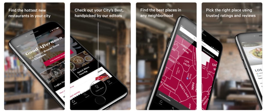
Zagat iPhone App Store screenshots
People want to know how your app is going to make their life better or easier. While the fact that you have 1000+ items for sale is great, it doesn’t explain why your app is better than your competitors.
In order to display benefits, you can add text to your screenshots that clearly outline why your app is the best choice.
For example, if you made an e-commerce app, you can explain how your services better connect sellers with buyers. Or, explain how your checkout process is faster than your competitors.
The order in which you display your screenshots matters
Be wary of randomly ordering your screenshots. Most people make a decision after seeing only two screenshots, so the first two are paramount.
People also understand content better when it’s displayed in a story-like fashion. If possible, order your screenshots in a way that has a defined start, middle, and end.
With the same e-commerce example, you could display the general product page first, followed by a specific product chosen, and end with the purchase page. A simple, effective story. The easier it is to understand, the more likely somebody will download.
Demonstrate how exactly the app works
It’s equally as important to demonstrate how your app will work once downloaded. If an app is impossible to figure out, it will get deleted faster than the time it took to install it.
In order to guarantee success, your app needs to be easy-to-use, interactive, friendly and non-complex. And the only way to guarantee a user feels confident that it will check all these boxes is to explain it well in screenshots.
If you created a game, for example, write the instructions on your screenshots (i.e. tap here to start, press this to power up, press here to exit).
Again, the easier it is to understand, the more excited people will be to download it.
Be descriptive
While words don’t matter as much as screenshots, they’re still important.
Screenshots give a visual representation and words describe exactly what is happening in the image. The goal is to pair a descriptive and captivating image with an equally descriptive text. That way, a reader gets the whole picture, literally.
Conclusion
How you display your app in the app store is extremely important. Because users who can visually picture themselves using your app in the real world are more likely to download, using effective mockups is key.
The right mockups can make or break your app’s success. Visit our store to check out our latest mockups that have helped hundreds of people find success in the app stores.


Top comments (0)