
Prepare your coffee or tea and let's get ready to go through the first design story, part of the 32 Design Stories series.
In this article, we're going to take a dive into learning about different human capabilities when it comes to the perception and how it influences the designs we are creating. This article is based on a lecture I had at the beginning of my course in HCI. It will be more theoretical than I planned, but I think it will be useful to get to know different theories, build upon that and then get to play around with some examples. It's funny how when I started studying these I was getting tired of all the theories and now I see the importance of all of them when thinking about design. And this is the point of this series - going back through all the material and extract the most interesting and important bits that I can then build upon and apply later in my projects.
Perception
Even though we as humans can do amazing things with our bare hands, we got where we are today based on our ability to create tools to help us in the day to day life. You will hear this a lot in HCI, but one of the most sophisticated tools we are referring to in this domain is, of course, the computer. Even though there are advancements in different AI algorithms to make computers smarter, at the end of the day the computer is still meant to be used to help humans accomplish goals faster. What I'm trying to get to here is that we have capabilities such as our perception of the world that influences how we create these tools. Knowing more about how we perceive the world means that we can design better tools.
Our perception capability is based on how we gather information from the world. This is done through our senses like vision, hearing, smell, touch and taste.
We are actually processing a lot of data every second:
- With our eyes, 10 million bps
- With our skin, 1 million bps
- With our ears, 100 000 bps
- With our nose, 100 000 bps
- With our tongue, 1000 bps
So in total, our brain's bandwidth is of about 11 million bits/second. Naturally, perception becomes of great importance to HCI and related fields like Human Factors because then the design can take into consideration how humans communicate with the world around them. Since we're concentrating on HCI, we're going to look more into how humans communicate with computers, in particular, and how the design is influenced by this. The main sense we're going to look at is the vision.
Vision
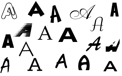
When it comes to vision, we as humans are super good at recognising patterns. Take the image below as an example where you can easily recognise all the letters in the image below as the letter "A" even though the letters vary in size and shapes. The fcat taht yuo cna raed tish aslo prooevs taht hmuans aer cool.
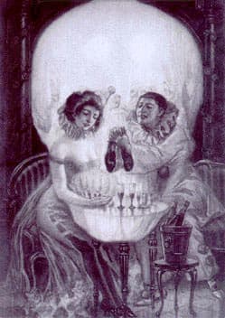
This superpower can also play tricks on us with things in the form of what we call optical illusions. Take the image below as an example. What do you see?
These are all interesting observations because it hints that we can see things better if we group them. If we can't see patterns, it will be hard to understand and navigate the world around us and will create confusion in multiple scenarios. All these observations were the basis of a psychology school that was founded at the beginning of the 20th century called Gestalt Psychology.
Gestalt Psychology
Max Wertheimer, Kurt Koffka, and Wolfgang Köhler founded the Gestalt Psychology school which studied human perception and created a theoretical framework and methodology around it. The theory is based on the following principles:
- The whole is more than the sum of the parts
- The isomorphism principle or the similarity of structures
- The organisational principle
From my experience in HCI, the last principle is the most important one when it comes to design. This principle is split into proximity, similarity, continuity, closure and good form. You might find these under different names depending on what site you stumble upon, but don't worry too much about it as the meaning is the same. So let's see what these mean:
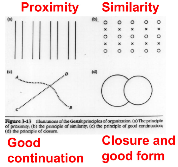
Proximity
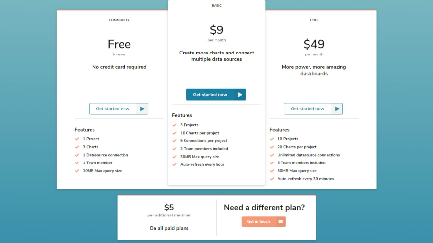
Because we're so used to seeing patterns we tend to group items together based on the distance between them. If you look in the image above, you can notice right away 4 pairs of lines instead of 8 lines. To better illustrate this, let's think of a website UI where you group cards to better convey information. In the example below, you can see pricing plans grouped together in a row and then underneath there's more information about member pricing. The way you would read this is influenced by the position of the cards. You will most likely explore the different plans and only then look at the details. On top of this, both sections are close to each other because they both refer to pricing. The rest of the elements on the page are further apart to differentiate themselves from the pricing section.
Similarity
We also tend to group items together by how similar they are with each other. This works in the example above as well. The 3 pricing plans cards all look similar and our brain instantly sees them as a group. The members' section is clearly referring to something other than pricing plans because it looks different. The picture above combines Proximity and Similarity to better convey the information. You might say that this is straightforward and that you do that without thinking about these terms and I 100% believe you. Don't forget that these principles were developed in the first part of the 20th century and website design evolved just "recently". Now all good practices are based on these theories even though most designers don't know about these principles.
Continuity
The best example other than the picture above is a song. When you hear a song you don't hear every single note, you hear the entire melody, the continuity of the notes. In the example above, you don't notice every dot at first, you firstly see two lines intersecting each other. In UI design this is mostly reflected through the proper alignment of items on the page.
Closure and good form
This is mostly reflected in the way we perceive messages from shapes. In the principles picture above, we can clearly notice that the image shows two circles and that one of them is on top of the other. I actually had to think a bit how this can be used in website UI design as I couldn't remember the examples we went through in the class when we covered these principles. Luckily, I found this article by Eleana very interesting to read for more details and examples of how Gestalt principles can be used in website UI design. The closure and good form principles can be reflected by using iconography to convey quick messages on web pages.
Conclusion
Human perception studies were and still are paramount to how Human Factor-related design evolves. The UI design is made for human use and it makes complete sense to know how we perceive different things. We have pattern recognition superpowers and our design should reflect this. I find it very interesting now that I look at all the websites out there and most use Gestalt principles in their design. I don't think this is all due to the studies done in the first part of the 20th century though. I'm a firm believer that even without knowing about these studies we inevitably let our design be guided by how we perceive the UI as we put everything together. Is that enough? Maybe not, I think having theoretical knowledge can help tremendously. And, of course, having the practice takes you on a whole different level.
The next article will explore human memory capabilities and how to design for the different situations. Stay tuned for next Friday and don't forget to subscribe to the newsletter to get a notification when I post a new part in the Design Stories series.
Until next time,
-Raz ✌
Follow me on Twitter if you want to get in touch - DMs are open 📬
Cover Photo by Daniil Kuželev on Unsplash

Top comments (0)