
Last week I shared that I was embarking on a journey to create 100 CSS images in 100 days - I started with little to no knowledge (beyond the more everyday CSS I do for frontend development work), and so needless to say every day I am learning a lot.
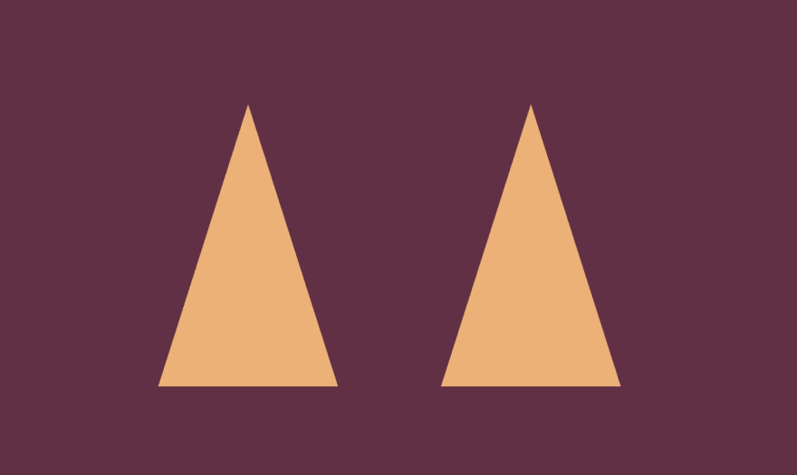
I thought I'd share some of those learnings as I progress through the 100 days, and this post is about the ears of this pupper that I made for Day 2:
I found the process to create those ear shapes quite challenging, but these are the steps that eventually worked for me.
Disclaimer: I doubt that this is the "best" way to create these shapes - like I say I'm still learning lots 😄
Step 1: Create the basic ear shape
First up I declare two div elements. I gave both of them a shared class 'ear' and their own class 'left-ear' and 'right-ear' - as so:
  <div class="left-ear ear"></div>
  <div class="right-ear ear"></div>
For reasons that I'll go into during a later step, I'm going to use the ::before and ::after pseudo elements to actually create the orange and pink parts of the ear, rather than the main '.ear' div itself.
A quick interlude on ::before and ::after
These are pseudo elements that allow you to insert more content onto the page using CSS only. You can read more about it at this CSS Tricks article, but the tl;dr is that what we'll end up with will be a little like:
<div class="left-ear ear">
  ::before element appears here
  ::after element appears here
</div>
Bear in mind this order of appearance when creating CSS images, especially if you're looking to overlay one on top of the other. In this ear example, we want the pink inner ear to appear on top of the orange outer ear, so we will use the ::before element for the orange outer ear, and the ::after element for the inner pink.
NB: for a ::before or ::after element to be visible on the page, you need to add content: ''. Otherwise CSS detects there is no content, so does nothing with the styles.
Back to creating the ear triangles
There are a few ways in CSS to create triangles. One option is to use the border-width property on a div with 0 height and width. There's a nice article on CSS Tricks about this: CSS Triangle.
For this task however I used clip-path, which literally 'clips' a rectangular div to only show what's inside of a specific shape. Creating clip-paths manually from the top of your head can be a bit tricky, but there's a great tool called Clippy that can generate one for you - I've been using this a lot!
My CSS and progress so far then is:
.ear {
  position: absolute;
  top: 10px;
  height: 220px;
  width: 140px;
  background: var(--background-color);
}

.left-ear {
  left: 120px;
}

.right-ear {
  right: 120px;
}

/* Shared main orange outer ear styles */
.ear::before {
  content: '';
  position: absolute;
  background: var(--orange-fur-color);
  width: 100%;
  height: 100%;
  clip-path: polygon(50% 0%, 0% 100%, 100% 100%);
}
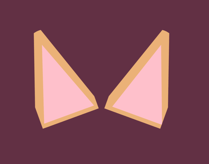
Step 2 - add the inner-ear pink
Now I can make use of the ::after pseudo element to add the pink inner ear. I didn't want the inner triangle to be too perfectly a replica of the outer triangle, so I changed up the clip-path property ever so slightly to give a different angle. I then offset the position of the inner pink so that the inner and outer ear have slightly different thickness to each other.
Here's the CSS for the inner ears, and what the work in progress looks like so far now:
.ear::after {
  content: '';
  bottom: 10px;
  position: absolute;
  background: pink;
  width: 95%;
  height: 80%;
  clip-path: polygon(50% 0, 6% 100%, 100% 100%);
}

.left-ear::after {
  right: -20px;
}

.right-ear::after {
  left: 20px;
}

Step 3 - rotate the ears
I don't want the ears to be quite so straight-up-and-down, so I rotated them 20 degrees in each direction, as so:
.left-ear {
  left: 120px;
  transform: rotate(-20deg);
}

.right-ear {
  right: 120px;
  transform: rotate(20deg);
}

(don't worry about the very bottom of the ears overlapping - I'll fix that in a later step)
Step 4 - Mask the pointiness
Corgis have super cute big pointy ears, but they're not spikey! I wanted to mask some of the pointy-ness and not have quite so perfect a triangular shape, and this is the reason I haven't used the main .ear div element for the orange and pink detail.
I can mask the top point of the ear by adding a border-radius to that parent element, and hiding the overflow, so our .ear class now looks like:
.ear {
  position: absolute;
  top: 10px;
  height: 220px;
  width: 140px;
  border-radius: 50% 50% 0 0;
  overflow: hidden;
  background: var(--background-color);
}
I'm going to move my outer ears (.ear::before) up a bit now using top: -25px to push the triangle up enough that it overflows the parent element, which is going to hide the overflow of its curved edges.
Even better, I'd like to give the outer edge of the ears a more straight shape, so we don't have such exact triangles all the way down. In the CSS snippet above, you'll see I only set the border-radius to 50% on the top two corners, with the lower two corners remaining straight/square. Now when I increase the size of my outer ears and tweak the positioning to move the triangle further towards the outside edges, it's forced to overflow again, this time over straight edges.
The CSS for my orange outer ears now looks like:
.ear::before {
  content: '';
  position: absolute;
  top: -25px;
  background: var(--orange-fur-color);
  width: 130%;
  height: 120%;
  clip-path: polygon(50% 0%, 0% 100%, 100% 100%);
}

.left-ear::before {
  left: -25px;
}

.right-ear::before {
  right: -25px;
}
At this point I also tweaked the inner pink ear position to fit a bit nicer now that the outer ear has changed shape slightly:
.left-ear::after {
  right: 8px;
}

.right-ear::after {
  left: 8px;
}
... which all results in:
Hang on, what?
To help illustrate how the changes in this step helped create the overall shape you see, take a look at how this would look if the .ear class had a white background:

Or if it had both a white background, and I removed the overflow: hidden line from the CSS:

I think this makes it a bit easier to see how overflow:hidden combined with the border-radius properties helped me to create the end shape.
The ears are done!
So that's the corgi ears. Check out the CodePen with the final product to see where the other elements came into play (which I found a lot more straightforward).
I learned a lot trying to accomplish this shape, and I'm sure there are far better ways to do it - every day I'm learning new things and I look forward to looking back on this one and realising all the ways I could have done it more efficiently!!

Oldest comments (4)
Woah, that's a great break-down! Keep going :)
That is so great! I haven't worked with clip-path much and have put it on my to do list.
I would love to join you're challenge, but sadly I'm neck deep in other projects. But you inspired me to share a tutorial I wrote on the Easter weekend. I'm curious what you draw next :) Greetings from Germany
Not so much, as clip path cuts it off. CSS Tricks has a nice article with alternatives though: Using box shadow and clip path