
With the growing demand for accessible designs, comes the challenges choose the right colours.
Index
How do we see color?
Guide to perfecting the design
It's more than color to help
Tools
Suggestions
Conclusion
Color blindness (color vision deficiency) is the decreased ability to see color or differences in color.
Males are more likely to be color blind than females, because the genes responsible for the most common forms of color blindness are on the X chromosome.
How do some of us see colors differently ?
Color is the way our eyes and brains perceive light. As the light enters our eyes it hits our retina where the light-sensitive cells, rods and cones are present.
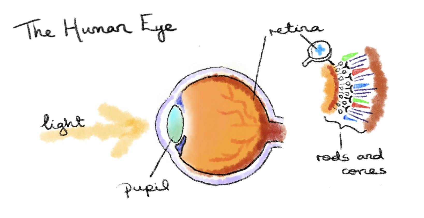
image source:daisymolving
- Cone cells are used in color vision and require a brightly lit environment
- Rods, which detect dim light and are used for night vision so cones are responsible for the colors we see
Cones are of 3 types L, M, and S cones. Each type of cone reacts a different amount to different wavelengths. here is the graph of how each of them reacts differently.

If yellow lights enter the eye then L will react a lot, M reacts a little, and S doesn't react, all of these signals to the brain that its yellow.
Now depending on which type of cone cells and by how much someone is missing results in different types of color blindness, a reduced ability to distinguish between certain colors.
Red-green color blindness
Red–green color blindness affects up to 1 in 12 males (8%) and 1 in 200 females (0.5%)
There are 4 types based on red and green color.
- Deuteranomaly is the most common amongst them, making green look more red. This type is mild and doesn't usually get in the way of normal activities.
- Protanomaly makes red look more green and less bright. This type is also mild.
- Protanopia and deuteranopia both make you unable to tell the difference between red and green at all. basically more severe cases of the above two.

-Outer ring represents the colors to normal eye and inner circle has same colors but it shows how colorblind see it-
Blue-yellow color blindness
- Tritanomaly makes it hard to tell the difference between blue and green, and between yellow and red.
- Tritanopia makes you unable to tell the difference between blue and green, purple and red, and yellow and pink. It also makes colors look less bright.
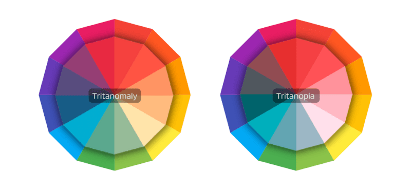
-Outer ring represents the colors to normal eye and inner circle has same colors but it shows how colorblind see it-
Complete color blindness
If you have complete color blindness, you can't see colors at all. This is also called monochromacy, and it's quite uncommon. so things are grayscaled for them.
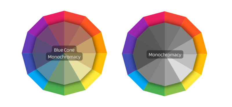
-Outer ring represents the colors to normal eye and inner circle has same colors but it shows how colorblind see it-
So how can designs be more inclusive?
Choose colors that everyone can distinguish if not then have some way that they can still get the information clearly.
To do this here is the guide:
Base concept:
The first thing that needs to be taken care of is contrast, if contrast is maintained properly, anyone can read the text easily. WCAG Web Content Accessibility Guidelines are part of a series of web accessibility guidelines published by the Web Accessibility Initiative (WAI) of the World Wide Web Consortium (W3C), the main international standards organization for the Internet. They are a set of recommendations for making Web content more accessible, primarily for people with disabilities.It has defined the minimum contrast ratio for graphic and user interface components it has three levels depending on the user type. here you can check the contrast and have a look at brief info they have on actual numbers to help you choose your WCAG level. for details you can see guidlines.
WCAG guidelines is a good practice for clear designs that every designer should follow
Monochromatic
image source:Ben Barnhart
Stick to one color and experiment with its shades like how dark or light the color is, ranging from black to white, and play with saturation a bit. the best thing about a monochromatic color scheme is that colors are guaranteed to look cohesive. to generate monochromatic palettes easiest way is to work with HSV/HSB/HSI.

image:from Wikimedia Commons
In HSV models,
Hue is the easiest one; it's basically just another word for "color."
Saturation refers to intensity—in other words, whether the color appears more subtle or more vibrant.
Value has to do with how dark or light the color is, ranging from black.
So just keep the hue same and play around with saturation and value to get the mono palette
OR
Just select a color and this monochromatic colors generator will generate the palette for you.
Color combination but with different shades
If you have planned to use more than one hue then there is one thing to keep in mind, not only use different colors but also keep the shades of those colors different from each other as well.
Light red cannot be used with light green as red and green appear the same to some people, but you can use dark red with light green , the intensity of the color is different so they will appear different.
Avoid these color combination
- Green & blue
- Blue & gray
- Blue & Purple
- Pink, turquoise, and grey
- Red, green, and brown see how they appear in color blind vision

Use patterns and texture
If you can't change colors then use patterns to make a way to distinguish them or a color coding system. in a color coding system, you assign shapes to colors.This could be done in bar graphs or in maps.

Example: that metro maps we see are not color-blind freindly
solution: for different routes different type of lines could be used like dashed,dotted,chain,zig-zag,double lines etc..
Texture adds a new dimension to the design, like for water in dackdrop with blue color add wave texture too.
image:Siang Ching
If the color is supposed to evoke a certain vibe or emotion then use texture does that for you very well. Textures don't need to have a lot of contrast with background color.

image:steakmob
Use symbols
For every event/function you are planning in your design make sure that change in color is not the only indication of that event being active or inactive.
In Spotify for the repeated button on being active not only the color changes but also a small dot appears at the bottom of it. use symbols to convey the emotion, for danger with red color use the symbol of it.

Tips:
Use HSV/ HSL /HSI color model
It is better to use one of these models as at any point slight changes in the saturation, tint, brightness, lightness can be done easily. while being in RGB it is much more difficult to change shades while sticking to the main color(hue).Here Check out the blog post on Color models and color space for better understanding of how these model are different from each other and how they work.
Check every functionality of the design in grayscale mode
there are extensions for that in browsers and for offline work, every windows/mac/Linux has themes for color blindness in settings type grayscale or go to color filters in settings.
Avoid giving info only when you hover or it
I'll explain this with 2 examples
- In amazon, you get to see the name of color only when you hover over it, now it's a bit irritating to hover over every color to find what you are looking for.

solution: use dropdown menu which has the colors with their names and when user hover over the colour it show colour names to indicate it to the user that for the name use the dropdown menu, if the question is the space constraint then someone will only look in the dropdown menu only when they need it

- Links between texts and the linked images again keep hovering on every word till the cursor changes. solution: underline the linked text and add a linked symbol for linked images
For backgrounds
Reduce the opacity of the image to increase the contrast making the text easier to read. Or use shadows on texts to enhance it a bit.
Tools that will help in the process:
Tools I found to work best all together:
who can use (preffered)
This tools does all tells you contrast ratio, if it passes WCAG Grading in general and also individualy for all types of color-blindness.Colorbox
Takes time to get the hang of it but Worth checking it out, Generate color palettes in HSV and color curves with the contrast level mentioned and a preview of the text. you can work on more than one palette at a time. You can get all sorts of combinations between the bound colors you choose.Coblis
Shows your images will appear to people with color blindness, good to check your background images.For local/offline works you can change the theme of your windows/mac/Linux in the settings to any vision
-
For testing your website for color-blindness in browser
- you right-click anywhere in the webpage and then select Inspect. Or, press F12. DevTools opens next to the webpage
- .Press Esc to open the Drawer at the bottom of DevTools. Click the + icon at the top of the Drawer to see the list of tools, and then select Rendering.In the Emulate vision deficiencies dropdown list, select the vision you want to emulate

Other valuable tools that can come in handy:
Khroma
Not the ideal but still,
With Khroma, you get to train an AI algorithm by choosing 50 colors that you like. Make sure in setting to toggle WCAG color on to block the failing colors note: color palettes are not color blind friendly. they depend on the colors you selectedAdobe Accessiblity
Shows the color palette in all color blind filters and tells if they are safe to use. But can use only 5 colors at a timeDalton only in chrome
An extension to apply color blindness filters to your webpagecontrast checker, who can use
To check the contrast for readability of textLink contrast checker
To check the contrast on embedded links between texts
Suggestion:
For times when you have to use a photo of an apple on the tree(red+green)
- color enhancer only in chrome
There are color adjustment extensions where by just sliding a bar user can enhance the colors if have a difficult in distinguishing otherwise, you can suggest in beginning for users to use. I know this takes a thought and space in your design but I am sure you can find space somewhere for suggesting this perhaps when they hover over the image. It is the extra step you take that count.
Conclusion:
Choose whatever colors you like but make sure they serve the purpose of being different. use patterns, textures, symbols, and contrasting shades of different colors, and with the tools available keep testing them. And if stuck remember monochromatic isn't a bad idea to start with.

Top comments (0)