
Part 6 of the series: "Extending bpmn-io Form-JS Beyond Its Limits"
Form-JS ships with a simple boolean toggle for disabled, readonly, and required. You click it on or off. That's the entire control.
For a basic form, this is fine. For a form that needs to dynamically disable a field when a condition is met — when status = "closed", when role != "manager", when amount > threshold — a boolean toggle is not enough. You need a control that accepts both a static boolean and a FEEL expression, switching between them depending on what the designer needs.
I needed this for all three properties. Building the enhanced control was straightforward. Getting it to appear in the panel instead of the default control — without both appearing simultaneously — took three hours and a lot of console logging.
This article documents exactly what I learned.
The Problem
The naive approach to adding an enhanced entry is to just add it. You register a provider, implement getGroups, push your enhanced entry into the relevant group. Done.
Except it's not done. You now have two entries for disabled in the panel: the original Form-JS boolean toggle, and your new FEEL-capable toggle. Both render. Both write to the same property. They conflict in confusing ways.
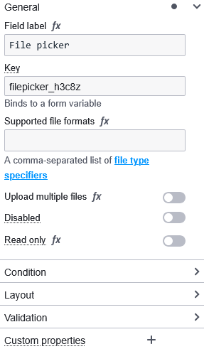
General group — what you see before just adding your entry:

What you want:
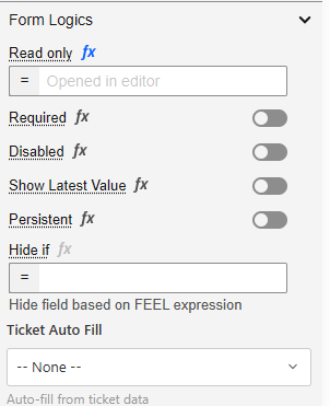
General / Form Logics group — what you want:

The problem has two parts. First, you need to remove the existing entry before adding yours. Second, you need to know the ID of the entry you're removing — and those IDs are not documented.
What I Tried First
My first attempt was to simply register at a higher priority and trust that mine would win:
// ❌ Attempt 1: High priority alone
export class DisabledPropertiesProvider {
  constructor(propertiesPanel) {
    propertiesPanel.registerProvider(this, 1000); // High priority
  }

  getGroups(element, editField) {
    return (groups) => {
      const generalGroup = groups.find(g => g.id === 'general');
      generalGroup.entries.push({
        id: 'my-disabled-entry',
        component: MyDisabledEntry,
        // ...
      });
      return groups;
    };
  }
}
Result: two entries. Priority controls execution order, not deduplication. Running at priority 1000 means you run after the built-ins — you see what they added — but you don't automatically replace anything. The built-in entry is still there.
My second attempt was to add mine first at low priority and hope Form-JS wouldn't add its own:
// ❌ Attempt 2: Low priority to run first
propertiesPanel.registerProvider(this, 100);
Result: still two entries. Form-JS adds its entries regardless of whether similar entries already exist. It doesn't check for duplicates.
My third attempt was to replace the entries array entirely:
// ❌ Attempt 3: Replacing the entries array
generalGroup.entries = [{
  id: 'my-disabled-entry',
  component: MyDisabledEntry,
  // ...
}];
Result: all other entries in general disappeared. Key, label, description — all gone. I replaced the whole array when I only wanted to remove one item.
The correct approach is surgical: run at high priority so you can see what's already there, filter out specifically the entries you want to replace, then add yours.
The Solution: Find, Filter, Replace
Step 1: Find the Entry IDs You Need to Remove
Before you can filter entries out, you need to know their IDs. Form-JS does not document these. The technique from Article 5 applies here: use a debug provider to inspect the panel at runtime.
// Temporary debug provider — add to additionalModules, select a field, check console
export class DebugProvider {
  constructor(propertiesPanel) {
    propertiesPanel.registerProvider(this, 1000);
  }

  getGroups(field, editField) {
    return (groups) => {
      console.log('=== All Entry IDs ===');
      groups.forEach(group => {
        console.log(`\nGroup: "${group.id}"`);
        (group.entries || []).forEach(entry => {
          console.log(`  "${entry.id}"`);
        });
      });
      return groups;
    };
  }
}
DebugProvider.$inject = ['propertiesPanel'];
Running this against a textfield with no custom providers registered produces:
Group: "general"
  "key"
  "label"
  "description"
  "disabled"     ← Form-JS built-in disabled toggle
  "readonly"     ← Form-JS built-in readonly toggle

Group: "condition"
  "conditionExpression"

Group: "validation"
  "required"     ← Form-JS built-in required toggle
  "minLength"
  "maxLength"
  "pattern"

Group: "appearance"
  "appearance-placeholder"
The three IDs you need for the most common overrides:
| Property | Form-JS Built-in ID | Location |
|---|---|---|
| Disabled | 'disabled' |
general group |
| Readonly | 'readonly' |
general group |
| Required | 'required' |
validation group |
Now run the debug provider again after you've added your own custom providers. You'll also see your own entry IDs:
In my system, logic-disabled, logic-readonly, and logic-required are my own entry IDs — not Form-JS built-ins. I chose the logic- prefix as a naming convention to distinguish my entries from the built-ins.
These appear because I have multiple providers in my system:
- A lower-priority provider adds the
logic-disabledentry toform-logics - A higher-priority override provider needs to clean up both the Form-JS built-in (
disabled) and any version of my own entry (logic-disabled) before adding the final version
This is why the filter removes two IDs per property — not because they're both built-ins, but because your system may have added an entry at one priority that a higher-priority provider needs to clean up and replace.
Step 2: Understand Why You Filter Across ALL Groups
The instinct is to only filter the group where you know the entry lives. disabled is in general, so filter general. But this breaks in two ways.
First: Over Form-JS versions, entries may move between groups. The required entry has appeared in both general and validation across different versions. Filtering only validation would miss it if it's in general in the user's version.
Second: Your own entries may be in a different group than the built-in. The Form-JS disabled entry is in general. My logic-disabled entry is in form-logics. If I only filter general, I remove the built-in but leave my own duplicate from a previous registration.
The safe approach is to filter all groups:
// ✅ Filter across ALL groups — safe, version-resilient
groups.forEach(group => {
  if (group?.entries) {  // ← Safety check — not all groups have entries
    group.entries = group.entries.filter(entry =>
      entry.id !== 'disabled' &&
      entry.id !== 'logic-disabled'
    );
  }
});
The safety check group?.entries is not optional. Some groups in the panel don't have an entries array — they may have other structures. Calling .filter() on undefined throws and crashes the panel silently.
Step 3: Why Priority 1000 Alone Is Not Enough
Priority controls when your provider's middleware function runs in the chain. It does not control deduplication, filtering, or replacement.
Priority 500 (Form-JS built-ins) run:
  → groups.general.entries now contains: ['key', 'label', 'description', 'disabled', 'readonly']
  → groups.validation.entries now contains: ['required', ...]

Priority 1000 (your provider) runs:
  → You receive groups with all the above entries already present
  → You can SEE the built-in entries
  → You can REMOVE them with filter
  → You can ADD your replacement
  → Priority alone did none of this — you have to do it explicitly
Priority 1000 gives you the opportunity to override. It doesn't do the override for you.
Step 4: The Complete Override Implementation
Here is the complete implementation for all three overrides — disabled, readonly, and required — as they exist in my production system:
// DisabledPropertiesProvider.js

import { DisabledEntry } from './DisabledEntry';

export class DisabledPropertiesProvider {
  constructor(propertiesPanel, eventBus, injector) {
    this._propertiesPanel = propertiesPanel;
    this._eventBus = eventBus;
    this._injector = injector;

    // ✅ Priority 1000 — runs after Form-JS built-ins at 500
    propertiesPanel.registerProvider(this, 1000);
  }

  getGroups(element, editField) {
    return (groups) => {
      const SUPPORTED_TYPES = [
        'textfield', 'textarea', 'number', 'select',
        'radio', 'checkbox', 'checklist', 'taglist',
        'datetime', 'date', 'time', 'dropdown',
        'datagrid', 'button', 'gridfield', 'fileupload', 'newImageView'
      ];

      // ✅ Step 1: Remove entries we're replacing — filter ALL groups
      groups.forEach(group => {
        if (group?.entries) {
          group.entries = group.entries.filter(entry =>
            // Remove Form-JS built-in
            entry.id !== 'disabled' &&
            // Remove our own entry added by a lower-priority registration
            entry.id !== 'logic-disabled'
          );
        }
      });

      // ✅ Step 2: Only add our replacement for supported types
      if (!SUPPORTED_TYPES.includes(element.type)) {
        return groups;
      }

      // ✅ Step 3: Get or create the Form Logics group
      let formLogicsGroup = groups.find(g => g.id === 'form-logics');
      if (!formLogicsGroup) {
        formLogicsGroup = {
          id: 'form-logics',
          label: 'Form Logics',
          entries: []
        };
        const generalIndex = groups.findIndex(g => g.id === 'general');
        const insertIndex = generalIndex >= 0 ? generalIndex + 1 : 0;
        groups.splice(insertIndex, 0, formLogicsGroup);
      }

      // ✅ Step 4: Add our enhanced entry
      // unshift puts it at the beginning of the group entries
      const disabledEntries = DisabledEntry({
        field: element,
        editField,
        eventBus: this._eventBus,
        injector: this._injector
      });
      formLogicsGroup.entries.unshift(...disabledEntries);

      return groups;
    };
  }
}

DisabledPropertiesProvider.$inject = ['propertiesPanel', 'eventBus', 'injector'];
// ReadonlyPropertiesProvider.js

import { ReadonlyEntry } from './ReadonlyEntry';

export class ReadonlyPropertiesProvider {
  constructor(propertiesPanel, eventBus, injector) {
    this._propertiesPanel = propertiesPanel;
    this._eventBus = eventBus;
    this._injector = injector;
    propertiesPanel.registerProvider(this, 1000);
  }

  getGroups(element, editField) {
    return (groups) => {
      const SUPPORTED_TYPES = [
        'textfield', 'textarea', 'number', 'select',
        'radio', 'checkbox', 'checklist', 'taglist',
        'datetime', 'date', 'time', 'dropdown',
        'datagrid', 'button', 'gridfield', 'fileupload', 'newImageView'
      ];

      // ✅ Filter across all groups — removes built-in AND any
      // duplicate from a lower-priority provider registration
      groups.forEach(group => {
        if (group?.entries) {
          group.entries = group.entries.filter(entry =>
            entry.id !== 'readonly' &&
            entry.id !== 'logic-readonly'
          );
        }
      });

      if (!SUPPORTED_TYPES.includes(element.type)) {
        return groups;
      }

      let formLogicsGroup = groups.find(g => g.id === 'form-logics');
      if (!formLogicsGroup) {
        formLogicsGroup = {
          id: 'form-logics',
          label: 'Form Logics',
          entries: []
        };
        const generalIndex = groups.findIndex(g => g.id === 'general');
        const insertIndex = generalIndex >= 0 ? generalIndex + 1 : 0;
        groups.splice(insertIndex, 0, formLogicsGroup);
      }

      const readonlyEntries = ReadonlyEntry({
        field: element,
        editField,
        eventBus: this._eventBus,
        injector: this._injector
      });
      formLogicsGroup.entries.unshift(...readonlyEntries);

      return groups;
    };
  }
}

ReadonlyPropertiesProvider.$inject = ['propertiesPanel', 'eventBus', 'injector'];
// RequiredPropertiesProvider.js

import { RequiredEntry } from './RequiredEntry';

export class RequiredPropertiesProvider {
  constructor(propertiesPanel, eventBus, injector) {
    this._propertiesPanel = propertiesPanel;
    this._eventBus = eventBus;
    this._injector = injector;
    propertiesPanel.registerProvider(this, 1000);
  }

  getGroups(element, editField) {
    return (groups) => {
      const SUPPORTED_TYPES = [
        'textfield', 'textarea', 'number', 'select',
        'radio', 'checkbox', 'checklist', 'taglist',
        'datetime', 'date', 'time', 'dropdown',
        'datagrid', 'button', 'gridfield', 'fileupload', 'newImageView'
      ];

      // ✅ Migrate legacy boolean at top-level `required` to validate.required
      // This handles schemas created before the enhanced provider existed
      if (SUPPORTED_TYPES.includes(element.type)) {
        if (typeof element.required === 'boolean') {
          const v = { ...(element.validate || {}) };
          if (element.required) v.required = true;
          else delete v.required;
          editField(element, ['validate'], v);
          editField(element, ['required'], undefined);
        }
        // Expression wins — drop static validate.required if FEEL expression present
        if (typeof element.required === 'string' &&
            element.required.trim().startsWith('=')) {
          const v = { ...(element.validate || {}) };
          if ('required' in v) {
            delete v.required;
            editField(element, ['validate'], v);
          }
        }
      }

      // ✅ Remove built-in required entry AND our own lower-priority version
      groups.forEach(group => {
        if (group?.entries) {
          group.entries = group.entries.filter(entry =>
            entry.id !== 'required' &&
            entry.id !== 'logic-required'
          );
        }
      });

      if (!SUPPORTED_TYPES.includes(element.type)) {
        return groups;
      }

      let formLogicsGroup = groups.find(g => g.id === 'form-logics');
      if (!formLogicsGroup) {
        formLogicsGroup = {
          id: 'form-logics',
          label: 'Form Logics',
          entries: []
        };
        const generalIndex = groups.findIndex(g => g.id === 'general');
        const insertIndex = generalIndex >= 0 ? generalIndex + 1 : 0;
        groups.splice(insertIndex, 0, formLogicsGroup);
      }

      const requiredEntries = RequiredEntry({
        field: element,
        editField,
        eventBus: this._eventBus,
        injector: this._injector
      });
      formLogicsGroup.entries.unshift(...requiredEntries);

      return groups;
    };
  }
}

RequiredPropertiesProvider.$inject = ['propertiesPanel', 'eventBus', 'injector'];
The Enhanced Entry Implementations
The override providers above call DisabledEntry, ReadonlyEntry, and RequiredEntry — factory functions that return entry definition objects. Here is what each one looks like.
All three use the same pattern: a FeelToggleSwitchEntry that accepts both a static boolean and a FEEL expression, storing them in separate schema paths:
// DisabledEntry.js
import { get } from 'min-dash';
import { useService } from '@bpmn-io/form-js';
import { FeelToggleSwitchEntry, isFeelEntryEdited } from '@/formjs/propertiesPanel';

const INPUTS = [
  'textfield', 'textarea', 'number', 'select',
  'radio', 'checkbox', 'checklist', 'taglist',
  'datetime', 'date', 'time', 'dropdown',
  'datagrid', 'button', 'gridfield', 'fileupload', 'newImageView'
];

export function DisabledEntry(props) {
  const { editField, field, eventBus } = props;

  return [{
    // ✅ My custom ID — named consistently for use in the filter
    id: `logic-disabled-${field.id}`,
    component: LogicDisabled,
    editField,
    field,
    eventBus,
    isEdited: isFeelEntryEdited,
    isDefaultVisible: (field) => INPUTS.includes(field.type)
  }];
}

function LogicDisabled(props) {
  const { editField, field, id, eventBus } = props;
  const debounce = useService('debounceInput') ?? ((fn) => fn);

  let variables = [];
  try {
    const variablesService = useService('variables');
    if (variablesService) {
      const vars = variablesService();
      if (Array.isArray(vars)) variables = vars.map(name => ({ name }));
    }
  } catch (err) {}

  const getValue = () => {
    // ✅ Expression takes priority over static boolean
    const expr = get(field, ['disabledExpression'], '');
    if (typeof expr === 'string' && expr.trim().length > 0) {
      return expr;
    }
    return get(field, ['disabled'], false);
  };

  const setValue = (value) => {
    if (typeof value === 'string' && value.trim().startsWith('=')) {
      // FEEL expression path
      editField(field, ['disabledExpression'], value);
      editField(field, ['disabled'], false); // ✅ Clear static to avoid conflict
    } else {
      // Static boolean path
      editField(field, ['disabled'], !!value);
      // ✅ Clear expression to avoid conflict
      if (typeof field.disabledExpression === 'string') {
        editField(field, ['disabledExpression'], undefined);
      }
    }
  };

  return FeelToggleSwitchEntry({
    debounce,
    element: field,
    eventBus,
    feel: 'optional',
    getValue,
    id,
    label: 'Disabled',
    tooltip: 'Toggle disabled or enter a FEEL expression (e.g., =status = "closed")',
    setValue,
    variables
  });
}
// ReadonlyEntry.js — same pattern, different paths
export function ReadonlyEntry(props) {
  const { editField, field, eventBus } = props;

  return [{
    id: `logic-readonly-${field.id}`,
    component: LogicReadonly,
    editField,
    field,
    eventBus,
    isEdited: isFeelEntryEdited,
    isDefaultVisible: (field) => INPUTS.includes(field.type)
  }];
}

function LogicReadonly(props) {
  const { editField, field, id, eventBus } = props;
  const debounce = useService('debounceInput') ?? ((fn) => fn);

  let variables = [];
  try {
    const variablesService = useService('variables');
    if (variablesService) {
      const vars = variablesService();
      if (Array.isArray(vars)) variables = vars.map(name => ({ name }));
    }
  } catch (err) {}

  const getValue = () => {
    // readonly stores expression and static boolean in the same path
    // using the FeelToggleSwitchEntry convention
    return get(field, ['readonly'], '');
  };

  const setValue = (value) => {
    editField(field, ['readonly'], value || false);
  };

  return FeelToggleSwitchEntry({
    debounce,
    element: field,
    eventBus,
    feel: 'optional',
    getValue,
    id,
    label: 'Read only',
    tooltip: 'Toggle read-only or enter a FEEL expression (e.g., =role != "editor")',
    setValue,
    variables
  });
}
// RequiredEntry.js — different storage paths, same pattern
export function RequiredEntry(props) {
  const { editField, field, eventBus } = props;

  return [{
    id: `logic-required-${field.id}`,
    component: LogicRequired,
    editField,
    field,
    eventBus,
    isEdited: isFeelEntryEdited,
    isDefaultVisible: (field) => INPUTS.includes(field.type)
  }];
}

function LogicRequired(props) {
  const { editField, field, id, eventBus } = props;
  const debounce = useService('debounceInput') ?? ((fn) => fn);

  let variables = [];
  try {
    const variablesService = useService('variables');
    if (variablesService) {
      const vars = variablesService();
      if (Array.isArray(vars)) variables = vars.map(name => ({ name }));
    }
  } catch (err) {}

  const getValue = () => {
    // ✅ Expression takes priority
    const expr = get(field, ['requiredExpression'], '');
    if (typeof expr === 'string' && expr.trim().length > 0) {
      return expr;
    }
    // Fall back to static validate.required
    return get(field, ['validate', 'required'], false);
  };

  const setValue = (value) => {
    if (typeof value === 'string' && value.trim().startsWith('=')) {
      // FEEL expression path
      editField(field, ['requiredExpression'], value);
      // ✅ Clear static required to avoid conflict
      const v = { ...(field.validate || {}) };
      if ('required' in v) delete v.required;
      editField(field, ['validate'], v);
    } else {
      // Static boolean path
      const boolVal = !!value;
      const v = { ...(field.validate || {}) };
      if (boolVal) v.required = true;
      else delete v.required;
      editField(field, ['validate'], v);
      // ✅ Clear expression to avoid conflict
      if (typeof field.requiredExpression === 'string') {
        editField(field, ['requiredExpression'], undefined);
      }
    }
  };

  return FeelToggleSwitchEntry({
    debounce,
    element: field,
    eventBus,
    feel: 'optional',
    getValue,
    id,
    label: 'Required',
    tooltip: 'Toggle required or enter a FEEL expression (e.g., =category = "other")',
    setValue,
    variables
  });
}
Before and After
Here is the complete before/after showing what the panel looks like in each scenario.
Before — only Form-JS built-ins, no custom providers:
General
  ├── key
  ├── label
  ├── description
  ├── [Disabled]    ← boolean toggle only
  └── [Read only]   ← boolean toggle only

Validation
  └── [Required]    ← boolean toggle only
After — naive approach (just adding entries without removing defaults):
General
  ├── key
  ├── label
  ├── description
  ├── [Disabled]          ← Form-JS boolean toggle (still here)
  └── [Read only]         ← Form-JS boolean toggle (still here)

Form Logics
  ├── [Disabled (FEEL)]   ← Your enhanced version (also here)
  └── [Read only (FEEL)]  ← Your enhanced version (also here)

Validation
  ├── [Required]          ← Form-JS boolean toggle (still here)
  └── [Required (FEEL)]   ← Your enhanced version (also here)
After — correct approach (filter then replace):
General
  ├── key
  ├── label
  └── description

Form Logics
  ├── [Required (FEEL)]   ← Your version with FEEL support
  ├── [Read only (FEEL)]  ← Your version with FEEL support
  └── [Disabled (FEEL)]   ← Your version with FEEL support
The built-in entries are gone. Only your enhanced versions appear. The Form Logics group is new — created by your providers because you moved the entries there for better organization.
The General Pattern for Overriding Any Default Entry
The pattern I've shown for disabled, readonly, and required applies to any default entry you want to override. Here it is abstracted:
export class OverrideProvider {
  constructor(propertiesPanel) {
    // ✅ Always priority 1000 for overrides
    propertiesPanel.registerProvider(this, 1000);
  }

  getGroups(element, editField) {
    return (groups) => {

      // ✅ Step 1: Discover the IDs to remove
      // Use the debug provider from Article 5 to find these
      const ENTRY_IDS_TO_REMOVE = [
        'built-in-entry-id',    // Form-JS built-in (found via debug provider)
        'my-custom-entry-id'    // Your own entry from a lower-priority provider
      ];

      // ✅ Step 2: Filter across ALL groups with safety check
      groups.forEach(group => {
        if (group?.entries) {
          group.entries = group.entries.filter(entry =>
            !ENTRY_IDS_TO_REMOVE.includes(entry.id)
          );
        }
      });

      // ✅ Step 3: Guard against unsupported field types
      if (!SUPPORTED_TYPES.includes(element.type)) {
        return groups;
      }

      // ✅ Step 4: Find or create target group
      let targetGroup = groups.find(g => g.id === 'your-target-group');
      if (!targetGroup) {
        targetGroup = {
          id: 'your-target-group',
          label: 'Your Group',
          entries: []
        };
        const insertAfter = groups.findIndex(g => g.id === 'general');
        groups.splice(insertAfter + 1, 0, targetGroup);
      }

      // ✅ Step 5: Add your replacement entry
      targetGroup.entries.push({
        id: `your-replacement-entry-${element.id}`, // ✅ Always include field.id
        component: YourEnhancedComponent,
        field: element,
        editField,
        isEdited: yourIsEditedFunction,
      });

      return groups;
    };
  }
}

OverrideProvider.$inject = ['propertiesPanel'];
Five steps, always in this order:
- Identify IDs — use the debug provider
- Filter all groups — with safety check, remove both built-in and your own duplicate
- Guard field type — only add replacement for supported types
- Find or create group — where your replacement lives
-
Add replacement — with unique ID including
field.id
Why the Filter Comes Before the Type Guard
Notice in the implementation that the filter runs before the type guard check:
return (groups) => {
  // ✅ Filter first
  groups.forEach(group => {
    if (group?.entries) {
      group.entries = group.entries.filter(entry =>
        entry.id !== 'disabled' &&
        entry.id !== 'logic-disabled'
      );
    }
  });

  // Type guard second
  if (!SUPPORTED_TYPES.includes(element.type)) {
    return groups; // Return with built-ins removed, no replacement added
  }

  // Add replacement third
  // ...
};
This is intentional. For field types that are NOT in SUPPORTED_TYPES — a custom field that shouldn't have a disabled toggle at all — you still want to remove the Form-JS built-in. You just don't add a replacement.
If you put the type guard first and return early, the built-in entry survives for unsupported field types. For most cases this doesn't matter. For custom field types where you've explicitly decided the property doesn't apply, leaving the built-in creates confusing UX.
Filter first, guard second, add replacement third.
The Tradeoffs
The filter is destructive. You're removing entries from groups that other code may depend on. If Form-JS or a third-party extension expects the 'disabled' entry to exist and reads it directly, your filter breaks that assumption. In practice this is rare — entry IDs are internal — but it's worth being aware of.
Built-in entry IDs can change between Form-JS versions. The debug provider technique gives you the IDs for your current version. When you upgrade Form-JS, run the debug provider again. The filter using stale IDs will silently fail to remove the old entry, resulting in the double-entry problem returning.
The Form-JS built-in entries write to the same schema paths your enhanced entries write to. If a user had a form created before your override was deployed — with disabled: true set by the original toggle — your enhanced entry reads that value correctly because the getValue function checks both the expression path and the static path. Forward compatibility is handled. Backward compatibility with forms created by the original toggle is also handled as long as getValue checks both paths.
Moving entries between groups changes the visual organization. The original disabled and readonly are in General. You move them to Form Logics. Form designers who were used to finding them in General won't find them there anymore. This is a UX tradeoff you're making deliberately — grouping all logic-related properties together — but it should be a conscious choice.
What Comes Next
You can now remove and replace any default entry in the properties panel. The next article covers what goes inside the replacement entries — specifically the toggle-or-FEEL pattern that makes a single control accept both a static boolean and a FEEL expression, storing them in separate schema paths without conflict.
Article 7 covers FeelToggleSwitchEntry in depth: the dual-path getValue and setValue, why you must clear the other path on every write, and how the runtime evaluators read both paths to determine the effective value at form execution time.
This is Part 6 of "Extending bpmn-io Form-JS Beyond Its Limits." The series covers the complete architecture for production-grade Form-JS extensions — the documentation that doesn't exist yet.
Tags: camunda bpmn formjs properties-panel form-editor override javascript devex

Top comments (0)