Introduction
In today's digital age, web responsiveness is essential. With diverse devices and screen sizes, businesses must adapt for a seamless user experience. In this article, we'll explore the significance of responsive design, its benefits, best practices, and tools.

The Significance of Responsive Design:
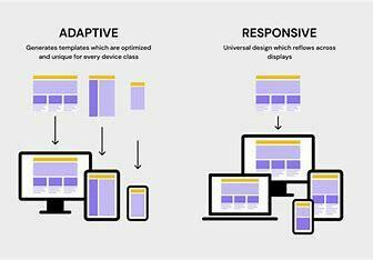
Responsive design refers to a flexible and adaptive approach to web design and development. It focuses on creating websites that seamlessly adapt to different screen sizes and resolutions, whether accessed on a desktop, laptop, tablet, or smartphone. With the majority of internet users now browsing through mobile devices, responsiveness has become a critical element for success in the online world.
Benefits of Responsive Design:
Enhanced User Experience: Responsive websites offer a consistent and optimized experience across various devices, eliminating the need to zoom in or scroll extensively. This ensures that users can easily navigate and interact with the content, ultimately leading to increased engagement and satisfaction.
Improved Search Engine Optimization (SEO): Search engines favor responsive websites as they provide a better browsing experience for mobile users. Responsive design eliminates the need for separate mobile and desktop versions, simplifying the website structure and making it easier for search engine algorithms to crawl and index content. This can boost your website's visibility and ranking in search engine results.

Cost and Time Efficiency: Responsive design allows businesses to maintain a single website that automatically adapts to different devices. It eliminates the need for creating and managing multiple versions, reducing development costs, time, and effort. Furthermore, updates and modifications can be made more efficiently, as they only need to be implemented once for all platforms.
Best practices for achieving web responsiveness
Mobile-First Approach: Start designing and developing for mobile devices first, ensuring a seamless experience on smaller screens. Then progressively enhance the design for larger screens and desktops.
Fluid Grids and Flexible Layouts: Implement a grid system that can adapt and scale based on screen size. Flexible layouts ensure that content adjusts gracefully, maintaining readability and usability across devices.
Optimized Images: Optimize images for different screen resolutions and use responsive image techniques, such as the srcset attribute and picture element, to serve appropriately sized images based on device capabilities.
Tools for Achieving Responsiveness:
Bootstrap: A popular responsive framework, Bootstrap provides a robust set of tools, components, and themes. It simplifies the process of creating responsive websites by offering a responsive grid system and ready-made UI components.
Foundation: Foundation is another popular responsive framework that offers a responsive grid system, customizable UI components, and responsive design templates. It's a robust tool for creating responsive websites quickly.
Google Mobile-Friendly Test: This tool analyzes a website's mobile friendliness and provides insights and recommendations for improvement. It helps to ensure that your website is well-optimized for different screen sizes.
Responsive Layout Grid in Material Design: In addition to the best practices and tools mentioned above, Material Design provides a responsive layout grid that adapts to screen size and orientation, ensuring consistency across layouts. This grid is composed of columns, gutters, and margins, with customizable options for creating responsive and visually appealing designs.
- Columns: Content adapts to screen size with percentage-defined widths and breakpoint-based column count.
- Gutters: Fixed gutter widths separate content, wider for larger screens.
- Margins: Variable margin widths, wider for larger screens.
- Breakpoints: Material Design's Breakpoints API defines responsive behaviors for diverse screens.
TL;DR
Web responsiveness is no longer an option but a necessity in today's digital landscape. By embracing responsive design, businesses can deliver seamless user experiences across diverse devices, gain a competitive edge, and enhance their online presence. Remember to follow best practices and utilize the available tools to achieve responsiveness effectively. Invest in creating a responsive website, and you will reap the numerous benefits it has to offer in the long run.

Top comments (0)