
A website that is interactive and responsive provides a better user experience on all devices. This engages users and encourages them to spend more time on the site. As per the report by NN Group, most users leave a webpage within 10 to 20 seconds, but a clear value proposition can make them stay longer. To make users remain for several minutes, you must communicate your value proposition clearly within the first 10 seconds.
When users can access all of the site’s features on any device without any issues, such websites are more likely to rank higher in search results. This can increase traffic to the website. Key KPIs like average time spent on a page, bounce rate, sessions, conversion rate, etc., are all interconnected with the website experience. The better the web experience, the higher the time spent on the site, which might lead to increased conversions.
Since your target users can access the website from a range of devices, it’s imperative to invest in improving the responsiveness and accessibility factors of the website. This is where you can leverage the benefits offered by CSS media queries and CSS min(), max(), and clamp() functions.
In this blog, we deep dive into the CSS min(), max(), and clamp() functions and explore how to use them for creating flexible & dynamic web layouts. The learnings of this blog will further help you improve the overall digital experience of your web product (or offering).
Without ado, let’s get started.
Want to convert your HTML code into BBCode? Look no further, Use our free online HTML to BBCode converter tool to convert your website’s HTML content to BBCode format
Introduction to CSS min(), max(), and clamp() functions
CSS provides various functions that make websites more responsive and dynamic. The CSS min(), max(), and clamp() functions can help keep your web designs responsive and flexible. Font size adjusts as per the viewport size of the device on which the website is being rendered. For this, you can use the CSS min(), max(), and clamp() functions to specify a range of font sizes that will adjust based on screen size. For example, if the screen is small, the font size would be set to a smaller size and vice versa.
The image below is taken from LT Browser 2.0.

LT Browser 2.0 is a dev-friendly Chromium-based browser to perform responsive testing across 53+ pre-installed device viewports for mobile, tablet, desktop, and laptops. It has several features that will make your responsive design development a breeze. Some include side-by-side comparisons, getting performance reports, generating JavaScript error reports, and much more.
Need to convert HTML to XML? Our HTML to XML converter is fast, easy to use, and completely free. Convert your HTML files to XML in just a few seconds
As you can see the above example of a website that adapts to any device viewports, whether a laptop, tablet, or phone, without creating any issues with the design. This website is designed to automatically adjust its text, images, layout, and other elements to fit any screen, making it dynamic and easy to use.
Min() returns a minimum value from the list of values passed to the function, which is used for setting the width, font size, etc., to the minimum value.
Max() returns the maximum value from a list of values passed in so that width, font size, etc., can be set to the maximum value.
Clamp() takes three comma-separated values: a minimum value, a preferred value, and a maximum value. It returns the preferred value if it’s within the range. Otherwise, it returns the minimum or maximum value accordingly.
Let’s dive deep into each of them in more detail.
What does the min() function do in CSS?
The CSS min() function returns a minimum value from a list of comma-separated values. It sets the minimum width, padding, font size, etc.
Syntax:

The min() function takes one or more values and compares them to obtain the minimum value. The following CSS code can be used to set the width of a box, and it uses the min() function to compare two values: 50vw (which represents 50% of the viewport width) and 400px.
As the viewport width changes, the 50vw value will also change, ensuring that the elements will never be smaller than either 400px or 50vw of the available viewport width, whichever is smaller.

CSS Viewports width is the width of the visible area on your screen when you open a webpage. It can differ based on the size of the devices (laptops, tablets, phones).
In the device below, you can see that the viewport width is 1366px. Therefore, 50% of 1366px would be 683px, and the minimum of 683px & 400px would be 400px, so that the box width would be 400px.

In the device below, the viewport width is 1024px, and 50% of the viewport width would be 512px. The minimum of 400px and 512px would be 400px so the box width will be set to 400px.

If you keep changing the viewport width, the box size will also change, as seen in the below device. For the below device, the viewport width is 414px, so 50% of the viewport width would be 207px. Now, the minimum of 207px & 400px would be 207px, so the box width will be set to 207px.
Make the conversion from YAML to JSON quick and easy with our free online converter YAML to JSON converter tool. No signup or installation required. Try it now

<div class="parent">
    <div class="line"></div>
    <p>Viewport Width: <span class="viewport"></span></p>
    <div class="line"></div>
  </div>

  <p>
    <code class="value"
      >width: min(<span class="max">50%</span>,
      <span class="min">400px</span>);</code
    >
  </p>

  <div class="rectangle">
    <p>Box Width: <span class="box"></span></p>
  </div>
const updateValues = () => {
    let pageWidth = window.innerWidth;
    let rectWidth = document.querySelector('.rectangle').clientWidth;

    document.querySelector('.viewport').innerText = pageWidth + 'px';
    document.querySelector('.box').innerText = rectWidth + 'px';

    checkWidth(rectWidth);
}

const checkWidth = (rectWidth) => {
    const minVal = parseInt(document.querySelector('.min').innerText, 10);

    if (rectWidth < minVal) {
        document.querySelector('.min').classList.remove('highlight');
        document.querySelector('.max').classList.add('highlight');
    } else {
        document.querySelector('.max').classList.remove('highlight');
        document.querySelector('.min').classList.add('highlight');
    }
}

updateValues();
window.onresize = updateValues;
body {
    font-family: "Gill Sans Extrabold", sans-serif;
    font-size: 20px;
    background-color: rgb(184, 206, 226);
    display: grid;
    place-content: center;
    text-align: center;
  }

  .value {
    border-radius: 0px;
    padding: 0.5em 0.25em;
  }

  .rectangle {
    background-color: rgb(171, 208, 222);
    height: 180px;
    width: min(50vw, 400px);
    display: grid;
    place-content: center;
    justify-self: center;
    border: 2px solid rgb(85, 85, 233);
  }

  .box {
    background: rgb(222, 121, 87);
    border-bottom: 3px dashed blue;
    font-family: "Gill Sans Extrabold", sans-serif;
    padding: 0.1em 0.25em;
  }

  .viewport {
    background: rgb(222, 121, 87);
    border-bottom: 3px dashed blue;
    font-family: "Gill Sans Extrabold", sans-serif;
    padding: 0.1em 0.25em;
  }

  .highlight {
    background-color: rgb(222, 121, 87);
    border-bottom: 3px dashed blue;
  }

  .parent {
    font-size: 20px;
    width: 100vw;
    display: grid;
    grid-template-columns: 1fr auto 1fr;
    align-items: center;
  }

  .line {
    height: 1px;
    width: 100%;
    background-color: blue;
  }

  .parent p {
    background: white;
    border: 2px solid blue;
    padding: 1rem;
  }
<div class="parent">
    <div class="line"></div>
    <p>Viewport Width: <span class="viewport"></span></p>
    <div class="line"></div>
  </div>

  <p>
    <code class="value"
      >width: min(<span class="max">50%</span>,
      <span class="min">400px</span>);</code
    >
  </p>

  <div class="rectangle">
    <p>Box Width: <span class="box"></span></p>
  </div>
The above code is trying to change the width of a rectangular box, but you can also change its height, font size, margin, padding, and more.
What does the max() function do in CSS?
The CSS max() function is a function that returns a maximum value from a list of comma-separated values. It is used to set the maximum width, padding, font size, etc.
Syntax:

The max() function takes one or more values and compares them to get the maximum value. The following CSS code can be used to set the width of a box, and it uses the max() function to compare two values: 45vw (which represents 45% of the viewport width) and 400px.
As the viewport width changes, the 45vw value will also change, ensuring that the elements will never be larger than either 400px or 45vw of the available viewport width, whichever is larger.

In the device below, you can see that the box width is 615px. When the viewport’s width is 1366px, 45% of 1366px would be around 615px. Therefore, the box width would be a maximum of 400px & 615px.

Now: in the below device, the viewport width is 1024px; if you calculate 45% of 1024px, it would be around 461px. The box width would be a maximum of 400px & 461px, i.e., 461px.

Similarly, in the below device, the viewport width is 414px, so if you find 45% of the viewport width (414px), it would be around 186px, but the maximum of 186px and 400px would be 400px so that the box width will set to 400px.
Looking for an easy way to convert your HTML files to JSON? Try our free online HTML to JSON converter tool to convert your HTML files to JSON format in seconds

<div class="parent">
    <div class="line"></div>
    <p>Viewport Width: <span class="viewport"></span></p>
    <div class="line"></div>
  </div>

  <p>
    <code class="value"
      >width: max(<span class="max">45%</span>,
      <span class="min">400px</span>);</code
    >
  </p>

  <div class="rectangle">
    <p>Box Width: <span class="box"></span></p>
  </div>
const updateValues = () => {
    let pageWidth = window.innerWidth;
    let rectWidth = document.querySelector('.rectangle').clientWidth;

    document.querySelector('.viewport').innerText = pageWidth + 'px';
    document.querySelector('.box').innerText = rectWidth + 'px';

    checkWidth(rectWidth);
}

const checkWidth = (rectWidth) => {
    const minVal = parseInt(document.querySelector('.min').innerText, 10);

    if (rectWidth > minVal) {
        document.querySelector('.min').classList.remove('highlight');
        document.querySelector('.max').classList.add('highlight');
    } else {
        document.querySelector('.max').classList.remove('highlight');
        document.querySelector('.min').classList.add('highlight');
    }
}

updateValues();
window.onresize = updateValues;
body {
    font-family: "Gill Sans Extrabold", sans-serif;
    font-size: 20px;
    background-color: rgb(184, 206, 226);
    display: grid;
    place-content: center;
    text-align: center;
  }

  .value {
    border-radius: 0px;
    padding: 0.5em 0.25em;
  }

  .rectangle {
    background-color: rgb(171, 208, 222);
    height: 180px;
    width: max(45vw, 400px);
    display: grid;
    place-content: center;
    justify-self: center;
    border: 2px solid rgb(85, 85, 233);
  }

  .box {
    background: rgb(222, 121, 87);
    border-bottom: 3px dashed blue;
    font-family: "Gill Sans Extrabold", sans-serif;
    padding: 0.1em 0.25em;
  }

  .viewport {
    background: rgb(222, 121, 87);
    border-bottom: 3px dashed blue;
    font-family: "Gill Sans Extrabold", sans-serif;
    padding: 0.1em 0.25em;
  }

  .highlight {
    background-color: rgb(222, 121, 87);
    border-bottom: 3px dashed blue;
  }

  .parent {
    font-size: 20px;
    width: 100vw;
    display: grid;
    grid-template-columns: 1fr auto 1fr;
    align-items: center;
  }

  .line {
    height: 1px;
    width: 100%;
    background-color: blue;
  }

  .parent p {
    background: white;
    border: 2px solid blue;
    padding: 1rem;
  }
<div class="parent">
    <div class="line"></div>
    <p>Viewport Width: <span class="viewport"></span></p>
    <div class="line"></div>
  </div>

  <p>
    <code class="value"
      >width: max(<span class="max">45%</span>,
      <span class="min">400px</span>);</code
    >
  </p>

  <div class="rectangle">
    <p>Box Width: <span class="box"></span></p>
  </div>
What does the clamp() function do in CSS?
Clamp() is a CSS function that allows you to set a value between a minimum and maximum range. Or, in simple terms, it will set the value within the lower and upper limits. The clamp() function takes three values: The first is a minimum value, the second is a preferred value, and the third is a maximum value.
The clamp() function will return the preferred value unless it exceeds the minimum value. If the preferred value exceeds the maximum value, it will return the maximum value, which means it will neither exceed the minimum or maximum value.
Syntax:

where
MIN: represents the minimum value
VAL: represents the preferred value
MAX: represents the maximum value.
Let’s consider an example for better understanding:
Suppose you are making a website. You want your main content to cover 50% of the area so that it does not become very narrow on smaller screens and not wide on larger screens. Therefore, you can set the minimum and maximum values according to available space. The width would be 250px to 400px, and it would not exceed 50% of the viewport width.

In the device below, you can see that the viewport width is 1366px. The 50% of the viewport width would be 683px. Since we have set the maximum value to 400px, the box width would be 400px.

Need to convert HTML data to CSV format? Use our HTML to CSV converter tool to convert your HTML data into CSV format quickly and easily. Try it out today.
In the below device, the viewport width is 1024px. Although 50% of the viewport width would be 512px, we have set the maximum value to 400px. Therefore, the box width cannot exceed 400px, resulting in a box width of 400px.

Similarly, in the device below, the viewport width is 414px. The 50% of the 414px would be 207px. But we have set the minimum value to 250px, so the box width would be 250px.

You might have considered how the clamp() function calculates its values. For example, clamp(250px, 50%, 400px) can be written as max(250px, min(50%, 400px).
<div class="parent">
  <div class="line"></div>
  <p>Viewport Width: <span class="viewport"></span></p>
  <div class="line"></div>
</div>

<p>
  <code class="value"
    >width: clamp(<span class="max">250px</span>, <span class="pref">50%</span>,
    <span class="min">400px</span>);</code
  >
</p>

<div class="rectangle">
  <p>Box Width: <span class="box"></span></p>
</div>
const updateValues = () => {
    let pageWidth = window.innerWidth;
    let rectWidth = document.querySelector('.rectangle').clientWidth;

    document.querySelector('.viewport').innerText = pageWidth + 'px';
    document.querySelector('.box').innerText = rectWidth + 'px';

    checkWidth(rectWidth);
}

const checkWidth = (rectWidth) => {
    const maxVal = parseInt(document.querySelector('.max').innerText, 10);
    const minVal = parseInt(document.querySelector('.min').innerText, 10);

    if (rectWidth === maxVal) {
        document.querySelector('.min').classList.remove('highlight');
        document.querySelector('.pref').classList.remove('highlight');
        document.querySelector('.max').classList.add('highlight');
    } else if (rectWidth === minVal) {
        document.querySelector('.max').classList.remove('highlight');
        document.querySelector('.pref').classList.remove('highlight');
        document.querySelector('.min').classList.add('highlight');
    } else {
        document.querySelector('.max').classList.remove('highlight');
        document.querySelector('.min').classList.remove('highlight');
        document.querySelector('.pref').classList.add('highlight');
    }
}

updateValues();
window.onresize = updateValues;
body {
  font-family: "Gill Sans Extrabold", sans-serif;
  font-size: 20px;
  background-color: rgb(184, 206, 226);
  display: grid;
  place-content: center;
  text-align: center;
}

.value {
  border-radius: 0px;
  padding: 0.5em 0.25em;
}

.rectangle {
  background-color: rgb(171, 208, 222);
  height: 180px;
  width: clamp(250px, 50%, 400px);
  display: grid;
  place-content: center;
  justify-self: center;
  border: 2px solid rgb(85, 85, 233);
}

.box {
  background: rgb(222, 121, 87);
  border-bottom: 3px dashed blue;
  font-family: "Gill Sans Extrabold", sans-serif;
  padding: 0.1em 0.25em;
}

.viewport {
  background: rgb(222, 121, 87);
  border-bottom: 3px dashed blue;
  font-family: "Gill Sans Extrabold", sans-serif;
  padding: 0.1em 0.25em;
}

.highlight {
  background-color: rgb(222, 121, 87);
  border-bottom: 3px dashed blue;
}

.parent {
  font-size: 20px;
  width: 100vw;
  display: grid;
  grid-template-columns: 1fr auto 1fr;
  align-items: center;
}

.line {
  height: 1px;
  width: 100%;
  background-color: blue;
}

.parent p {
  background: white;
  border: 2px solid blue;
  padding: 1rem;
}

So, to simplify the above code, we can break it down into simple code.

In the above code, we have separated the minimum and maximum width from the calc() function, making the code easier to understand and debug.
The calc() function in CSS allows you to perform simple arithmetic operations. You can use different units like pixels or percentages, and the function gives you a single value after evaluating the expression you provide.
Simplify the process of converting JSON to HTML with our efficient online JSON to HTML converter to convert your JSON data to HTML code quickly and easily.
In the below device, the box width is 800px, though the box-width should be greater than 800px according to the above code. We have also set that the width cannot exceed 800px (max-width: 800px).

In the below device, the width is between the minimum width (400px) and maximum width (800px), i.e., 492px. Here the width would be according to calc(50vw — 20px).
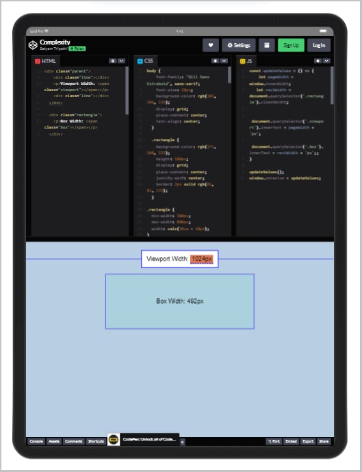
Similarly, in the below device, the box width is 300px, i.e., the minimum width.

<div class="parent">
    <div class="line"></div>
    <p>Viewport Width: <span class="viewport"></span></p>
    <div class="line"></div>
  </div>

  <div class="rectangle">
    <p>Box Width: <span class="box"></span></p>
  </div>
const updateValues = () => {
    let pageWidth = window.innerWidth;
   let rectWidth = document.querySelector('.rectangle').clientWidth;

    document.querySelector('.viewport').innerText = pageWidth + 'px';
  document.querySelector('.box').innerText = rectWidth + 'px';;
}

updateValues();
window.onresize = updateValues;
body {
    font-family: "Gill Sans Extrabold", sans-serif;
    font-size: 20px;
    background-color: rgb(184, 206, 226);
    display: grid;
    place-content: center;
    text-align: center;
  }

  .rectangle {
    background-color: rgb(171, 208, 222);
    height: 180px;
    display: grid;
    place-content: center;
    justify-self: center;
    border: 2px solid rgb(85, 85, 233);
  }

.rectangle {
  min-width: 300px;
  max-width: 800px;
  width: calc(50vw - 20px);
}

  .viewport {
    background: rgb(222, 121, 87);
    border-bottom: 3px dashed blue;
    font-family: "Gill Sans Extrabold", sans-serif;
    padding: 0.1em 0.25em;
  }

  .highlight {
    background-color: rgb(222, 121, 87);
    border-bottom: 3px dashed blue;
  }

  .parent {
    font-size: 20px;
    width: 100vw;
    display: grid;
    grid-template-columns: 1fr auto 1fr;
    align-items: center;
  }

  .line {
    height: 1px;
    width: 100%;
    background-color: blue;
  }

  .parent p {
    background: white;
    border: 2px solid blue;
    padding: 1rem;
  }
Using min(), max(), and clamp() with HSL functions
According to the official documentation, the hsl() functional notation expresses RGB color according to its hue, saturation, and lightness components.
HSL is a way to specify colors in web design. It lets you choose the hue (what color it is), saturation (how strong the color is), and lightness (how bright or dark the color is). With the CSS min(), max(), and clamp() functions, you can change the saturation and lightness values of your HSL colors more flexibly and dynamically. This gives you more control over how your website looks.
Look at the below code, and we’re setting the background color of an element using the HSL color model, wherein the hue value is set to 50 degrees, the saturation value is set as the maximum between 50%, and the value assigned to the custom property “–saturation,” and the lightness is set to 50%.

CodePen:
div {
  width: 200px;
  height: 100px;
  margin: 1rem;
}

:root {
    --saturation: 65%;
}

.box {
  background-color: hsl(50, max(50%, var(--saturation)), 50%);
}
Similarly, you can use the min() function. The below code shows that the lightness will never go below 30%. Here the lightness would be a minimum of 30% or the value of a custom property called –lightness.

Struggling to create a responsive design? Use our Px to REM Converter to quickly convert your CSS pixel values to REM values for a smooth and easy design process.
CodePen:
div {
  width: 200px;
  height: 100px;
  margin: 1rem;
}

:root {
    --lightness: 65%;
}

.box {
  background-color: hsl(50, 50%, min(30%, var(--lightness)));
}
Now, let’s say you want to set the saturation value of an HSL color to a value between 40% and 60%, regardless of the value of the –saturation custom property. You can use the clamp() function to achieve this:

CodePen:
div {
  width: 200px;
  height: 100px;
  margin: 1rem;
}

:root {
    --saturation: 65%;
}

.box {
  background-color: hsl(60, clamp(40%, var(--saturation), 60%), 50%);

}
Best Practices for using CSS min(), max(), and clamp() functions
While creating a responsive website that can adjust to different screen sizes, the use of CSS min(), max(), and clamp() functions would be a smart choice because these help you to create a flexible layout. However, to use these functions effectively, there are some best practices you should keep in mind to avoid minor problems with the layout.
Using CSS min(), max(), and clamp() functions with relative units
Using fixed units alone, like pixels, doesn’t work well for different sizes, which can make your site unresponsive. For example, if you want the container to be 600px on desktop screens and 300px on phone screens, you can use relative units like %, the CSS min() function, and media queries.

A relative unit such as em, rem, or percentage can make your design more responsive and flexible. When you use a relative unit with margin or padding, the elements will adjust to different screen sizes according to space availability. Website users can change the font size without compromising the website’s layout.
When the screen size is greater than 767px (a common breakpoint for mobile devices), the container’s width will be at least 100% of the parent width and 600px. In the image below, the box width is 600px because it is a larger screen.

On smaller screens, the container width will be either 100% of the parent’s width or 300px, whichever is smaller. This is specified inside a media query that targets small screens, such as phones, allowing the container to adjust to the available screen space. In the image below, the box size is 300px because the screen is smaller.

<div class="parent">
    <div class="line"></div>
    <p>Viewport Width: <span class="viewport"></span></p>
    <div class="line"></div>
  </div>

  <div class="rectangle">
    <p>Box Width: <span class="box"></span></p>
  </div>
const updateValues = () => {
    let pageWidth = window.innerWidth;
    let rectWidth = document.querySelector('.rectangle').clientWidth;

    document.querySelector('.viewport').innerText = pageWidth + 'px';
    document.querySelector('.box').innerText = rectWidth + 'px';
}

updateValues();
window.onresize = updateValues;
body {
    font-family: "Gill Sans Extrabold", sans-serif;
    font-size: 20px;
    background-color: rgb(184, 206, 226);
    display: grid;
    place-content: center;
    text-align: center;
  }

  .rectangle {
    background-color: rgb(171, 208, 222);
    height: 180px;
    display: grid;
    place-content: center;
    justify-self: center;
    border: 2px solid rgb(85, 85, 233);
  }

.rectangle {
  width: min(100%, 600px);
}

@media (max-width: 767px) {
  .rectangle {
    width: min(100%, 300px);
  }
}
  .box {
    background: rgb(222, 121, 87);
    border-bottom: 3px dashed blue;
    font-family: "Gill Sans Extrabold", sans-serif;
    padding: 0.1em 0.25em;
  }

  .viewport {
    background: rgb(222, 121, 87);
    border-bottom: 3px dashed blue;
    font-family: "Gill Sans Extrabold", sans-serif;
    padding: 0.1em 0.25em;
  }

  .highlight {
    background-color: rgb(222, 121, 87);
    border-bottom: 3px dashed blue;
  }

  .parent {
    font-size: 20px;
    width: 100vw;
    display: grid;
    grid-template-columns: 1fr auto 1fr;
    align-items: center;
  }

  .line {
    height: 1px;
    width: 100%;
    background-color: blue;
  }

  .parent p {
    background: white;
    border: 2px solid blue;
    padding: 1rem;
  }
<div class="parent">
    <div class="line"></div>
    <p>Viewport Width: <span class="viewport"></span></p>
    <div class="line"></div>
  </div>

  <div class="rectangle">
    <p>Box Width: <span class="box"></span></p>
  </div>
Binary to Decimal Converter is a tool that converts binary numbers into their equivalent decimal form. Simply enter a binary number and let this converter do it for you.
Avoid using CSS min(), max(), and clamp() functions for fixed values
We can use CSS min(), max(), and clamp() functions with fixed values, but it’s not recommended. These functions are meant to make the layout responsive and adaptable.
When used with fixed values, they may produce a different outcome and can add unnecessary complexity. To understand this better, let’s look at the following code examples.

The images below show that the box width is the same in all the devices. So there is no need to use these functions here. Width, height, and font size could also be replaced by width: 300px, height: 200px, and font-size: 20px.


<div class="parent">
    <div class="line"></div>
    <p>Viewport Width: <span class="viewport"></span></p>
    <div class="line"></div>
  </div>

  <div class="rectangle">
    <p>Box Width: <span class="box-width"></span></p>
    <p>Box Height: <span class="box-height"></span></p>
    <p>Font Size: <span class="box-font"></span></p>
  </div>
const updateValues = () => {
  let pageWidth = window.innerWidth;
  let rectWidth = document.querySelector('.rectangle').clientWidth;
  let rectHeight = document.querySelector('.rectangle').clientHeight;
  let rectFont = document.querySelector('.rectangle');
  let styles = getComputedStyle(rectFont);
  let fontSize = styles.getPropertyValue('font-size');

  document.querySelector('.viewport').innerText = pageWidth + 'px';
  document.querySelector('.box-width').innerText = rectWidth + 'px';
  document.querySelector('.box-height').innerText = rectHeight + 'px';
  document.querySelector('.box-font').innerText = fontSize;
}

updateValues();
window.onresize = updateValues;
body {
  font-family: "Gill Sans Extrabold", sans-serif;
  font-size: 20px;
  background-color: rgb(184, 206, 226);
  display: grid;
  place-content: center;
  text-align: center;
}

.rectangle {
  background-color: rgb(171, 208, 222);
  height: 180px;
  display: grid;
  place-content: center;
  justify-self: center;
  border: 2px solid rgb(85, 85, 233);
}

.rectangle {
  width: min(300px, 400px);
  height: max(100px, 200px);
  font-size: clamp(10px, 20px, 100px);
}

.box-width,
.box-height,
.box-font {
  background: rgb(222, 121, 87);
  border-bottom: 3px dashed blue;
  font-family: "Gill Sans Extrabold", sans-serif;
  padding: 0.1em 0.25em;
}

.viewport {
  background: rgb(222, 121, 87);
  border-bottom: 3px dashed blue;
  font-family: "Gill Sans Extrabold", sans-serif;
  padding: 0.1em 0.25em;
}

.highlight {
  background-color: rgb(222, 121, 87);
  border-bottom: 3px dashed blue;
}

.parent {
  font-size: 20px;
  width: 100vw;
  display: grid;
  grid-template-columns: 1fr auto 1fr;
  align-items: center;
}

.line {
  height: 1px;
  width: 100%;
  background-color: blue;
}

.parent p {
  background: white;
  border: 2px solid blue;
  padding: 1rem;
}
CodePen:
<div class="parent">
    <div class="line"></div>
    <p>Viewport Width: <span class="viewport"></span></p>
    <div class="line"></div>
  </div>

  <div class="rectangle">
    <p>Box Width: <span class="box-width"></span></p>
    <p>Box Height: <span class="box-height"></span></p>
    <p>Font Size: <span class="box-font"></span></p>
  </div>
In the above CSS code, the width is always 300px, and the height is always 200px. Therefore, there is no need to use the CSS min() or max() functions to specify these values. Instead, you can simply use width: 300px and height: 200px.
The clamp() function is used to set values within a range. However, since the font-size is fixed at 20px in this case, using the clamp() function is unnecessary. Therefore, you can specify the font-size directly as 20px.
Binary to Gray Code Converter is a free, easy-to-use online tool that converts a binary number into its equivalent Gray code representation in just one click.
Avoid overusing CSS min(), max(), and clamp() functions
Using CSS min(), max(), and clamp() functions can be helpful, but it’s essential to use them wisely to avoid making your code unnecessarily complex and difficult to maintain. Overuse of these functions can make your code harder to read and understand.
Suppose you have a section in your website with two images placed side-by-side, and you want to adjust their size based on the screen size. To do this, you can use the following CSS:

The CSS code sets the width and height of each image to a value of either 50% of the container width or 200px, whichever is smaller. Note that the fixed value of 200px may only work well on a small or very large screen.
In the output below, you can see that both images adjust as the screen size changes. You can make them even more interactive by using media queries to ensure that the images are sized correctly for each screen and that the styling is consistent across all screens.

<section> <img src="https://www.lambdatest.com/logo.png" alt="Image 1"> <img src="https://images.g2crowd.com/uploads/product/image/large_detail/large_detail_c8f5f4721cde3897dffa246c0e0bfce9/lambdatest-lambdatest.png" alt="Image 2"></section>
section {
  display: flex;
}

img {
  width: min(50%, 200px);
  height: min(50%, 200px);
}
CodePen:
<section>
  <img src="https://www.lambdatest.com/logo.png" alt="Image 1">
  <img src="https://images.g2crowd.com/uploads/product/image/large_detail/large_detail_c8f5f4721cde3897dffa246c0e0bfce9/lambdatest-lambdatest.png" alt="Image 2">
</section>
To adjust the width and height of the images based on the screen size, it’s better to use media queries. Here’s an example:

The code uses media queries to adjust the width and height of each image based on the screen size. It sets the default values for each property outside of any media query and overrides those values using media queries based on the screen size.
In the output below, both images adjust as the device changes. We used media queries instead of relying on the CSS min(), max(), and clamp() functions and the result is more interactive.
On the tablet device, both images adjust themselves based on the available space, which was different when we were using the CSS min(), max(), and clamp() functions.
<section>
  <img src="https://www.lambdatest.com/logo.png" alt="Image 1">
  <img src="https://images.g2crowd.com/uploads/product/image/large_detail/large_detail_c8f5f4721cde3897dffa246c0e0bfce9/lambdatest-lambdatest.png" alt="Image 2">
</section>
section {
  display: flex;
}

img {
  width: 50%;
  height: auto;
}

@media screen and (min-width: 768px) {
  img {
    max-width: 50%;
    max-height: 200px;
  }
}

@media screen and (min-width: 1024px) {
  img {
    max-width: 200px;
    max-height: 50%;
  }
}
CodePen:
<section>
  <img src="https://www.lambdatest.com/logo.png" alt="Image 1">
  <img src="https://images.g2crowd.com/uploads/product/image/large_detail/large_detail_c8f5f4721cde3897dffa246c0e0bfce9/lambdatest-lambdatest.png" alt="Image 2">
</section>
Try not to overuse the CSS min(), max(), and clamp() functions in your projects. Although they can be helpful in some situations, using them excessively or unnecessarily can result in complex and hard-to-maintain styles.
Binary to Octal Converter is a free, easy-to-use online tool that converts binary number to octal format. Enter a binary number and convert it to an octal number.
Use Fallback Values
While using the CSS min(), max(), and clamp() functions, it’s essential to use fallback values for browsers that do not support these functions. To ensure that your layout remains flexible, providing fallback values is crucial. According to this report, browsers like Internet Explorer (IE) do not support these functions, but IE still has a 2.51% share of the global desktop browser market.
To ensure that your layout remains flexible, it’s essential to provide fallback values. Let’s have a look at the browser compatibility of the CSS min(), max(), and clamp() functions.


Suppose you have the following CSS code.

If the browser doesn’t support the clamp function, the font size won’t be set. To ensure it’s kept in all browsers, we can use the fallback values as shown below:

If the browser doesn’t support the clamp() function, the font size will be set to a fixed value of 20px. It’s essential to provide fallback values so that when these CSS functions aren’t supported, they can use other fixed values.
Pros of CSS min(), max(), and clamp() functions
CSS min(), max(), and clamp() functions are powerful functions for creating dynamic and responsive layouts. To determine whether or not to use these functions in your projects, it is crucial to consider their pros.
Flexible values
In the example code, the function sets the width to either 10% of the viewport width or 100px, depending on which value is smaller. This allows the width to adjust dynamically based on the available space on the web page, ensuring a responsive layout.

In the image below, the box width is automatically set to 100px. As the device changes, the box width will adjust accordingly. In this case, the viewport width is 1366px, and 10vw would represent 10% of that, approximately 136px. Since the minimum of 136px and 100px is 100px, the box width is set to 100px.

In the image below, the box width is automatically set to 41px. As the device changes, the box width will adjust accordingly. In this case, the viewport width is 412px, and 10vw would represent 10% of that, approximately 41px. Since the minimum of 41px and 100px is 41px, the box width is set to 41px.

These two images show that using flexible values with the CSS min(), max(), and clamp() functions can make our website more responsive and dynamic.
<div class="parent">
    <div class="line"></div>
    <p>Viewport Width: <span class="viewport"></span></p>
    <div class="line"></div>
  </div>

  <p>
    <code class="value"
      >width: min(<span class="max">10vw</span>,
      <span class="min">100px</span>);</code
    >
  </p>

  <div class="rectangle">
    <p>Box Width: <span class="box"></span></p>
  </div>
const updateValues = () => {
    let pageWidth = window.innerWidth;
    let rectWidth = document.querySelector('.rectangle').clientWidth;

    document.querySelector('.viewport').innerText = pageWidth + 'px';
    document.querySelector('.box').innerText = rectWidth + 'px';

    checkWidth(rectWidth);
}

const checkWidth = (rectWidth) => {
    const minVal = parseInt(document.querySelector('.min').innerText, 10);

    if (rectWidth < minVal) {
        document.querySelector('.min').classList.remove('highlight');
        document.querySelector('.max').classList.add('highlight');
    } else {
        document.querySelector('.max').classList.remove('highlight');
        document.querySelector('.min').classList.add('highlight');
    }
}

updateValues();
window.onresize = updateValues;
body {
    font-family: "Gill Sans Extrabold", sans-serif;
    font-size: 20px;
    background-color: rgb(184, 206, 226);
    display: grid;
    place-content: center;
    text-align: center;
  }

  .value {
    border-radius: 0px;
    padding: 0.5em 0.25em;
  }

  .rectangle {
    background-color: rgb(171, 208, 222);
    height: 180px;
    width: min(10vw, 100px);
    display: grid;
    place-content: center;
    justify-self: center;
    border: 2px solid rgb(85, 85, 233);
  }

  .box {
    background: rgb(222, 121, 87);
    border-bottom: 3px dashed blue;
    font-family: "Gill Sans Extrabold", sans-serif;
    padding: 0.1em 0.25em;
  }

  .viewport {
    background: rgb(222, 121, 87);
    border-bottom: 3px dashed blue;
    font-family: "Gill Sans Extrabold", sans-serif;
    padding: 0.1em 0.25em;
  }

  .highlight {
    background-color: rgb(222, 121, 87);
    border-bottom: 3px dashed blue;
  }

  .parent {
    font-size: 20px;
    width: 100vw;
    display: grid;
    grid-template-columns: 1fr auto 1fr;
    align-items: center;
  }

  .line {
    height: 1px;
    width: 100%;
    background-color: blue;
  }

  .parent p {
    background: white;
    border: 2px solid blue;
    padding: 1rem;
  }
Simplified Code
We can use CSS min(), max(), and clamp() functions to simplify code and make it easier to read and maintain.
Media queries are commonly used to adjust styles based on the device screen size, viewport dimensions, and orientation. It helps developers customize the styles for different devices and CSS viewport units.
For example, we can use the clamp() function to define a range of font sizes for different screen sizes and limit it by maximum and minimum values. This means we don’t need to use media queries to adjust font size on other devices.

It can be easily replaced by the clamp() function.

In the below images, you can see that the font size varies as we change the devices.

<div class="parent">
    <div class="line"></div>
    <p>Viewport Width: <span class="viewport"></span></p>
    <div class="line"></div>
  </div>

  <div class="rectangle">
    <p>Font Size: <span class="box"></span></p>
  </div>
const updateValues = () => {
    let pageWidth = window.innerWidth;
   let rectFont = document.querySelector('.rectangle');
  let styles = getComputedStyle(rectFont);
  let fontSize = styles.getPropertyValue('font-size');

    document.querySelector('.viewport').innerText = pageWidth + 'px';
  document.querySelector('.box').innerText = fontSize;
}

updateValues();
window.onresize = updateValues;
body {
    font-family: "Gill Sans Extrabold", sans-serif;
    font-size: 20px;
    background-color: rgb(184, 206, 226);
    display: grid;
    place-content: center;
    text-align: center;
  }

  .rectangle {
    background-color: rgb(171, 208, 222);
    height: 180px;
    display: grid;
    place-content: center;
    justify-self: center;
    border: 2px solid rgb(85, 85, 233);
  }

.rectangle {
  width: min(100%, 600px);
}

.rectangle {
  font-size: 3rem;
}
@media (max-width: 1300px) {
  .rectangle {
    font-size: calc(-2rem + 5vw);
  }
}
@media (max-width: 900px) {
  .rectangle {
    font-size: 2rem;
  }
}
  .viewport {
    background: rgb(222, 121, 87);
    border-bottom: 3px dashed blue;
    font-family: "Gill Sans Extrabold", sans-serif;
    padding: 0.1em 0.25em;
  }

  .highlight {
    background-color: rgb(222, 121, 87);
    border-bottom: 3px dashed blue;
  }

  .parent {
    font-size: 20px;
    width: 100vw;
    display: grid;
    grid-template-columns: 1fr auto 1fr;
    align-items: center;
  }

  .line {
    height: 1px;
    width: 100%;
    background-color: blue;
  }

  .parent p {
    background: white;
    border: 2px solid blue;
    padding: 1rem;
  }
Convert octal to decimal quickly and easily with our free online converter tool. Try it now for free.
Accessibility
These functions can help improve accessibility by allowing users to adjust font sizes and styles to meet their needs. People with special abilities might need larger text sizes or more contrast between text and background. Using these functions can make it easier to create responsive designs that accommodate these needs without compromising the overall look and feel.
To test for accessibility of your webpages or mobile apps so that people with special abilities can access your website or application, LambdaTest enables you to perform accessibility testing across 3000+ desktop browsers, browser versions, and operating systems.
%[ https://youtu.be/rkdi2L7XtE4 ]
You can also subscribe to our LambdaTest YouTube Channel to learn about software testing automation tools like Selenium, Playwright, Appium, and many more tutorials.
The clamp() function can set a range of font sizes that automatically adjust according to the screen’s width. This ensures that users can read the text without it being too small or too large, even if they zoom in or out on the page.

The clamp() function used here sets a minimum font size of 18px, a preferred font size of 3.5% of the viewport width, and a maximum font size of 28px. This ensures that the font size scales smoothly between these values based on the screen size.
Additionally, most modern browsers like Chrome, Firefox, Safari, and Edge support the CSS min(), max(), and clamp() functions. However, older browsers like Internet Explorer (IE) don’t support them, and we can ensure through browser testing on IE if it still makes sense. To ensure that your website is accessible to all users, you should provide fallback values for browsers that don’t support these functions.
We talked about fallback values in the best practices section for using the CSS min(), max(), and *clamp()*functions.
Shortcomings of CSS min(), max(), and clamp() functions
Though there are numerous advantages of using CSS min(), max(), and clamp() functions, there are a few shortcomings as well. Some of the major ones are mentioned below:
Complexity
Using CSS min(), max(), and clamp() functions can make the code complex and harder to understand, mainly if used excessively or improperly. While these functions offer flexible layout options, they may be challenging for new developers to read and understand.
Nesting multiple functions within each other is a common issue when using CSS min(), max(), and clamp() functions. This can lead to increased complexity, making it harder to maintain and debug in the long run. For example

This code calculates an element’s width using a combination of CSS min(), max(), and clamp() functions, which can be challenging to understand at first glance.
Debugging
CSS min(), max(), and clamp() functions can be hard to debug compared to other CSS properties, especially when using complex calculations or multiple variables. This can take more time and be more challenging to fix. Errors can happen due to syntax, calculation, compatibility, or complexity issues, making debugging difficult.
Suppose a developer is working on responsive modern web designs and wants to adjust the CSS font spacing and size of the heading based on the viewport width using the clamp() function. See the below examples.

If the developer unintentionally uses the min() function instead of clamp().

In such a scenario, the font size will always be set to the smallest value, irrespective of the viewport width. Detecting this mistake can be challenging since the code will compile without errors.
Let’s look at the examples of both of the above scenarios.
The image below shows that the text size changes as the browser window size changes. This is because we use the clamp() function, which changes the font size for the viewport width.

In the image below, you can see that the text size is almost the same as the device changes. This is because we are using the min() function. In this case, the font size will always be set to the smallest input value, regardless of the viewport width.

Fixing this error can be more complicated than correcting other CSS issues, especially if the code involves multiple calculations or variables.
Intuited to learn how to perform responsive testing, watch our video on performing responsive testing on the LambdaTest platform.
Browser Support
Some older browsers, such as Internet Explorer (IE), don’t support them. Therefore, it is essential to provide fallback values for browsers that don’t support these functions to ensure your website works for everyone. According to this report, IE still has a 2.51% share of the global desktop browser market.
Testing your website in Internet Explorer (IE) is essential to ensure compatibility with older browsers that some users may still be using. Even though fewer people use IE these days. By testing your website in IE, you can ensure that it works properly for all users, regardless of their browser. See the below graph by StatCounter; it keeps decreasing, which shows that it is not popular but still in use by 2.15 percent of global internet users.

Here are some tips for testing your website in IE:
Check Browser Support: Check which versions of IE your website supports before testing. If older versions are no longer widely used, skip testing on them to save time and effort.
Use Virtual Machines: You can use virtual machines to test your website on multiple versions of IE without installing each version on your local machine.
Test on Real Devices: Virtual machines help test your website in different IE versions, but testing on real devices is important to ensure your website works correctly.
Consider Alternatives: If users with modern browsers mainly access your website, you may drop support for older versions of IE.
You can also check out helpful CSS functions like calc(), as well as CSS values in which you will learn absolute, relative units, etc.
Decimal to Binary Converter is a free online tool that will give you the binary equivalent of any decimal number. Enter your number, then simply click ‘convert’.
Conclusion
In this article, we took a look at CSS min(), max(), and clamp() functions. We have understood these functions deeply with examples of each. We have also learned the best practices for using CSS min(), max(), and clamp() functions in your layout so that you can make a more responsive and flexible website. Ultimately, we have seen the pros and cons of using these functions, followed by browser compatibility testing.
So, in short, the CSS min(), max(), and clamp() functions can help keep your web designs responsive and flexible. Say you want the font size to be flexible so that it changes as the screen size changes. For this, you can use CSS min(), max(), and clamp() functions by passing a range of font sizes that will change based on the screen size like if the screen is small, the font size will be set to small and vice-versa.

Top comments (0)