
(Part 2 of 2 - Jump to Part 1)
In my last post, I went through the basics of using CSS to create and style some content <div>s and a content wrapper <div> around them. This time, we're going to go a few Steps further.
Once more unto the breach!
Step 2.1:
So we have some content in a wrapper, but what's next? Wouldn't it be great if we could somehow have another element on the page that was static, yet interacted well with our resizable <div>-wrapped content? Surprisingly, it can be fairly easy to accomplish.
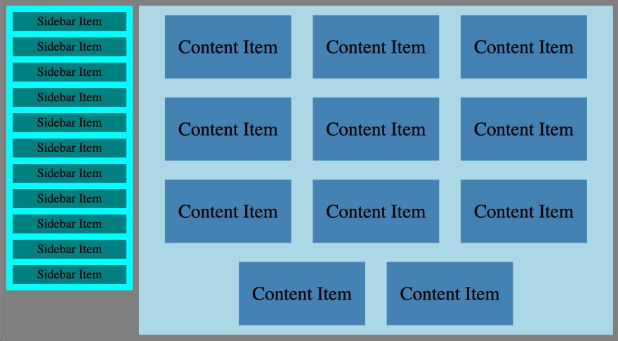
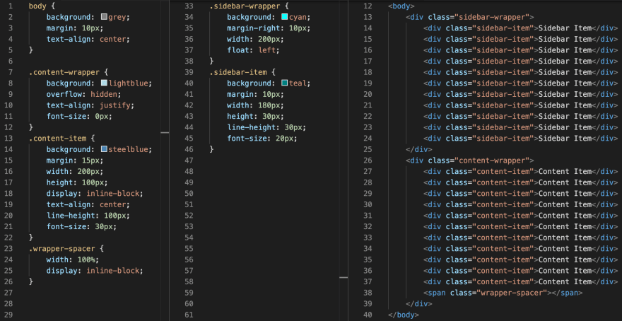
First, let's imagine a static sidebar that we want to live on the left side of the page. Obviously, we'll need to create another <div> and build out another new .wrapper-class-name {} style in our CSS file. We'll give our sidebar wrapper class a static width: value; and height: value;. This time, however, we can't just make both wrapper <div>s have the display: inline-block; style, because the sidebar should stay parked on the left side.
To accomplish this we'll need to use another new style: the float: left; style. This will cause the <div> to adhere to the left side of the page. Multiple <div>s with the float: left; style will stack from left to right, similar to the way display: inline-block; will, but unfortunately, the only way that could work for us in this situation is if we set the content wrapper to a static width small enough for both to exist on the same line.
Instead, this time we want the content wrapper to take up the full amount of remaining adjustable page width after the static sidebar has been displayed. This is accomplished by adding the overflow: hidden; style to our content wrapper <div>. The very last step is to add a margin-right: value; to our sidebar to put a buffer between the two <div>s.
Due to the interaction between float: value and our content wrapper using overflow: hidden; to take up the remaining space on the line, the floated <div> must come first. This is natural when using float: left;, since we're used to thinking about lines rendering from left to right. If, however, you wanted the sidebar to be on the right instead of the left, you'd change the sidebar wrapper style to float: right; and margin-left: value;, but you'd also have to make sure the sidebar wrapper is still rendered first in your HTML file.
(Note 2: just like in the content <div>s, the font-size: value; and line-height: value; styles have been added to the sidebar <div> simply for the display text purposes.)
CSS & HTML:

Browser:

Step 2.2:
So now it should be a pretty easy next step to add some content to the sidebar. We can add some sidebar content <div>s to the html file, along with a new CSS .class-name {} defined in the CSS file for the sidebar content. We'll want to set a static width: value; and height: value; for the new sidebar content, as well as a margin: value;.
Don't forget that the width of the sidebar content should be equal to the width of the sidebar wrapper minus the left and right margins on the sidebar content. We'll also want to remove the static height: value; from the sidebar wrapper and let its height be adjustable based on the amount of sidebar content.
CSS & HTML:

Browser:
Step 2.3:
At this point, I'm going to take a little bit of a detour and demonstrate another way to align multiple content <div>s into a wrapper <div>. What if you wanted the content <div>s on the outer edge to stick to the sides of the wrapper rather than allowing the unused space to push to the side margins of your content wrapper?
Since we're already thinking about display: inline-block;s as words/sentences, something should come to mind: text justification. Justified text will force all complete lines to align perfectly on both left and right edges, while allocating any unused space evenly between the line words (blocks).
To do this in CSS is super easy; we can just swap the wrapper's text-align: center; for text-align: justify;, either directly in the wrapper class, or inherited from a parent element. In our case, we want the text-align: center; to remain in the body style because of the text content we have throughout the page, so we'll justify only the wrapper class.
But then we run into another snag: while all complete lines are nicely spaced, justification doesn't space the final, incomplete line. The solution here is to use CSS magic to make another "final" line in order to justify the incomplete line of content <div>s. We can create a new CSS class specifically to do this function, and all it will need are the display: inline-block; style as well as a width: 100%; style to make sure that it becomes a new line. Let's throw this class on a fairly innocuous <span> and place it inside the wrapper, but after all the content <div>s.
This has the intended effect of making our leftover line of content <div>s symmetrical, but it has one side effect: the wrapper <div> now extends a bit too far below the end of the content. Thankfully, that's another easy fix: placing a font-size: 0px; in the wrapper class will shrink that extra line space down to nothing.
CSS & HTML:
Browser:

Step 2.4:
Justified content can be useful in some situations, but its main problem is that it doesn't tend to respond to resizing quite as gracefully as centered content, especially when each line is potentially only a few content <div>s wide. Where it can shine is in fixed-width wrappers filled with different-sized content, just as we find it used with text (like newspaper columns).
Similarly, centered content maintains the space between content <div>s on the same line, which opens it up some clever manipulation, while still allowing for much greater flexibility in resizing.
In the final example, we'll experiment by altering the core content <div>s. For the main content wrapper, we'll go back to the centered content from Step 6, but let's create a new class for a double-content <div>. Since most of the class style is going to be the same between the two classes, we can group them in our CSS file, separated by a comma before the initial definition. The only dissimilar value in this case will be the width: value;, which we can overwrite for the second class in a separate class definition. The width for this double-content element should be twice the standard width plus twice the margin width to account for the extra space.
Now, we can also take the skills demonstrated in both this and the last step to likewise create half-width content in the sidebar and text-align: justify; those <div>s. Unfortunately, we run into another issue with display: inline-block;, which is that it creates double margins. In a larger <div> it's not particularly noticeable, but in a smaller <div> like this one, it's glaringly obvious.
In order to compensate for this, we just need to modify our margin and padding values a little. Because the text-align: justify; will take care of our horizontal spacing on the half <div>s, let's adjust the sidebar classes' top/bottom margins to half their old value, and set the left/right margins to zero. Thanks to more CSS magic, we can do this in one line with margin: 5px 0px;. When margin takes in two values, it applies the first value to both the top and bottom, and applies the second value to both the left and right.
To make up the missing space around the edges of our sidebar wrapper, we can just set the value of the the wrapper's padding as padding: 5px 10px;. Because the padding areas are visually counted as a part of the <div> but not counted in the width value, we must remember to subtract the value of the padding (20px in this case) from the width: value; of our wrapper.
CSS & HTML:

Browser:

By now you can hopefully see just how powerful some elementary CSS can be, and the possibilities just keep going and going. Don't be afraid to incorporate some of these new tools in your next project!
(Part 2 of 2 - Jump to Part 1)

Top comments (0)