The easiest way you can make your websites footer stick to the bottom of the page no matter what the height of your webpage is to use CSS flexbox.
This is our example HTML webpage's code:
<header>
<h1>HEADER TITLE</h1>
<h2>Subtitle</h2>
</header>
<div class="content">
<h1>Content Title</h1>
<p>
Lorem ipsum dolor sit, amet consectetur adipisicing elit. Necessitatibus
incidunt explicabo error, maxime reiciendis consectetur sapiente velit
perspiciatis, quibusdam enim facere praesentium vitae alias dignissimos
debitis impedit sequi, assumenda ipsa.
</p>
</div>
<footer>
<h3>Created By Shafi</h3>
<p>© 2020</p>
</footer>
We've connected our stylesheet with this page and stripped down the default styling by using this CSS Snippet
* {
  margin: 0;
  padding: 0;
  box-sizing: border-box;
  font-family: monospace;
}
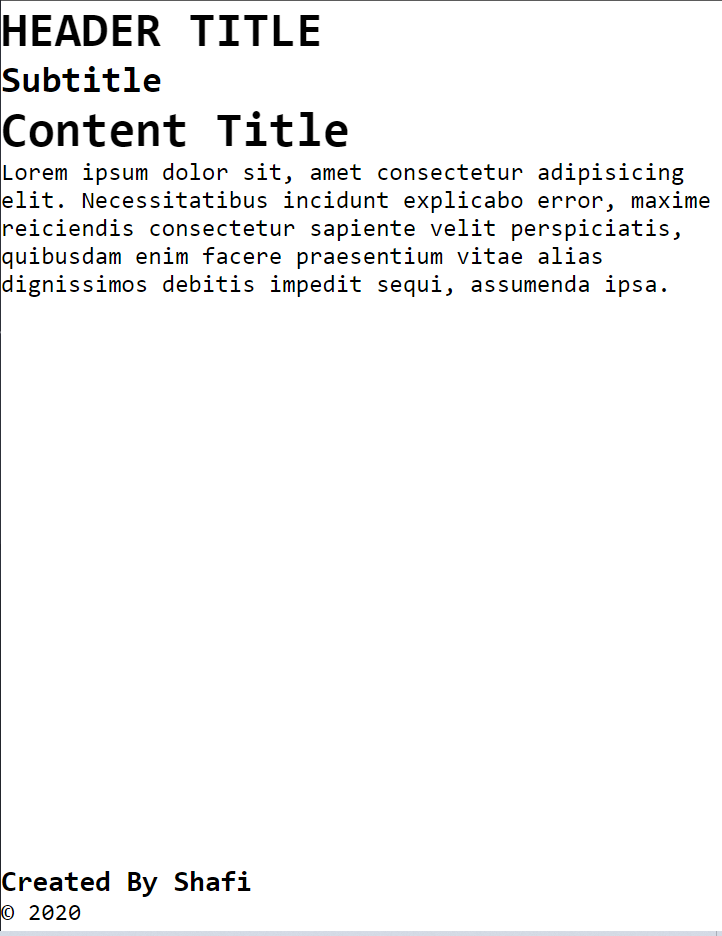
At this moment our webpage looks like this:

To take our footer element to the bottom of the page, we're going to use our body element as a flex container. All the children of body will thus turn into individual flex items.
body {
  display: flex;
  flex-direction: column;
  min-height: 100vh;
}
Here, using the display: flex turned our body element into a flex container.
The flex-direction property specifies the direction of the flexible items.
We setflex-directions property ascolumn. Thus all the children of body will flow from top to bottom.
And we set a min-height property on our page so that no matter what the contents length is, the body height will at least equals to the screen size.
Well, the CSS didn't do much to our webpage, did it?
Worry not! We'd only need one more line of code to set our footer to the bottom of the screen.
.content {
  flex: 1;
}
The
flexproperty is a shorthand property for:
flex-growflex-shrinkflex-basisThe
flexproperty sets the flexible length on flexible items.
This tells our content div to take all the available unused space.
Our webpage now looks like this!
Cheers 🎉
Now if we want to center all the contents inside of our content div, we can just turn it into a flex container like this
.content {
  flex: 1;
  /* CENTER EVERYTHING VERTICALLY */
  display: flex;
  flex-direction: column;
  justify-content: center;
}
And now the end result looks like this


Top comments (2)
yup, this is handy, search this most of the time 😉
Thanks! :)