Learn how to add different types of shadows to boxes and text.
Box-Shadow
The box-shadow property adds shadow effects around an element. A box shadow is described by X and Y offsets relative to the element, blur and spread radii, and color.
If a border-radius is specified on the element with a box shadow, the box shadow takes on the same rounded corners.
The box-shadow property can have several values:
-
inset: changes the shadow to one inside the box — inside the border, above the background, but below content (e. g.
box-shadow: 5px 10px inset;) - offset-x: (required) specifies the horizontal distance; negative values place the shadow to the left of the element; positive ones put the shadow on the right of the box
- offset-y: (required) specifies the vertical distance; negative values place the shadow above the element; positive ones put the shadow below the box
-
blur-radius: the larger this value, the bigger the blur; negative values are not allowed (e. g.
box-shadow: 10px 10px 8px #888;). If not specified, it will be set at 0 and the shadow’s edge will be sharp -
spread-radius: positive values will cause the shadow to expand and grow bigger, negative values will cause the shadow to shrink (e. g.
box-shadow: 10px 10px 8px 10px #888;). If not specified, it will be 0 and the shadow will be the same size as the element - color
- none: default value; no shadow is displayed
You can specify a single box-shadow using 2–4 values, and inset:
- If only 2 values are given, they are interpreted as values
- If a 3rd value is given, it is interpreted as a
- If a 4th value is given, it is interpreted as a
To specify multiple shadows, provide a comma-separated list of shadows (each one having bigger
lengthvalues than the previous ones), for example:
box-shadow: 5px 5px #888, 10px 10px #7eb4e2, 15px 15px #f69ec4;
One-Sided Shadow
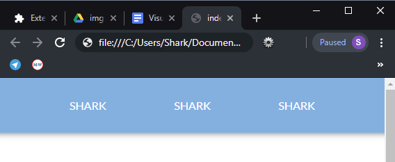
You can create a one-sided shadow by setting the offset-x value to 0 and applying a negative spread-radius.
box-shadow: 0 10px 5px -5px #888;
One-Sided Full-Width Shadow
To create a one-sided shadow with the length equal to the length of the element, set the offset-x value to 0 and apply a negative offset-y:
box-shadow: 0 -16px 12px 12px #000;
It will work only for a navigation bar that is sticking to the top, left, and right of the page. When applied to an element with space all around it, this kind of shadow will look like a three-sided shadow.
Shadow From Two Opposite Sides
To create a shadow that is dropped from two opposite sides, add two comma-separated lists. The second one should contain a negative value for offset-x.
box-shadow: 10px 0 10px -10px #666,
            -10px 0 10px -10px #666;
Irregular Drop-Shadows
Here are (slightly modified) examples of how to create irregular drop-shadows from Lea Verou’s book CSS Secrets. In the examples below, shadows are created with the help of the filter property, not box-shadow.
div {
  position: relative;
  display: inline-flex;
  flex-direction: column;
  justify-content: center;
  vertical-align: bottom;
  width: 5.9em;
  height: 5.2em;
  margin: .6em;
  background: #7eb4e2;
  filter: drop-shadow(.1em .1em .1em rgba(0,0,0,.5));
  font: 200%/1.6 'Amatic SC', cursive;
  font-weight: 700;
  text-align: center;
}

.speech {
  border-radius: .3em;

  &::before {
    content: '';
    position: absolute;
    top: 1em;
    right: -.7em;
    width: 0;
    height: 0;
    border: 1em solid transparent;
    border-left-color: #7eb4e2;
    border-right-width: 0;
  }
}

.dotted {
  background: transparent;
  border: .3em dotted #7eb4e2;
}

.cutout {
  border: .5em solid #7eb4e2;
  border-image: 1 url('data:image/svg+xml,\
                     <svg xmlns="http://www.w3.org/2000/svg"\
                      width="3" height="3" fill="%237eb4e2">\
                         <polygon points="0,1 1,0 2,0 3,1 3,2 2,3 1,3 0,2"/>\
                      </svg>');
  background-clip: padding-box;
}
Text-Shadow
The text-shadow property is useful to add a shadow to the text. Shadows can be single-layered or multi-layered, blurred, colored or transparent. By applying a shadow to an element, you can specify only one length and color value, thus creating a color copy of a single character or word. Also, with the help of the shadow, you can make the text more readable if the contrast between the text color and the background is not sufficient.
Each shadow is applied both to the text itself and to the text-decoration property if there is one. You can set several shadows at the same time, separated by commas. Shadows overlap but do not overlap the text itself. The first shadow is always located above the rest of the shadows.
The text-shadow property can have up to four values: two or three values defining the length of the shadow and an optional color.
text-shadow: x-offset | y-offset | blur | color
- x-offset: specifies the horizontal offset of the shadow; a positive value creates a shadow offset to the right of the text, and a negative length creates a shadow to the left
- y-offset: specifies the vertical offset of the shadow; a positive value shifts the shadow down, a negative value shifts it up
- blur: sets the blur radius; negative values are not allowed; if the blur value is 0, the edge of the shadow is clear; otherwise, the larger the value, the more blurred is the edge of the shadow
For example:
color: #fff;
text-shadow: 1px 1px #32557f,
             1px -1px #32557f,
             -1px 1px #32557f,
             -1px -1px #32557f,
             3px 3px 6px rgba(0,0,0,.5);
You can find more examples of text shadows in the article CSS Fonts on sharkcoder.com.


Top comments (1)
Nice! Thanks for this article.