
This article contains HTML form design examples with code. It will help you style your HTML form and make all sorts of custom inputs.
To make an input, use the <input> tag. There is also a number of attributes that can be placed inside this tag.
The type attribute is useful to ensure the correct validation and work of inputs. This attribute can take different values:
- type="checkbox" — for making checkboxes
- type="email" — for email addresses (the multiple attribute can be added to email fields to select an email from a list of multiple email addresses)
- type="file" — to upload files
- type="radio" — for making radio inputs
- type="range" — this input will be displayed as a graphical slider (there can be additional min, max, and step attributes)
- type="tel" — for entering phone numbers
- type="text" — for entering any text data
- etc.
The placeholder attribute specifies a short hint that describes the expected value of an input field.
The name attribute specifies the name of an <input> element. It’s used to reference elements in JavaScript, to reference form data after a form is submitted, and to ensure the correct work of radio inputs. Only form elements with the name attribute will have their values passed when submitting a form.
The aria-label attribute is used to define a string that labels the current element. Use it in cases where a text label is not visible on the screen. If there is visible text labeling the element, use aria-labelledby instead.
Below are some examples.
Name input:
<input name="name" type="text" placeholder="Name" aria-label="Name" />
Phone input:
<input name="phone" type="tel" placeholder="Phone number" aria-label="Phone number" />
Email input:
<input name="email" type="email" placeholder="Email" aria-label="Email" multiple />
The <input> element is usually accompanied with the <label> tag that represents a caption for the input. To associate the <label> with an <input> element, you need to give the <input> an ID. The <label> then needs the for attribute whose value is the same as the input’s ID.
<label>Name
    <input name="name" type="text" aria-label="Name" />
</label>
Basic Input Styling
All browsers apply their own styles to inputs. To reset those styles, you need to add these rules:
input {
  outline: none;
  user-select: none;
}
The outline: none; property removes the default outline of the input. And the user-select: none; property prevents the element to be highlighted if you click on it.
Next, you can apply your own styles: border, background, color, etc., as well as add pseudo-classes to control inputs styles in response to user actions. Here is an example:
input {
  border: 1px solid #a4a4a4;
  padding: 15px 20px;
  border-radius: 4px;
  width: 100%; // set width relatively to the parent container with fixed width
  margin-bottom: 10px;
  background: #f8f8ff;

  &:active, &:hover, &:focus {
    box-shadow: 2px 2px 5px 0px rgba(128,128,128,.7);
    transition: box-shadow .3s linear;
  }
}
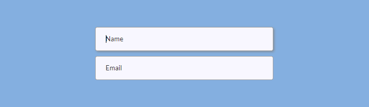
Here is the result:
Range Input
A type="range" input will be displayed as a graphical slider. You can generate cross-browser compatible range inputs with custom styles.
First, prepare some basic markup:
<p>Set the range<span class="range-data">60%</span></p>
<input type="range" />
To override basic browser styles, you need to make your input “invisible”:
input[type="range"] {
  -webkit-appearance: none;
  -moz-appearance: none;
  -ms-appearance: none;
  width: 100%;
  border: none;
  padding: 0;
  background: transparent;

  &:focus {
    outline: none;
  }
}
Next, you need to style your range input’s thumb and track. The thumb is the thing that you drag along the track, and the track is the line that the thumb moves across. You need to add different styles for different browsers. Set the background (it can be an image), size, border-radius, etc.
input[type="range"] {
  // Chrome, Opera
  &::-webkit-slider-thumb {
    -webkit-appearance: none;
    border: none;
    height: 24px; width: 24px;
    border-radius: 3px;
    background: url(images/range-thumb.png) no-repeat;
    cursor: pointer;
    margin-top: -10px;
  }

  // Firefox
  &::-moz-range-thumb {
    border: none;
    height: 24px; width: 24px;
    border-radius: 12px;
    background: #32557f;
    cursor: pointer;
    margin-top: -10px;
  }

 // IE
  &::-ms-thumb {
    border: none;
    height: 24px; width: 24px;
    background: #32557f;
    cursor: pointer;
    margin-top: 0;
  }
}
To style the track, you can also add rules for different browsers.
input[type="range"] {
  // Chrome, Opera
  &::-webkit-slider-runnable-track {
    width: 100%; height: 6px;
    border: 1px solid #FFF;
    border-radius: 3px;
    cursor: pointer;
    background: #a4a4a4;
  }

  // Firefox
  &::-moz-range-track {
    width: 100%; height: 6px;
    border: 1px solid #FFF;
    border-radius: 3px;
    cursor: pointer;
    background: #a4a4a4;
  }

  // IE
  &::-ms-track {
    width: 99%; height: 6px;
    cursor: pointer;
    border-color: transparent;
    color: transparent;
    border: 1px solid #FFF;
    border-radius: 3px;
    background: #a4a4a4;;
  }
}
If you apply those styles, your range input will look basically like this in Chrome and Opera (don’t forget to upload an image for the thumb):

Finally, you need to allow changing the digits in HTML (60%) when users drag the thumb. Here is the jQuery code for getting range input value and putting it inside HTML:
$('input[type=range]').val(60); // set initial value
$('.range-data').html( $('input[type=range]').val() + '%' ); // change HTML

$('input[type=range]').on('input', function() {
    $('.range-data').html( $(this).val() + '%' );
});
Checkbox Inputs
The type="checkbox" attribute will change your input into a checkbox.
Here is the markup:
<input type="checkbox" id="whale-shark" autofocus />
<label for="whale-shark">Whale Shark</label>

<input type="checkbox" id="basking-shark" checked />
<label for="basking-shark">Basking Shark</label>

<input type="checkbox" id="bull-shark" disabled />
<label for="bull-shark">Bull Shark</label>

<input type="checkbox" id="blue-shark" checked disabled />
<label for="blue-shark">Blue Shark</label>
Autofocus, checked, and disabled are attributes that allow styling checkboxes in different states (focus, checked, and disabled).
Now let’s make custom checkboxes. First, apply the display: block; property to your label elements if you want to make the checkboxes appear as a column. You can add the line-height property to determine the distance between the lines of checkboxes.
label {
  display: block;
  line-height: 1.8;
}
To visually hide browser styling of checkboxes, you can add position and clip properties to your checkbox inputs.
input[type="checkbox"] {
  position: absolute;
  clip: rect(0,0,0,0);
}
Now we will make our custom rectangular checkboxes with the help of width, height, and background properties. The text-indent property is required for the checkbox mark’s horizontal position, and the line-height is for the checkbox mark’s vertical align.
input[type="checkbox"] + label::before {
  content: '\a0';
  display: inline-block;
  width: 1.2em;
  height: 1.2em;
  margin-right: .5em;
  border-radius: .2em;
  background: #f8f8ff;
  text-indent: .25em;
  line-height: 1.4;
  border: 1px solid #555;
}
\2713 is a CSS symbol for the checkbox mark that will appear when the checkbox is checked:
input[type="checkbox"]:checked + label::before {
  content: '\2713';
  background: #32557f;
  color: #fff;
  transition: background .05s ease-out;
}
And here are other rules for focus and disabled states:
input[type="checkbox"]:focus + label::before {
  box-shadow: 0 0 .1em .1em #7eb4e2;
}

input[type="checkbox"]:disabled + label {
  color: #555;

  &::before {
    background: #a4a4a4;
    box-shadow: none;
    color: #555;
    cursor: not-allowed;
  }
}
This is how the final checkboxes will look like in different states (unchecked, checked, disabled, and checked-disabled):

To disable or enable elements of the form, add these lines to your JS file:
$ ('.class').on('click', function() { $('.anotherClass').prop('disabled', true); }); // To disable an element
$ ('.class').on('click', function() { $('.anotherClass').prop('disabled', false); }); //To enable an element
.class is an element which clicking event enables the disabled state of .anotherClass element.
Radio Inputs
Unlike checkboxes, only one radio input may be selected at a time. To make a radio input, add the type="radio" and name="anyname" attributes to the tag. Choose whatever name you like, but remember that the name attribute should be the same for each radio input that is not disabled. Otherwise, your radio inputs will be acting like checkboxes.
Here is the markup (<i> is added to style the radio circle):
<label>
    <input name="radio" type="radio" />
    <i></i><span>Whale Shark</span>
</label>

<label>
    <input name="radio" type="radio" checked />
    <i></i><span>Basking Shark</span>
</label>

<label>
    <input name="radio" type="radio" disabled />
    <i></i><span>Bull Shark</span>
</label>

<label>
    <input type="radio" checked disabled />
    <i></i><span>Blue Shark</span>
</label>
First, organize your radio inputs as a column with the margin-bottom: 5px (or whatever margin you like):
.radio {
  display: flex;
  flex-flow: column wrap;
}

label {
  margin-bottom: 5px;
}
Next, add rules for different states of the radio inputs (checked and disabled). And don’t forget the position:absolute property for your input.
input[type="radio"] {
  position: absolute;
  opacity: 0;

  &:checked + i::before {
    top: 5px;
    opacity: 1;
  }

  &:checked + i::after {
    top: 1px;
    right: 1px;
    bottom: 1px;
    left: 1px;
    background: #f8f8ff;
  }

  &:disabled + i {
    cursor: not-allowed;
  }

  &:disabled + i::before {
    background: #555;
  }

  &:disabled + i::after {
    background: #a4a4a4;
  }

  &:disabled ~ span {
    color: #555;
  }
}
Finally, do some styling for radio circles and dot marks (this is where your <i> element comes in handy).
i {
  position: relative;
  display: block;
  float: left;
  margin-right: 10px;
  width: 18px;
  height: 18px;
  cursor: pointer;
  background: #4a4a4a;
  outline: none;
  border-radius: 50%;
  z-index: 0;

  &::after,
  &::before {
    content: "";
    position: absolute;
    display: block;
  }

  &::before {
    width: 8px;
    height: 8px;
    border-radius: 50%;
    background-color: #32557f;
    top: 5px;
    right: 5px;
    bottom: 5px;
    left: 5px;
    opacity: 0;
    z-index: 2;
  }

  &::after {
    top: 1px;
    right: 1px;
    bottom: 1px;
    left: 1px;
    background: #f8f8ff;
    border-radius: 50%;
    z-index: 1;
  }
}
Here is the result for radio inputs in different states (unchecked, checked, disabled, and checked-disabled):

Select Element
To make a select element, you can create the <select> tag and nest your options inside it. And don’t forget to add value attributes to <option> tag.
<select name="shark">
    <option value="Whale Shark">Whale Shark</option>
    <option value="Basking Shark">Basking Shark</option>
    <option value="Shortfin Mako Shark">Shortfin Mako Shark</option>
</select>
However, if you wish to apply really fancy styling, it would be easier to do without <select> and <option> tags. In this case, you can use simple <div> tags to style your select element.
Create a wrapper element (.select-wrap) and nest your select element with options inside. You can add .select and .options classes to divs intended for the select element and options. You can create an additional element to style a select arrow (.arrow). Also, you can wrap options with an additional <div> if you want to style the scrollbar (.options-container).
<div class="select-wrap">
    <div class="select">
        <span>Choose your shark</span><i class="arrow"></i>
    </div>
    <div class="options">
        <div class="options-container">
            <p>Whale Shark</p>
            <p>Basking Shark</p>
            <p>Shortfin Mako Shark</p>
            <p>Thresher Sharks</p>
            <p>Bull Shark</p>
            <p>Tiger Shark</p>
            <p>White Shark</p>
            <p>Oceanic Whitetip Shark</p>
            <p>Blue Shark</p>
            <p>Hammerhead Shark</p>
        </div>
   </div >
</div>
First, you should position your wrapper and select divs relatively. Also, you may want to add other styles such as width or height. Choose the fixed width for your wrapper div and 100% width for your .select div.
.select-wrap {
  position: relative;
  width: 100%;
}

.select {
  position: relative;
  width: 100%;
  height: 48px;
  cursor: pointer;
}
You can also add to .select other rules for the border, padding, border-radius, width, and other properties from the Basic Input section.
Next, you need to position your options absolutely and determine the top and left properties relatively to the .select div. The top property should correspond to the height of your .select div. After you finish styling, don’t forget to make your .options div invisible — it should open when you click on the .select div (we’ll be able to do it with the help of jQuery later). You can put this property inside comments for the time being to be able to see the result.
.options {
  // display: none;
  width: 100%;
  position: absolute;
  top: 48px; // = height of your .select div
  left: 0;
}
And here are other unimportant rules that you are free to change as you wish:
.options {
  width: 100%;
  border: 1px solid #32557f;
  border-radius: 0 0 4px 4px;
  background-color: rgba(39, 39, 51, .9);
  padding: 2px 3px 2px 16px;
  cursor: pointer;

  p {
    line-height: 1.9;
    color: #FFF;

    &:first-of-type {
      padding-top: 3px;
    }

    &:last-of-type {
      padding-bottom: 8px;
    }

    &:active,
    &:hover {
      color: #7eb4e2;
      transition: color .3s linear;
    }
  }
}
To make your div look like the true select element, you need to add an arrow to indicate that the div contains options. You can use the rules below to make a down-pointing arrow. The border and border-width properties will form the arrow shape, the position, top, and right properties will position the arrow inside the .select div, and the transform property will help to set the right direction for the arrow (down-pointing) by turning it by 45 degrees.
.arrow {
  display: inline-block;
  border: solid #555;
  border-width: 0 2px 2px 0;
  padding: 3px;
  position: absolute;
  top: 16px;
  right: 16px;
  transform: rotate(45deg);
}
After that, you need to style your .select div when it’s open with the options showing. You can add a new class (e. g. .select-open) and change the background-color, color, and other properties if you wish. You may also want to transform your down-pointing arrow into an up-pointing arrow by turning it by 135 degrees and slightly changing its positioning to make it look better.
.select-open {
  background-color: #32557f;
  border: 1px solid #32557f;
  border-radius: 4px 4px 0 0;
  color: #FFF;

  .arrow {
    // the first 5 properties don’t change
    border: solid #fff;
    border-width: 0 2px 2px 0;
    display: inline-block;
    padding: 3px;
    position: absolute;

    top: 20px; right: 16px; // to change the positioning
    transform: rotate(-135deg); // to make an up-pointing arrow
  }
}
If you want a triangle instead of an arrow, apply these rules to the .select::after div (for a down-pointing triangle):
.select::after {
  content: "";
  width: 0;
  height: 0;
  border-left: 4px solid transparent;
  border-right: 4px solid transparent;
  border-top: 4px solid #555;
  position: absolute;
  top: 20px;
  right: 16px;
}
Change border-top: 4px solid #555; to border-bottom: 4px solid #555; if you want to transform a down-pointing triangle to an up-pointing triangle.
Finally, you need to add a jQuery scenario to make your .select and .options divs behave like the true select and options. Add the following code to your JS file:
// To toggle options by clicking on .select div (show/hide options)
$('.select').click(function(e) {
    $('.options').toggle();
    $('.select').toggleClass('select-open'); // To add the class .select-open
    e.stopPropagation();
});

// To hide options when clicking on the document outside the .select div
$(document).click(function(e) {
    var $filter = $('.options');
    if (!$filter.is(e.target) && $filter.has(e.target).length === 0)    {
        $filter.hide();
        $('.select').removeClass('select-open');
    }
});

// To get options’ values and put them into .select div
$('.options p').click(function() {
    var optionVal = $(this).html();
    $('.select span').html(optionVal);
    $('.options').hide();
    $('.select').removeClass('select-open');
});
Optionally, you can style the scrollbar to make your options look better if there are too many of them. The important thing is to add the overflow-y: auto property to the div containing the options (.options-container). You may need to add different styles for different browsers.
Note that ::-webkit-scrollbar-track is the empty space below the progress bar and ::-webkit-scrollbar-thumb is the draggable scrolling element.
.options {
  scrollbar-color: #7eb4e2 #32557f;
  scrollbar-width: thin;

  // For IE
  scrollbar-base-color: #32557f;
  scrollbar-face-color: #7eb4e2;
  scrollbar-track-color: #32557f;
  scrollbar-arrow-color: #32557f;
  scrollbar-shadow-color: #7eb4e2;

  &-container {
    max-height: 180px;
    overflow-y: auto;

    &::-webkit-scrollbar {
      width: 9px;
      background-color: transparent;

      &-track {
        border-radius: 3px;
        background-color: #32557f;
        margin: 2px 0 2px;
      }

      &-thumb {
        border-radius: 3px;
        background-color: #7eb4e2;
      }
    }
  }
}
Below is an example of how your final select element may look like (#1 is the select element before clicking and #2 is the select element with open options after clicking):

You can find more about styling different HTML elements on Sharkcoder.com.

Top comments (0)