If you are a Frontend Developer & facing some hard times mainly with the styling part of your website this article is for you🤗.
The flexbox for a website is mainly used for purpose of layout, and alignment for the children of a container.
Basics

The figure shown above is the basic building block of how the flex property works in CSS.
- Flex Container: It is the main container to which CSS display: flex property will be given.
- Flex Items: Children of the main container which will laid out according to the flex-direction property.
- Main Size: Total size i.e "width/height" of the main container in whichever is along the main axis.
- Cross Size: Total size i.e "width/height" of the main container in whichever is along the cross axis.
- Main Axis: It is the axis along which items are laid out either row/column as in the figure it is in a row. This changes according to the flex-direction property.
- Cross Axis: It is the axis perpendicular to the main axis.
Properties
- Properties for flex are divided mainly into two different parts i.e the property for "container" & property for "items".
- So first here are few container properties for flex.
display

.container {
   display: flex;
}
The green background shown in the above image is the main flex container to which the display property of flex is given. It will laid down its children directly.
flex-direction
The default property for flex-direction is row. As shown in first example itself
.container {
  // possible values
  flex-direction: row/column/row-reverse/column-reverse;
}


The flex-direction property will set the main-axis & items are aligned according to the value of direction.
flex-wrap
The default value is "no-wrap" means items will tend to fit itself into a single row or column.
.container {
  // possible values
  flex-wrap: no-wrap / wrap / wrap-reverse
}

As it's understood from the image the items are squeezed & tend to align & fit themselves into a single row because of default property of "no-wrap".


So by setting flex-wrap property with its value as wrap the items are allowed to fit as much available space to them & it will go to next line since wrapping is allowed it will wrap to multiple lines from top to bottom.
By setting it as wrap-reverse it behaves similar to wrap but in opposite direction i.e bottom to top.
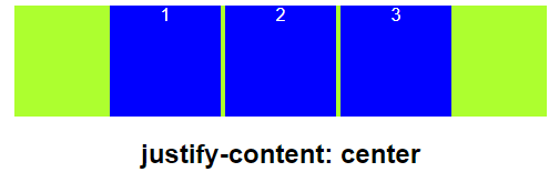
justify-content
This property set alignment along main-axis.
.container {
  // possible values
  justify-content: flex-start / flex-end / space-around / space-
  between / center / space-evenly.
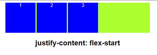


- flex-start: it is default value items are laid towards starting of flex-direction.
- flex-end: items are laid towards end of flex-direction.
- center: items are placed at the center.
- space-around: items laid down & have equal spaced around them.
- space-between: there is only space between the items of container & not between the borders of container & the items.
- space-evenly: items are equally spaced around the edges & between themselves also.
align-items
It sets out alignment along the cross-axis.


.container {
  // possible values
  align-items: center / flex-start / flex-end / baseline / stretch
}
So these are the properties which needs to be used on parent for the flex. You can play around with the given sandbox & learn by changing the values for the above listed properties because learning while making is best practice.
https://codesandbox.io/s/nervous-bassi-ckrh4x?file=/src/styles.css
PS: Feedback's are welcome!! Catch you next time !!!

Top comments (0)