In this post, we will see the Exploratory Data Analysis or EDA, but we are not going to use any models or feature extraction methods. Our main focus is on the data. In future posts, we’ll explore feature extraction methods and modeling.
I consider myself lucky when at the beginning of the day, a dataset is given to me. In most cases, we have to build our own datasets in order to create the models to answer, solve, or explore problems, and honestly, that is ok. It is our job to define the data that we need, to gather them, and eventually build a pretty good dataset. Let’s say we do that, then what? What are the next steps? “I am sure than I know my data very well, after all, I gathered them. I should start building the model and train it!” Well… this is a point, but it is something that is not sitting well with me. I love exploring my dataset, I ask questions, and the data reply with tables, numbers, and visuals. I want to know them better, to explore them, and to learn from them. This is a process I follow every time I get my hands on a dataset, and today I invite you to walk this path with me. We will download a dataset, explore its features, gain insights, and finally formulate some hypotheses.
This process is called Exploratory Data Analysis, in short EDA, and it is a fundamental ‘tool’ for a Data Scientist. It is a method that allows us to take an in-depth look into our data and gain knowledge of their format, their distribution. Without EDA, we are flying blind.
Tukey defined data analysis in 1961 as:
Procedures for analyzing data, techniques for interpreting the results of such procedures, ways of planning the gathering of data to make its analysis easier, more precise or more accurate, and all the machinery and results of (mathematical) statistics which apply to analyze data.
Prerequisites
First of all, we need a dataset. We will not go down the path to gather and create our own, this is a topic for another post, for now, we’ll visit Kaggle and download one. Yes! We found the perfect dataset! The old-time classic and very popular Titanic dataset. It is perfect for our case, there are missing values, strange columns, diverse types, etc.
Considering the environment I recommend using the following:
- Jupyter notebook (pip install jupyter)
- Pandas (pip install pandas)
- Matplotlib (pip install matplotlib)
- Seaborn (pip install seaborn)
- Kaggle API (pip install kaggle)
So without further ado let’s start!
Exploring our data
Let’s download the data from Kaggle. You can follow the instructions here to install Kaggle API, get the API keys from your account and set it up. Then you run the following command to download the dataset:
kaggle competitions download -c titanic -p data
I have created a folder called data and with the flag -p downloaded the dataset directly to the folder, you can do the same if you want. Now that we have all the data let’s explore.
We are going to open the dataset and take a glance at the data. Then search for missing values and explore each column.
df_data = pd.read_csv('data/train.csv')
df_data.head()
df_data.columns
>> Index(['PassengerId', 'Survived', 'Pclass', 'Name', 'Sex',
          'Age', 'SibSp', 'Parch', 'Ticket', 'Fare', 'Cabin',
          'Embarked'], dtype='object')

df_data.shape
>> (891, 12)
We have data for 891 passengers of the Titanic. Let’s see if there are any missing values
df_data.isnull().values.any()
>> True
Look at that! There are missing values in our dataset, but we want to know which columns and at what degree
total_rows =  df_data.shape[0]
columns = df_data.columns
na_values = {}

for column in columns:
    na_values[column] = f"{(1 - df_data[column].count() / total_rows)*100:.2f}%"

na_values

>> {'PassengerId': '0.00%',
 'Survived': '0.00%',
 'Pclass': '0.00%',
 'Name': '0.00%',
 'Sex': '0.00%',
 'Age': '19.87%',
 'SibSp': '0.00%',
 'Parch': '0.00%',
 'Ticket': '0.00%',
 'Fare': '0.00%',
 'Cabin': '77.10%',
 'Embarked': '0.22%'}
There are missing values on the following columns:
- Age
- Cabin
- Embarked
The cabin is missing the 77.1% of values, with Age coming second with almost 20%. We can explore Age but it will be very difficult to use Cabin.
Understanding your data
There is a detailed explanation of the columns in Kaggle. The column Survived is our label. The rest of the columns are as follows:
- PassengerId: This is the identifier of the passenger
- Pclass: This is the socio-economic status, we can see that the variable is ordinal
- 1: Upper
- 2: Middle
- 3: Lower
- Name
- Sex: This is a categorical variable, we will have to assign numbers to each category
- 0: male
- 1: female
- Age: This is also an interval-level variable
- SibSp: family relations, we will have to explore that variable
- Parch: family relations, we will also have to explore that variable
- Ticket: The ticket that passenger had
- Fare: Passenger fare
- Cabin: we can already see some NaN values here
- Embarked: Port
- C = Cherbourg
- Q = Queenstown
- S = Southampton
Let's analyze each feature!
Survived
# 1
survived = df_data['Survived'].values.tolist()
val, cnt = np.unique(survived, return_counts=True)
plt.bar(val, cnt)
plt.ylabel("Number of Passengers|")
plt.xlabel("Survivability")

# 2
survived = df_data['Survived'].values.tolist()
val, cnt = np.unique(survived, return_counts=True)
prop = cnt / len(survived)
plt.bar(val, prop)
plt.ylabel("Probability")
plt.xlabel("Survivability")

The probability of someone dying in the Titanic is higher than the probability of surviving. This is just an observation we did in our data by just plotting the survival rate. We extracted that hypothesis by just looking at one feature. Let’s see what we can learn from the other features!
P-class
P-class is the class of the passenger. We have three classes in the Titanic dataset:
- Upper class
- Middle class
- Lower class
The class is based on the income of the passenger, it is a proxy for socioeconomic status. Let's see what we can learn from that.
# 1
survived = df_data['Pclass'].values.tolist()
val, cnt = np.unique(survived, return_counts=True)
plt.bar(val, cnt)
plt.ylabel("Number of Passengers|")
plt.xlabel("Pclass")

# 2
passenger_classes = df_data['Pclass'].values.tolist()
val, cnt = np.unique(passenger_classes, return_counts=True)
prop = cnt / len(passenger_classes)
plt.bar(val, prop)
plt.ylabel("Percentage of passengers")
plt.xlabel("Economic Class")

# 3
sns.barplot(x='Pclass', y='Survived', data=df_data)


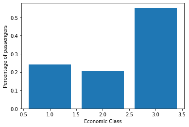
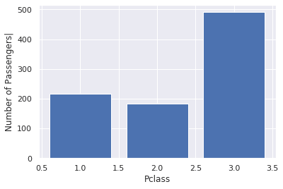
We can see that Titanic had a lot more passengers from the lower class, we can also see that more than 50% of the passengers are in the lowest economic class. Almost 70% of the non-survivors were at the lowest economic class.
Gender
We all know from the famous movie "Titanic" that in the case of emergency women and children are prioritized to the lifeboats. Let's see if we can back it up with data.
# 1
sex = df_data['Sex'].values.tolist()
val, cnt = np.unique(sex, return_counts=True)
plt.bar(val, cnt)
plt.ylabel("Number of passengers")
plt.xlabel("Sex")

# 2
sex = df_data['Sex'].values.tolist()
val, cnt = np.unique(sex, return_counts=True)
prop = cnt / len(sex)
plt.bar(val, prop)
plt.ylabel("Percentage of passengers")
plt.xlabel("Sex")

# 3
sns.barplot(x='Sex', y='Survived', data=df_data)

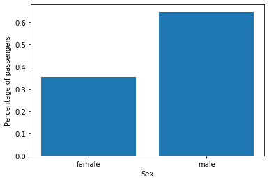
The numbers support the hypothesis we did, based on the movie! Let's look now at the age. There are some missing data in that column, we are going to use only the ones we have. When we build the model, we'll fill that data based on the observations (future post).
Age
Age is an interval-level variable. Interval-level data are quantitative, i.e. years, temperature, etc. In this dataset, Age is fractional if less than 1. If the age is estimated, it is in the form of xx.5. We will transform age into integers with .x going to 0.
# 1
age = df_data['Age'].dropna().astype(int).values.tolist()
val, cnt = np.unique(age, return_counts=True)
plt.bar(val, cnt)
plt.ylabel("Number of passengers")
plt.xlabel("Age")

# 2
age = df_data['Age'].dropna().astype(int).values.tolist()
sns.distplot(age)

# 3
age_survived = df_data[df_data['Survived'] == 0]['Age'].dropna().astype(int).values.tolist()
age_not_survived = df_data[df_data['Survived'] == 1]['Age'].dropna().astype(int).values.tolist()
ax = sns.distplot(age_survived, label='survived')
ax = sns.distplot(age_not_survived, label='not-survived')
plt.legend()
ax.set(xlabel='Age', ylabel='Percentage')


Again, the hypothesis is valid, children and infants have a high survival rate. We also see that passengers in their 20s-40s also had a high survival rate, care to bet on their gender? Let's see!
# 1
age = df_data[(df_data['Survived'] == 1) & (df_data['Sex'] == 'female')]['Age'].dropna().astype(int).values.tolist()
ax = sns.distplot(age)
ax.set(xlabel='Age', ylabel='Percentage - survived')

# 2
age = df_data[(df_data['Survived'] == 1) & (df_data['Sex'] == 'male')]['Age'].dropna().astype(int).values.tolist()
ax = sns.distplot(age)
ax.set(xlabel='Age', ylabel='Percentage - survived')

Well, that makes sense for the female passengers, but we also notice an increase in survival rate on male passengers around their 30s. We know that in the Titanic all women had the highest priority to get into a lifeboat, but it seems that some men potentially with higher P-class managed to get in.
Now we'll follow the same practices for the rest of the features, and you can see the full analysis of each column here.
Correlations
We'll have to look for correlations between features. First, we assign the value 0 to males and 1 to females
df_data['Sex'] = df_data['Sex'].map({'female': 1, 'male': 0})
df_data.head()
Now we will search for correlations between the columns. As for age, we will try to see if filling the NaN values is making any difference.
# 1
corr_matrix = df_data[['Survived', 'Sex', 'Age', 'Pclass', 'Fare']].corr()
corr_matrix

# 2
df_data['new_age'] = df_data['Age'].fillna(df_data['Age'].mean())
corr_matrix = df_data[['Survived', 'Sex', 'new_age', 'Pclass', 'Fare']].corr()
corr_matrix


Let's try a heatmap also.
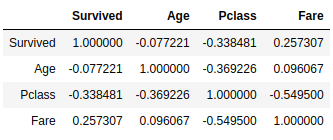
We can see that Survived has a correlation with Sex, P-class, and Fare and the movie can totally back this up! There is a lot more in that heatmap.
- Fare has a negative correlation with P-class, which means the more the fare increases the more the P-class decreases, which makes sense, P-class 1 is the Upper one.
- Age has a negative correlation with P-class
- We see the usual suspects, the Survived is correlated with Sex and Fare and negatively correlated with Pclass. This supports some of the hypotheses we tested above.
There is so much more that we can do with the data, so I decided that we will explore the Bayes theorem in a future post. I would like to hear your thoughts, what you would have done differently, what more would you have explored? Let me know in the comment section below or on Twitter @siaterliskonsta. If you think I am missing something, or you need more explanation please let me know.


Top comments (0)