Introduction
This is part of the UI Kit with React, TypeScript, Storybook and Tailwind, make sure you've checked out the previous entries in the series if you find anything confusing 😊.
In this series I aim to implement a basic button component and integrate it with Storybook.
The button
Let's start off by creating what's necessary for the button component. I want my button to support three sizes, three variants, accept an onClick handler and to specify the text in the button.
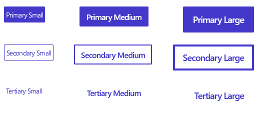
We will build the following in this blog post:
In the project, create the following file:
src/components/Button/Button.tsx
First, we'll create the types I want my Button to support:
// Button.tsx

export enum ButtonVariant {
  PRIMARY = "primary",
  SECONDARY = "secondary",
  TERTIARY = "tertiary",
}

export enum ButtonSize {
  SMALL = "small",
  MEDIUM = "medium",
  LARGE = "large",
}

export type ButtonProps = {
  type?: "submit" | "reset" | "button";
  text: string;
  variant: ButtonVariant;
  size?: ButtonSize;
  onClick?: () => void;
};
This lays a nice foundation, having the types in advance makes the writing of the Button component easier.
Now we need to start working on the component itself, start of by writing the necessary boilerplate:
// Button.tsx

const Button = ({
  type = "submit",
  text,
  size = ButtonSize.MEDIUM,
  variant = ButtonVariant.PRIMARY,
  onClick,
}: ButtonProps) => {
  return (
    <button onClick={onClick} type={type}>
      {text}
    </button>
  );
};

export default Button;
At this stage, the Button component just looks like this in all variants and sizes:
So let's add some styles with tailwind:
const shared =
  "rounded-sm text-white tracking-tighter transition-color duration-150";

const small = "p-1 text-sm font-medium gap-2 border-1";
const medium = "px-3 py-1.5 font-semibold border-2";
const large = "px-4 py-2 text-lg font-semibold border-4";

const primary =
  "bg-indigo-700 border-transparent text-white hover:bg-indigo-600";

const secondary =
  "border border-indigo-700 text-indigo-700 hover:bg-indigo-200";

const tertiary =
  "text-indigo-700 border-transparent bg-white hover:bg-indigo-600 hover:text-white";

const getSizeClass = (size: ButtonSize) => {
  if (size === ButtonSize.SMALL) return small;
  if (size === ButtonSize.MEDIUM) return medium;
  if (size === ButtonSize.LARGE) return large;
};

const getVariantClass = (variant: ButtonVariant) => {
  if (variant === ButtonVariant.PRIMARY) return primary;
  if (variant === ButtonVariant.SECONDARY) return secondary;
  if (variant === ButtonVariant.TERTIARY) return tertiary;
};
And import classnames so that we can easily combine classes in our Button:
// Button.tsx

import cx from "classnames";

const Button = ({
  type = "submit",
  text,
  size = ButtonSize.MEDIUM,
  variant = ButtonVariant.PRIMARY,
  onClick,
}: ButtonProps) => {
  return (
    <button
      onClick={onClick}
      className={cx(shared, getSizeClass(size), getVariantClass(variant))}
      type={type}
    >
      {text}
    </button>
  );
};
That's all we need for our Button component 😊.
Adding our Button to Storybook
To display our Button with various predefined properties in Storybook, create the following file:
src/stories/Button/Button.stories.tsx
And add the following content:
// Button.stories.tsx

import { ComponentMeta, Story } from "@storybook/react";
import Button, {
  ButtonProps,
  ButtonSize,
  ButtonVariant,
} from "../../components/Button/Button";

export default {
  title: "Button",
  component: Button,
} as ComponentMeta<typeof Button>;

const Template: Story<ButtonProps> = (args) => <Button {...args} />;

export const SmallPrimary = Template.bind({});
SmallPrimary.args = {
  text: "Submit",
  variant: ButtonVariant.PRIMARY,
  size: ButtonSize.SMALL,
};

export const MediumPrimary = Template.bind({});
MediumPrimary.args = {
  text: "Submit",
  variant: ButtonVariant.PRIMARY,
  size: ButtonSize.MEDIUM,
  type: "button",
};

export const MediumSecondary = Template.bind({});
MediumSecondary.args = {
  text: "Submit",
  variant: ButtonVariant.SECONDARY,
  size: ButtonSize.MEDIUM,
  type: "button",
};

export const LargeTertiary = Template.bind({});
LargeTertiary.args = {
  text: "Submit",
  variant: ButtonVariant.TERTIARY,
  size: ButtonSize.LARGE,
  type: "button",
};
This will give you the following list once you run Storybook:

If you want to accomplish what my initial screenshot in this post included, add the following as well:
// Button.stories.tsx

export const All = () => {
  return (
    <div className="flex gap-6 items-start flex-col" style={{ width: "500px" }}>
      <div className="flex gap-2 items-start justify-between w-full">
        <Button
          text={"Primary Small"}
          variant={ButtonVariant.PRIMARY}
          size={ButtonSize.SMALL}
        ></Button>
        <Button
          text={"Primary Medium"}
          variant={ButtonVariant.PRIMARY}
          size={ButtonSize.MEDIUM}
        ></Button>
        <Button
          text={"Primary Large"}
          variant={ButtonVariant.PRIMARY}
          size={ButtonSize.LARGE}
        ></Button>
      </div>
      <div className="flex gap-2 items-start justify-between w-full">
        <Button
          text={"Secondary Small"}
          variant={ButtonVariant.SECONDARY}
          size={ButtonSize.SMALL}
        ></Button>
        <Button
          text={"Secondary Medium"}
          variant={ButtonVariant.SECONDARY}
          size={ButtonSize.MEDIUM}
        ></Button>
        <Button
          text={"Secondary Large"}
          variant={ButtonVariant.SECONDARY}
          size={ButtonSize.LARGE}
        ></Button>
      </div>
      <div className="flex gap-2 items-start justify-between w-full">
        <Button
          text={"Tertiary Small"}
          variant={ButtonVariant.TERTIARY}
          size={ButtonSize.SMALL}
        ></Button>
        <Button
          text={"Tertiary Medium"}
          variant={ButtonVariant.TERTIARY}
          size={ButtonSize.MEDIUM}
        ></Button>
        <Button
          text={"Tertiary Large"}
          variant={ButtonVariant.TERTIARY}
          size={ButtonSize.LARGE}
        ></Button>
      </div>
    </div>
  );
};
Troubleshooting
If you can't get it to run, or have some other concerns, check it out from my repo and see if that works:
https://github.com/simon-nystrom/newcurrent-react-ui/tree/button
Stay tuned for the next entry in the series 😊. What component would you like to see next?

Top comments (0)