Design systems are all the rage these days - here's how to make your own.
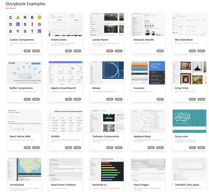
Because React is built on a plug and play component philosophy, every company has rushed to build and open source their component libraries, which are both displayed on a hot reloadable Storybook as well as importable as an npm library. Look at all these companies!!!
Because companies also care about maintainability, they also like creating Design Systems in Typescript. The prop typing that Typescript enforces helps us autogenerate documentation for our design systems, so it is a win-win!
Today we are going to walk through how to build and ship a React + Typescript Storybook Design System with handy addons for documentation. The end result looks like this:
The Short Version
git clone https://github.com/sw-yx/react-typescript-storybook-starter
yarn
npm run storybook
Read more at the repo here.
The DIY Version
Ready? Lets go!
Assuming you are in an empty folder:
yarn init -y
yarn add -D @storybook/react @storybook/addon-info @storybook/addon-knobs storybook-addon-jsx @types/react babel-core typescript awesome-typescript-loader react-docgen-typescript-webpack-plugin jest "@types/jest" ts-jest
yarn add react react-dom
mkdir .storybook src
touch .storybook/config.js .storybook/addons.js .storybook/welcomeStory.js utils.js
I have gone for a "colocated stories" setup where your story for a component lives next to the component. There is another setup where the stories are in a totally separate stories folder. I find this to be extra hassle when working on a component and its associated Story. So we will set up the rest of this app with colocated stories.
To have a runnable storybook, add this npm script to your package.json:
{
  "scripts": {
    "storybook": "start-storybook -p 6006 -c .storybook"
  }
}
There's no strong reason why we want to run storybook on port 6006, it's just what seems to be common.
In .storybook/config.js:
import { configure } from '@storybook/react';
import { setAddon, addDecorator } from '@storybook/react';
import JSXAddon from 'storybook-addon-jsx';
import { withKnobs, select } from '@storybook/addon-knobs/react';
addDecorator(withKnobs);
setAddon(JSXAddon);

// automatically import all files ending in *.stories.js
const req = require.context('../src', true, /.stories.js$/);
function loadStories() {
  require('./welcomeStory');
  req.keys().forEach(filename => req(filename));
}

configure(loadStories, module);
In .storybook/addons.js:
import '@storybook/addon-knobs/register';
import 'storybook-addon-jsx/register';
In utils.js:
import { withInfo } from '@storybook/addon-info';
const wInfoStyle = {
  header: {
    h1: {
      marginRight: '20px',
      fontSize: '25px',
      display: 'inline'
    },
    body: {
      paddingTop: 0,
      paddingBottom: 0
    },
    h2: {
      display: 'inline',
      color: '#999'
    }
  },
  infoBody: {
    backgroundColor: '#eee',
    padding: '0px 5px',
    lineHeight: '2'
  }
};
export const wInfo = text =>
  withInfo({ inline: true, source: false, styles: wInfoStyle, text: text });
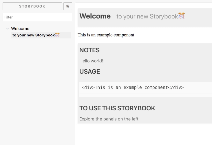
In .storybook/welcomeStory.js:
import React from 'react';

import { storiesOf } from '@storybook/react';
import { wInfo } from '../utils';

storiesOf('Welcome', module).addWithJSX(
  'to your new Storybook🎊',
  wInfo(`


    ### Notes

    Hello world!:

    ### Usage
    ~~~js
    <div>This is an example component</div>
    ~~~

    ### To use this Storybook

    Explore the panels on the left.
  `)(() => <div>This is an example component</div>)
);
Let's see it work! npm run storybook:
Your first Typescript component
Time to make a Typescript component.
mkdir src/Button
touch src/Button/Button.tsx src/Button/Button.css src/Button/Button.stories.js
In src/Button/Button.tsx:
import * as React from 'react';
import './Button.css';
export interface Props {
  /** this dictates what the button will say  */
  label: string;
  /** this dictates what the button will do  */
  onClick: () => void;
  /**
   * Disables onclick
   *
   * @default false
   **/
  disabled?: boolean;
}
const noop = () => {}; // tslint:disable-line
export const Button = (props: Props) => {
  const { label, onClick, disabled = false } = props;
  const disabledclass = disabled ? 'Button_disabled' : '';
  return (
    <div
      className={`Button ${disabledclass}`}
      onClick={!disabled ? onClick : noop}
    >
      <span>{label}</span>
    </div>
  );
};
In src/Button/Button.css:
.Button span {
  margin: auto;
  font-size: 16px;
  font-weight: bold;
  text-align: center;
  color: #fff;
  text-transform: uppercase;
}
.Button {
  padding: 0px 20px;
  height: 49px;
  border-radius: 2px;
  border: 2px solid var(--ui-bkgd, #3d5567);
  display: inline-flex;
  background-color: var(--ui-bkgd, #3d5567);
}

.Button:hover:not(.Button_disabled) {
  cursor: pointer;
}

.Button_disabled {
  --ui-bkgd: rgba(61, 85, 103, 0.3);
}
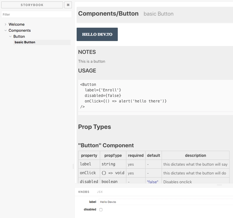
In src/Button/Button.stories.js:
import React from 'react';

import { storiesOf } from '@storybook/react';
import { Button } from './Button';
import { wInfo } from '../../utils';
import { text, boolean } from '@storybook/addon-knobs/react';

storiesOf('Components/Button', module).addWithJSX(
  'basic Button',
  wInfo(`

  ### Notes

  This is a button

  ### Usage
  ~~~js
  <Button
    label={'Enroll'}
    disabled={false}
    onClick={() => alert('hello there')}
  />
  ~~~`
)(() => (
    <Button
      label={text('label', 'Enroll')}
      disabled={boolean('disabled', false)}
      onClick={() => alert('hello there')}
    />
  ))
);
We also have to make Storybook speak typescript:
touch .storybook/webpack.config.js tsconfig.json
In webpack.config.js:
const path = require('path');
const TSDocgenPlugin = require('react-docgen-typescript-webpack-plugin');
module.exports = (baseConfig, env, defaultConfig) => {
  defaultConfig.module.rules.push({
    test: /\.(ts|tsx)$/,
    loader: require.resolve('awesome-typescript-loader')
  });
  defaultConfig.plugins.push(new TSDocgenPlugin());
  defaultConfig.resolve.extensions.push('.ts', '.tsx');
  return defaultConfig;
};
Note - you may have seen old instructions from const genDefaultConfig = require('@storybook/react/dist/server/config/defaults/webpack.config.js'); but that is now deprecated. We are using Full control mode + default instead.
In tsconfig.json:
{
  "compilerOptions": {
    "outDir": "build/lib",
    "module": "commonjs",
    "target": "es5",
    "lib": ["es5", "es6", "es7", "es2017", "dom"],
    "sourceMap": true,
    "allowJs": false,
    "jsx": "react",
    "moduleResolution": "node",
    "rootDir": "src",
    "baseUrl": "src",
    "forceConsistentCasingInFileNames": true,
    "noImplicitReturns": true,
    "noImplicitThis": true,
    "noImplicitAny": true,
    "strictNullChecks": true,
    "suppressImplicitAnyIndexErrors": true,
    "noUnusedLocals": true,
    "declaration": true,
    "allowSyntheticDefaultImports": true,
    "experimentalDecorators": true
  },
  "include": ["src/**/*"],
  "exclude": ["node_modules", "build", "scripts"]
}
Ok that should be it. npm run storybook again!
Boom!
Time to build and ship your (one-Button) Design System
Typescript is only responsible for your Typescript-to-JS compiled code, but you're also going to want to ship CSS and other assets. So you have to do an extra copy process when you build your storybook:
yarn add -D cpx
touch src/index.tsx
echo "node_modules" >> .gitignore
git init # version control is good for you
In your package.json, add:
{
  "main": "build/lib/index.js",
  "types": "build/lib/index.d.ts",
  "files": [
    "build/lib"
  ],
  "scripts": {
    "storybook": "start-storybook -p 6006 -c .storybook",
    "build": "npm run build-lib && build-storybook",
    "build-lib": "tsc && npm run copy-css-to-lib",
    "build-storybook": "build-storybook",
    "copy-css-to-lib": "cpx \"./src/**/*.css\" ./build/lib"
  },
}
Note that you already have a main from your init, so overwrite it.
In src/index.tsx:
export {Button} from './Button/Button'
This is where you re-export all your components in one file so that you can import them all together. This is known as the Barrel pattern
Now when you run npm run build, it builds just your Design system in build without any of the storybook stuff, AND when you run npm run build-storybook, it builds a static page storybook you can host anywhere!
Did I leave out anything? let me know!

Top comments (4)
Great article, but couple of questions.
Why did you use
awesome-typescript-loader instead of justts-loader? Digging myself and using the most recent versions of webpack, react, storybook, etc..., it won't run even with you source, but whereas if I loadts-loader, it is just fine.Also,
cpxis fairly dated and doesn't seem to support recent updates. Was that the case when this tutorial was put together?And lastly, would you see any benefit to have jsx and tsx stories or just one or the other?
We use TypeScript, React and Styled Components at work with Storybook. It's such a great project for building UI components.
Two things I wasn't aware of before reading your article,
. addWithJSX (...)andreact-docgen-typescript-webpack-pluginwhich led me to react-docgen. react-docgen is going to come in handy on a non-TS project.Also in regards to the barrel pattern, there was an interesting discussion on Twitter about it this week.
Thanks for sharing Shawn. 🔥💯
How would I set up emotion styles to compile correctly? I tried doing this in the ts config JSON style that awesome-typescript-loader links to by setting babelOption plugins to reference emotion and some other things. I am not getting my emotion styles to compile correctly for storybook yet, though. Do you have any suggestions or examples? Thanks!
Great article! I was able to fix an error I found in the project dependencies. I needed to run
yarn add @storybook/react@4.0.0-alpha.3