
TL;DR: The human hearing range spans from 20 Hz to 20 kHz. Similarly, we’ll visualize the hearing ranges of various living beings by customizing the Syncfusion WPF Range Column Chart to create a Range Bar Chart.
Welcome to the Chart of the Week blog series!
Today, we’ll explore how to visualize the hearing range of various living beings, from humans to animals, by creating a Range Bar Chart (Transposed Column Chart) using the Syncfusion WPF Charts control. We’ll also customize the series and marker appearance of the range bar to achieve the dumbbell chart appearance.
The Range Bar Chart is a horizontal range column chart that uses range bars to display values for one or more items based on high and low values. It is also called a dumbbell chart. Using this chart, we’ll visualize the hearing range from Hertz (Hz) to kilohertz (kHz) for various living beings on Earth.
Refer to the following image.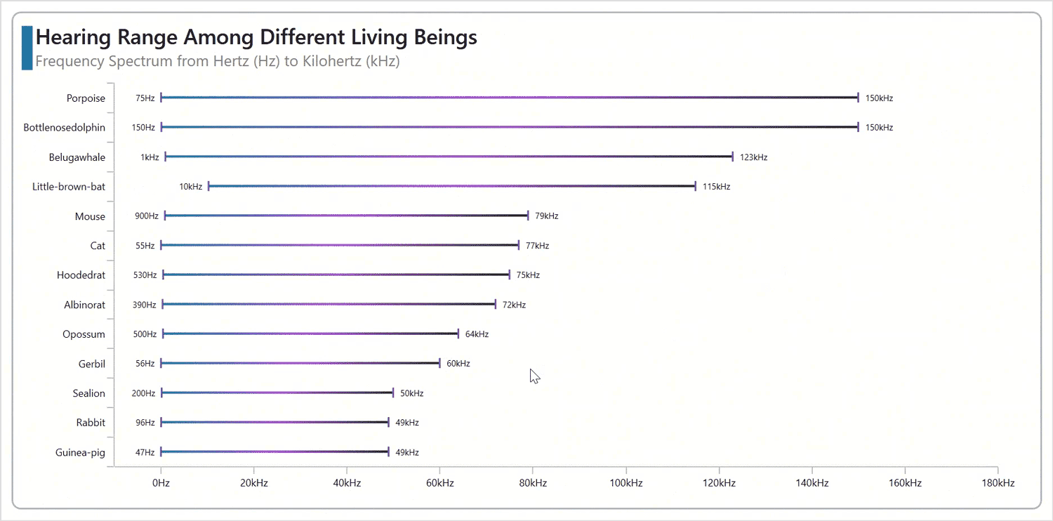
Let’s explore the steps to showcase these details using the WPF Range Bar Chart!
Step 1: Gather hearing range data
Before creating the chart, we need to gather data on the hearing range of various living beings from Wikipedia.
Step 2: Populate the data for the chart
Define the HearingRangeModel class with the LivingBeings, HighValue, and LowValue properties to store the hearing capacity data for our chart.
public class HearingRangeModel
{
    public string LivingBeings { get; set; }
    public double HighValue { get; set; }
    public double LowValue { get; set; }
    public HearingRangeModel(string livingBeings, double highValue, double lowValue)
    {
        LivingBeings = livingBeings;
        HighValue = highValue;
        LowValue = lowValue;
    }
}
Now, generate the data collection that illustrates the hearing capacity sources using the HearingRangeData class with the Data property.
public class HearingRangeData
{
    public ObservableCollection<HearingRangeModel> Data { get; set; }
    public HearingRangeData()
    {
        Data = new ObservableCollection<HearingRangeModel>()
        {
            new HearingRangeModel("Tuna",50,1100),
            new HearingRangeModel("Chicken", 125,2000),
            new HearingRangeModel("Goldfish", 20, 3000),
            new HearingRangeModel("Bullfrog",100,3000),
            new HearingRangeModel("Catfish",50,4000),
            new HearingRangeModel("Treefrog",50, 4000),
            new HearingRangeModel("Canary",250, 8000),
            new HearingRangeModel("Cockatiel",250,8000),
            new HearingRangeModel("Parakeet",200,8500),
            new HearingRangeModel("Elephant",17,10500),
            new HearingRangeModel("Owl",200,12000),
            new HearingRangeModel("Human",31,19000),
            new HearingRangeModel("Chinchilla",52,33000),
            new HearingRangeModel("Horse",55,33500),
            new HearingRangeModel("Cow",23,35000),
            new HearingRangeModel("Raccoon",100,40000),
            new HearingRangeModel("Sheep",125,42500),
            new HearingRangeModel("Dog",64,44000),
            new HearingRangeModel("Ferret",16,44000),
            new HearingRangeModel("Hedgehog",250,45000),
            new HearingRangeModel("Guinea-pig",47,49000),
            new HearingRangeModel("Rabbit",96,49000),
            new HearingRangeModel("Sealion",200,50000),
            new HearingRangeModel("Gerbil",56,60000),
            new HearingRangeModel("Opossum",500,64000),
            new HearingRangeModel("Albinorat", 390, 72000),
            new HearingRangeModel("Hoodedrat",530,75000),
            new HearingRangeModel("Cat",55,77000),
            new HearingRangeModel("Mouse",900, 79000),
            new HearingRangeModel("Little-brown-bat",10300,115000),
            new HearingRangeModel("Belugawhale",1000,123000),
            new HearingRangeModel("Bottlenosedolphin",150,150000),
            new HearingRangeModel("Porpoise", 75, 150000),
       };
   }
}
Step 3: Configure the Syncfusion WPF Charts
Let’s configure the Syncfusion WPF Charts control using this documentation.
Refer to the following code example.
<chart:SfChart>

 <chart:SfChart.PrimaryAxis>
  <chart:CategoryAxis>
  </chart:CategoryAxis>
 </chart:SfChart.PrimaryAxis>

 <chart:SfChart.SecondaryAxis>
  <chart:NumericalAxis>
  </chart:NumericalAxis>
 </chart:SfChart.SecondaryAxis>

</chart:SfChart>
Step 4: Binding data to WPF Range Bar Chart
To visualize the hearing range data, we will use the Syncfusion RangeColumnSeries. We will set the IsTransposed property to True to design it to replicate the Range Bar Chart.
Refer to the following code example. Here, we have bound the ItemSource, XBindingPath, High, and Low properties with the Data, LivingBeings, HighValue, and LowValue properties, respectively.
<chart:RangeColumnSeries ItemsSource="{Binding Data}" High="HighValue" Low="LowValue" XBindingPath="LivingBeings" IsTransposed="True">

</chart:RangeColumnSeries>
Step 5: Customize the chart appearance
We can enhance the appearance of the WPF Range Bar Chart by customizing its elements, such as the title, axis, data labels, and marker.
Customizing the chart title
Adding a title can help make the data presented in the chart more easily understood. Refer to the following code example to customize the chart title.
<chart:SfChart HorizontalHeaderAlignment="Left" >

 <chart:SfChart.Header>
  <Grid Margin="0,0,0,10">
   <Grid.ColumnDefinitions>
     <ColumnDefinition Width="13"/>
     <ColumnDefinition Width="*"/>
   </Grid.ColumnDefinitions>
   <StackPanel Orientation="Vertical" Margin="0,5,0,0" Background="#2582a4"/>
   <StackPanel Grid.Column="1" Margin="3,0,0,0">
    <TextBlock Text="Hearing Range Among Different Living Beings" FontSize="25" FontWeight="SemiBold" Foreground="Black"/>
    <TextBlock Text="Frequency Spectrum from Hertz (Hz) to Kilohertz (kHz)" FontSize="18" Foreground="Gray"/>
   </StackPanel>
  </Grid>
 </chart:SfChart.Header>

</chart:SfChart>
Customizing the chart axis
You can customize the chart axis using the following properties:
- ShowGridLines: To adjust the visibility of the major grid lines.
- LabelStyle: To modify the style of the axis labels.
- LabelPlacement: To place the axis label at the desired position.
- LabelCreated: To customize the label format for a specific or whole label.
Refer to the following code example.
XAML
<chart:SfChart.PrimaryAxis>
 <chart:CategoryAxis AutoScrollingMode="End" AutoScrollingDelta="13" ShowGridLines="False" Interval="1" LabelPlacement="BetweenTicks">
  <chart:CategoryAxis.LabelStyle>
   <chart:LabelStyle FontSize="12"/>
  </chart:CategoryAxis.LabelStyle>
 </chart:CategoryAxis>
</chart:SfChart.PrimaryAxis>

<chart:SfChart.SecondaryAxis>
 <chart:NumericalAxis Minimum="-10000" Maximum="180000" ShowGridLines="False" LabelCreated="LabelCreated">
  <chart:NumericalAxis.LabelStyle>
   <chart:LabelStyle FontSize="12"/>
  </chart:NumericalAxis.LabelStyle>
 </chart:NumericalAxis>
</chart:SfChart.SecondaryAxis>
C#
private void LabelCreated(object sender, LabelCreatedEventArgs e)
{
    double position = e.AxisLabel.Position;
    if (position >= 1000 && position <= 180000)
    {
        string text = (position / 1000).ToString("N0");
        e.AxisLabel.LabelContent = $"{text}kHz";
    }
    else
    {
        e.AxisLabel.LabelContent = $"{position:N0}Hz";
    }
}
Customizing the chart color and size
The following code example shows how to customize the chart’s size and color using the SegmentSpacing and Interior properties, respectively.
<chart:RangeColumnSeries SegmentSpacing="0.9">

 <chart:RangeColumnSeries.Interior>
  <LinearGradientBrush StartPoint="0,0" EndPoint="1,0">
    <GradientStop Color="#2582a4" Offset="0"/>
    <GradientStop Color="#ae3de0" Offset="0.5"/>
    <GradientStop Color="#292F2E" Offset="1"/>
  </LinearGradientBrush>
 </chart:RangeColumnSeries.Interior>

</chart:RangeColumnSeries>
Customize the data label and marker appearance
To improve readability, we can activate and customize the chart data labels and markers using the AdornmentsInfo property.
<chart:RangeColumnSeries>

 <chart:RangeColumnSeries.AdornmentsInfo>
  <chart:ChartAdornmentInfo ShowLabel="True" AdornmentsPosition="TopAndBottom" Background="Transparent" LabelPosition="Outer" ShowMarker="True" Symbol="VerticalLine">
   <chart:ChartAdornmentInfo.LabelTemplate>
    <DataTemplate>
     <Label Content="{Binding Converter={StaticResource valueToRangeConverter}}" FontSize="10"/>
    </DataTemplate>
   </chart:ChartAdornmentInfo.LabelTemplate>
  </chart:ChartAdornmentInfo>
 </chart:RangeColumnSeries.AdornmentsInfo>

</chart:RangeColumnSeries>
Enabling the panning interactivity
To improve the visualization, we can enable panning to scroll through series within a particular range using the ChartZoomPanBehavior and AutoScrollingDelta properties.
<chart:SfChart.PrimaryAxis>
 <chart:CategoryAxis AutoScrollingMode="End" AutoScrollingDelta="13">
 </chart:CategoryAxis>
</chart:SfChart.PrimaryAxis>

<chart:SfChart.Behaviors>
 <chart:ChartZoomPanBehavior EnablePinchZooming="False" ResetOnDoubleTap="False" EnablePanning="True" EnableMouseWheelZooming="False"/>
</chart:SfChart.Behaviors>
After executing the previous code examples, the output will look like the following image.

Conclusion
Thanks for reading! In this blog, we’ve seen how to visualize the data on hearing range using the Syncfusion WPF Range Bar Chart (Transposed Column Chart). We strongly encourage you to follow the steps outlined in this blog and share your feedback in the comments section below.
If you require assistance, please don’t hesitate to contact us via our support forum, support portal, or feedback portal. We are always eager to help you!
Related blogs
- What’s New in WPF Gantt Chart: 2024 Volume 2
- Chart of the Week: Creating a WPF Pie Chart to Visualize the Percentage of Global Forest Area for Each Country
- Syncfusion Essential Studio 2024 Volume 2 Is Here!
- Chart of the Week: Creating a WPF Sunburst Chart to Visualize the Syncfusion Chart of the Week Blog Series

Top comments (0)