If you are a mobile app developer and love to use the Flutter framework, you’ll be thrilled to know that the beta version of the Syncfusion Flutter Charts package is available on pub.dev.
The Syncfusion Flutter Charts package is a data-visualization library written natively in Dart for creating beautiful and high-performance charts for high-quality mobile app user interfaces for iOS and Android using the Flutter framework. It allows users to plot data and render customized chart types with seamless interactions and responsively smooth animations. 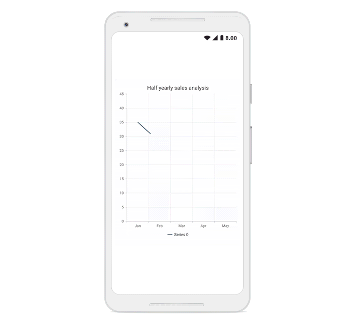
What is Flutter?
Flutter is Google’s mobile app development SDK that has widgets and tools for creating natively compiled cross-platform mobile applications from a single code base. Flutter has the following advantages over other cross-platform, mobile app development frameworks:
• Fast development cycle: With stateful hot reload, you can repaint the app live without building it again.
• Single code base: Use a single code base to build applications in iOS and Android.
• Flexible UIs and widgets: A wide range of widgets and tools are available for building flexible apps.
• Native performance: The framework provides complete native support, even for scrolling, navigation, icons, and fonts.
• Open source: Flutter is open source and available to use or study free of cost.
Flutter charts features
Syncfusion Flutter charts are rich in features, including functionality for rendering Cartesian charts and Circular charts. They are completely customizable and extendable, and their feature list will expand aggressively in upcoming updates. Have a look at the following current features.
Chart types
The chart widget includes functionality for plotting 12 series types:
• Line
• Spline
• Area
• Step line
• Fast line
• Column
• Bar
• Bubble
• Scatter
• Pie
• Doughnut
• Radial bar
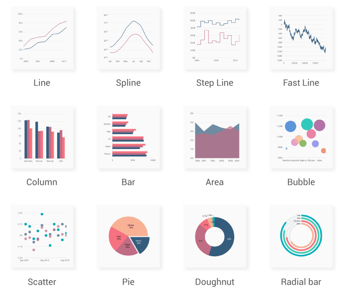
Each chart type is easily configured with built-in support for creating stunning visual effects. You can add any number of series to the chart. Features like markers, data labels, data label builder, animation, gradient fill, dashes, sorting, and annotations are easy to incorporate and customize.
Axis types
Plot any type of data in a graph with the help of three axes types:
• Numeric
• Category
• Date-time
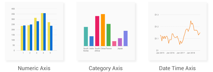
Axis features like label intersecting, edge label placement, label rotation, axis opposition, inverse axis, and multiple axis allow users to further customize axis elements to make an axis more readable.
Legend
Display additional information about a chart series with the help of a legend. The chart legend can also be used to collapse the series. Legends can be wrapped or scrolled if items exceed the available bounds. 
User interaction
User experience is greatly enhanced by the following interaction features:
• Zooming and panning
• Crosshairs
• Trackballs
• Drilling down
• Events
• Selection
• Tooltips

Dynamic updates
A chart can be updated dynamically with live data that changes in seconds, like stock prices, temperature, speed (i.e. data points or series can be added or removed from the rendered chart dynamically). Also, the entire data source of the chart can be completely replaced.
We plan to add even more chart types, as well as richer charts, in future releases.
Add Flutter Charts to your app
This section explains how to create a simple chart and demonstrates basic chart usage.
Add dependency
Add the Syncfusion Flutter Charts dependency to your the pubspec.yaml file.
dependencies:syncfusion\_flutter\_charts: ^1.0.0-beta.3
Get packages
Run the following command to get the required packages.
$ flutter pub get
Import package
Import the following package in your Dart code.
import 'package:syncfusion\_flutter\_charts/charts.dart';
Add a chart to the widget tree
Add the chart widget as a child of any widget. Here, add the chart widget as a child of the container widget.
@override
Widget build(BuildContext context) {
  return Scaffold(
    body: Center(
      child: Container(
        child: SfCartesianChart(
        )
      )
    )
  );
}
Bind data source
Based on your data, initialize the appropriate axis type and series type. In the series, you need to map the data source and the fields for x and y data points. Since we are going to render a line chart with a category axis, I have initialized those.
@override
Widget build(BuildContext context) {
  return Scaffold(
    body: Center(
      child: Container(
        child: SfCartesianChart(
          primaryXAxis: CategoryAxis(), // Initialize category axis.
          series: <LineSeries<SalesData, String>>[ // Initialize line series.
            LineSeries<SalesData, String>(
              dataSource: [
                SalesData('Jan', 35),
                SalesData('Feb', 28),
                SalesData('Mar', 34),
                SalesData('Apr', 32),
                SalesData('May', 40)
              ],
              xValueMapper: (SalesData sales, _) => sales.year,
              yValueMapper: (SalesData sales, _) => sales.sales
            )
          ]
        )
      )
    )
  );
}

class SalesData {
  SalesData(this.year, this.sales);
  final String year;
  final double sales;
}
Add chart elements
Finally, add Syncfusion Flutter Charts elements such as a title, legend data labels, and tooltips to display additional information about data plotted in the chart.
@override
Widget build(BuildContext context) {
  return Scaffold(
    body: Center(
      child: Container(
        child: SfCartesianChart(
          primaryXAxis: CategoryAxis(),
          title: ChartTitle(text: 'Half yearly sales analysis'), //Chart title.
          legend: Legend(isVisible: true), // Enables the legend.
          tooltipBehavior: ChartTooltipBehavior(enable: true), // Enables the tooltip.
          series: <LineSeries<SalesData, String>>[
            LineSeries<SalesData, String>(
              dataSource: [
                SalesData('Jan', 35),
                SalesData('Feb', 28),
                SalesData('Mar', 34),
                SalesData('Apr', 32),
                SalesData('May', 40)
              ],
              xValueMapper: (SalesData sales, _) => sales.year,
              yValueMapper: (SalesData sales, _) => sales.sales,
              dataLabelSettings: DataLabelSettings(isVisible: true) // Enables the data label.
            )
          ]
        )
      )
    )
  );
}
Thus, the previous code renders the chart seen in the following image.

Explore Flutter chart examples and demos
• You can see Syncfusion’s Flutter app with many examples in this GitHub location.
• Additionally, take a look at our demo app in the Play Store.
If you want an in-depth learning experience on how to create a complete Flutter app, be sure to read Flutter Succinctly by Ed Freitas. It’s part of Syncfusion’s library of free technical ebooks.
Upcoming development plans
Next, we plan to implement Scheduler, and Circular Gauge widgets in Flutter, and add chart types and usability features in the Charts widget.
We prioritize our development features and widgets based on developers’ needs; hence, if you would like us to add a new widget, or if you have questions about our Flutter charts, please let us know in the comments section of this post. You can also contact us through our support forum, Direct-Trac, or feedback portal. This helps us prioritize the next set of controls and features to implement.
Conclusion
In this blog post, we walked through our new Syncfusion Flutter Charts widget and discussed our future plans. We invite you to try out the widget and provide your feedback to make it more robust before it’s a final release. As always, we are happy to assist you!
The post Introducing Data Visualization Widgets for Flutter appeared first on Syncfusion Blogs.

Top comments (0)