
Ok.... So this one is a big one for me. I have MAJOR issues seeing forms. Especially when people use white on... a little less white... With light grey text... WTF!??!?!?
Labeling
Using a placeholder without a label is problematic because placeholder text usually lacks sufficient contrast. Apple has this problem with their registration form:

Using labels works a lot better.

But even then the border is too light and I personally would have issues seeing that.
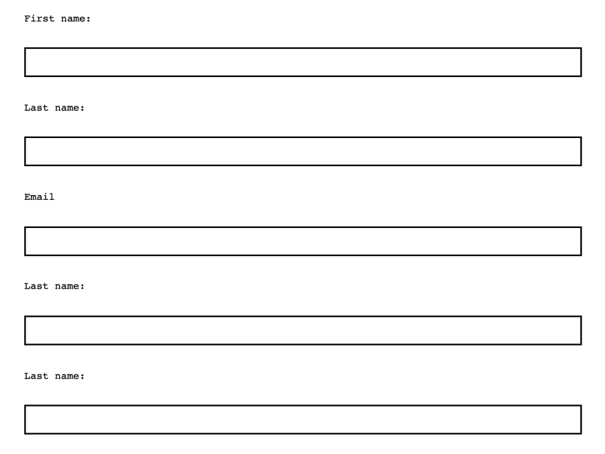
Adding a darker / thicker border or even some shadow helps even more.
Required Fields
The picture below is a perfect example. I cannot tell which one of these if any... or all of them are required...

Instead try:
Marking required fields with an asterisk.
Even better, marking required fields with “required.”
Where possible, remove optional fields altogether.
In the next article I'll be wrapping up this series with a few more examples and tooling!

Top comments (0)