Hey there ✌🏼
In this article, we'll tackle a common CSS issue that can be a bit puzzling.
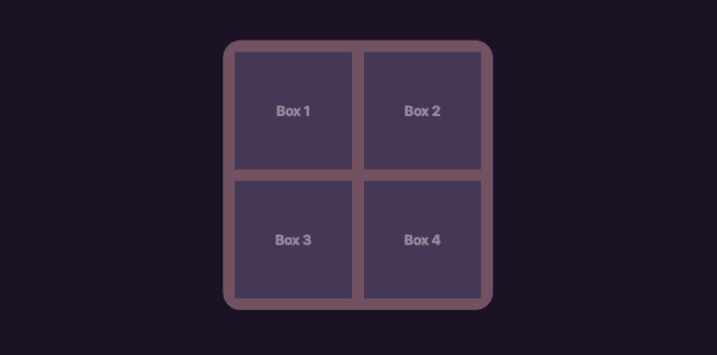
Imagine you're sitting on your desk, working on the frontend of your million-dollar idea application. You have a main outer container with smaller box elements inside it.
To make them look good, you've decided to round the corners of the outer container. In this example let’s say you decide for the outside container to have 50px of border radius and a padding of 20px with the inside elements.
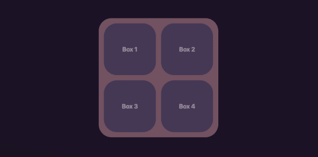
And of course you want everything to match, so you've given the smaller boxes the same rounded corners.
But wait a minute…
Something is off isn't it?
When you apply the same border radius to both the outer and inner elements, you might expect them to seamlessly nestle together, sharing the same rounded edges. However, that's not the case.
The inner elements inherit the border radius from the outer container, but they also inherit the padding. This means that the inner elements will have their rounded corners start from the edge of their content box, which includes the padding space. As a result, the corners of the inner elements might appear to stick out beyond the edges of the outer container.
To resolve this issue and restore peace inside your application you'd need to perform a simple calculation
// The Calculation
Inner Border Radius = Outer Border Radius - Padding

// So in our case
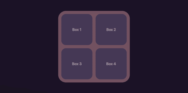
Inner Border Radius = 50px - 20px = 30px
Of course you can apply the same principle with more than pixels, using other units.
Let's see the result with our new border radius values:
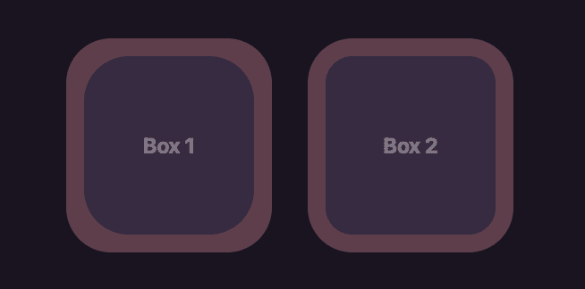
Let's also examine it with one inner element to make the difference more distinct
That's it for today, thanks for taking the time to read 🙏🏼


Top comments (0)