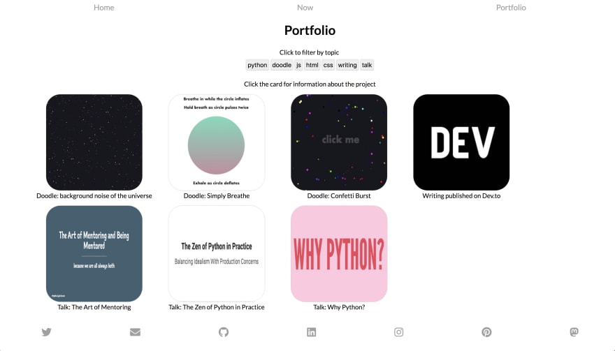
I'm actually in the process of redoing my personal site right now. Most of the content on other pages is placeholder and will change soon, but I'm trying out a new idea for presenting projects and talks.
Again, the content for each project is incomplete, but I would love feedback on the functionality and design. Oh, and the button filtering is wonky. This is my staging site and totally should not be viewed as production ready 😅
I've been a professional C, Perl, PHP and Python developer.
I'm an ex-sysadmin from the late 20th century.
These days I do more Javascript and CSS and whatnot, and promote UX and accessibility.
The modal doesn't resize when the window changes, so turning your phone could result in broken text.
The modal requires a minimum height, which my laptop screen just doesn't have, in order to display enough of its content.
From an accessibility point of view, the links are too low-contrast, and the only way they're distinguished from body text or for their hover states is by a very slight luminosity change.
The social links have no content, so they can't be used with a screenreader, etc.
You can't use the keyboard to navigate through the thumbnails because they're not really links.
The filter buttons could be bigger, because they're a little swamped with the other components on the screen.
It's not obvious that the filters are ANDed together until you experiment. My assumption was that clicking one after another would have removed the first filter. Perhaps they could be made more obvious with some kind of checkbox-like states?
Other suggestions:
You could made the esc key dismiss the modal.
A different effect for the modal appearing and disappearing? It's slightly disconcerting that it zooms in from the side even when you click on one of the figures from the opposite side.
Make the modal background colour use something from the same palette as the clickable thumbnail?
Add your name to the page title so people who bookmark it can find it again easily
I actually think that since this is a page about showing off a few things that you've done, and there's a manageable number of them, that just displaying things one after another would be fine, rather than using the modal effect at all.
Thank you so much for this thorough review! I’ll definitely take a couple things under advisement, but like I said before, this is a staging site for my portfolio where I sandbox things to play with, so it’s missing a lot of content and listing everything out would not be good.
I have an updated local version that I think already addresses a couple of these issues that I just haven’t pushed up yet. If you’re interested I’d love for you to take a look after I’m done. Thanks again.
All that being said, I’m a data engineer who Is touching JavaScript and CSS again for the first time in 5 years just for this site and a couple doodles, so if you have any advice on how to do things like sizing things from an accessibility standpoint, or places to test contrast between two colors, that would be super helpful!
For further actions, you may consider blocking this person and/or reporting abuse
We're a place where coders share, stay up-to-date and grow their careers.

I'm actually in the process of redoing my personal site right now. Most of the content on other pages is placeholder and will change soon, but I'm trying out a new idea for presenting projects and talks.
Again, the content for each project is incomplete, but I would love feedback on the functionality and design. Oh, and the button filtering is wonky. This is my staging site and totally should not be viewed as production ready 😅
Awesome! I mostly use mine for speaking gigs now too! I'm also a huge fan of the Zen of Python!
I didn't get this exactly how I wanted it, but I changed some sizing/ordering in order to emphasize stuff and use more space!
I also struggled to close the modals, though I love how much info you give on your projects!
I found a couple of glitches:
From an accessibility point of view, the links are too low-contrast, and the only way they're distinguished from body text or for their hover states is by a very slight luminosity change.
The social links have no content, so they can't be used with a screenreader, etc.
You can't use the keyboard to navigate through the thumbnails because they're not really links.
The filter buttons could be bigger, because they're a little swamped with the other components on the screen.
It's not obvious that the filters are ANDed together until you experiment. My assumption was that clicking one after another would have removed the first filter. Perhaps they could be made more obvious with some kind of checkbox-like states?
Other suggestions:
esckey dismiss the modal.I actually think that since this is a page about showing off a few things that you've done, and there's a manageable number of them, that just displaying things one after another would be fine, rather than using the modal effect at all.
Thank you so much for this thorough review! I’ll definitely take a couple things under advisement, but like I said before, this is a staging site for my portfolio where I sandbox things to play with, so it’s missing a lot of content and listing everything out would not be good.
I have an updated local version that I think already addresses a couple of these issues that I just haven’t pushed up yet. If you’re interested I’d love for you to take a look after I’m done. Thanks again.
All that being said, I’m a data engineer who Is touching JavaScript and CSS again for the first time in 5 years just for this site and a couple doodles, so if you have any advice on how to do things like sizing things from an accessibility standpoint, or places to test contrast between two colors, that would be super helpful!