
I recently wrote the third tutorial for Domternal, my MIT-licensed ProseMirror editor: a comment box with @mentions in Vue. The core package alone runs 2,441 unit tests. There are four demo apps, one per supported framework, each with its own Playwright suite. I felt pretty good about coverage.
The comment box found four real bugs in one afternoon.
None of them were exotic. Every one had been sitting in shipped releases, invisible, because every test and every demo I had ever written shared one assumption the comment box didn't: that the editor is a big, tall document. A one-line composer is a different shape of consumer, and a different shape is exactly what coverage numbers can't measure. Here's what it caught.
Bug 1: The placeholder that wasn't there
The composer starts empty, so the first thing you should see is the placeholder prompt. Instead: nothing. Click into the editor: still nothing, because a click only dispatches a transaction when the selection actually changes, and in an empty document there is nowhere else for it to go. Type one character and delete it: there it is.
The placeholder is a ProseMirror decoration (presentational markup the editor layers over the document, recomputed from editor state rather than stored in it), and the plugin computing it had a guard that looked completely reasonable:
decorations: ({ doc, selection }) => {
  const editor = this.editor;
  if (!editor?.view) return DecorationSet.empty;
  const isEditable = editor.view.editable;
  // ...
The catch is when ProseMirror first asks for decorations: during the EditorView constructor, while it draws the initial document. At that moment editor.view is still unassigned, because the assignment only happens after the constructor returns. So the very first draw gets an empty decoration set, and since decorations are only recomputed on a state update, the placeholder stays invisible until the first transaction. The one-line repro that confirmed it:
editor.view.dispatch(editor.state.tr); // a no-op transaction, placeholder appears
Why did no test or demo ever catch this? Every demo seeds the editor with content, and every placeholder test called the decoration function manually, after construction, when the view exists. The fix was to make editor.isEditable safe before the view exists (it falls back to the configured option) and drop the view check from the plugin, plus a regression test that asserts [data-placeholder] is in the DOM immediately after new Editor(...), before anything else happens.
Bug 2: The popup that got clipped
Type @ in the composer and the mention popup opens, except it gets sliced off at the editor's bottom edge: two rows visible, the third cut mid-letter.

Domternal positions all floating UI (suggestion popups, bubble menus, popovers) position: absolute inside the editor wrapper. That's a deliberate architecture choice: during scrolling the popup moves with the content for free, on the compositor, with no JavaScript repositioning and no jitter. The theme also set overflow: hidden on that same wrapper, for rounded corners.
In a full-page document those two choices never meet: the popup opens next to the caret, well inside the box. In a composer the box is 80 pixels tall and the full six-person popup needs 190. Even filtered down to three people it measured 64 pixels past the editor's bottom edge. Clipped.
The fix moves the clipping one element down, onto the editor's content wrapper, so the document still crops at the rounded corners but floating UI can escape the box:
.dm-editor {
  /* overflow: hidden is gone from the wrapper itself */
}
.dm-editor > div:has(> .ProseMirror) {
  overflow: hidden;
  border-radius: inherit;
}
On released versions the tutorial documents the one-line workaround (overflow: visible on the composer's editor), which becomes a harmless no-op once this ships in 0.9.0.
Bug 3: The mouse that wouldn't let go
This one I only found because I record the tutorial demos with a scripted, human-like cursor. The script typed @ma, pressed ArrowDown to highlight the second person, and pressed Enter. The video showed the highlight never moving and Enter inserting the wrong person.

The same steps in a plain Playwright test passed. The difference between the two runs took a while to find: in the recording, the real mouse pointer was resting where it had last clicked, and the popup happened to open underneath it.
The suggestion list re-renders on every change, including the re-render that ArrowDown itself triggers. Rebuilding the item buttons under a stationary pointer makes the browser fire a synthetic mouseenter on whichever new element ends up under the cursor, with zero physical mouse movement. The renderer treated mouseenter as "the user is hovering this item" and moved the selection right back. Keyboard presses ArrowDown, re-render happens, phantom hover undoes it. Every time.
The fix is small and a classic of autocomplete UIs: select on mousemove instead of mouseenter. Real hovering always produces mousemove events; a DOM swap under a motionless pointer never does. The regression tests now assert that a synthetic mouseenter alone does not move the selection.

Bug 4: The calc() that ate my padding
The composer needed smaller padding than a document, and the theme exposes a custom property for exactly that. The theme used it like this:
.dm-editor .ProseMirror {
  padding: var(--dm-editor-padding);
  padding-top: calc(var(--dm-editor-padding) + var(--dm-editor-padding-top-extra, 0px));
}
Works beautifully until someone sets the variable to a two-value shorthand:
--dm-editor-padding: 4rem 4.8rem;
The padding line is fine. The padding-top line substitutes to calc(4rem 4.8rem + 0px), which is invalid. And here's the cruel part of the CSS spec: a declaration that becomes invalid at computed-value time doesn't fall back to the earlier padding declaration in the cascade. It computes to the property's default. padding-top: 0. Silently. No console warning, nothing in DevTools except a value you didn't set.
The punchline: all four of Domternal's own demo apps set exactly that two-value shorthand. Every demo had been rendering with zero top padding and nobody noticed, because a 4.8rem side padding makes a missing 4.5rem top padding look like a slightly snug design choice rather than a bug.
The fix adds a dedicated single-value variable with a fallback chain, so existing single-value users keep their behavior and shorthand users get a working knob:
padding-top: calc(var(--dm-editor-padding-top, var(--dm-editor-padding)) + var(--dm-editor-padding-top-extra, 0px));
What actually caught them
Not one of these four bugs was caught by adding more tests to the shapes I already had, because tests encode the consumer you imagined while writing them. All my imagined consumers were documents: tall, content-seeded, mouse-and-keyboard in the usual places. Every core test that existed at the time kept passing before, during, and after all four bugs.
What caught them was a new shape: an editor that is one line tall, starts empty, hijacks Enter, and gets driven by a recorded cursor that behaves like a human hand instead of a test runner. Placeholder-on-first-paint only matters when the editor starts empty. Popup clipping only matters when the editor is shorter than the popup. The hover bug only appears when a real pointer rests where a popup opens. The padding bug was visible all along, but only a composer made it look broken instead of stylistic.
The placeholder and hover fixes now ship with regression tests that fail on the old code, and the theme changes were run through the suggestion and Notion e2e suites of all four demo apps, so the shapes stay covered. But the general lesson stands: if your library has only ever been used the way you use it, you don't know how it behaves. Write the tutorial. Build the weird little composer. Your test suite will thank you, right after it embarrasses you.
All four fixes land in Domternal 0.9.0, the next release. If you want the comment box that started all this, the full walkthrough is in the Vue tutorial, and the editor itself is MIT-licensed on GitHub.
 domternal
/
domternal
domternal
/
domternal
Modern, extensible rich text editor toolkit built on ProseMirror. Classic and Notion-style editors out of the box. Or go headless and assemble from 65+ tree-shakeable extensions. First-class wrappers for Angular, React, Vue, and Vanilla.
Domternal
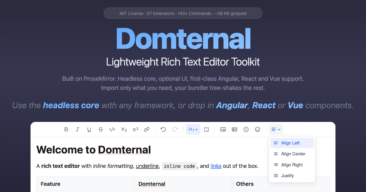
A lightweight, extensible rich text editor toolkit built on ProseMirror. Framework-agnostic headless core with first-class Angular, React, Vue, and Vanilla wrappers. Use it headless with vanilla JS/TS, add the built-in toolbar and theme, or drop in ready-made framework components. Fully tree-shakeable, import only what you use, unused extensions are stripped from your bundle.

Website · Getting Started · Packages & Bundle Size
StackBlitz (Angular) · StackBlitz (React) · StackBlitz (Vue) · StackBlitz (Vanilla TS)
Features
- Headless core - use with any framework or vanilla JS/TS
- Angular components - editor, toolbar, bubble menu, floating menu, emoji picker, notion color picker (signals, OnPush, zoneless-ready)
-
React components - composable
Domternalcomponent, toolbar, bubble menu, floating menu, emoji picker, notion color picker, custom node views (React 18+) -
Vue components - composable
Domternalcomponent,useEditor/useEditorStatecomposables, toolbar, bubble menu, floating menu, emoji picker, notion color picker, custom node…

Top comments (0)