
I had some great success critiquing/roasting your websites on Twitter and here on dev.to, and I'd love to help tell you why your website sucks agai...
For further actions, you may consider blocking this person and/or reporting abuse


francoscarpa.com
Thanks for sharing Franco!
Starting off, your website looks amazing 😄
2 small things I noticed:
1. On a larger screen, the user is able to scroll just a TINY bit
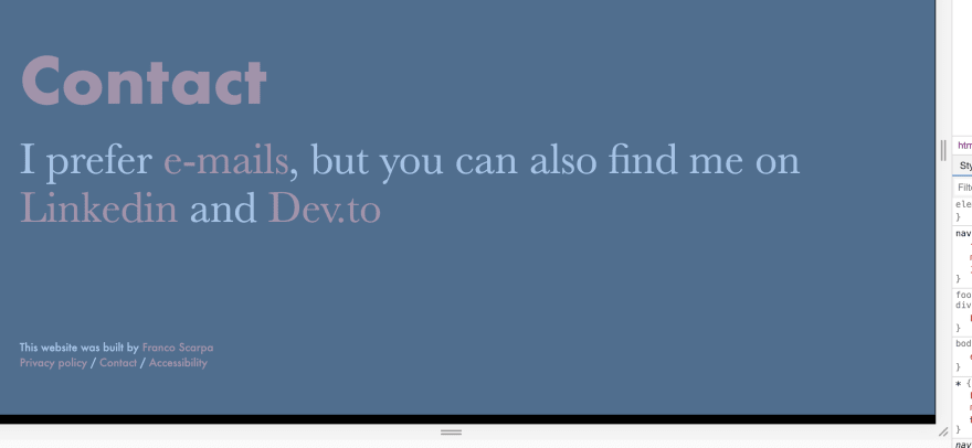
Something about the CSS is causing the home and contact page to be larger than they need to be.
2. External links don't open in a new tab/window
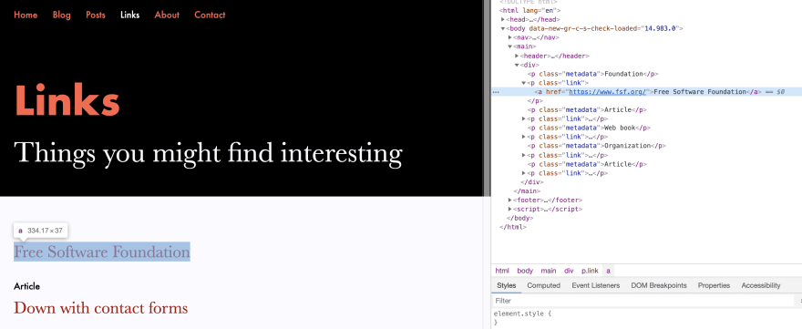
For external links, I'd advise making them open in a new tab.
This way, a user can easily go back to your own webpage.
Be sure to use rel="noopener noreferrer"
I was aware of the height issue, but it’s OK for me; I also decided for myself to open links in the same window. Thanks anyway!
Thanks for keeping links working the way they were intended. Opening in a new tab/window is easily accomplished with a middle click, but forcing something to open in the same tab/window when a site has decided to force things to open in new tabs/windows is not so straightforward.
There are occasions where opening a link in a new tab/window is a good idea but, when in doubt, leave it out. Give the user choice based on standard approaches.
Sorry, but I didn’t understand your point of view... Can you explain it better?
I'm just saying that links that work the default way -- opening in the same browser tab/window normally, but in a new tab/window when someone middle-clicks -- are usually a good idea. It seems that is how your website works, and I think that's a good thing, even if Twan Mulder thinks you should change it.
Please have a look at: inspirezone.tech
harsh criticism is highly welcome!
Thanks for sharing Fum!
2 things I noticed:
Whenever the user wants to comment on a blog post and they haven't entered their name or email, they get redirected to a new page and have to click back.

An inline error is advised and doesn't distract the user.
Second, is that there a lot of things you can improve on in terms of performance/best practises.
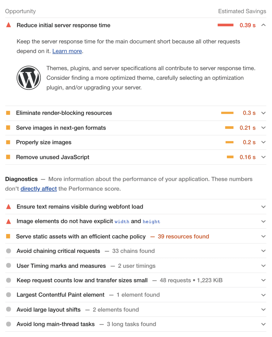
Check out the lighthouse reports in order to find points to improve on.
Thanks for your feedback, very helpful :)
I didnt like the logo in the header and some images are cliche
Thanks for your feedback! Which images in particular don't you like?
Image in nav, 'learn to code code to learn' image
The text that says 'A developer community inspiring you to code' should be a bit larger for text hierarchy
Links in the footer are not attractive im not gonna click on any of them you know add some preview, CTA, date length in terms on reading
chriswray.dev
Hey Christopher, thanks for sharing your website!
Starting off, I really like the feel of your website.
Very light and easy to scan and read.
As others have said, the custom scrollbar can be a bit tricky. Not all browsers support it and there's no standard way of styling it. This means that your scrollbar may look different depending on what device and/or browser the user is using.
The other thing I noticed, is the first thing someone sees when going to your website: the hero
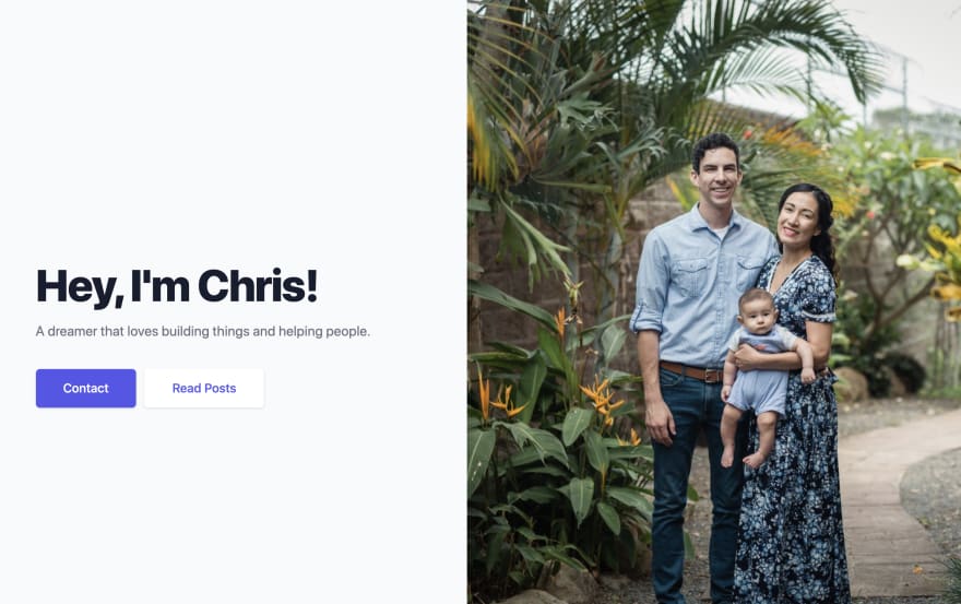
Currently, the copy of your hero doesn't convey a very clear message.
A "dreamer" doesn't really describe what your role/function is.
"building things" can also mean way too much. What do you build? Is there a specific niche you build for?
I'd advise experimenting with the copy your using on the hero of your homepage.
Again, thanks for sharing 😄
Thanks so much! I forgot to respond but I made quite a few changes based on your feedback! I still kept the scroll bar because I like it 😂
That's awesome Chris, thanks for the reply 😄 Keep up the great work and I wish you the best!
I'm not sure that it's a good idea to use a custom scrollbar for body.
But your website's at least readable.
Check this: epower.ng
Hey Hammed, thanks for sharing 😄
In general, I really like the website. The design is very sleek.
The first thing I noticed were the cursor drops/circles whenever you move the cursor.
I'd advise removing this because it will only distract the user of the content of your website.
Second, I'd advise on not using a hamburger menu on desktop

There's a lot of empty space on the top of the screen on desktop.
Use it!
Let the user navigate your webpage without having to open a menu 😄
Thanks again for sharing!
Sorry for that, but it's the worst thing I've ever seen. So many animations! I'm loosing my mind when scrolling the page.
🤣🤣🤣
If you insist: jvarness.blog
Thanks for sharing Jake!
I've got 2 things:
1. Width of blog container
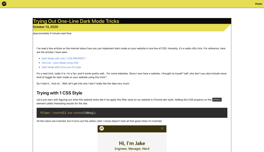
The advised amount of characters on a single line is about 65-85 characters.
Currently, it's a little too wide, especially on a larget screen.
I'd advise using the CSS "ch" unit, its support is pretty good
2. Recent blog posts on homepage

When viewing your most recent blog posts, there's no way to reach all your blog posts. I'd add a CTA directing to all your posts, just like in the navigation, with some text like "View all posts" or "Read more"
Ah, yes, I shoulda known. Thanks for the feedback. I’ll definitely take it into consideration
Check this: devhammed.github.io
Hey Hammed, thanks for sharing!
To be perfectly honest, I've got nothing to say about your website.
It's a great way of telling who you are and what you do in a very concise way.
The design is nice and clear, all the handy links to socials are there, it's great!
The only thing I'd have to say, is that the image on mobile is a little too large.

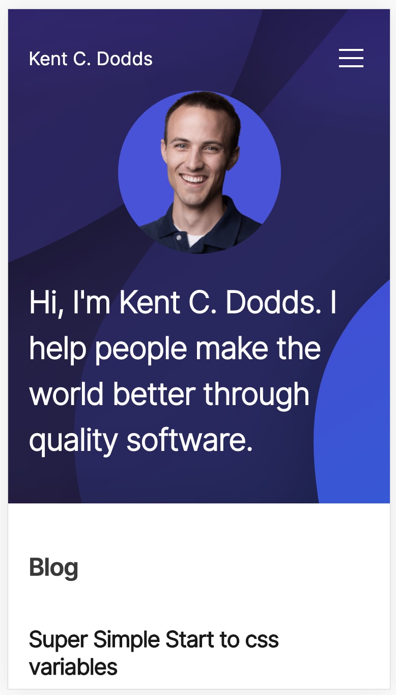
Maybe you could go for something like kent Kent C. Dodds does:
Thanks for sharing and have a nice day 😄
particles.matteobruni.it
I don't know how to improve it but I know it needs improving.
You can also check out the root domain, I have an old CV there, but I don't remember when I updated it last time.
ndw.one/
Going through a rebuild anyway so all feedback welcome :D
Have a look at denizaksimsek.com!
Hey Deniz, thanks for sharing your website!
I really like the minimalistic look of it 😄
2 things I noticed:
1. Numbers in about text link

I like how you already link to categories of your blog, but the numbers don't necessarily add any value for the user. I'd advise removing them. Also, the "programming languages" link is currently dead.
2. No action at end of blog post
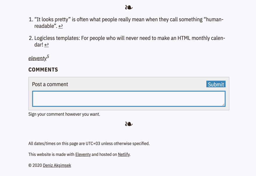
When the user is done reading, you can have them take another action on your website.
Maybe a user wants to read another article, a more recent or older one.
Think about showing a link to a next or previous article at the end of your articles.
Done & done! This is a great service you're offering everybody!
Awesome! That's quick 😄
niroshkumarldb.netlify.app/
---☮
justaashir.com
I'm excited
I love the design, it's very sleek. Just one thing: the white text is very bright, which makes it uncomfortable to look at. Using
#EEEinstead of#FFFwould make it a lot easier on the eyes.I hate reading vertical text. No one loves reading vertical text)
Your fonts jump around during page loading. It's so annoying.
Here's my website --
akshatagrawal.co.in
Thanks :)
notebook.aboutdavid.me
my blog thing
devdiary.me
Excited for your Feedback😍
skilledguyanese.com
Can you tell if my portfolio can be improved any further?
volt9801.github.io/portfolio
check this tfblog.herokuapp.com/
santoshb.com.np
jenuelganawed.com
marcoibarra.com/
Let’s do this! 😄
Let’s go 😁 antoineleguern.fr/
roombuddy.co/en
Just launched! Thank you!